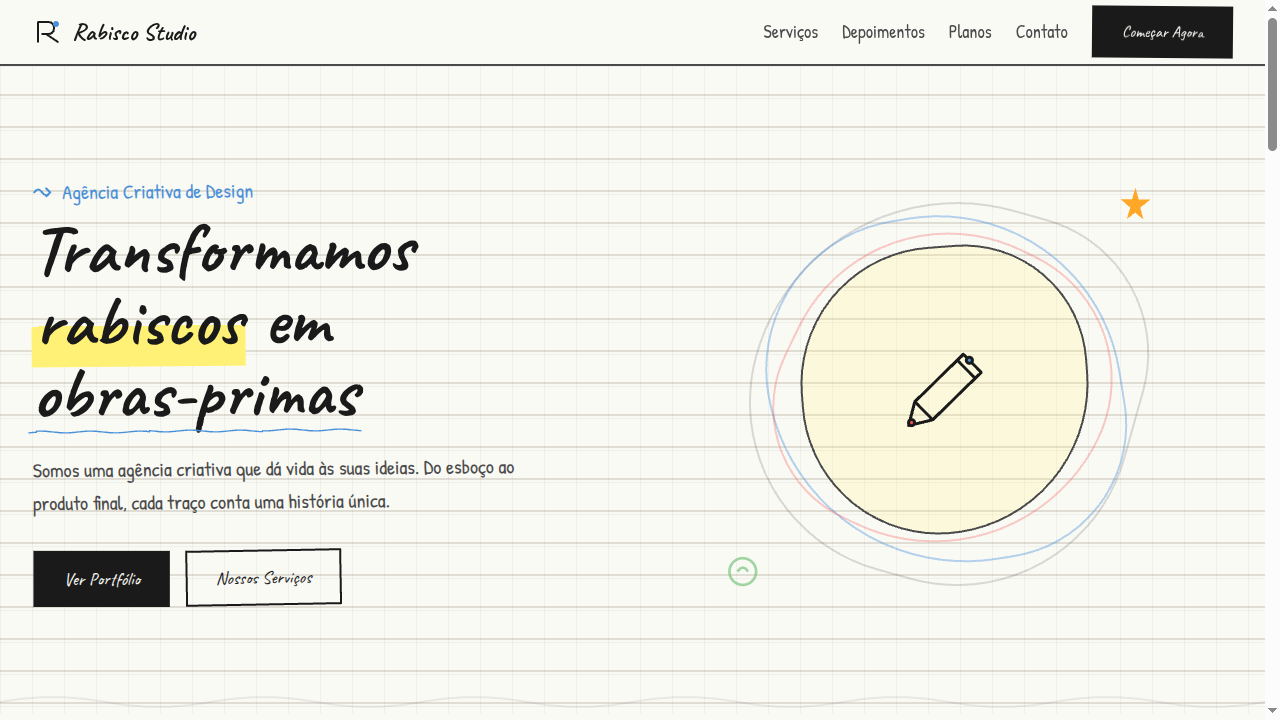
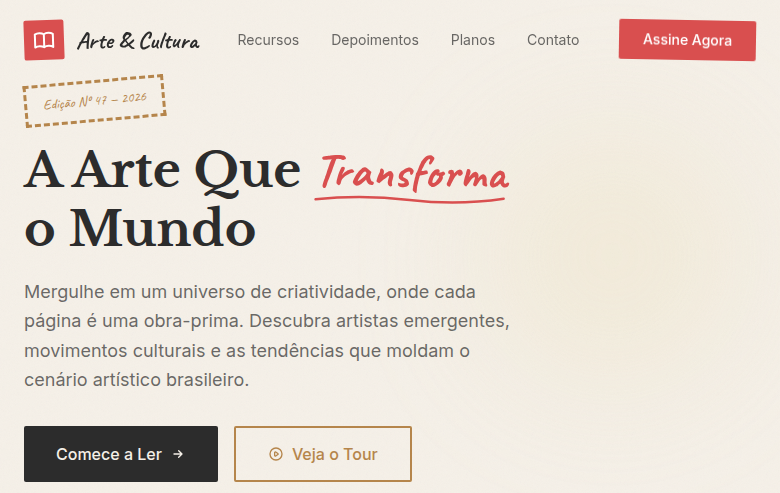
Conceptual Sketch / Doodle Art
Doodle art landing page with hand-drawn, sketch-like aesthetics. Ideal for branding lúdico, creative agencies, produtos para público jovem, editoriais divertidos. AI-ready template.
Use case: Branding lúdico, Creative agencies, Produtos para público jovem, Editoriais divertidos
Historical Context
The doodle is older than graphic design itself. Marginalia in medieval manuscripts, Leonardo's notebook sketches, Saul Steinberg's deceptively simple line work for The New Yorker — the conceptual sketch has always been the thinking person's visual language. It's not decoration; it's cognition made visible. The hand-drawn line carries something a vector never will: the tremor of an idea still forming. In the 1960s and 70s, designers like Corita Kent and Sister Mary Corita proved that raw, unpolished mark-making could carry enormous conceptual weight. Later, Stefan Sagmeister's hand-scrawled typography and Christoph Niemann's abstract Sunday Sketches demonstrated that the doodle wasn't primitive — it was deliberately unfinished, inviting the viewer to complete the thought. Today, tools like Excalidraw and FigJam have digitized the aesthetic, but the best implementations still honor the original premise: a sketch is a conversation, not a deliverable.
When to Use
Deploy doodle art when you need to signal that ideas are still in motion — brainstorming interfaces, workshop facilitation tools, creative agency portfolios, or any context where polish would feel premature and dishonest. It works beautifully for onboarding flows that want to feel approachable rather than intimidating, and for ideation platforms where the UI itself should whisper 'nothing here is precious yet.' Avoid it for anything requiring authority or precision. A bank should not doodle.
Design Principles
- Embrace imperfection deliberately — wobbly lines, uneven spacing, and visible corrections signal authenticity; if your doodles look too consistent, you've over-produced them
- Limit your palette to 2-3 colors maximum, treating ink-on-paper as the default mental model; monochrome with one accent color almost always outperforms a rainbow
- Maintain generous whitespace around sketched elements — doodles need breathing room or they collapse into visual noise that reads as clutter rather than creativity
- Keep stroke weight variation organic but controlled; mix thin exploratory lines with confident thick strokes to create hierarchy without resorting to traditional typographic scale
- Never animate doodles with mechanical easing — if you must animate, use hand-drawn frame sequences or deliberately jerky timing that preserves the human quality of the mark
Technical Specs
Colors
Primary
Secondary
Effects
Hand-drawn SVG borders (wavy/irregular), sketch-style underlines, notebook paper background (lined or grid), doodle arrow decorations, wiggle animations on hover, pencil texture overlays
Light/Dark
✓ Full / ◐ Partial
Related
Last synced: 4/1/2026