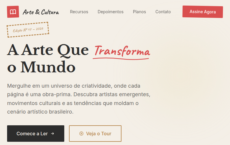
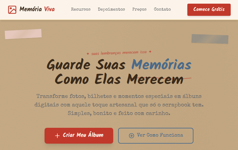
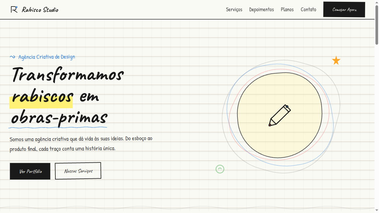
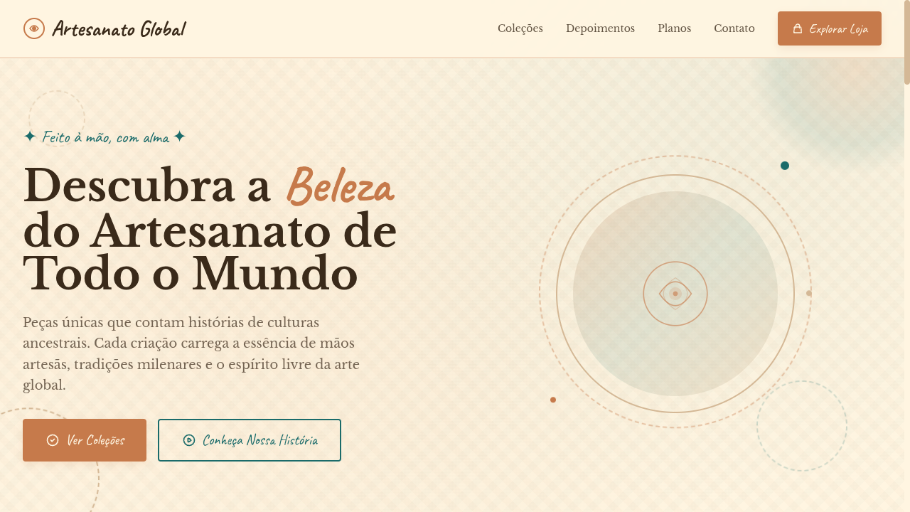
Mixed Media
Mixed media landing page combining collage, painting and photography aesthetics. Ideal for spreads de revistas, capas de álbuns, publicidade criativa, portfólios artísticos. AI-ready template.
Use case: Spreads de revistas, Capas de álbuns, Publicidade criativa, Portfólios artísticos
Historical Context
Mixed media isn't a style — it's a refusal to pick one. Its roots sit somewhere between Cubist papier collé, Dada photomontage, and the ripped-poster walls of 1960s Paris. Schwitters was gluing bus tickets to canvas before anyone had a word for it. Rauschenberg's Combines blew the door open: painting could hold photographs, fabric, found objects, whatever served the idea. The point was never decoration. It was confrontation — forcing unlike materials into dialogue until something unexpected emerged. Digitally, mixed media found new legs in the zine explosion of the '90s and the early-web collage aesthetic that treated the screen like a light table. David Carson's Ray Gun layouts proved that layering photography over paint textures over torn paper could communicate feeling faster than clean typography ever would. Today the approach lives in editorial design, album art, fashion campaigns, and any context where polish feels dishonest. The tension between analog texture and digital precision is the whole point — it signals that a human hand was here, making decisions that no grid system would sanction.
When to Use
When the brief demands rawness, personality, or cultural credibility that polished vector work can't deliver. Mixed media shines for creative agencies building identity systems that need to feel handmade, art platforms showcasing process over product, experimental brands rejecting corporate sterility, and zines or independent publications where imperfection is the aesthetic contract with the reader. If your audience values authenticity over cleanliness, this is your language.
Design Principles
- Embrace material tension — let photography argue with paint, let paper texture interrupt digital gradients. The friction is the design.
- Layer with intention, not decoration. Every collaged element must earn its place through contrast, narrative, or compositional necessity.
- Preserve analog artifacts — scan marks, torn edges, ink bleed, grain. These imperfections carry more information than any filter can simulate.
- Establish a tonal hierarchy despite the chaos. Mixed media without clear focal points is just a mess. Controlled disorder requires more discipline than minimalism.
- Let negative space breathe between dense collage zones. The eye needs rest stops — silence makes the noise legible.
Technical Specs
Colors
Primary
Secondary
Effects
Layered overlapping elements with z-index stacking, torn paper edge effects via clip-path, tape/pin decorative SVG elements, mixed texture backgrounds (paper, canvas, photo), collage-style asymmetric layouts, washi tape borders, slight rotation on layered elements
Light/Dark
✓ Full / ◐ Partial
Related
Last synced: 4/1/2026