Capsule
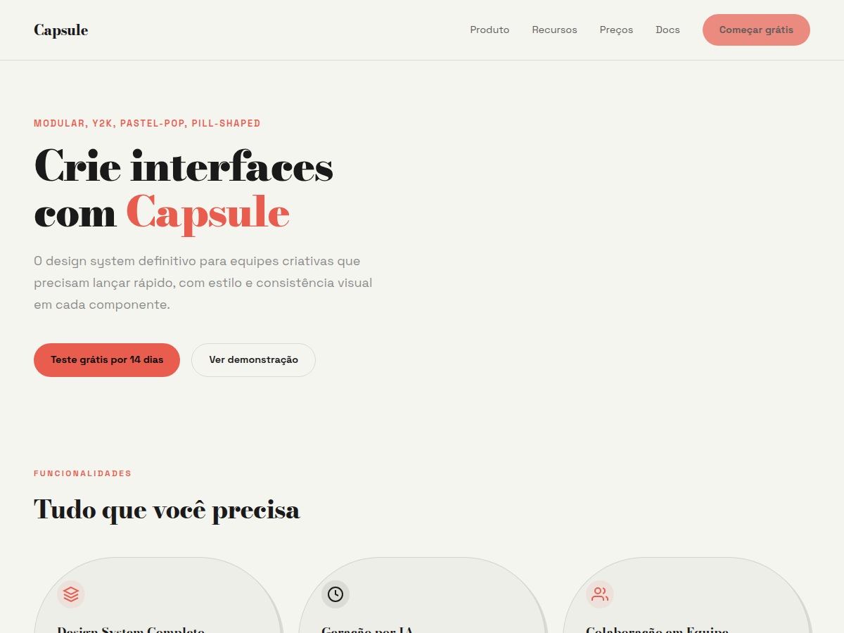
Capsule — Modular pill-shaped cards on warm bone with a full pastel-pop palette. Bodoni Moda typography. warm bone background, ink-black structure, and a full pastel-pop palette (coral,. Best for lifestyle brand, creator portfolio, DTC product launch. AI-ready design system.
Use case: lifestyle brand, creator portfolio, DTC product launch, wellness or beauty pitch, Y2K-tinged brand work
Historical Context
The capsule shape didn't arrive from nowhere — it's a direct descendant of the rounded rectangle obsession that dominated early 2000s interface design. Think of those chunky Aqua buttons in Mac OS X, the bubbly navigation bars in MSN Messenger, the inflated pill tabs in Winamp skins. That era treated software like candy: glossy, tactile, almost edible. The form communicated approachability at a time when computers were still intimidating objects in most households. When flat design steamrolled everything post-2012, the capsule went underground. Sharp corners and stark geometry ruled. But the pendulum swung back — hard. Around 2020, Gen Z designers started excavating Y2K aesthetics with genuine affection rather than irony. The pill shape re-emerged stripped of its Aqua-era gloss, now rendered flat or with barely-there soft shadows. Pastel palettes replaced the chrome gradients. The result is something that feels simultaneously nostalgic and contemporary — a shape that carries warmth without the visual weight of its ancestors. Today's capsule components sit at the intersection of neomorphism's subtlety and flat design's clarity. They reject the cold precision of purely geometric systems in favor of something more human, more playful, more willing to admit that interfaces can simply feel nice.
When to Use
Reach for capsule components when your product needs to feel approachable without being childish. Social apps, dating platforms, music discovery tools, anything where the interaction model is casual and the audience skews younger. They work beautifully for tags, status indicators, user chips, and action buttons where you want tap targets that feel generous and forgiving. Avoid them in data-dense enterprise interfaces or anywhere precision and information density matter more than personality. The capsule earns its place when delight is a product requirement, not a nice-to-have.
Design Principles
- Generous padding is non-negotiable — the interior space defines the capsule's personality. Cramped content inside a pill shape looks like a manufacturing defect, not a design choice.
- Limit your radius to exactly half the component height. Anything less creates a rounded rectangle pretending to be a capsule. Commit to the form or don't use it.
- Pastel backgrounds with high-contrast foreground text. The softness lives in the container, not the content. Legibility is never sacrificed for aesthetic.
- Shadows should whisper, never shout. A 2-4px blur with 5-8% opacity maximum. If your capsule casts a visible shadow on scroll, you've gone too far.
- Maintain consistent capsule proportions across breakpoints — scale the entire component rather than stretching width while keeping height fixed. Capsules that become lozenges at wide viewports lose their charm entirely.
DESIGN.md
---
version: "alpha"
name: "Capsule"
description: "Capsule — Modular pill-shaped cards on warm bone with a full pastel-pop palette. Bodoni Moda typography. warm bone background, ink-black structure, and a full pastel-pop palette (coral,. Best for lifestyle brand, creator portfolio, DTC product launch. AI-ready design system."
colors:
  primary: "#F5F5F0"
  secondary: "#1A1A1A"
  tertiary: "#E85D4E"
  neutral: "#C4D94E"
  surface: "#C5B5E0"
  accent: "#8BB4F7"
typography:
  h1:
    fontFamily: Bodoni Moda
    fontSize: 2.5rem
    fontWeight: 700
  body-md:
    fontFamily: Bodoni Moda
    fontSize: 1rem
    fontWeight: 400
rounded:
  sm: 999px
  md: 1998px
  lg: 2997px
spacing:
  sm: 1.5rem
  md: 3.0rem
  lg: 6.0rem
components:
  button-primary:
    backgroundColor: "{colors.primary}"
    textColor: "{colors.neutral}"
    rounded: "{rounded.sm}"
    padding: 12px
---

## Overview

Capsule — Modular pill-shaped cards on warm bone with a full pastel-pop palette. Bodoni Moda typography. warm bone background, ink-black structure, and a full pastel-pop palette (coral,. Best for lifestyle brand, creator portfolio, DTC product launch. AI-ready design system. The capsule shape didn't arrive from nowhere — it's a direct descendant of the rounded rectangle obsession that dominated early 2000s interface design. Think of those chunky Aqua buttons in Mac OS X, the bubbly navigation bars in MSN Messenger, the inflated pill tabs in Winamp skins. That era treated software like candy: glossy, tactile, almost edible. The form communicated approachability at a time when computers were still intimidating objects in most households.

When flat design steamrolled everything post-2012, the capsule went underground. Sharp corners and stark geometry ruled. But the pendulum swung back — hard. Around 2020, Gen Z designers started excavating Y2K aesthetics with genuine affection rather than irony. The pill shape re-emerged stripped of its Aqua-era gloss, now rendered flat or with barely-there soft shadows. Pastel palettes replaced the chrome gradients. The result is something that feels simultaneously nostalgic and contemporary — a shape that carries warmth without the visual weight of its ancestors.

Today's capsule components sit at the intersection of neomorphism's subtlety and flat design's clarity. They reject the cold precision of purely geometric systems in favor of something more human, more playful, more willing to admit that interfaces can simply feel nice.

- Density: 5/10 — Balanced
- Variance: 5/10 — Moderate
- Motion: 4/10 — Subtle

- **Style:** Modular, Y2K, Pastel-Pop, Pill-Shaped
- **Keywords:** Pill-shaped cards, Y2K, pastel-pop, modular, Bodoni Moda, playful, modern, warm bone
- **Era:** 2020s Modern
- **Light/Dark:** ✓ Full / ✗ None

## Colors

- **Bg** (#F5F5F0) — Primary surface or dominant color
- **Fg** (#1A1A1A) — Accent highlight, links and focus states
- **Coral** (#E85D4E) — Secondary accent
- **Lime** (#C4D94E) — Accent color, emphasis elements
- **Lavender** (#C5B5E0) — Extended palette, decorative use
- **Sky** (#8BB4F7) — Background alternate
- **Violet** (#A06CE8) — Muted text / borders
- **Yellow** (#F2D160) — Extended palette
- **Peach** (#F5B895) — Extended palette, decorative use
- **Mint** (#A8E6CF) — Extended palette, decorative use


## Typography

- **Display / Hero:** Bodoni Moda — Weight 700, tight tracking, used for headline impact
- **Body:** Space Grotesk — Weight 400, 16px/1.6 line-height, max 72ch per line
- **UI Labels / Captions:** Space Grotesk — 0.875rem, weight 500, slight letter-spacing
- **Monospace:** JetBrains Mono — Used for code, metadata, and technical values

Scale:
- Hero: clamp(2.5rem, 5vw, 4rem)
- H1: 2.25rem
- H2: 1.5rem
- Body: 1rem / 1.6
- Small: 0.875rem


## Layout

- **Grid:** CSS Grid primary. Max-width containment: 1280px centered with 1.5rem side padding.
- **Spacing rhythm:** Balanced. Base unit: 0.5rem (8px).
- **Section vertical gaps:** clamp(4rem, 8vw, 8rem).
- **Hero layout:** Split-screen (text left, visual right).
- **Feature sections:** Zig-zag alternating text+image rows. No 3-equal-columns.
- **Mobile collapse:** All multi-column layouts collapse below 768px. No horizontal overflow.
- **z-index contract:** base (0) / sticky-nav (100) / overlay (200) / modal (300) / toast (500).


## Elevation & Depth

display font Bodoni Moda for hero headlines, smooth hover transitions (200-250ms), subtle lift shadows, pill-shaped (border-radius: 999px) card badges, full pastel-pop palette blocks

- **Physics:** Ease-out curves, 200-300ms duration. Smooth and predictable.
- **Entry animations:** Fade + translate-Y (16px → 0) over 420ms ease-out. Staggered cascades for lists: 80ms between items.
- **Hover states:** Subtle color shift + shadow adjustment over 200ms.
- **Page transitions:** Fade only (200ms).
- **Performance:** Only transform and opacity animated. No layout-triggering properties.


## Shapes

Base corner radius: 999px. See rounded tokens in front matter for the full scale.


## Components

- **Primary Button:** 999px (pill shape) border-radius. Accent color fill. Hover: 8% darken + subtle lift shadow. Active: -1px translate tactile press. Font weight 600. No outer glows.
- **Secondary / Ghost Button:** Outline variant. 1.5px border in muted color. Text in primary color. Hover: subtle background fill.
- **Cards:** 999px (pill shape) corners. Surface background. Subtle shadow (0 2px 12px rgba(0,0,0,0.06)). 1px border stroke.
- **Inputs:** Label above input. 1px border stroke. Focus ring: 2px accent color offset 2px. Error text below in semantic red. No floating labels.
- **Navigation:** Primary surface background. Active item: accent color indicator. Font weight 500 when active.
- **Skeletons:** Shimmer animation matching component dimensions. No circular spinners.
- **Empty States:** Icon-based composition with descriptive text and action button.


## Do's and Don'ts

- No emojis in UI — use icon system only (Lucide, Heroicons)
- No pure black (#000000) — use off-black or charcoal variants
- No oversaturated accent colors (saturation cap: 80%)
- No 3-column equal-width feature layouts — use zig-zag or asymmetric grid
- No `h-screen` — use `min-h-[100dvh]`
- No AI copywriting clichés: "Elevate", "Seamless", "Unleash", "Next-Gen"
- No broken external image links — use picsum.photos or inline SVG
- No generic lorem ipsum in demos

- Do Bodoni Moda display font loaded via Google Fonts
- Do Color palette variables applied consistently
- Do Typography scale: hero clamp(2.5rem,5vw,4rem)
- Do H1 2.25rem
- Do body 1rem/1.6
- Do WCAG AA contrast ratio verified (4.5:1 body text)
- Do Mobile responsive layout (stack below 768px)


## Use Case

lifestyle brand, creator portfolio, DTC product launch, wellness or beauty pitch, Y2K-tinged brand work
Technical Specs
CSS
font-family: 'Bodoni Moda', serif; background: #F5F5F0; color: #1A1A1A; border-radius: 999px; padding: 0.5rem 1.5rem
Variables
--bg: #F5F5F0, --fg: #1A1A1A, --accent: #E85D4E, --font-display: 'Bodoni Moda', --font-body: 'Space Grotesk', --radius: 999px, --spacing: 1.5rem
Checklist
☐ Bodoni Moda display font loaded via Google Fonts, ☐ Color palette variables applied consistently, ☐ Typography scale: hero clamp(2.5rem,5vw,4rem), H1 2.25rem, body 1rem/1.6, ☐ WCAG AA contrast ratio verified (4.5:1 body text), ☐ Mobile responsive layout (stack below 768px)
Colors
Primary
Secondary
Effects
display font Bodoni Moda for hero headlines, smooth hover transitions (200-250ms), subtle lift shadows, pill-shaped (border-radius: 999px) card badges, full pastel-pop palette blocks
Light/Dark
✓ Full / ✗ None
AI Prompt
Act as a Senior Frontend Engineer and Expert UI Designer.
Your task is to code a complete Landing Page on the first attempt.
- Landing Page Theme: <INSERT THEME>
- Sections to add: <INSERT SECTIONS>

Generate the final code immediately following these definitions:

## Style

- **Name:** Capsule
- **Type:** Modular, Y2K, Pastel-Pop, Pill-Shaped
- **Keywords:** Pill-shaped cards, Y2K, pastel-pop, modular, Bodoni Moda, playful, modern, warm bone
- **Era:** 2020s Modern
- **Light/Dark:** ✓ Full / ✗ None

## Color Palette

- **Primary:** Bg #F5F5F0, Fg #1A1A1A, Coral #E85D4E
- **Secondary:** Lime #C4D94E, Lavender #C5B5E0, Sky #8BB4F7, Violet #A06CE8

## Visual Effects

display font Bodoni Moda for hero headlines, smooth hover transitions (200-250ms), subtle lift shadows, pill-shaped (border-radius: 999px) card badges, full pastel-pop palette blocks

## AI Visual Direction

Design a modular Y2K-modern layout with pill-shaped (border-radius: 999px) card badges. Use: warm bone background (#F5F5F0), full pastel-pop palette (coral #E85D4E, lime #C4D94E, lavender #C5B5E0, sky #8BB4F7), Bodoni Moda for display, Space Grotesk for body. Flat capsule shapes.

## CSS Technical

```css
font-family: 'Bodoni Moda', serif; background: #F5F5F0; color: #1A1A1A; border-radius: 999px; padding: 0.5rem 1.5rem
```

## Design System Variables

```css
--bg: #F5F5F0, --fg: #1A1A1A, --accent: #E85D4E, --font-display: 'Bodoni Moda', --font-body: 'Space Grotesk', --radius: 999px, --spacing: 1.5rem
```

## Implementation Checklist

- ☐ Bodoni Moda display font loaded via Google Fonts
- ☐ Color palette variables applied consistently
- ☐ Typography scale: hero clamp(2.5rem,5vw,4rem)
- H1 2.25rem
- body 1rem/1.6
- ☐ WCAG AA contrast ratio verified (4.5:1 body text)
- ☐ Mobile responsive layout (stack below 768px)

## Execution Rules

1. Strictly follow the defined visual style.
2. Use high-quality inline SVG icons (Heroicons or Lucide style) — NEVER use emojis as icons.
3. Add `cursor-pointer` and smooth `hover` states (transition-all) on all interactive elements.
4. Required Page Structure:
   - Navbar (Logo + Links + CTA)
   - Hero Section (Impactful Headline + Subtitle + 2 buttons + 3D/Abstract visual element via CSS)
   - Features (3 cards with icons)
   - Testimonials (3 cards)
   - Pricing (3 tiers, highlight the middle one)
   - Final CTA
   - Full Footer with social links, privacy policy, terms of use, contact and SEO links.
5. All text content must be in English.
6. The visual must be CLEARLY distinct — do not create a "default Bootstrap" design. Force the use of the provided design system variables.
7. Use `<style>` tags in the head for custom classes (especially for complex backdrop-filter effects and animations) that Tailwind CDN doesn't cover.
8. Full Responsiveness: Layout must adapt perfectly to Mobile, Tablet and Desktop (vertical stack on mobile).
9. Include basic SEO, Viewport and Open Graph meta tags in `<head>`.
10. Footer must contain: Copyright 2026, Secondary navigation links and Social media icons.
11. Make the creative decisions needed to deliver the complete, functional result now.
Related
Last synced: 5/6/2026