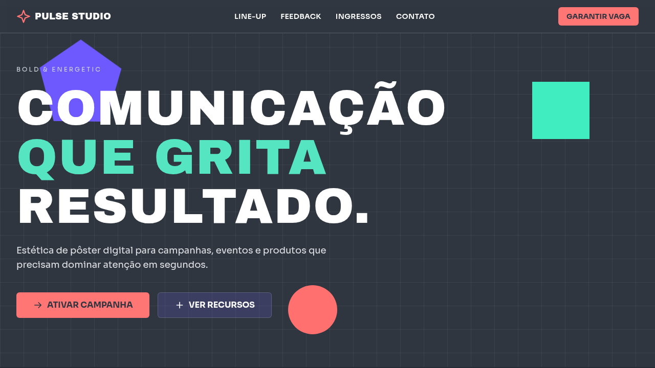
Bold & Energetic
Bold and energetic poster-style interface using 60/30/10 color balance. Ideal for design de pôsteres, eventos e festivais, campanhas promocionais, landing pages de lançamento, conteúdo social de alto impacto. AI-ready template.
Use case: Poster design, Events and festivals, Promotional campaigns, Launch landing pages, High-impact social content
Historical Context
Bold and energetic design didn't emerge from careful deliberation — it exploded out of necessity. The rave flyers of late-80s Manchester, the punk zines stapled together in London squats, the Constructivist posters screaming revolution across Soviet cities. These weren't polite compositions. They were visual assaults designed to stop you mid-stride and demand attention in environments saturated with noise. The lineage runs through Reid Miles' Blue Note covers, where typography hit as hard as the music inside. Through Wolfgang Weingart's New Wave experiments that detonated Swiss precision into something raw and confrontational. Through April Greiman's CalArts explosions and David Carson's deliberate destruction of readability at Ray Gun magazine. Each generation understood the same truth: energy in design isn't decoration — it's structural. What separates genuinely bold work from merely loud work is intentional tension. The best high-energy design operates like a controlled detonation — every element placed with precision, but the overall effect feels spontaneous, urgent, almost dangerous. It's the difference between a stadium concert and someone just turning the volume up.
When to Use
When the brief demands immediate visceral response over contemplation. Event posters competing against urban visual clutter. Sports brands that need to match the adrenaline of competition. Youth-facing campaigns where restraint reads as irrelevance. Product launches that need to own a room before anyone reads a single word. This approach works when your audience is moving fast, scrolling faster, and your window is measured in fractions of a second. If the context rewards quiet sophistication, step away from this toolkit entirely.
Design Principles
- Contrast as architecture — scale jumps of 300%+ between elements create instant hierarchy without needing color to do the heavy lifting
- Diagonal tension over static grids — angled compositions generate kinetic energy that horizontal/vertical layouts physically cannot produce
- Typographic weight as emotion — ultra-bold condensed faces aren't a stylistic choice, they're the structural foundation that everything else reacts against
- Chromatic aggression with purpose — saturated, clashing palettes demand attention but must serve the message hierarchy, not compete with it
- Negative space as percussion — the pauses between dense elements create rhythm; without them, bold becomes noise and energy becomes exhaustion
DESIGN.md
---
version: "alpha"
name: "Bold & Energetic"
description: "Bold and energetic poster-style interface using 60/30/10 color balance. Ideal for design de pôsteres, eventos e festivais, campanhas promocionais, landing pages de lançamento, conteúdo social de alto impacto. AI-ready template."
colors:
  primary: "#2F3640"
  secondary: "#6C5CE7"
  tertiary: "#55E6C1"
typography:
  h1:
    fontFamily: System UI stack
    fontSize: 2.25rem
    fontWeight: 700
  body-md:
    fontFamily: System UI stack
    fontSize: 1rem
    fontWeight: 400
  label-caps:
    fontFamily: System UI stack
    fontSize: 0.75rem
    fontWeight: 500
components:
  button-primary:
    backgroundColor: "{colors.primary}"
    padding: 12px
---

## Overview

Bold and energetic poster-style interface using 60/30/10 color balance. Ideal for design de pôsteres, eventos e festivais, campanhas promocionais, landing pages de lançamento, conteúdo social de alto impacto. AI-ready template. Bold and energetic design didn't emerge from careful deliberation — it exploded out of necessity. The rave flyers of late-80s Manchester, the punk zines stapled together in London squats, the Constructivist posters screaming revolution across Soviet cities. These weren't polite compositions. They were visual assaults designed to stop you mid-stride and demand attention in environments saturated with noise.

The lineage runs through Reid Miles' Blue Note covers, where typography hit as hard as the music inside. Through Wolfgang Weingart's New Wave experiments that detonated Swiss precision into something raw and confrontational. Through April Greiman's CalArts explosions and David Carson's deliberate destruction of readability at Ray Gun magazine. Each generation understood the same truth: energy in design isn't decoration — it's structural.

What separates genuinely bold work from merely loud work is intentional tension. The best high-energy design operates like a controlled detonation — every element placed with precision, but the overall effect feels spontaneous, urgent, almost dangerous. It's the difference between a stadium concert and someone just turning the volume up.

- Density: 5/10 — Balanced
- Variance: 4/10 — Moderate
- Motion: 1/10 — Static

- **Style:** Impactful, Dynamic, High-Energy, Poster-Driven
- **Keywords:** bold, energetic, poster design, high impact, geometric, expressive, youth culture, contrast, vibrant, event
- **Era:** Modern Digital Poster (2015+)
- **Light/Dark:** ✓ Full / ✓ Full

## Colors

- **Dark Slate** (#2F3640) — Dark surface, primary background
- **Deep Purple** (#6C5CE7) — Accent color, emphasis elements
- **e Soft Mint** (#55E6C1) — Extended palette, decorative use


## Typography

- **Display / Hero:** System UI stack (-apple-system, sans-serif) — Weight 700, tight tracking, used for headline impact
- **Body:** System UI stack (-apple-system, sans-serif) — Weight 400, 16px/1.6 line-height, max 72ch per line
- **UI Labels / Captions:** System UI stack (-apple-system, sans-serif) — 0.875rem, weight 500, slight letter-spacing
- **Monospace:** JetBrains Mono — Used for code, metadata, and technical values

Scale:
- Hero: clamp(2.5rem, 5vw, 4rem)
- H1: 2.25rem
- H2: 1.5rem
- Body: 1rem / 1.6
- Small: 0.875rem


## Layout

- **Grid:** CSS Grid primary. Max-width containment: 1280px centered with 1.5rem side padding.
- **Spacing rhythm:** Balanced. Base unit: 0.5rem (8px).
- **Section vertical gaps:** clamp(4rem, 8vw, 8rem).
- **Hero layout:** Split-screen (text left, visual right).
- **Feature sections:** Zig-zag alternating text+image rows. No 3-equal-columns.
- **Mobile collapse:** All multi-column layouts collapse below 768px. No horizontal overflow.
- **z-index contract:** base (0) / sticky-nav (100) / overlay (200) / modal (300) / toast (500).


## Elevation & Depth

10%: Vivid Orange #FF7675 para chamada principal, data de evento e pontos críticos; composições diagonais, tipografia grande e transições energéticas (200-260ms)

- Minimal motion design. Hover states use color transitions only (150ms).
- No entry animations. No page transitions. Instant, utilitarian feedback.
- Performance: No animation overhead. Static-first approach.


## Shapes

Base corner radius: 0px. See rounded tokens in front matter for the full scale.


## Components

- **Primary Button:** Sharp edges (0px) shape. Accent color fill. Hover: 8% darken + subtle lift shadow. Active: -1px translate tactile press. Font weight 600. No outer glows.
- **Secondary / Ghost Button:** Outline variant. 1.5px border in muted color. Text in primary color. Hover: subtle background fill.
- **Cards:** Sharp edges (0px) corners. Surface background. Subtle shadow (0 2px 12px rgba(0,0,0,0.06)). 1px border stroke.
- **Inputs:** Label above input. 1px border stroke. Focus ring: 2px accent color offset 2px. Error text below in semantic red. No floating labels.
- **Navigation:** Primary surface background. Active item: accent color indicator. Font weight 500 when active.
- **Skeletons:** Shimmer animation matching component dimensions. No circular spinners.
- **Empty States:** Icon-based composition with descriptive text and action button.


## Do's and Don'ts

- No emojis in UI — use icon system only (Lucide, Heroicons)
- No pure black (#000000) — use off-black or charcoal variants
- No oversaturated accent colors (saturation cap: 80%)
- No 3-column equal-width feature layouts — use zig-zag or asymmetric grid
- No `h-screen` — use `min-h-[100dvh]`
- No AI copywriting clichés: "Elevate", "Seamless", "Unleash", "Next-Gen"
- No broken external image links — use picsum.photos or inline SVG
- No generic lorem ipsum in demos

- Do Base #2F3640 dominante (60%)
- Do Roxo e menta em 30%
- Do Laranja vibrante reservado a 10%
- Do Hierarquia tipográfica agressiva
- Do Composição geométrica de pôster
- Do Responsivo mobile/desktop


## Use Case

Poster design, Events and festivals, Promotional campaigns, Launch landing pages, High-impact social content
Technical Specs
CSS
background: #2F3640; color: #FFFFFF; --purple: #6C5CE7; --mint: #55E6C1; --accent: #FF7675; font-size: clamp(1rem, 1.2vw, 1.2rem); --display-size: clamp(2.2rem, 6vw, 5rem); transform: translate3d(0,0,0); transition: all 0.24s ease;
Variables
--color-base-60: #2F3640; --color-secondary-30-a: #6C5CE7; --color-secondary-30-b: #55E6C1; --color-accent-10: #FF7675; --radius-sharp: 6px; --shadow-poster: 0 10px 26px rgba(47,54,64,0.4); --tracking-wide: 0.02em;
Checklist
☐ Base #2F3640 dominante (60%), ☐ Roxo e menta em 30%, ☐ Laranja vibrante reservado a 10%, ☐ Hierarquia tipográfica agressiva, ☐ Composição geométrica de pôster, ☐ Responsivo mobile/desktop
Colors
Primary
Secondary
Effects
10%: Vivid Orange #FF7675 para chamada principal, data de evento e pontos críticos; composições diagonais, tipografia grande e transições energéticas (200-260ms)
Light/Dark
✓ Full / ✓ Full
AI Prompt
Act as a Senior Frontend Engineer and Expert UI Designer.
Your task is to code a complete Landing Page on the first attempt.
- Landing Page Theme: <INSERT THEME>
- Sections to add: <INSERT SECTIONS>

Generate the final code immediately following these definitions:

## Style

- **Name:** Bold & Energetic
- **Type:** Impactful, Dynamic, High-Energy, Poster-Driven
- **Keywords:** bold, energetic, poster design, high impact, geometric, expressive, youth culture, contrast, vibrant, event
- **Era:** Modern Digital Poster (2015+)
- **Light/Dark:** ✓ Full / ✓ Full

## Color Palette

- **Primary:** 60%: Dark Slate #2F3640 para fundo sólido e contraste de alto impacto
- **Secondary:** 30%: Deep Purple #6C5CE7 e Soft Mint #55E6C1 para blocos visuais, tipografia de apoio e formas geométricas

## Visual Effects

10%: Vivid Orange #FF7675 para chamada principal, data de evento e pontos críticos; composições diagonais, tipografia grande e transições energéticas (200-260ms)

## AI Visual Direction

Create a bold and energetic poster-style interface using 60/30/10 color balance. Use 60% dark slate (#2F3640) as the grounding base, 30% deep purple (#6C5CE7) and soft mint (#55E6C1) for dynamic composition blocks, and 10% vivid orange (#FF7675) for the most important message (date, CTA, headline punch). Use oversized typography, geometric forms, and strong rhythm.

## CSS Technical

```css
background: #2F3640; color: #FFFFFF; --purple: #6C5CE7; --mint: #55E6C1; --accent: #FF7675; font-size: clamp(1rem, 1.2vw, 1.2rem); --display-size: clamp(2.2rem, 6vw, 5rem); transform: translate3d(0,0,0); transition: all 0.24s ease;
```

## Design System Variables

```css
--color-base-60: #2F3640; --color-secondary-30-a: #6C5CE7; --color-secondary-30-b: #55E6C1; --color-accent-10: #FF7675; --radius-sharp: 6px; --shadow-poster: 0 10px 26px rgba(47,54,64,0.4); --tracking-wide: 0.02em;
```

## Implementation Checklist

- ☐ Base #2F3640 dominante (60%)
- ☐ Roxo e menta em 30%
- ☐ Laranja vibrante reservado a 10%
- ☐ Hierarquia tipográfica agressiva
- ☐ Composição geométrica de pôster
- ☐ Responsivo mobile/desktop

## Execution Rules

1. Strictly follow the defined visual style.
2. Use high-quality inline SVG icons (Heroicons or Lucide style) — NEVER use emojis as icons.
3. Add `cursor-pointer` and smooth `hover` states (transition-all) on all interactive elements.
4. Required Page Structure:
   - Navbar (Logo + Links + CTA)
   - Hero Section (Impactful Headline + Subtitle + 2 buttons + 3D/Abstract visual element via CSS)
   - Features (3 cards with icons)
   - Testimonials (3 cards)
   - Pricing (3 tiers, highlight the middle one)
   - Final CTA
   - Full Footer with social links, privacy policy, terms of use, contact and SEO links.
5. All text content must be in English.
6. The visual must be CLEARLY distinct — do not create a "default Bootstrap" design. Force the use of the provided design system variables.
7. Use `<style>` tags in the head for custom classes (especially for complex backdrop-filter effects and animations) that Tailwind CDN doesn't cover.
8. Full Responsiveness: Layout must adapt perfectly to Mobile, Tablet and Desktop (vertical stack on mobile).
9. Include basic SEO, Viewport and Open Graph meta tags in `<head>`.
10. Footer must contain: Copyright 2026, Secondary navigation links and Social media icons.
11. Make the creative decisions needed to deliver the complete, functional result now.
Related
Last synced: 4/1/2026