Y2K Aesthetic
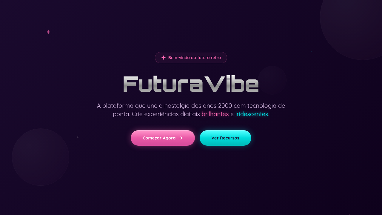
Y2K aesthetic interface. Ideal for landing pages, saas. AI-ready template.
Use case: Landing pages, SaaS
Historical Context
The 20-year nostalgia cycle is ruthlessly predictable. The early 2000s gave us interfaces dripping in chrome gradients, lens flares, and that particular shade of hot pink that screamed 'future' to a generation raised on Winamp skins and Flash intros. Websites were maximalist playgrounds — animated cursors, metallic textures, bubble typography that looked like it was inflated with helium. It was gaudy, unapologetic, and deeply fun. Then minimalism killed it. Flat design buried all that exuberance under white space and Helvetica. For fifteen years, we pretended restraint was the only valid aesthetic. Gen Z broke that spell. Through TikTok edits, Y2K fashion resurgences, and a genuine hunger for personality in digital spaces, the aesthetic came roaring back — but smarter this time. Modern Y2K doesn't mean slapping a butterfly clip on your UI. It means iridescent color shifts rendered in CSS, chrome effects powered by WebGL, bubble fonts paired with clean grids. The chaos is intentional now. The kitsch is curated. And honestly? Interfaces feel alive again.
When to Use
Reach for Y2K when your audience skews young and your brand can handle volume. Fashion drops, beauty launches, music platforms, social apps targeting Gen Z — these are natural fits. It works brilliantly for limited editions, campaign microsites, and anything that needs to feel like an event rather than a utility. Skip it for enterprise dashboards or healthcare. But if your brief says 'make it feel like a party' — this is your system.
Design Principles
- Maximalism with structure — layer chrome, gradients, and iridescence but anchor everything to a rigid grid so the chaos reads as intentional, not accidental
- Color as attitude — neon pink, electric purple, holographic shifts aren't decoration, they're the personality. Commit fully or don't bother
- Typography plays loud — bubble fonts, inflated letterforms, and exaggerated weight contrasts. The type should feel physical, almost tactile
- Texture over flatness — metallic sheens, glass morphism, light refractions. Every surface should catch light and reward closer inspection
- Nostalgia filtered through modern craft — reference the era but execute with current technology. CSS gradients not GIF artifacts. Smooth 60fps not janky Flash
DESIGN.md
---
version: "alpha"
name: "Y2K Aesthetic"
description: "Y2K aesthetic interface. Ideal for landing pages, saas. AI-ready template."
colors:
  primary: "#FF69B4"
  secondary: "#00FFFF"
  tertiary: "#C0C0C0"
  neutral: "#9400D3"
typography:
  h1:
    fontFamily: System UI stack
    fontSize: 2.25rem
    fontWeight: 700
  body-md:
    fontFamily: System UI stack
    fontSize: 1rem
    fontWeight: 400
  label-caps:
    fontFamily: System UI stack
    fontSize: 0.75rem
    fontWeight: 500
components:
  button-primary:
    backgroundColor: "{colors.primary}"
    textColor: "{colors.neutral}"
    padding: 12px
---

## Overview

Y2K aesthetic interface. Ideal for landing pages, saas. AI-ready template. The 20-year nostalgia cycle is ruthlessly predictable. The early 2000s gave us interfaces dripping in chrome gradients, lens flares, and that particular shade of hot pink that screamed 'future' to a generation raised on Winamp skins and Flash intros. Websites were maximalist playgrounds — animated cursors, metallic textures, bubble typography that looked like it was inflated with helium. It was gaudy, unapologetic, and deeply fun.

Then minimalism killed it. Flat design buried all that exuberance under white space and Helvetica. For fifteen years, we pretended restraint was the only valid aesthetic.

Gen Z broke that spell. Through TikTok edits, Y2K fashion resurgences, and a genuine hunger for personality in digital spaces, the aesthetic came roaring back — but smarter this time. Modern Y2K doesn't mean slapping a butterfly clip on your UI. It means iridescent color shifts rendered in CSS, chrome effects powered by WebGL, bubble fonts paired with clean grids. The chaos is intentional now. The kitsch is curated. And honestly? Interfaces feel alive again.

- Density: 5/10 — Balanced
- Variance: 7/10 — Dynamic
- Motion: 8/10 — Cinematic

- **Style:** Nostalgic, Shiny, Futuristic, Playful
- **Keywords:** Neon pink, chrome, metallic, bubblegum, iridescent, glossy, retro-futurism, 2000s, futuristic nostalgia
- **Era:** Y2K 2000s
- **Light/Dark:** ✓ Full / ◐ Partial

## Colors

- **#FF69B4** (#FF69B4) — Primary surface or dominant color
- **#00FFFF** (#00FFFF) — Secondary surface or text color
- **#C0C0C0** (#C0C0C0) — Supporting palette color
- **#9400D3** (#9400D3) — Supporting palette color


## Typography

- **Display / Hero:** System UI stack (-apple-system, sans-serif) — Weight 700, tight tracking, used for headline impact
- **Body:** System UI stack (-apple-system, sans-serif) — Weight 400, 16px/1.6 line-height, max 72ch per line
- **UI Labels / Captions:** System UI stack (-apple-system, sans-serif) — 0.875rem, weight 500, slight letter-spacing
- **Monospace:** JetBrains Mono — Used for code, metadata, and technical values

Scale:
- Hero: clamp(2.5rem, 5vw, 4rem)
- H1: 2.25rem
- H2: 1.5rem
- Body: 1rem / 1.6
- Small: 0.875rem


## Layout

- **Grid:** CSS Grid primary. Max-width containment: 1280px centered with 1.5rem side padding.
- **Spacing rhythm:** Balanced. Base unit: 0.5rem (8px).
- **Section vertical gaps:** clamp(4rem, 8vw, 8rem).
- **Hero layout:** Asymmetric composition.
- **Feature sections:** Asymmetric grid with varied card sizes. No 3-equal-columns.
- **Mobile collapse:** All multi-column layouts collapse below 768px. No horizontal overflow.
- **z-index contract:** base (0) / sticky-nav (100) / overlay (200) / modal (300) / toast (500).


## Elevation & Depth

linear-gradient metallic, glossy buttons, 3D chrome effects, glow animations, bubble shapes

- **Physics:** Spring — stiffness 120, damping 20. Confident, weighted transitions.
- **Entry animations:** Fade + translate-Y (16px → 0) over 540ms ease-out. Staggered cascades for lists: 120ms between items.
- **Hover states:** Scale(1.03) + shadow lift over 200ms.
- **Page transitions:** Fade + slide (300ms).
- **Performance:** Only transform and opacity animated. No layout-triggering properties.


## Shapes

Base corner radius: 9999px. See rounded tokens in front matter for the full scale.


## Components

- **Primary Button:** Rounded (50% for bubbles) shape. Accent color fill. Hover: 8% darken + subtle lift shadow. Active: -1px translate tactile press. Font weight 600. No outer glows.
- **Secondary / Ghost Button:** Outline variant. 1.5px border in muted color. Text in primary color. Hover: subtle background fill.
- **Cards:** Rounded (50% for bubbles) corners. Surface background. Subtle shadow (0 2px 12px rgba(0,0,0,0.06)). 1px border stroke.
- **Inputs:** Label above input. 1px border stroke. Focus ring: 2px accent color offset 2px. Error text below in semantic red. No floating labels.
- **Navigation:** Primary surface background. Active item: accent color indicator. Font weight 500 when active.
- **Skeletons:** Shimmer animation matching component dimensions. No circular spinners.
- **Empty States:** Icon-based composition with descriptive text and action button.


## Do's and Don'ts

- No emojis in UI — use icon system only (Lucide, Heroicons)
- No pure white (#FFFFFF) backgrounds — use off-white or dark surfaces
- No oversaturated accent colors (saturation cap: 80%)
- No 3-column equal-width feature layouts — use zig-zag or asymmetric grid
- No `h-screen` — use `min-h-[100dvh]`
- No AI copywriting clichés: "Elevate", "Seamless", "Unleash", "Next-Gen"
- No broken external image links — use picsum.photos or inline SVG
- No generic lorem ipsum in demos

- Do Neon colors balanced
- Do Chrome effects visible
- Do Glossy buttons styled
- Do Bubble shapes decorative
- Do Sparkle animations
- Do Retro fonts loaded


## Use Case

Landing pages, SaaS
Technical Specs
CSS
background: linear-gradient(135deg, #FF69B4, #00FFFF), filter: drop-shadow for glow, border-radius: 50% for bubbles, metallic gradients (silver/chrome), text-shadow: neon glow, ::before for sparkles
Variables
--neon-pink: #FF69B4, --neon-cyan: #00FFFF, --chrome-silver: #C0C0C0, --glossy-gradient: linear-gradient(180deg, white 0%, transparent 50%), --glow-blur: 10px
Checklist
☐ Neon colors balanced, ☐ Chrome effects visible, ☐ Glossy buttons styled, ☐ Bubble shapes decorative, ☐ Sparkle animations, ☐ Retro fonts loaded
Colors
Primary
Effects
linear-gradient metallic, glossy buttons, 3D chrome effects, glow animations, bubble shapes
Light/Dark
✓ Full / ◐ Partial
AI Prompt
Act as a Senior Frontend Engineer and Expert UI Designer.
Your task is to code a complete Landing Page on the first attempt.
- Landing Page Theme: <INSERT THEME>
- Sections to add: <INSERT SECTIONS>

Generate the final code immediately following these definitions:

## Style

- **Name:** Y2K Aesthetic
- **Type:** Nostalgic, Shiny, Futuristic, Playful
- **Keywords:** Neon pink, chrome, metallic, bubblegum, iridescent, glossy, retro-futurism, 2000s, futuristic nostalgia
- **Era:** Y2K 2000s
- **Light/Dark:** ✓ Full / ◐ Partial

## Color Palette

- **Primary:** #FF69B4 (Hot Pink), #00FFFF (Cyan), #C0C0C0 (Silver), #9400D3 (Purple)
- **Secondary:** Metallic gradients, glossy overlays, iridescent effects, chrome textures

## Visual Effects

linear-gradient metallic, glossy buttons, 3D chrome effects, glow animations, bubble shapes

## AI Visual Direction

Design a Y2K aesthetic interface. Use: neon pink/cyan colors, chrome/metallic textures, bubblegum gradients, glossy buttons, iridescent effects, 2000s futurism, star/sparkle decorations, bubble shapes, tech-optimistic vibe.

## CSS Technical

```css
background: linear-gradient(135deg, #FF69B4, #00FFFF), filter: drop-shadow for glow, border-radius: 50% for bubbles, metallic gradients (silver/chrome), text-shadow: neon glow, ::before for sparkles
```

## Design System Variables

```css
--neon-pink: #FF69B4, --neon-cyan: #00FFFF, --chrome-silver: #C0C0C0, --glossy-gradient: linear-gradient(180deg, white 0%, transparent 50%), --glow-blur: 10px
```

## Implementation Checklist

- ☐ Neon colors balanced
- ☐ Chrome effects visible
- ☐ Glossy buttons styled
- ☐ Bubble shapes decorative
- ☐ Sparkle animations
- ☐ Retro fonts loaded

## Execution Rules

1. Strictly follow the defined visual style.
2. Use high-quality inline SVG icons (Heroicons or Lucide style) — NEVER use emojis as icons.
3. Add `cursor-pointer` and smooth `hover` states (transition-all) on all interactive elements.
4. Required Page Structure:
   - Navbar (Logo + Links + CTA)
   - Hero Section (Impactful Headline + Subtitle + 2 buttons + 3D/Abstract visual element via CSS)
   - Features (3 cards with icons)
   - Testimonials (3 cards)
   - Pricing (3 tiers, highlight the middle one)
   - Final CTA
   - Full Footer with social links, privacy policy, terms of use, contact and SEO links.
5. All text content must be in English.
6. The visual must be CLEARLY distinct — do not create a "default Bootstrap" design. Force the use of the provided design system variables.
7. Use `<style>` tags in the head for custom classes (especially for complex backdrop-filter effects and animations) that Tailwind CDN doesn't cover.
8. Full Responsiveness: Layout must adapt perfectly to Mobile, Tablet and Desktop (vertical stack on mobile).
9. Include basic SEO, Viewport and Open Graph meta tags in `<head>`.
10. Footer must contain: Copyright 2026, Secondary navigation links and Social media icons.
11. Make the creative decisions needed to deliver the complete, functional result now.
Related
Last synced: 4/1/2026