Vintage Lithograph / Victorian
Victorian lithograph interface. Ideal for landing pages, saas. AI-ready template.
Use case: Landing pages, SaaS
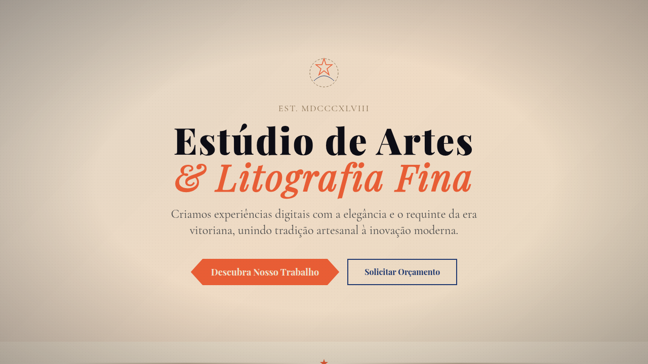
Historical Context
Victorian typography never really left. It just went underground — into antique shops, flea market ephemera, the backrooms of print studios where letterpress operators kept their wood type blocks oiled and ready. Then around 2010, craft culture exploded. Breweries needed labels that looked like they'd survived a century in a cellar. Barbershops wanted signage that whispered "we existed before your grandfather." And suddenly, lithograph aesthetics weren't nostalgia — they were strategy. The revival makes sense when you understand what these forms communicate. A hand-drawn vignette border doesn't just decorate; it says "someone sat here, for hours, with a nib." Ornamental ribbons carrying a brand name aren't decoration — they're a claim of lineage. The density of Victorian composition, those stacked serifs and interlocking frames, signals labor. And labor signals care. In a market drowning in Helvetica and flat minimalism, that density became a differentiator. What's interesting is how the aesthetic has matured. Early revival work was pastiche — slap some distress textures on Playfair Display and call it artisan. The good work now understands proportion, ink spread, the way a real lithograph bleeds at the edges. It respects the craft it's referencing.
When to Use
Reach for this when the brand story is rooted in process, tradition, or physical craft. Breweries, distilleries, barbershops, leather goods, small-batch anything. It works when you need to communicate "made by hands, not algorithms." But be honest with yourself — if the product ships from a fulfillment center in Shenzhen, this aesthetic becomes costume. Use it when there's genuine substance behind the ornament. It pairs terribly with tech products and SaaS dashboards. It sings on packaging, menus, certificates, and environmental signage.
Design Principles
- Density is the point — embrace stacked type, nested frames, and filled space. White space minimalism is the opposite of what you're doing here.
- Every ornament must earn its place. A ribbon holds a name. A border defines hierarchy. If it's purely decorative with no structural role, cut it.
- Commit to serif weight. Hairline serifs read as modern. You want bracketed, heavy, slightly irregular serifs that reference metal type and woodblock printing.
- Texture is non-negotiable. Lithograph work lives on textured stock with ink variation. If your output looks pixel-perfect and uniform, you've missed the entire genre.
- Respect asymmetry within symmetry. Victorian layouts are formally centered but full of subtle imbalance — different ribbon lengths, varied ornament weights, hand-drawn inconsistency. That tension is what makes it feel human.
DESIGN.md
---
version: "alpha"
name: "Vintage Lithograph / Victorian"
description: "Victorian lithograph interface. Ideal for landing pages, saas. AI-ready template."
colors:
  primary: "#F0E3CE"
  secondary: "#0D0D15"
  tertiary: "#E85D35"
  neutral: "#223A70"
  surface: "#8B7355"
  accent: "#D4A574"
typography:
  h1:
    fontFamily: ornate serif
    fontSize: 2.25rem
    fontWeight: 700
  body-md:
    fontFamily: ornate serif
    fontSize: 1rem
    fontWeight: 400
  label-caps:
    fontFamily: ornate serif
    fontSize: 0.75rem
    fontWeight: 500
components:
  button-primary:
    backgroundColor: "{colors.primary}"
    textColor: "{colors.neutral}"
    padding: 12px
---

## Overview

Victorian lithograph interface. Ideal for landing pages, saas. AI-ready template. Victorian typography never really left. It just went underground — into antique shops, flea market ephemera, the backrooms of print studios where letterpress operators kept their wood type blocks oiled and ready. Then around 2010, craft culture exploded. Breweries needed labels that looked like they'd survived a century in a cellar. Barbershops wanted signage that whispered "we existed before your grandfather." And suddenly, lithograph aesthetics weren't nostalgia — they were strategy.

The revival makes sense when you understand what these forms communicate. A hand-drawn vignette border doesn't just decorate; it says "someone sat here, for hours, with a nib." Ornamental ribbons carrying a brand name aren't decoration — they're a claim of lineage. The density of Victorian composition, those stacked serifs and interlocking frames, signals labor. And labor signals care. In a market drowning in Helvetica and flat minimalism, that density became a differentiator.

What's interesting is how the aesthetic has matured. Early revival work was pastiche — slap some distress textures on Playfair Display and call it artisan. The good work now understands proportion, ink spread, the way a real lithograph bleeds at the edges. It respects the craft it's referencing.

- Density: 5/10 — Balanced
- Variance: 8/10 — Expressive
- Motion: 6/10 — Expressive

- **Style:** Victorian, Ornate, Detailed, Vintage
- **Keywords:** Hand-drawn lithograph, ornamental ribbons, vignette borders, parchment grain, watercolor wash, ink stipple, antiquated, scholarly, art nouveau
- **Era:** 1800s Victorian Revival
- **Light/Dark:** ✓ Full / ◐ Partial

## Colors

- **Aged Parchment** (#F0E3CE) — Primary surface or dominant color
- **Ink Black** (#0D0D15) — Dark surface, primary background
- **Vermillion** (#E85D35) — Supporting palette color
- **Navy** (#223A70) — Supporting palette color
- **Warm Brown** (#8B7355) — Extended palette, decorative use
- **Tan** (#D4A574) — Extended palette, decorative use
- **Charcoal** (#4A4A4A) — Deep contrast surface


## Typography

- **Display / Hero:** ornate serif — Weight 700, tight tracking, used for headline impact
- **Body:** ornate serif — Weight 400, 16px/1.6 line-height, max 72ch per line
- **UI Labels / Captions:** ornate serif — 0.875rem, weight 500, slight letter-spacing
- **Monospace:** JetBrains Mono — Used for code, metadata, and technical values

Scale:
- Hero: clamp(2.5rem, 5vw, 4rem)
- H1: 2.25rem
- H2: 1.5rem
- Body: 1rem / 1.6
- Small: 0.875rem


## Layout

- **Grid:** CSS Grid primary. Max-width containment: 1280px centered with 1.5rem side padding.
- **Spacing rhythm:** Balanced. Base unit: 0.5rem (8px).
- **Section vertical gaps:** clamp(4rem, 8vw, 8rem).
- **Hero layout:** Asymmetric composition.
- **Feature sections:** Asymmetric grid with varied card sizes. No 3-equal-columns.
- **Mobile collapse:** All multi-column layouts collapse below 768px. No horizontal overflow.
- **z-index contract:** base (0) / sticky-nav (100) / overlay (200) / modal (300) / toast (500).


## Elevation & Depth

Soft diffuse daylight, decorative scroll animations, vignette fade effects, ink stipple textures, ribbon banner reveals

- **Physics:** Spring — stiffness 120, damping 20. Confident, weighted transitions.
- **Entry animations:** Fade + translate-Y (16px → 0) over 480ms ease-out. Staggered cascades for lists: 100ms between items.
- **Hover states:** Scale(1.03) + shadow lift over 200ms.
- **Page transitions:** Fade + slide (300ms).
- **Performance:** Only transform and opacity animated. No layout-triggering properties.


## Shapes

Base corner radius: 8px. See rounded tokens in front matter for the full scale.


## Components

- **Primary Button:** Subtly rounded (0.5rem) shape. Accent color fill. Hover: 8% darken + subtle lift shadow. Active: -1px translate tactile press. Font weight 600. No outer glows.
- **Secondary / Ghost Button:** Outline variant. 1.5px border in muted color. Text in primary color. Hover: subtle background fill.
- **Cards:** Subtly rounded (0.5rem) corners. Surface background. Subtle shadow (0 2px 12px rgba(0,0,0,0.06)). 1px border stroke.
- **Inputs:** Label above input. 1px border stroke. Focus ring: 2px accent color offset 2px. Error text below in semantic red. No floating labels.
- **Navigation:** Primary surface background. Active item: accent color indicator. Font weight 500 when active.
- **Skeletons:** Shimmer animation matching component dimensions. No circular spinners.
- **Empty States:** Icon-based composition with descriptive text and action button.


## Do's and Don'ts

- No emojis in UI — use icon system only (Lucide, Heroicons)
- No pure black (#000000) — use off-black or charcoal variants
- No oversaturated accent colors (saturation cap: 80%)
- No 3-column equal-width feature layouts — use zig-zag or asymmetric grid
- No `h-screen` — use `min-h-[100dvh]`
- No AI copywriting clichés: "Elevate", "Seamless", "Unleash", "Next-Gen"
- No broken external image links — use picsum.photos or inline SVG
- No generic lorem ipsum in demos

- Do Parchment texture present
- Do Ornamental borders
- Do Serif typography ornate
- Do Watercolor effects subtle
- Do Vignette applied
- Do Victorian authenticity


## Use Case

Landing pages, SaaS
Technical Specs
CSS
background: #F0E3CE with parchment texture, border: ornamental SVG scrollwork, font-family: ornate serif, color: #0D0D15, accent: #E85D35, watercolor overlay (mix-blend-mode: multiply), vignette (radial-gradient)
Variables
--parchment-bg: #F0E3CE, --ink-black: #0D0D15, --vermillion: #E85D35, --navy: #223A70, --vignette-opacity: 0.3, --stipple-density: medium
Checklist
☐ Parchment texture present, ☐ Ornamental borders, ☐ Serif typography ornate, ☐ Watercolor effects subtle, ☐ Vignette applied, ☐ Victorian authenticity
Colors
Primary
Secondary
Effects
Soft diffuse daylight, decorative scroll animations, vignette fade effects, ink stipple textures, ribbon banner reveals
Light/Dark
✓ Full / ◐ Partial
AI Prompt
Act as a Senior Frontend Engineer and Expert UI Designer.
Your task is to code a complete Landing Page on the first attempt.
- Landing Page Theme: <INSERT THEME>
- Sections to add: <INSERT SECTIONS>

Generate the final code immediately following these definitions:

## Style

- **Name:** Vintage Lithograph / Victorian
- **Type:** Victorian, Ornate, Detailed, Vintage
- **Keywords:** Hand-drawn lithograph, ornamental ribbons, vignette borders, parchment grain, watercolor wash, ink stipple, antiquated, scholarly, art nouveau
- **Era:** 1800s Victorian Revival
- **Light/Dark:** ✓ Full / ◐ Partial

## Color Palette

- **Primary:** Aged Parchment #F0E3CE, Ink Black #0D0D15, Vermillion #E85D35, Navy #223A70
- **Secondary:** Warm Brown #8B7355, Tan #D4A574, Charcoal #4A4A4A, watercolor washes

## Visual Effects

Soft diffuse daylight, decorative scroll animations, vignette fade effects, ink stipple textures, ribbon banner reveals

## AI Visual Direction

Design a Victorian lithograph interface. Use: hand-drawn illustration style, ornamental ribbon banners, vignette borders, aged parchment texture (#F0E3CE), watercolor wash effects, ink stipple details, decorative scrollwork, segmented collage layout.

## CSS Technical

```css
background: #F0E3CE with parchment texture, border: ornamental SVG scrollwork, font-family: ornate serif, color: #0D0D15, accent: #E85D35, watercolor overlay (mix-blend-mode: multiply), vignette (radial-gradient)
```

## Design System Variables

```css
--parchment-bg: #F0E3CE, --ink-black: #0D0D15, --vermillion: #E85D35, --navy: #223A70, --vignette-opacity: 0.3, --stipple-density: medium
```

## Implementation Checklist

- ☐ Parchment texture present
- ☐ Ornamental borders
- ☐ Serif typography ornate
- ☐ Watercolor effects subtle
- ☐ Vignette applied
- ☐ Victorian authenticity

## Execution Rules

1. Strictly follow the defined visual style.
2. Use high-quality inline SVG icons (Heroicons or Lucide style) — NEVER use emojis as icons.
3. Add `cursor-pointer` and smooth `hover` states (transition-all) on all interactive elements.
4. Required Page Structure:
   - Navbar (Logo + Links + CTA)
   - Hero Section (Impactful Headline + Subtitle + 2 buttons + 3D/Abstract visual element via CSS)
   - Features (3 cards with icons)
   - Testimonials (3 cards)
   - Pricing (3 tiers, highlight the middle one)
   - Final CTA
   - Full Footer with social links, privacy policy, terms of use, contact and SEO links.
5. All text content must be in English.
6. The visual must be CLEARLY distinct — do not create a "default Bootstrap" design. Force the use of the provided design system variables.
7. Use `<style>` tags in the head for custom classes (especially for complex backdrop-filter effects and animations) that Tailwind CDN doesn't cover.
8. Full Responsiveness: Layout must adapt perfectly to Mobile, Tablet and Desktop (vertical stack on mobile).
9. Include basic SEO, Viewport and Open Graph meta tags in `<head>`.
10. Footer must contain: Copyright 2026, Secondary navigation links and Social media icons.
11. Make the creative decisions needed to deliver the complete, functional result now.
Related
Last synced: 4/1/2026