Vintage Botanical / Scientific
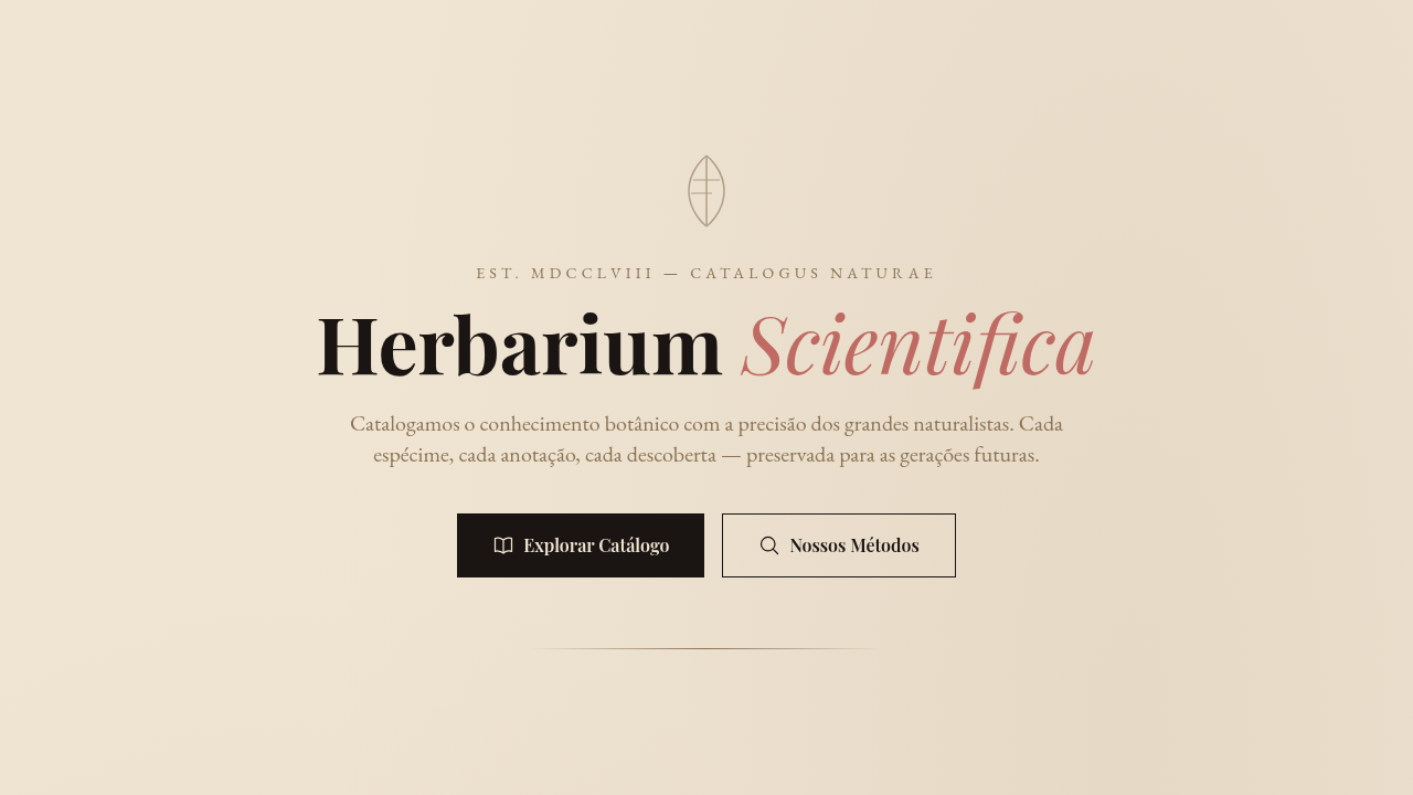
Vintage botanical scientific interface. Ideal for landing pages, saas. AI-ready template.
Use case: Landing pages, SaaS
Historical Context
Before photography existed, science depended on artists who could render nature with obsessive precision. Maria Sibylla Merian sailed to Suriname in 1699 — alone, as a woman, in the 17th century — to document insect metamorphosis through watercolors that were simultaneously rigorous data and breathtaking art. Two centuries later, Ernst Haeckel's lithographs in 'Kunstformen der Natur' turned radiolarians and jellyfish into geometric compositions so perfect they influenced Art Nouveau architecture. These illustrations carried an implicit message: nature is worth studying slowly. That ethos never really left. Fast-forward to the 2010s. Aesop wraps brown apothecary bottles in serif typography and lets the ingredient list do the talking. Le Labo hand-writes labels like specimen tags. Grown Alchemist prints molecular diagrams on packaging. The botanical-scientific aesthetic became shorthand for 'we respect the raw material.' It signals craft without shouting. Intelligence without pretension. The visual language says: this product has lineage, and so does the knowledge behind it.
When to Use
Reach for this when the brand needs to feel studied, intentional, unhurried. Natural skincare, apothecary-style wellness, herbal supplements, botanical gin — anything where provenance matters. Works beautifully for educational contexts too: field guides, museum exhibits, science communication that wants warmth instead of clinical coldness. Luxury cosmetics use it to signal ingredient transparency. The key qualifier: your product must actually have substance behind it. This aesthetic punishes emptiness — if there's no real story, the specimen labels just look like costume.
Design Principles
- Precision over decoration — every line, label, and annotation should feel like it serves a documentary purpose, not an ornamental one
- Asymmetric composition with generous negative space — botanical plates breathe; they never crowd the specimen against the frame edge
- Typography as taxonomy — use serif or didone type for specimen names, monospaced or condensed sans for data labels, and let the hierarchy feel like a naturalist's notebook
- Muted, specimen-accurate color — pull palettes from actual dried herbarium sheets: ochres, sage greens, faded indigos, parchment whites. Saturated color should feel like a rare bloom, not a default
- Visible craft artifacts — engraving crosshatching, hand-numbered plates, ink bleed on cotton paper. The texture communicates that a human hand was involved before the machine
DESIGN.md
---
version: "alpha"
name: "Vintage Botanical / Scientific"
description: "Vintage botanical scientific interface. Ideal for landing pages, saas. AI-ready template."
colors:
  primary: "#F0E5D3"
  secondary: "#1A1512"
  tertiary: "#BF6B63"
  neutral: "#8B7355"
  surface: "#A0826D"
  accent: "#C9B299"
typography:
  h1:
    fontFamily: elegant serif
    fontSize: 2.25rem
    fontWeight: 700
  body-md:
    fontFamily: elegant serif
    fontSize: 1rem
    fontWeight: 400
  label-caps:
    fontFamily: elegant serif
    fontSize: 0.75rem
    fontWeight: 500
components:
  button-primary:
    backgroundColor: "{colors.primary}"
    textColor: "{colors.neutral}"
    padding: 12px
---

## Overview

Vintage botanical scientific interface. Ideal for landing pages, saas. AI-ready template. Before photography existed, science depended on artists who could render nature with obsessive precision. Maria Sibylla Merian sailed to Suriname in 1699 — alone, as a woman, in the 17th century — to document insect metamorphosis through watercolors that were simultaneously rigorous data and breathtaking art. Two centuries later, Ernst Haeckel's lithographs in 'Kunstformen der Natur' turned radiolarians and jellyfish into geometric compositions so perfect they influenced Art Nouveau architecture.

These illustrations carried an implicit message: nature is worth studying slowly. That ethos never really left.

Fast-forward to the 2010s. Aesop wraps brown apothecary bottles in serif typography and lets the ingredient list do the talking. Le Labo hand-writes labels like specimen tags. Grown Alchemist prints molecular diagrams on packaging. The botanical-scientific aesthetic became shorthand for 'we respect the raw material.' It signals craft without shouting. Intelligence without pretension. The visual language says: this product has lineage, and so does the knowledge behind it.

- Density: 5/10 — Balanced
- Variance: 7/10 — Dynamic
- Motion: 8/10 — Cinematic

- **Style:** Scientific, Detailed, Natural, Vintage
- **Keywords:** Botanical illustrations, scientific labels, vintage diagrams, aged paper, ink drawings, specimen-focused, annotated, natural history, scholarly
- **Era:** 18th-19th Century Scientific
- **Light/Dark:** ✓ Full / ◐ Partial

## Colors

- **Aged Paper** (#F0E5D3) — Primary surface or dominant color
- **Dark Ink** (#1A1512) — Dark surface, primary background
- **Rose Dust** (#BF6B63) — Supporting palette color
- **Warm Brown** (#8B7355) — Supporting palette color
- **Tan** (#A0826D) — Extended palette, decorative use
- **Light Tan** (#C9B299) — Extended palette, decorative use


## Typography

- **Display / Hero:** elegant serif — Weight 700, tight tracking, used for headline impact
- **Body:** elegant serif — Weight 400, 16px/1.6 line-height, max 72ch per line
- **UI Labels / Captions:** elegant serif — 0.875rem, weight 500, slight letter-spacing
- **Monospace:** JetBrains Mono — Used for code, metadata, and technical values

Scale:
- Hero: clamp(2.5rem, 5vw, 4rem)
- H1: 2.25rem
- H2: 1.5rem
- Body: 1rem / 1.6
- Small: 0.875rem


## Layout

- **Grid:** CSS Grid primary. Max-width containment: 1280px centered with 1.5rem side padding.
- **Spacing rhythm:** Balanced. Base unit: 0.5rem (8px).
- **Section vertical gaps:** clamp(4rem, 8vw, 8rem).
- **Hero layout:** Asymmetric composition.
- **Feature sections:** Asymmetric grid with varied card sizes. No 3-equal-columns.
- **Mobile collapse:** All multi-column layouts collapse below 768px. No horizontal overflow.
- **z-index contract:** base (0) / sticky-nav (100) / overlay (200) / modal (300) / toast (500).


## Elevation & Depth

Natural soft lighting, scholarly presentation, specimen reveal animations, annotation line drawing, subtle parallax on illustrations

- **Physics:** Spring — stiffness 120, damping 20. Confident, weighted transitions.
- **Entry animations:** Fade + translate-Y (16px → 0) over 540ms ease-out. Staggered cascades for lists: 120ms between items.
- **Hover states:** Scale(1.03) + shadow lift over 200ms.
- **Page transitions:** Fade + slide (300ms).
- **Performance:** Only transform and opacity animated. No layout-triggering properties.


## Shapes

Base corner radius: 8px. See rounded tokens in front matter for the full scale.


## Components

- **Primary Button:** Subtly rounded (0.5rem) shape. Accent color fill. Hover: 8% darken + subtle lift shadow. Active: -1px translate tactile press. Font weight 600. No outer glows.
- **Secondary / Ghost Button:** Outline variant. 1.5px border in muted color. Text in primary color. Hover: subtle background fill.
- **Cards:** Subtly rounded (0.5rem) corners. Surface background. Subtle shadow (0 2px 12px rgba(0,0,0,0.06)). 1px border stroke.
- **Inputs:** Label above input. 1px border stroke. Focus ring: 2px accent color offset 2px. Error text below in semantic red. No floating labels.
- **Navigation:** Primary surface background. Active item: accent color indicator. Font weight 500 when active.
- **Skeletons:** Shimmer animation matching component dimensions. No circular spinners.
- **Empty States:** Icon-based composition with descriptive text and action button.


## Do's and Don'ts

- No emojis in UI — use icon system only (Lucide, Heroicons)
- No pure black (#000000) — use off-black or charcoal variants
- No oversaturated accent colors (saturation cap: 80%)
- No 3-column equal-width feature layouts — use zig-zag or asymmetric grid
- No `h-screen` — use `min-h-[100dvh]`
- No AI copywriting clichés: "Elevate", "Seamless", "Unleash", "Next-Gen"
- No broken external image links — use picsum.photos or inline SVG
- No generic lorem ipsum in demos

- Do Aged paper background
- Do Botanical illustrations
- Do Scientific labels
- Do Ink drawing style
- Do Specimen layout
- Do Scholarly typography


## Use Case

Landing pages, SaaS
Technical Specs
CSS
background: #F0E5D3 with aged paper texture, color: #1A1512, font-family: elegant serif, border: thin ink lines, SVG for botanical illustrations, annotation lines (leader lines), muted earth palette
Variables
--aged-paper: #F0E5D3, --dark-ink: #1A1512, --rose-dust: #BF6B63, --warm-brown: #8B7355, --annotation-line: 1px solid #8B7355, --serif-font: Georgia
Checklist
☐ Aged paper background, ☐ Botanical illustrations, ☐ Scientific labels, ☐ Ink drawing style, ☐ Specimen layout, ☐ Scholarly typography
Colors
Primary
Secondary
Effects
Natural soft lighting, scholarly presentation, specimen reveal animations, annotation line drawing, subtle parallax on illustrations
Light/Dark
✓ Full / ◐ Partial
AI Prompt
Act as a Senior Frontend Engineer and Expert UI Designer.
Your task is to code a complete Landing Page on the first attempt.
- Landing Page Theme: <INSERT THEME>
- Sections to add: <INSERT SECTIONS>

Generate the final code immediately following these definitions:

## Style

- **Name:** Vintage Botanical / Scientific
- **Type:** Scientific, Detailed, Natural, Vintage
- **Keywords:** Botanical illustrations, scientific labels, vintage diagrams, aged paper, ink drawings, specimen-focused, annotated, natural history, scholarly
- **Era:** 18th-19th Century Scientific
- **Light/Dark:** ✓ Full / ◐ Partial

## Color Palette

- **Primary:** Aged Paper #F0E5D3, Dark Ink #1A1512, Rose Dust #BF6B63, Warm Brown #8B7355
- **Secondary:** Tan #A0826D, Light Tan #C9B299, muted earth tones, ink wash effects

## Visual Effects

Natural soft lighting, scholarly presentation, specimen reveal animations, annotation line drawing, subtle parallax on illustrations

## AI Visual Direction

Design a vintage botanical scientific interface. Use: botanical illustration style, scientific annotation labels, aged paper background (#F0E5D3), ink drawing aesthetic, specimen-focused layout, vintage diagram style, natural history feel, scholarly presentation.

## CSS Technical

```css
background: #F0E5D3 with aged paper texture, color: #1A1512, font-family: elegant serif, border: thin ink lines, SVG for botanical illustrations, annotation lines (leader lines), muted earth palette
```

## Design System Variables

```css
--aged-paper: #F0E5D3, --dark-ink: #1A1512, --rose-dust: #BF6B63, --warm-brown: #8B7355, --annotation-line: 1px solid #8B7355, --serif-font: Georgia
```

## Implementation Checklist

- ☐ Aged paper background
- ☐ Botanical illustrations
- ☐ Scientific labels
- ☐ Ink drawing style
- ☐ Specimen layout
- ☐ Scholarly typography

## Execution Rules

1. Strictly follow the defined visual style.
2. Use high-quality inline SVG icons (Heroicons or Lucide style) — NEVER use emojis as icons.
3. Add `cursor-pointer` and smooth `hover` states (transition-all) on all interactive elements.
4. Required Page Structure:
   - Navbar (Logo + Links + CTA)
   - Hero Section (Impactful Headline + Subtitle + 2 buttons + 3D/Abstract visual element via CSS)
   - Features (3 cards with icons)
   - Testimonials (3 cards)
   - Pricing (3 tiers, highlight the middle one)
   - Final CTA
   - Full Footer with social links, privacy policy, terms of use, contact and SEO links.
5. All text content must be in English.
6. The visual must be CLEARLY distinct — do not create a "default Bootstrap" design. Force the use of the provided design system variables.
7. Use `<style>` tags in the head for custom classes (especially for complex backdrop-filter effects and animations) that Tailwind CDN doesn't cover.
8. Full Responsiveness: Layout must adapt perfectly to Mobile, Tablet and Desktop (vertical stack on mobile).
9. Include basic SEO, Viewport and Open Graph meta tags in `<head>`.
10. Footer must contain: Copyright 2026, Secondary navigation links and Social media icons.
11. Make the creative decisions needed to deliver the complete, functional result now.
Related
Last synced: 4/1/2026