Utilitarian
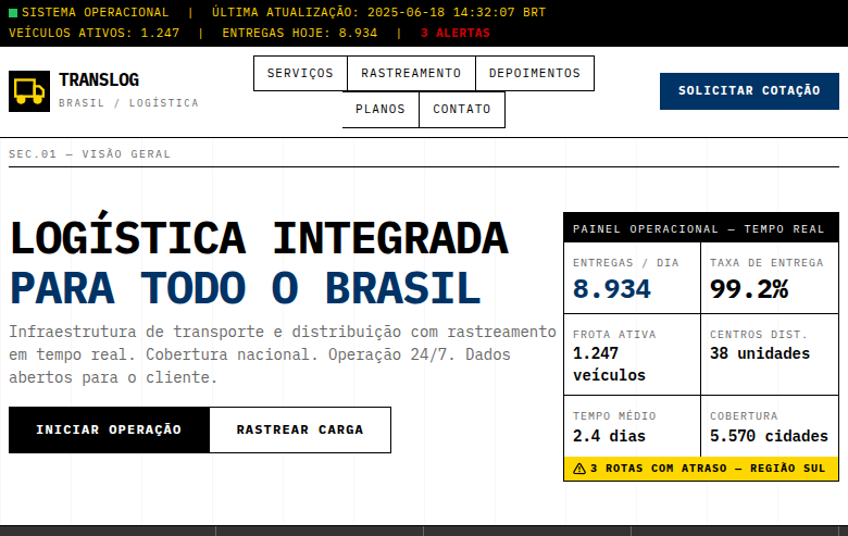
Utilitarian landing page stripped to absolute essentials. Ideal for sinalética, interfaces industriais, etiquetas de roupa, design de embalagens informativas. AI-ready template.
Use case: Signage, Industrial interfaces, Clothing labels, Informative packaging design
Historical Context
Utilitarian design didn't emerge from art schools or manifestos — it came from necessity. Military equipment manuals, factory floor signage, government forms. Places where misunderstanding a label could get someone killed. The aesthetic wasn't chosen; it was what remained after everything unnecessary was stripped away. The lineage traces through Soviet constructivism, Dieter Rams at Braun, and the anonymous designers who created NATO symbology and industrial safety standards. These weren't people concerned with beauty. They were solving communication problems under constraint — limited ink, bad lighting, stressed operators, zero tolerance for ambiguity. What makes utilitarian design distinct from mere minimalism is its indifference to taste. Minimalism still cares about looking good. Utilitarian design cares about working. The grid exists because alignment reduces cognitive load. The type is monospaced because columns need to scan vertically. The color is functional — red means stop, not 'accent.' Every decision answers to the task, never to the portfolio.
When to Use
When your users are there to accomplish something and any visual flourish is a speed bump. Developer tools, CLI interfaces, dashboards monitoring critical systems, military and government applications where clarity is non-negotiable. Products where the audience actively distrusts polish — where looking 'designed' signals that you spent time on the wrong things. No-nonsense B2B tools, industrial control panels, infrastructure software. If your users would describe the ideal interface as 'it just gets out of my way,' this is your system.
Design Principles
- Function dictates form — every element must justify its existence through utility, not aesthetics
- Information density over white space — respect the operator's time by showing what matters without forcing clicks
- Systematic color with zero decoration — color is a data channel, never ornament. Reserve it for status, severity, and state
- Monospace and tabular alignment — text is data. Columns align, numbers right-justify, and scanning is vertical
- Visible hierarchy through weight and scale alone — no borders, cards, or shadows when typographic contrast solves the problem
DESIGN.md
---
version: "alpha"
name: "Utilitarian"
description: "Utilitarian landing page stripped to absolute essentials. Ideal for sinalética, interfaces industriais, etiquetas de roupa, design de embalagens informativas. AI-ready template."
colors:
  primary: "#FFFFFF"
  secondary: "#000000"
  tertiary: "#FFD700"
  neutral: "#CC0000"
  surface: "#666666"
  accent: "#CCCCCC"
typography:
  h1:
    fontFamily: IBM Plex Mono
    fontSize: 2.5rem
    fontWeight: 700
  body-md:
    fontFamily: IBM Plex Mono
    fontSize: 1rem
    fontWeight: 400
rounded:
  sm: 2px
  md: 4px
  lg: 8px
spacing:
  sm: 1.0px
  md: 2.0px
  lg: 4.0px
components:
  button-primary:
    backgroundColor: "{colors.primary}"
    textColor: "{colors.neutral}"
    rounded: "{rounded.sm}"
    padding: 12px
---

## Overview

Utilitarian landing page stripped to absolute essentials. Ideal for sinalética, interfaces industriais, etiquetas de roupa, design de embalagens informativas. AI-ready template. Utilitarian design didn't emerge from art schools or manifestos — it came from necessity. Military equipment manuals, factory floor signage, government forms. Places where misunderstanding a label could get someone killed. The aesthetic wasn't chosen; it was what remained after everything unnecessary was stripped away.

The lineage traces through Soviet constructivism, Dieter Rams at Braun, and the anonymous designers who created NATO symbology and industrial safety standards. These weren't people concerned with beauty. They were solving communication problems under constraint — limited ink, bad lighting, stressed operators, zero tolerance for ambiguity.

What makes utilitarian design distinct from mere minimalism is its indifference to taste. Minimalism still cares about looking good. Utilitarian design cares about working. The grid exists because alignment reduces cognitive load. The type is monospaced because columns need to scan vertically. The color is functional — red means stop, not 'accent.' Every decision answers to the task, never to the portfolio.

- Density: 3/10 — Airy
- Variance: 2/10 — Structured
- Motion: 6/10 — Expressive

- **Style:** Essential, Function-Over-Form, Stark, Typography-Driven
- **Keywords:** Utilitarian, essential, function over decoration, stark, minimal, typography-driven, industrial, signage, rigid grid, information-dense
- **Era:** Industrial Design & Military Signage
- **Light/Dark:** ✓ Full / ✓ Full

## Colors

- **Pure White** (#FFFFFF) — Light surface, card backgrounds
- **Pure Black** (#000000) — Dark surface, primary background
- **Safety Yellow** (#FFD700) — Warning states, attention indicators
- **Signal Red** (#CC0000) — Error states, destructive actions
- **Medium Grey** (#666666) — Secondary text, borders, muted elements
- **Light Grey** (#CCCCCC) — Secondary text, borders, muted elements
- **Dark Grey** (#333333) — Deep contrast surface
- **Industrial Blue** (#003366) — Secondary accent


## Typography

- **Display / Hero:** IBM Plex Mono — Weight 700, tight tracking, used for headline impact
- **Body:** IBM Plex Mono — Weight 400, 16px/1.6 line-height, max 72ch per line
- **UI Labels / Captions:** IBM Plex Mono — 0.875rem, weight 500, slight letter-spacing
- **Monospace:** IBM Plex Mono — Used for code, metadata, and technical values

Scale:
- Hero: clamp(2.5rem, 5vw, 4rem)
- H1: 2.25rem
- H2: 1.5rem
- Body: 1rem / 1.6
- Small: 0.875rem


## Layout

- **Grid:** CSS Grid primary. Max-width containment: 1280px centered with 1.5rem side padding.
- **Spacing rhythm:** Balanced. Base unit: 0.5rem (8px).
- **Section vertical gaps:** clamp(4rem, 8vw, 8rem).
- **Hero layout:** Split-screen (text left, visual right).
- **Feature sections:** Zig-zag alternating text+image rows. No 3-equal-columns.
- **Mobile collapse:** All multi-column layouts collapse below 768px. No horizontal overflow.
- **z-index contract:** base (0) / sticky-nav (100) / overlay (200) / modal (300) / toast (500).


## Elevation & Depth

No decorative elements whatsoever, strict rigid grid (12-column), monospace typography only, visible grid lines as design element, high information density, minimal padding, functional color coding (red=alert, yellow=warning, blue=info), no animations except functional state changes

- **Physics:** Spring — stiffness 120, damping 20. Confident, weighted transitions.
- **Entry animations:** Fade + translate-Y (16px → 0) over 480ms ease-out. Staggered cascades for lists: 100ms between items.
- **Hover states:** Scale(1.03) + shadow lift over 200ms.
- **Page transitions:** Fade + slide (300ms).
- **Performance:** Only transform and opacity animated. No layout-triggering properties.


## Shapes

Base corner radius: 0px. See rounded tokens in front matter for the full scale.


## Components

- **Primary Button:** Sharp edges (0px) shape. Accent color fill. Hover: 8% darken + subtle lift shadow. Active: -1px translate tactile press. Font weight 600. No outer glows.
- **Secondary / Ghost Button:** Outline variant. 1.5px border in muted color. Text in primary color. Hover: subtle background fill.
- **Cards:** Sharp edges (0px) corners. Surface background. Subtle shadow (0 2px 12px rgba(0,0,0,0.06)). 1px border stroke.
- **Inputs:** Label above input. 1px border stroke. Focus ring: 2px accent color offset 2px. Error text below in semantic red. No floating labels.
- **Navigation:** Primary surface background. Active item: accent color indicator. Font weight 500 when active.
- **Skeletons:** Shimmer animation matching component dimensions. No circular spinners.
- **Empty States:** Icon-based composition with descriptive text and action button.


## Do's and Don'ts

- No emojis in UI — use icon system only (Lucide, Heroicons)
- No decorative gradients — flat color only
- No shadows heavier than 0 2px 8px rgba(0,0,0,0.08)
- No pure black (#000000) — use off-black or charcoal variants
- No oversaturated accent colors (saturation cap: 80%)
- No 3-column equal-width feature layouts — use zig-zag or asymmetric grid
- No `h-screen` — use `min-h-[100dvh]`
- No AI copywriting clichés: "Elevate", "Seamless", "Unleash", "Next-Gen"
- No broken external image links — use picsum.photos or inline SVG
- No generic lorem ipsum in demos

- Do No decorative elements
- Do Strict 12-column grid
- Do Monospace typography only
- Do Functional color coding
- Do High information density
- Do Minimal padding
- Do No animations (except state changes)
- Do Every element serves a purpose
- Do Responsive grid


## Use Case

Signage, Industrial interfaces, Clothing labels, Informative packaging design
Technical Specs
CSS
font-family: 'IBM Plex Mono', monospace, display: grid, grid-template-columns: repeat(12, 1fr), gap: 1px, background: #FFFFFF, color: #000000, border: 1px solid #000000, border-radius: 0px, box-shadow: none, padding: 8px, font-size: 14px, line-height: 1.4, text-transform: uppercase for labels
Variables
--color-white: #FFFFFF, --color-black: #000000, --color-warning: #FFD700, --color-alert: #CC0000, --color-info: #003366, --font-mono: 'IBM Plex Mono', --grid-columns: 12, --gap: 1px, --padding: 8px, --border: 1px solid #000000, --border-radius: 0px
Checklist
☐ No decorative elements, ☐ Strict 12-column grid, ☐ Monospace typography only, ☐ Functional color coding, ☐ High information density, ☐ Minimal padding, ☐ No animations (except state changes), ☐ Every element serves a purpose, ☐ Responsive grid
Colors
Primary
Secondary
Effects
No decorative elements whatsoever, strict rigid grid (12-column), monospace typography only, visible grid lines as design element, high information density, minimal padding, functional color coding (red=alert, yellow=warning, blue=info), no animations except functional state changes
Light/Dark
✓ Full / ✓ Full
AI Prompt
Act as a Senior Frontend Engineer and Expert UI Designer.
Your task is to code a complete Landing Page on the first attempt.
- Landing Page Theme: <INSERT THEME>
- Sections to add: <INSERT SECTIONS>

Generate the final code immediately following these definitions:

## Style

- **Name:** Utilitarian
- **Type:** Essential, Function-Over-Form, Stark, Typography-Driven
- **Keywords:** Utilitarian, essential, function over decoration, stark, minimal, typography-driven, industrial, signage, rigid grid, information-dense
- **Era:** Industrial Design & Military Signage
- **Light/Dark:** ✓ Full / ✓ Full

## Color Palette

- **Primary:** Pure White #FFFFFF, Pure Black #000000, Safety Yellow #FFD700, Signal Red #CC0000
- **Secondary:** Medium Grey #666666, Light Grey #CCCCCC, Dark Grey #333333, Industrial Blue #003366

## Visual Effects

No decorative elements whatsoever, strict rigid grid (12-column), monospace typography only, visible grid lines as design element, high information density, minimal padding, functional color coding (red=alert, yellow=warning, blue=info), no animations except functional state changes

## AI Visual Direction

Design a utilitarian landing page stripped to absolute essentials. Function over decoration. Use pure black, white with safety yellow and signal red for functional color coding. Monospace typography only on a strict rigid 12-column grid. Visible grid lines, high information density, minimal padding. No decorative elements, no animations except functional state changes. Industrial signage aesthetic — every element serves a purpose.

## CSS Technical

```css
font-family: 'IBM Plex Mono', monospace, display: grid, grid-template-columns: repeat(12, 1fr), gap: 1px, background: #FFFFFF, color: #000000, border: 1px solid #000000, border-radius: 0px, box-shadow: none, padding: 8px, font-size: 14px, line-height: 1.4, text-transform: uppercase for labels
```

## Design System Variables

```css
--color-white: #FFFFFF, --color-black: #000000, --color-warning: #FFD700, --color-alert: #CC0000, --color-info: #003366, --font-mono: 'IBM Plex Mono', --grid-columns: 12, --gap: 1px, --padding: 8px, --border: 1px solid #000000, --border-radius: 0px
```

## Implementation Checklist

- ☐ No decorative elements
- ☐ Strict 12-column grid
- ☐ Monospace typography only
- ☐ Functional color coding
- ☐ High information density
- ☐ Minimal padding
- ☐ No animations (except state changes)
- ☐ Every element serves a purpose
- ☐ Responsive grid

## Execution Rules

1. Strictly follow the defined visual style.
2. Use high-quality inline SVG icons (Heroicons or Lucide style) — NEVER use emojis as icons.
3. Add `cursor-pointer` and smooth `hover` states (transition-all) on all interactive elements.
4. Required Page Structure:
   - Navbar (Logo + Links + CTA)
   - Hero Section (Impactful Headline + Subtitle + 2 buttons + 3D/Abstract visual element via CSS)
   - Features (3 cards with icons)
   - Testimonials (3 cards)
   - Pricing (3 tiers, highlight the middle one)
   - Final CTA
   - Full Footer with social links, privacy policy, terms of use, contact and SEO links.
5. All text content must be in English.
6. The visual must be CLEARLY distinct — do not create a "default Bootstrap" design. Force the use of the provided design system variables.
7. Use `<style>` tags in the head for custom classes (especially for complex backdrop-filter effects and animations) that Tailwind CDN doesn't cover.
8. Full Responsiveness: Layout must adapt perfectly to Mobile, Tablet and Desktop (vertical stack on mobile).
9. Include basic SEO, Viewport and Open Graph meta tags in `<head>`.
10. Footer must contain: Copyright 2026, Secondary navigation links and Social media icons.
11. Make the creative decisions needed to deliver the complete, functional result now.
Related
Last synced: 4/1/2026