Social Proof-Focused
Social proof landing page. Ideal for marketing, conversão, lead gen. AI-ready template.
Use case: Marketing, Conversion, Lead gen
Historical Context
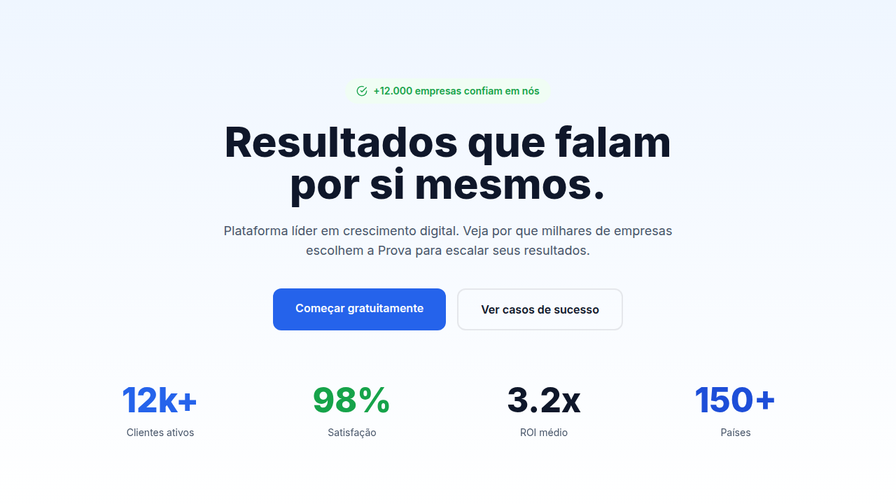
Robert Cialdini nailed it in 1984: people look to others when they're uncertain. Social proof isn't a marketing trick — it's a cognitive shortcut baked into how we make decisions. The enterprise B2B world took decades to internalize this. For years, these pages led with features, specs, jargon. Nobody cared. The shift happened somewhere around 2015-2018. Stripe put client logos above the fold. Slack showed user counts. Suddenly every SaaS landing page had that grayscale logo bar — you know the one. Five to seven logos, desaturated, evenly spaced. It became visual shorthand for 'we're legit.' Some designers hate it. But it works, and the data backs it up consistently. The 2020s pushed this further. Now it's not just logos — it's named testimonials with headshots, video case studies, specific metrics ('saved 40 hours/month'). The proof got granular. B2B buyers are skeptical by default; they've been burned before. Leading with evidence rather than promises became the dominant pattern for pages selling anything above $10k ARR.
When to Use
When your product sells on trust more than novelty. Enterprise deals, consulting engagements, agency pitches — anywhere the buyer needs reassurance that others have walked this path successfully. Particularly effective when you have recognizable logos, quantifiable results, or articulate customers willing to be quoted. Skip this pattern if you're pre-revenue or your proof points are weak — half-hearted social proof backfires worse than none at all.
Design Principles
- Hierarchy of credibility: named quotes with photos > anonymous testimonials > logo bars alone. Stack them deliberately, strongest proof highest on the page.
- Let the numbers breathe. A testimonial saying '3x pipeline growth' needs whitespace and large type — don't bury metrics in paragraph text.
- Desaturate client logos to prevent visual competition with your own brand, but ensure they remain recognizable. Test at actual render size.
- Pair every testimonial with context: role, company size, industry. 'Marketing Director at a 200-person fintech' converts better than 'Sarah K.'
- Design case study cards as entry points, not summaries. Give enough to intrigue — the specific result, the company name, one line of context — then link deeper.
DESIGN.md
---
version: "alpha"
name: "Social Proof-Focused"
description: "Social proof landing page. Ideal for marketing, conversão, lead gen. AI-ready template."
colors:
  primary: "#1A1A1A"
  secondary: "#4A4A4A"
  tertiary: "#0066FF"
  neutral: "#FFFFFF"
typography:
  h1:
    fontFamily: System UI stack
    fontSize: 2.25rem
    fontWeight: 700
  body-md:
    fontFamily: System UI stack
    fontSize: 1rem
    fontWeight: 400
  label-caps:
    fontFamily: System UI stack
    fontSize: 0.75rem
    fontWeight: 500
---

## Overview

Social proof landing page. Ideal for marketing, conversão, lead gen. AI-ready template. Robert Cialdini nailed it in 1984: people look to others when they're uncertain. Social proof isn't a marketing trick — it's a cognitive shortcut baked into how we make decisions. The enterprise B2B world took decades to internalize this. For years, these pages led with features, specs, jargon. Nobody cared.

The shift happened somewhere around 2015-2018. Stripe put client logos above the fold. Slack showed user counts. Suddenly every SaaS landing page had that grayscale logo bar — you know the one. Five to seven logos, desaturated, evenly spaced. It became visual shorthand for 'we're legit.' Some designers hate it. But it works, and the data backs it up consistently.

The 2020s pushed this further. Now it's not just logos — it's named testimonials with headshots, video case studies, specific metrics ('saved 40 hours/month'). The proof got granular. B2B buyers are skeptical by default; they've been burned before. Leading with evidence rather than promises became the dominant pattern for pages selling anything above $10k ARR.

- Density: 5/10 — Balanced
- Variance: 4/10 — Moderate
- Motion: 6/10 — Expressive

- **Style:** Landing Page
- **Keywords:** Testimonials prominent, client logos displayed, case studies sections, reviews/ratings, user avatars, success metrics, credibility markers
- **Era:** 2020s Modern
- **Light/Dark:** ✓ Full / ✓ Full

## Colors

- Palette derived from style keywords and era context


## Typography

- **Display / Hero:** System UI stack (-apple-system, sans-serif) — Weight 700, tight tracking, used for headline impact
- **Body:** System UI stack (-apple-system, sans-serif) — Weight 400, 16px/1.6 line-height, max 72ch per line
- **UI Labels / Captions:** System UI stack (-apple-system, sans-serif) — 0.875rem, weight 500, slight letter-spacing
- **Monospace:** JetBrains Mono — Used for code, metadata, and technical values

Scale:
- Hero: clamp(2.5rem, 5vw, 4rem)
- H1: 2.25rem
- H2: 1.5rem
- Body: 1rem / 1.6
- Small: 0.875rem


## Layout

- **Grid:** CSS Grid primary. Max-width containment: 1280px centered with 1.5rem side padding.
- **Spacing rhythm:** Balanced. Base unit: 0.5rem (8px).
- **Section vertical gaps:** clamp(4rem, 8vw, 8rem).
- **Hero layout:** Split-screen (text left, visual right).
- **Feature sections:** Zig-zag alternating text+image rows. No 3-equal-columns.
- **Mobile collapse:** All multi-column layouts collapse below 768px. No horizontal overflow.
- **z-index contract:** base (0) / sticky-nav (100) / overlay (200) / modal (300) / toast (500).


## Elevation & Depth

Testimonial carousel animations, logo grid fade-in, stat counter animations (number count-up), review star ratings

- **Physics:** Spring — stiffness 120, damping 20. Confident, weighted transitions.
- **Entry animations:** Fade + translate-Y (16px → 0) over 480ms ease-out. Staggered cascades for lists: 100ms between items.
- **Hover states:** Scale(1.03) + shadow lift over 200ms.
- **Page transitions:** Fade + slide (300ms).
- **Performance:** Only transform and opacity animated. No layout-triggering properties.


## Shapes

Base corner radius: 8px. See rounded tokens in front matter for the full scale.


## Components

- **Primary Button:** Subtly rounded (0.5rem) shape. Accent color fill. Hover: 8% darken + subtle lift shadow. Active: -1px translate tactile press. Font weight 600. No outer glows.
- **Secondary / Ghost Button:** Outline variant. 1.5px border in muted color. Text in primary color. Hover: subtle background fill.
- **Cards:** Subtly rounded (0.5rem) corners. Surface background. Subtle shadow (0 2px 12px rgba(0,0,0,0.06)). 1px border stroke.
- **Inputs:** Label above input. 1px border stroke. Focus ring: 2px accent color offset 2px. Error text below in semantic red. No floating labels.
- **Navigation:** Primary surface background. Active item: accent color indicator. Font weight 500 when active.
- **Skeletons:** Shimmer animation matching component dimensions. No circular spinners.
- **Empty States:** Icon-based composition with descriptive text and action button.


## Do's and Don'ts

- No emojis in UI — use icon system only (Lucide, Heroicons)
- No pure black (#000000) — use off-black or charcoal variants
- No oversaturated accent colors (saturation cap: 80%)
- No 3-column equal-width feature layouts — use zig-zag or asymmetric grid
- No `h-screen` — use `min-h-[100dvh]`
- No AI copywriting clichés: "Elevate", "Seamless", "Unleash", "Next-Gen"
- No broken external image links — use picsum.photos or inline SVG
- No generic lorem ipsum in demos

- Do Testimonials with real photos
- Do Logo grid 6-12 logos
- Do Star ratings accessible
- Do Metrics animated on scroll
- Do Case studies linked
- Do Mobile carousel works


## Use Case

Marketing, Conversion, Lead gen
Technical Specs
CSS
testimonial cards with avatar, logo grid (grayscale filter), star rating SVGs, counter animations (count-up), blockquote styling, carousel for testimonials, metric cards
Variables
--avatar-size: 64px, --logo-height: 40px, --star-color: #FBBF24, --metric-font-size: 3rem, --testimonial-bg: #F9FAFB, --blockquote-border: 4px solid accent
Checklist
☐ Testimonials with real photos, ☐ Logo grid 6-12 logos, ☐ Star ratings accessible, ☐ Metrics animated on scroll, ☐ Case studies linked, ☐ Mobile carousel works
Colors
Effects
Testimonial carousel animations, logo grid fade-in, stat counter animations (number count-up), review star ratings
Light/Dark
✓ Full / ✓ Full
AI Prompt
Act as a Senior Frontend Engineer and Expert UI Designer.
Your task is to code a complete Landing Page on the first attempt.
- Landing Page Theme: <INSERT THEME>
- Sections to add: <INSERT SECTIONS>

Generate the final code immediately following these definitions:

## Style

- **Name:** Social Proof-Focused
- **Type:** Landing Page
- **Keywords:** Testimonials prominent, client logos displayed, case studies sections, reviews/ratings, user avatars, success metrics, credibility markers
- **Era:** 2020s Modern
- **Light/Dark:** ✓ Full / ✓ Full

## Color Palette

- **Primary:** Primary brand, trust colors (blue), success/growth colors (green), neutral backgrounds
- **Secondary:** Testimonial highlight colors, logo grid backgrounds (light grey), badge/achievement colors

## Visual Effects

Testimonial carousel animations, logo grid fade-in, stat counter animations (number count-up), review star ratings

## AI Visual Direction

Design a social proof landing page. Use: testimonials with photos, client logos grid, case study cards, review ratings (stars), user count metrics, success stories, trust indicators, before/after comparisons.

## CSS Technical

```css
testimonial cards with avatar, logo grid (grayscale filter), star rating SVGs, counter animations (count-up), blockquote styling, carousel for testimonials, metric cards
```

## Design System Variables

```css
--avatar-size: 64px, --logo-height: 40px, --star-color: #FBBF24, --metric-font-size: 3rem, --testimonial-bg: #F9FAFB, --blockquote-border: 4px solid accent
```

## Implementation Checklist

- ☐ Testimonials with real photos
- ☐ Logo grid 6-12 logos
- ☐ Star ratings accessible
- ☐ Metrics animated on scroll
- ☐ Case studies linked
- ☐ Mobile carousel works

## Execution Rules

1. Strictly follow the defined visual style.
2. Use high-quality inline SVG icons (Heroicons or Lucide style) — NEVER use emojis as icons.
3. Add `cursor-pointer` and smooth `hover` states (transition-all) on all interactive elements.
4. Required Page Structure:
   - Navbar (Logo + Links + CTA)
   - Hero Section (Impactful Headline + Subtitle + 2 buttons + 3D/Abstract visual element via CSS)
   - Features (3 cards with icons)
   - Testimonials (3 cards)
   - Pricing (3 tiers, highlight the middle one)
   - Final CTA
   - Full Footer with social links, privacy policy, terms of use, contact and SEO links.
5. All text content must be in English.
6. The visual must be CLEARLY distinct — do not create a "default Bootstrap" design. Force the use of the provided design system variables.
7. Use `<style>` tags in the head for custom classes (especially for complex backdrop-filter effects and animations) that Tailwind CDN doesn't cover.
8. Full Responsiveness: Layout must adapt perfectly to Mobile, Tablet and Desktop (vertical stack on mobile).
9. Include basic SEO, Viewport and Open Graph meta tags in `<head>`.
10. Footer must contain: Copyright 2026, Secondary navigation links and Social media icons.
11. Make the creative decisions needed to deliver the complete, functional result now.
Related
Last synced: 4/1/2026