Símbolos Culturais Brasileiros
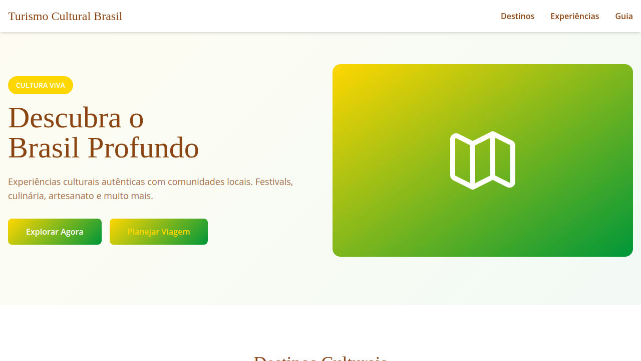
Design an authentic and engaging landing page for a Brazilian cultural tourism platform, inspired by graphic symbolism. Ideal for landing pages, saas. AI-ready template.
Use case: Landing pages, SaaS
Historical Context
Brazilian cultural symbols didn't arrive in design through careful academic study. They crashed in — loud, syncopated, impossible to ignore. Samba rhythms dictated layout tempo decades before anyone called it 'motion design.' Carnival's chromatic excess taught us that restraint isn't always the answer. Capoeira's fluid geometry — that constant negotiation between attack and grace — maps directly onto interaction patterns that feel alive rather than merely functional. The regional layer is where it gets genuinely interesting. Marajoara ceramics from the Amazon carry geometric systems that predate European grid theory by centuries. Cordel literature woodcuts from the Northeast deliver narrative density in a single frame. Bahian candomblé iconography operates on symbolic registers that Western design vocabulary barely touches. These aren't decorative assets to sprinkle over tourism interfaces. They're complete visual languages with their own internal logic. Designers working in cultural tourism have a responsibility here. Strip these symbols from context and you get airport-gift-shop aesthetics. Embed them with understanding and you create experiences that make visitors feel the difference between consuming a culture and actually encountering one.
When to Use
Deploy when building platforms where cultural authenticity isn't decoration — it's the product. Museum digital experiences. Heritage trail apps. Regional tourism portals that need to feel rooted rather than generic. Experience marketplaces connecting travelers with local practitioners. Any interface where the visual system must signal 'this place is specific' rather than 'this place is pleasant.' Skip if you're just looking for tropical color palettes. This framework demands research commitment.
Design Principles
- Root every visual decision in specific regional tradition — never pan-Brazilian generics. Bahia is not Rio is not Belém.
- Let rhythm drive layout structure. Samba's syncopation, forró's pulse, maracatu's procession — each suggests different compositional cadence.
- Treat color as cultural signal, not mood board fodder. Carnival yellow carries different weight than candomblé white. Know the difference.
- Honor the handmade register. Cordel woodcut texture, ceramic imperfection, woven pattern irregularity — these resist the sterility that kills authenticity.
- Design for encounter, not consumption. The interface should slow visitors down, create friction that produces understanding rather than frictionless scrolling past meaning.
DESIGN.md
---
version: "alpha"
name: "Símbolos Culturais Brasileiros"
description: "Design an authentic and engaging landing page for a Brazilian cultural tourism platform, inspired by graphic symbolism. Ideal for landing pages, saas. AI-ready template."
colors:
  primary: "#FFD700"
  secondary: "#009739"
  tertiary: "#87CEEB"
  neutral: "#8B4513"
  surface: "#FF6F61"
  accent: "#CC5500"
typography:
  h1:
    fontFamily: Lora
    fontSize: 2.5rem
    fontWeight: 700
  body-md:
    fontFamily: Lora
    fontSize: 1rem
    fontWeight: 400
components:
  button-primary:
    backgroundColor: "{colors.primary}"
    textColor: "{colors.neutral}"
    padding: 12px
---

## Overview

Design an authentic and engaging landing page for a Brazilian cultural tourism platform, inspired by graphic symbolism. Ideal for landing pages, saas. AI-ready template. Brazilian cultural symbols didn't arrive in design through careful academic study. They crashed in — loud, syncopated, impossible to ignore. Samba rhythms dictated layout tempo decades before anyone called it 'motion design.' Carnival's chromatic excess taught us that restraint isn't always the answer. Capoeira's fluid geometry — that constant negotiation between attack and grace — maps directly onto interaction patterns that feel alive rather than merely functional.

The regional layer is where it gets genuinely interesting. Marajoara ceramics from the Amazon carry geometric systems that predate European grid theory by centuries. Cordel literature woodcuts from the Northeast deliver narrative density in a single frame. Bahian candomblé iconography operates on symbolic registers that Western design vocabulary barely touches. These aren't decorative assets to sprinkle over tourism interfaces. They're complete visual languages with their own internal logic.

Designers working in cultural tourism have a responsibility here. Strip these symbols from context and you get airport-gift-shop aesthetics. Embed them with understanding and you create experiences that make visitors feel the difference between consuming a culture and actually encountering one.

- Density: 5/10 — Balanced
- Variance: 4/10 — Moderate
- Motion: 4/10 — Subtle

- **Style:** Authentic, Engaging, Visual, Cultural
- **Keywords:** cultural tourism, Brazil, authentic experiences, symbolic, engaging, visual, traditional, diverse, immersive, local
- **Era:** 2026+ Imersão Cultural
- **Light/Dark:** ✓ Full / ✗ No

## Colors

- **Amarelo Ouro** (#FFD700) — Warning states, attention indicators
- **Verde Bandeira** (#009739) — Secondary surface or text color
- **Azul Céu** (#87CEEB) — Accent highlight, links and focus states
- **Marrom Terra** (#8B4513) — Supporting palette color
- **Vermelho Coral** (#FF6F61) — Error states, destructive actions
- **Laranja Queimado** (#CC5500) — Warm accent, call-to-action secondary
- **Roxo Açaí** (#8A2BE2) — Accent color, emphasis elements
- **Branco** (#FFFFFF) — Secondary surface


## Typography

- **Display / Hero:** Lora — Weight 700, tight tracking, used for headline impact
- **Body:** Lora — Weight 400, 16px/1.6 line-height, max 72ch per line
- **UI Labels / Captions:** Lora — 0.875rem, weight 500, slight letter-spacing
- **Monospace:** JetBrains Mono — Used for code, metadata, and technical values

Scale:
- Hero: clamp(2.5rem, 5vw, 4rem)
- H1: 2.25rem
- H2: 1.5rem
- Body: 1rem / 1.6
- Small: 0.875rem


## Layout

- **Grid:** CSS Grid primary. Max-width containment: 1280px centered with 1.5rem side padding.
- **Spacing rhythm:** Balanced. Base unit: 0.5rem (8px).
- **Section vertical gaps:** clamp(4rem, 8vw, 8rem).
- **Hero layout:** Split-screen (text left, visual right).
- **Feature sections:** Zig-zag alternating text+image rows. No 3-equal-columns.
- **Mobile collapse:** All multi-column layouts collapse below 768px. No horizontal overflow.
- **z-index contract:** base (0) / sticky-nav (100) / overlay (200) / modal (300) / toast (500).


## Elevation & Depth

Mapas estilizados com ícones de pontos turísticos, tipografia serifada e sans-serif que remete à tradição e modernidade, fotografias de festivais e culinária local, micro-interações de hover com informações culturais, transições de seção com efeito de "desdobramento" de mapa ou "revelação" de paisagem.

- **Physics:** Ease-out curves, 200-300ms duration. Smooth and predictable.
- **Entry animations:** Fade + translate-Y (16px → 0) over 420ms ease-out. Staggered cascades for lists: 80ms between items.
- **Hover states:** Subtle color shift + shadow adjustment over 200ms.
- **Page transitions:** Fade only (200ms).
- **Performance:** Only transform and opacity animated. No layout-triggering properties.


## Shapes

Base corner radius: 8px. See rounded tokens in front matter for the full scale.


## Components

- **Primary Button:** Subtly rounded (0.5rem) shape. Accent color fill. Hover: 8% darken + subtle lift shadow. Active: -1px translate tactile press. Font weight 600. No outer glows.
- **Secondary / Ghost Button:** Outline variant. 1.5px border in muted color. Text in primary color. Hover: subtle background fill.
- **Cards:** Subtly rounded (0.5rem) corners. Surface background. Subtle shadow (0 2px 12px rgba(0,0,0,0.06)). 1px border stroke.
- **Inputs:** Label above input. 1px border stroke. Focus ring: 2px accent color offset 2px. Error text below in semantic red. No floating labels.
- **Navigation:** Primary surface background. Active item: accent color indicator. Font weight 500 when active.
- **Skeletons:** Shimmer animation matching component dimensions. No circular spinners.
- **Empty States:** Icon-based composition with descriptive text and action button.


## Do's and Don'ts

- No emojis in UI — use icon system only (Lucide, Heroicons)
- No pure black (#000000) — use off-black or charcoal variants
- No oversaturated accent colors (saturation cap: 80%)
- No 3-column equal-width feature layouts — use zig-zag or asymmetric grid
- No `h-screen` — use `min-h-[100dvh]`
- No AI copywriting clichés: "Elevate", "Seamless", "Unleash", "Next-Gen"
- No broken external image links — use picsum.photos or inline SVG
- No generic lorem ipsum in demos

- Do Paleta de cores brasileira verificada
- Do Autenticidade cultural brasileira verificada
- Do Tipografia hierárquica clara
- Do Responsividade mobile verificada
- Do Contraste WCAG AA verificado
- Do Conteúdo em PT-BR verificado


## Use Case

Landing pages, SaaS
Technical Specs
CSS
background: #FFFFFF, color: #8B4513, border-bottom: 2px solid #FFD700, font-family: "Lora, serif", transition: all 0.6s ease-in-out, .stylized-map, .cultural-icon, .map-unfold-transition.
Variables
--gold-yellow: #FFD700, --flag-green: #009739, --sky-blue: #87CEEB, --earth-brown: #8B4513, --white-bg: #FFFFFF, --border-accent: 2px solid #FFD700, --font-serif: "Lora, serif", --font-sans: "Open Sans, sans-serif", --map-unfold-duration: 0.6s.
Checklist
☐ Paleta de cores brasileira verificada, ☐ Autenticidade cultural brasileira verificada, ☐ Tipografia hierárquica clara, ☐ Responsividade mobile verificada, ☐ Contraste WCAG AA verificado, ☐ Conteúdo em PT-BR verificado
Colors
Primary
Secondary
Effects
Mapas estilizados com ícones de pontos turísticos, tipografia serifada e sans-serif que remete à tradição e modernidade, fotografias de festivais e culinária local, micro-interações de hover com informações culturais, transições de seção com efeito de "desdobramento" de mapa ou "revelação" de paisagem.
Light/Dark
✓ Full / ✗ No
AI Prompt
Act as a Senior Frontend Engineer and Expert UI Designer.
Your task is to code a complete Landing Page on the first attempt.
- Landing Page Theme: <INSERT THEME>
- Sections to add: <INSERT SECTIONS>

Generate the final code immediately following these definitions:

## Style

- **Name:** Símbolos Culturais Brasileiros
- **Type:** Authentic, Engaging, Visual, Cultural
- **Keywords:** cultural tourism, Brazil, authentic experiences, symbolic, engaging, visual, traditional, diverse, immersive, local
- **Era:** 2026+ Imersão Cultural
- **Light/Dark:** ✓ Full / ✗ No

## Color Palette

- **Primary:** Amarelo Ouro #FFD700, Verde Bandeira #009739, Azul Céu #87CEEB, Marrom Terra #8B4513
- **Secondary:** Vermelho Coral #FF6F61, Laranja Queimado #CC5500, Roxo Açaí #8A2BE2, Branco #FFFFFF

## Visual Effects

Mapas estilizados com ícones de pontos turísticos, tipografia serifada e sans-serif que remete à tradição e modernidade, fotografias de festivais e culinária local, micro-interações de hover com informações culturais, transições de seção com efeito de "desdobramento" de mapa ou "revelação" de paisagem.

## AI Visual Direction

Design an authentic and engaging landing page for a Brazilian cultural tourism platform, inspired by graphic symbolism. Use: stylized maps with landmark icons, traditional/modern serif and sans-serif typography, photographs of local festivals and cuisine, cultural information hover micro-interactions, map "unfolding" or landscape "reveal" section transitions, gold yellow and flag green accents, diverse and immersive feel.

## CSS Technical

```css
background: #FFFFFF, color: #8B4513, border-bottom: 2px solid #FFD700, font-family: "Lora, serif", transition: all 0.6s ease-in-out, .stylized-map, .cultural-icon, .map-unfold-transition.
```

## Design System Variables

```css
--gold-yellow: #FFD700, --flag-green: #009739, --sky-blue: #87CEEB, --earth-brown: #8B4513, --white-bg: #FFFFFF, --border-accent: 2px solid #FFD700, --font-serif: "Lora, serif", --font-sans: "Open Sans, sans-serif", --map-unfold-duration: 0.6s.
```

## Implementation Checklist

- ☐ Paleta de cores brasileira verificada
- ☐ Autenticidade cultural brasileira verificada
- ☐ Tipografia hierárquica clara
- ☐ Responsividade mobile verificada
- ☐ Contraste WCAG AA verificado
- ☐ Conteúdo em PT-BR verificado

## Execution Rules

1. Strictly follow the defined visual style.
2. Use high-quality inline SVG icons (Heroicons or Lucide style) — NEVER use emojis as icons.
3. Add `cursor-pointer` and smooth `hover` states (transition-all) on all interactive elements.
4. Required Page Structure:
   - Navbar (Logo + Links + CTA)
   - Hero Section (Impactful Headline + Subtitle + 2 buttons + 3D/Abstract visual element via CSS)
   - Features (3 cards with icons)
   - Testimonials (3 cards)
   - Pricing (3 tiers, highlight the middle one)
   - Final CTA
   - Full Footer with social links, privacy policy, terms of use, contact and SEO links.
5. All text content must be in English.
6. The visual must be CLEARLY distinct — do not create a "default Bootstrap" design. Force the use of the provided design system variables.
7. Use `<style>` tags in the head for custom classes (especially for complex backdrop-filter effects and animations) that Tailwind CDN doesn't cover.
8. Full Responsiveness: Layout must adapt perfectly to Mobile, Tablet and Desktop (vertical stack on mobile).
9. Include basic SEO, Viewport and Open Graph meta tags in `<head>`.
10. Footer must contain: Copyright 2026, Secondary navigation links and Social media icons.
11. Make the creative decisions needed to deliver the complete, functional result now.
Related
Last synced: 4/1/2026