Símbolos Cívicos Brasileiros
Design an informative and symbolic landing page for a civic education platform, inspired by Aloísio Magalhães' graphic identity. Ideal for landing pages, saas. AI-ready template.
Use case: Landing pages, SaaS
Historical Context
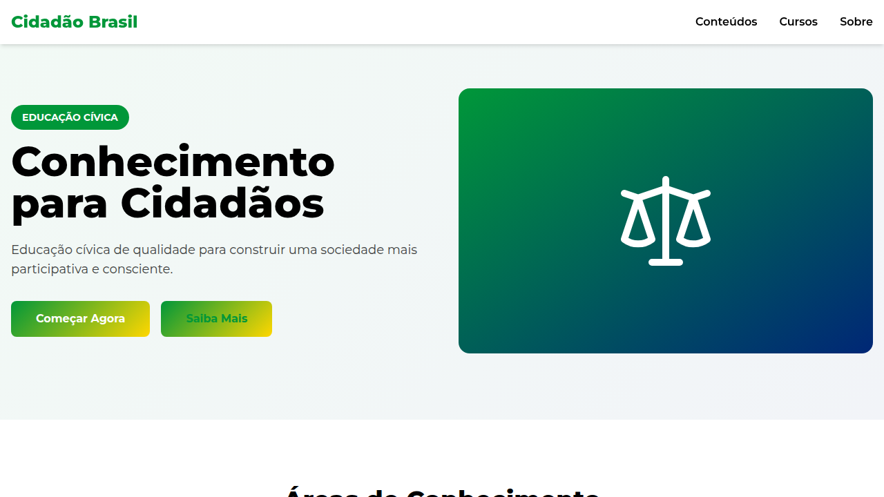
Brazil's civic visual language didn't emerge from a design studio. It was forged through political rupture — the Republic's flag adopted in 1889 carried positivist philosophy literally stitched into its fabric. Green for the House of Braganza, yellow for the Habsburgs, the celestial globe frozen at a specific moment in time over Rio. These aren't arbitrary choices. They're ideological artifacts. Translating this weight into digital platforms is where most government projects fail. They flatten the symbolism into decorative stripe patterns or slap the flag on a header and call it civic design. The real opportunity is structural: how do you encode the democratic tension between order and progress into an interface that teaches citizenship? The green-yellow-blue palette carries baggage — it's been co-opted by political movements across the spectrum. A civic design system must acknowledge this complexity rather than pretend neutrality. The best Brazilian civic digital work treats national symbols as living typography — elements that carry meaning through context, not just color. Platforms like gov.br started getting this right around 2020, moving away from literal flag reproduction toward systemic use of civic color relationships.
When to Use
Government education portals. Civic engagement platforms where citizens interact with democratic processes. Social project interfaces that need institutional trust without authoritarian aesthetics. School platforms teaching Brazilian history and civics. Voter education tools. Public consultation systems. Any context where you need to say 'this is Brazil, this is official, this matters' without wrapping everything in a flag.
Design Principles
- Civic palette as system, not decoration — green, yellow, blue, and white function as semantic tokens (trust, action, information, space) rather than patriotic wallpaper
- Institutional gravity without rigidity — use the weight of national symbols to establish authority, then let the interface breathe with generous whitespace and clear hierarchy
- Symbol literacy over symbol display — teach what the 27 stars mean, what Ordem e Progresso implies, through interaction design rather than static illustration
- Political neutrality through design restraint — the civic palette has been weaponized by all sides; use it sparingly, structurally, letting content carry the civic message
- Accessibility as democratic principle — if civic education isn't reaching everyone regardless of ability, connection speed, or device, it's failing its own premise
Technical Specs
Colors
Primary
Secondary
Effects
Uso de símbolos gráficos abstratos e geométricos, tipografia sans-serif limpa e impactante, infográficos e visualizações de dados claros, micro-interações de hover com destaque de informações importantes, transições de seção com efeito de "revelação" de conceito.
Light/Dark
✓ Full / ✗ No
Related
Last synced: 4/1/2026