Reuso Criativo Disruptivo
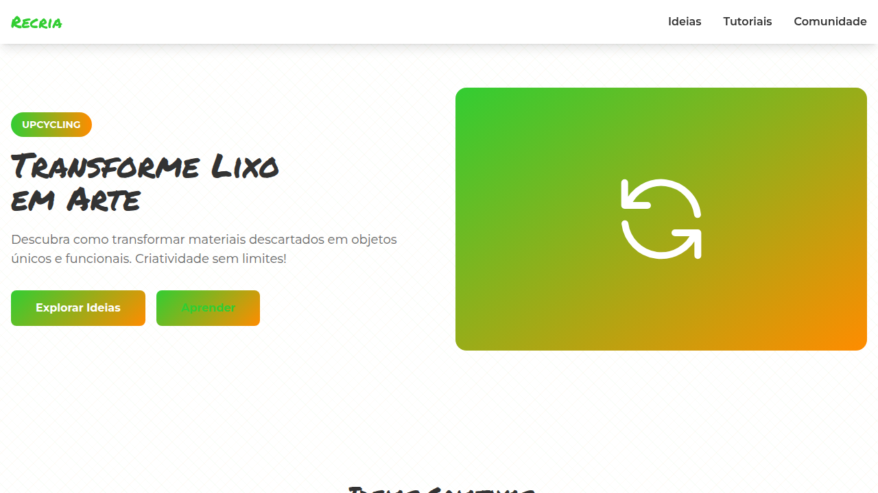
Design an innovative and playful landing page for a creative reuse and upcycling platform, inspired by Irmãos Campana. Ideal for landing pages, saas. AI-ready template.
Use case: Landing pages, SaaS
Historical Context
Brazil never needed permission to invent. Long before upcycling became a design conference buzzword, favela architects were turning shipping pallets into furniture, oil drums into planters, tire rubber into sandals that outlasted anything from a factory. This is gambiarra — not a trend, but a survival aesthetic refined over generations. It treats scarcity as a creative constraint, not a limitation. The movement gained formal recognition in the 2000s when designers like the Campana Brothers brought woven-wire and stuffed-animal chairs to Milan, forcing the global design establishment to confront an uncomfortable truth: discarded materials carry more narrative weight than virgin ones. Every scratch tells a story. Every weld mark is a decision. What makes Brazilian creative reuse disruptive — not merely sustainable — is its refusal to apologize. These aren't objects that look recycled. They look inevitable. The palette runs raw: exposed cardboard browns, oxidized metals, sun-bleached plastics. Texture dominates color. Imperfection is the point. The aesthetic says: beauty was always here, in what you threw away.
When to Use
Deploy when your brand needs to signal genuine sustainability without greenwashing polish. Perfect for circular economy platforms, upcycling marketplaces, eco-design studios, and any project where environmental consciousness must feel urgent rather than precious. Works when you want raw materiality over clean minimalism. Avoid if your audience expects luxury refinement — this aesthetic deliberately rejects smoothness. Best paired with documentary photography, hand-drawn type, and interfaces that breathe rather than dazzle.
Design Principles
- Material honesty over surface decoration — let textures, seams, and wear patterns speak; never simulate distress digitally when you can photograph it
- Imperfection as intentional rhythm — asymmetric grids, uneven spacing, and visible construction echo handmade assembly processes
- Warm neutrals anchored by found-object color — cardboard, rust, bleached fiber as base; accent only with colors that occur naturally in discarded materials
- Typography that works, not performs — functional type choices (condensed sans, monospace) that reference industrial labeling and packaging origins
- Narrative layering through visible history — every component should suggest a previous life; palimpsest over blank canvas, always
DESIGN.md
---
version: "alpha"
name: "Reuso Criativo Disruptivo"
description: "Design an innovative and playful landing page for a creative reuse and upcycling platform, inspired by Irmãos Campana. Ideal for landing pages, saas. AI-ready template."
colors:
  primary: "#32CD32"
  secondary: "#FF8C00"
  tertiary: "#00BFFF"
  neutral: "#A9A9A9"
  surface: "#8A2BE2"
  accent: "#FFD700"
typography:
  h1:
    fontFamily: Permanent Marker
    fontSize: 2.5rem
    fontWeight: 700
  body-md:
    fontFamily: Permanent Marker
    fontSize: 1rem
    fontWeight: 400
rounded:
  sm: 5px
  md: 10px
  lg: 15px
components:
  button-primary:
    backgroundColor: "{colors.primary}"
    textColor: "{colors.neutral}"
    rounded: "{rounded.sm}"
    padding: 12px
---

## Overview

Design an innovative and playful landing page for a creative reuse and upcycling platform, inspired by Irmãos Campana. Ideal for landing pages, saas. AI-ready template. Brazil never needed permission to invent. Long before upcycling became a design conference buzzword, favela architects were turning shipping pallets into furniture, oil drums into planters, tire rubber into sandals that outlasted anything from a factory. This is gambiarra — not a trend, but a survival aesthetic refined over generations. It treats scarcity as a creative constraint, not a limitation.

The movement gained formal recognition in the 2000s when designers like the Campana Brothers brought woven-wire and stuffed-animal chairs to Milan, forcing the global design establishment to confront an uncomfortable truth: discarded materials carry more narrative weight than virgin ones. Every scratch tells a story. Every weld mark is a decision.

What makes Brazilian creative reuse disruptive — not merely sustainable — is its refusal to apologize. These aren't objects that look recycled. They look inevitable. The palette runs raw: exposed cardboard browns, oxidized metals, sun-bleached plastics. Texture dominates color. Imperfection is the point. The aesthetic says: beauty was always here, in what you threw away.

- Density: 5/10 — Balanced
- Variance: 7/10 — Dynamic
- Motion: 4/10 — Subtle

- **Style:** Innovative, Sustainable, Raw, Playful
- **Keywords:** upcycling, creative reuse, sustainable, innovative, raw, playful, unconventional, DIY, community, eco-friendly
- **Era:** 2026+ Economia Circular
- **Light/Dark:** ✓ Full / ✗ No

## Colors

- **Verde Limão** (#32CD32) — Primary surface or dominant color
- **Laranja Vibrante** (#FF8C00) — Warm accent, call-to-action secondary
- **Azul Elétrico** (#00BFFF) — Accent highlight, links and focus states
- **Cinza Concreto** (#A9A9A9) — Secondary text, borders, muted elements
- **Roxo Profundo** (#8A2BE2) — Primary background surface
- **Amarelo Sol** (#FFD700) — Warning states, attention indicators
- **Vermelho Tijolo** (#CB4154) — Error states, destructive actions
- **Branco** (#FFFFFF) — Secondary surface


## Typography

- **Display / Hero:** Permanent Marker — Weight 700, tight tracking, used for headline impact
- **Body:** Permanent Marker — Weight 400, 16px/1.6 line-height, max 72ch per line
- **UI Labels / Captions:** Permanent Marker — 0.875rem, weight 500, slight letter-spacing
- **Monospace:** JetBrains Mono — Used for code, metadata, and technical values

Scale:
- Hero: clamp(2.5rem, 5vw, 4rem)
- H1: 2.25rem
- H2: 1.5rem
- Body: 1rem / 1.6
- Small: 0.875rem


## Layout

- **Grid:** CSS Grid primary. Max-width containment: 1280px centered with 1.5rem side padding.
- **Spacing rhythm:** Balanced. Base unit: 0.5rem (8px).
- **Section vertical gaps:** clamp(4rem, 8vw, 8rem).
- **Hero layout:** Asymmetric composition.
- **Feature sections:** Asymmetric grid with varied card sizes. No 3-equal-columns.
- **Mobile collapse:** All multi-column layouts collapse below 768px. No horizontal overflow.
- **z-index contract:** base (0) / sticky-nav (100) / overlay (200) / modal (300) / toast (500).


## Elevation & Depth

Elementos de UI com texturas de sucata, cordas e materiais reciclados, tipografia "imperfeita" e com efeito de stencil, fotografias de objetos upcycled com foco na transformação, micro-interações de hover com efeito de "montagem" ou "desmontagem" de peças, transições de seção com efeito de "colagem" ou "recorte".

- **Physics:** Ease-out curves, 200-300ms duration. Smooth and predictable.
- **Entry animations:** Fade + translate-Y (16px → 0) over 420ms ease-out. Staggered cascades for lists: 80ms between items.
- **Hover states:** Subtle color shift + shadow adjustment over 200ms.
- **Page transitions:** Fade only (200ms).
- **Performance:** Only transform and opacity animated. No layout-triggering properties.


## Shapes

Base corner radius: 5px. See rounded tokens in front matter for the full scale.


## Components

- **Primary Button:** Rounded (5px) shape. Accent color fill. Hover: 8% darken + subtle lift shadow. Active: -1px translate tactile press. Font weight 600. No outer glows.
- **Secondary / Ghost Button:** Outline variant. 1.5px border in muted color. Text in primary color. Hover: subtle background fill.
- **Cards:** Rounded (5px) corners. Surface background. Subtle shadow (0 2px 12px rgba(0,0,0,0.06)). 1px border stroke.
- **Inputs:** Label above input. 1px border stroke. Focus ring: 2px accent color offset 2px. Error text below in semantic red. No floating labels.
- **Navigation:** Primary surface background. Active item: accent color indicator. Font weight 500 when active.
- **Skeletons:** Shimmer animation matching component dimensions. No circular spinners.
- **Empty States:** Icon-based composition with descriptive text and action button.


## Do's and Don'ts

- No emojis in UI — use icon system only (Lucide, Heroicons)
- No pure black (#000000) — use off-black or charcoal variants
- No oversaturated accent colors (saturation cap: 80%)
- No 3-column equal-width feature layouts — use zig-zag or asymmetric grid
- No `h-screen` — use `min-h-[100dvh]`
- No AI copywriting clichés: "Elevate", "Seamless", "Unleash", "Next-Gen"
- No broken external image links — use picsum.photos or inline SVG
- No generic lorem ipsum in demos

- Do Paleta de cores brasileira verificada
- Do Elementos de sustentabilidade presentes
- Do Elementos de comunidade presentes
- Do Tipografia hierárquica clara
- Do Responsividade mobile verificada
- Do Contraste WCAG AA verificado
- Do Conteúdo em PT-BR verificado


## Use Case

Landing pages, SaaS
Technical Specs
CSS
background: #FFFFFF, color: #333333, border: 2px dashed #A9A9A9, border-radius: 5px, font-family: "Permanent Marker, cursive", transition: all 0.5s ease-in-out, .recycled-texture-bg, .stencil-text, .collage-transition.
Variables
--lime-green: #32CD32, --vibrant-orange: #FF8C00, --electric-blue: #00BFFF, --concrete-grey: #A9A9A9, --border-dashed-grey: 2px dashed #A9A9A9, --font-stencil: "Permanent Marker, cursive", --scrap-texture-bg: url("scrap-texture.png"), --collage-duration: 0.5s.Checklist
☐ Paleta de cores brasileira verificada, ☐ Elementos de sustentabilidade presentes, ☐ Elementos de comunidade presentes, ☐ Tipografia hierárquica clara, ☐ Responsividade mobile verificada, ☐ Contraste WCAG AA verificado, ☐ Conteúdo em PT-BR verificado
Colors
Primary
Secondary
Effects
Elementos de UI com texturas de sucata, cordas e materiais reciclados, tipografia "imperfeita" e com efeito de stencil, fotografias de objetos upcycled com foco na transformação, micro-interações de hover com efeito de "montagem" ou "desmontagem" de peças, transições de seção com efeito de "colagem" ou "recorte".
Light/Dark
✓ Full / ✗ No
AI Prompt
Act as a Senior Frontend Engineer and Expert UI Designer.
Your task is to code a complete Landing Page on the first attempt.
- Landing Page Theme: <INSERT THEME>
- Sections to add: <INSERT SECTIONS>

Generate the final code immediately following these definitions:

## Style

- **Name:** Reuso Criativo Disruptivo
- **Type:** Innovative, Sustainable, Raw, Playful
- **Keywords:** upcycling, creative reuse, sustainable, innovative, raw, playful, unconventional, DIY, community, eco-friendly
- **Era:** 2026+ Economia Circular
- **Light/Dark:** ✓ Full / ✗ No

## Color Palette

- **Primary:** Verde Limão #32CD32, Laranja Vibrante #FF8C00, Azul Elétrico #00BFFF, Cinza Concreto #A9A9A9
- **Secondary:** Roxo Profundo #8A2BE2, Amarelo Sol #FFD700, Vermelho Tijolo #CB4154, Branco #FFFFFF

## Visual Effects

Elementos de UI com texturas de sucata, cordas e materiais reciclados, tipografia "imperfeita" e com efeito de stencil, fotografias de objetos upcycled com foco na transformação, micro-interações de hover com efeito de "montagem" ou "desmontagem" de peças, transições de seção com efeito de "colagem" ou "recorte".

## AI Visual Direction

Design an innovative and playful landing page for a creative reuse and upcycling platform, inspired by Irmãos Campana. Use: scrap, rope, and recycled material textures in UI elements, imperfect stencil-effect typography, photographs of upcycled objects focusing on transformation, piece "assembly"/"disassembly" hover micro-interactions, collage/cut-out section transitions, lime green and vibrant orange accents, sustainable and unconventional feel.

## CSS Technical

```css
background: #FFFFFF, color: #333333, border: 2px dashed #A9A9A9, border-radius: 5px, font-family: "Permanent Marker, cursive", transition: all 0.5s ease-in-out, .recycled-texture-bg, .stencil-text, .collage-transition.
```

## Design System Variables

```css
--lime-green: #32CD32, --vibrant-orange: #FF8C00, --electric-blue: #00BFFF, --concrete-grey: #A9A9A9, --border-dashed-grey: 2px dashed #A9A9A9, --font-stencil: "Permanent Marker, cursive", --scrap-texture-bg: url("scrap-texture.png"), --collage-duration: 0.5s.
```

## Implementation Checklist

- ☐ Paleta de cores brasileira verificada
- ☐ Elementos de sustentabilidade presentes
- ☐ Elementos de comunidade presentes
- ☐ Tipografia hierárquica clara
- ☐ Responsividade mobile verificada
- ☐ Contraste WCAG AA verificado
- ☐ Conteúdo em PT-BR verificado

## Execution Rules

1. Strictly follow the defined visual style.
2. Use high-quality inline SVG icons (Heroicons or Lucide style) — NEVER use emojis as icons.
3. Add `cursor-pointer` and smooth `hover` states (transition-all) on all interactive elements.
4. Required Page Structure:
   - Navbar (Logo + Links + CTA)
   - Hero Section (Impactful Headline + Subtitle + 2 buttons + 3D/Abstract visual element via CSS)
   - Features (3 cards with icons)
   - Testimonials (3 cards)
   - Pricing (3 tiers, highlight the middle one)
   - Final CTA
   - Full Footer with social links, privacy policy, terms of use, contact and SEO links.
5. All text content must be in English.
6. The visual must be CLEARLY distinct — do not create a "default Bootstrap" design. Force the use of the provided design system variables.
7. Use `<style>` tags in the head for custom classes (especially for complex backdrop-filter effects and animations) that Tailwind CDN doesn't cover.
8. Full Responsiveness: Layout must adapt perfectly to Mobile, Tablet and Desktop (vertical stack on mobile).
9. Include basic SEO, Viewport and Open Graph meta tags in `<head>`.
10. Footer must contain: Copyright 2026, Secondary navigation links and Social media icons.
11. Make the creative decisions needed to deliver the complete, functional result now.Related
Last synced: 4/1/2026