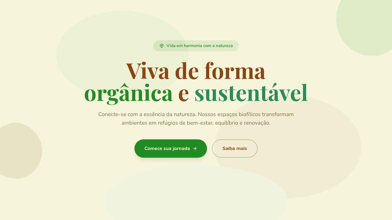
Organic Biophilic
Biophilic organic interface. Ideal for landing pages, saas. AI-ready template.
Use case: Landing pages, SaaS
Historical Context
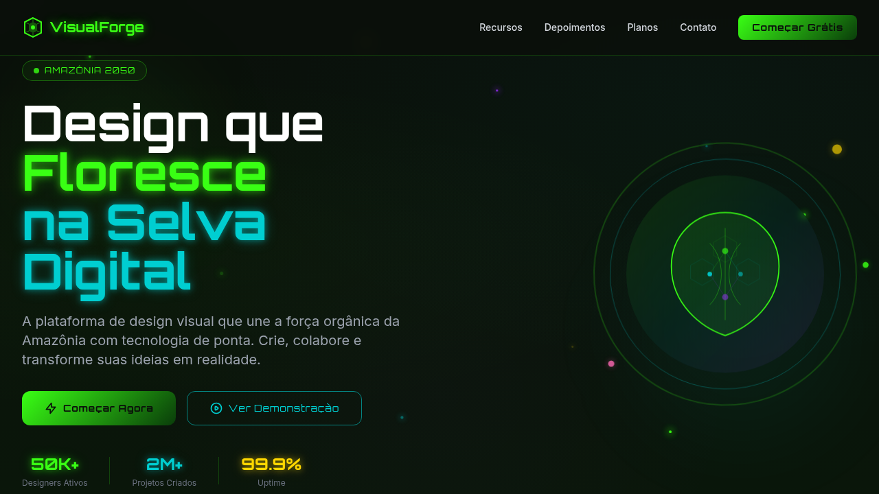
Edward O. Wilson coined 'biophilia' in 1984 — the idea that humans are hardwired to seek connection with nature. For decades, architects ran with it. Interior designers ran with it. Digital? Not so much. We were too busy chasing flat design and geometric minimalism to notice. Then the pandemic locked everyone indoors, and suddenly screens needed to breathe. Calm apps exploded. Headspace redesigned everything around soft gradients and leaf motifs. Wellness startups ditched the clinical white-and-blue palette for moss greens and terracotta. The organic shape — that wobbly, imperfect blob — became the anti-grid. A quiet rebellion against pixel-perfect rigidity. What's interesting is how it stuck. Post-2022, biophilic UI isn't a trend anymore — it's a vertical. Sustainability brands expect it. Health platforms demand it. The visual language of 'natural' now has its own grammar: rounded corners pushed to extremes, earth-tone palettes that feel like soil after rain, illustrations that move like water. Wilson would probably hate the screen time. But he'd recognize the impulse.
When to Use
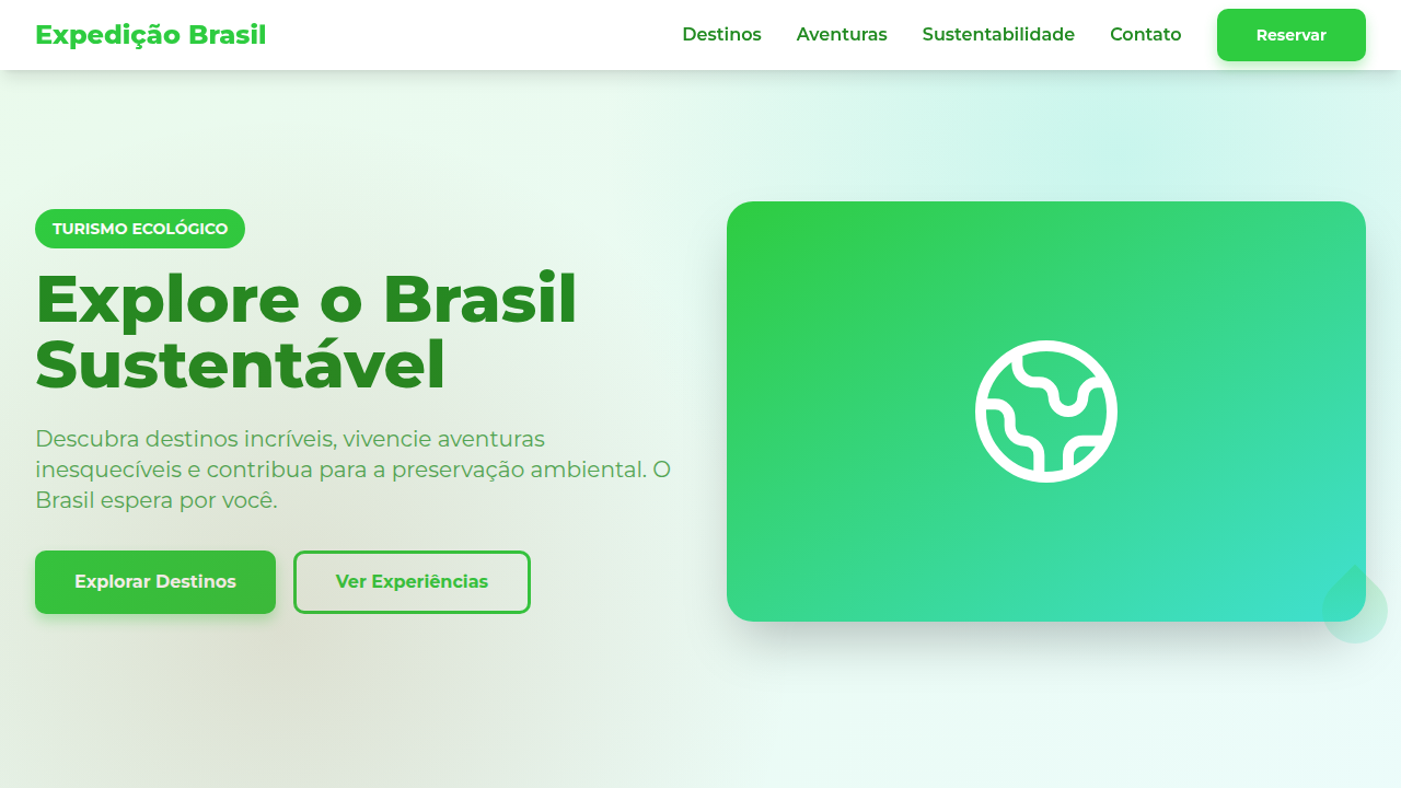
Reach for this when your product needs to feel alive, grounded, unhurried. Wellness apps, eco-commerce, sustainable fashion, organic food brands, meditation platforms, fertility trackers, plant-care tools — anything where trust comes from warmth rather than authority. It works beautifully for brands that want to signal 'we care about the planet' without being preachy. Skip it for fintech, developer tools, or anything that needs to communicate speed and precision. Organic shapes whisper. Sometimes you need to shout.
Design Principles
- Imperfect geometry over rigid grids — use hand-drawn curves, asymmetric blobs, and shapes that feel grown rather than constructed
- Earth-tone palettes anchored in nature — sage, terracotta, warm sand, deep forest — with green as a functional accent, never decorative
- Generous whitespace as breathing room — let compositions feel spacious and unhurried, like a clearing in dense woods
- Fluid motion and micro-animations that mimic organic movement — slow easing, gentle parallax, elements that sway rather than snap
- Texture and materiality over flat surfaces — subtle grain, paper-like backgrounds, watercolor washes that remind users of the physical world
Technical Specs
Colors
Primary
Effects
Rounded corners (16-24px), organic curves (border-radius variations), natural shadows, flowing SVG shapes
Light/Dark
✓ Full / ✓ Full
Related
Last synced: 4/1/2026