Solarpunk Utópico
Solarpunk utopian landing page. Ideal for landing pages, saas. AI-ready template.
Use case: Landing pages, SaaS
Historical Context
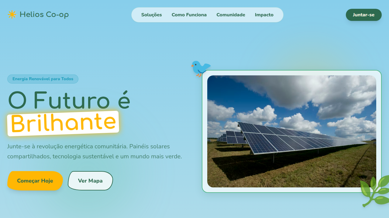
Solarpunk emerged in the early 2010s as a deliberate rejection of dystopia. Where cyberpunk gave us rain-soaked neon and corporate decay, solarpunk asked: what if we actually got it right? The aesthetic draws from Art Nouveau's organic curves, pairs them with photovoltaic glass and vertical gardens, and wraps everything in a palette that feels like morning light through leaves. It's speculative design with genuine hope baked in. The visual language is unmistakable — translucent solar panels as architectural ornament, mycelium networks rendered as data flows, cities where infrastructure and ecology aren't fighting each other. Think Gaudi meets greenhouse. The movement borrows heavily from indigenous futurism and solves the problem most tech aesthetics ignore: how do you make sustainability look desirable rather than sacrificial? Green tech companies caught on fast. Tesla's early marketing flirted with it. Newer climate startups lean in hard — using those warm ambers, deep botanical greens, and flowing geometries to signal that their product isn't just less bad, it's actively beautiful. The aesthetic does real work: it makes the future feel like somewhere you'd want to live.
When to Use
Reach for solarpunk when your product genuinely builds toward a better world and you need the visuals to match that ambition. Climate tech, renewable energy platforms, sustainable commerce, urban planning tools — anything where optimism isn't naive but earned. It works beautifully for brands tired of the sterile minimalism that dominates green marketing. Skip it if your product has nothing to do with sustainability. Borrowed utopia reads as greenwashing instantly, and audiences are sharp enough to notice.
Design Principles
- Organic geometry over rigid grids — curves, arcs, and flowing forms that echo natural growth patterns rather than industrial precision
- Warm luminosity as a system value — ambers, soft golds, and filtered greens that evoke sunlight passing through living things
- Transparency and layering — translucent panels, overlapping botanical elements, and depth that suggests interconnected systems
- Technology as symbiosis, not domination — UI elements that feel grown rather than manufactured, where data visualization mimics root networks and canopy structures
- Earned optimism in motion — animations that unfurl, bloom, and breathe rather than snap or bounce, reinforcing the patience inherent in sustainable thinking
Technical Specs
Colors
Primary
Secondary
Effects
Organic vine borders, solar flare animations, botanical illustrations, living architecture patterns, gradient skies, leaf particle effects, curved glass panels, soft ambient glow
Light/Dark
✓ Full / ✗ No
Related


Last synced: 4/1/2026