Retro Travel Poster
Retro travel poster interface. Ideal for landing pages, saas. AI-ready template.
Use case: Landing pages, SaaS
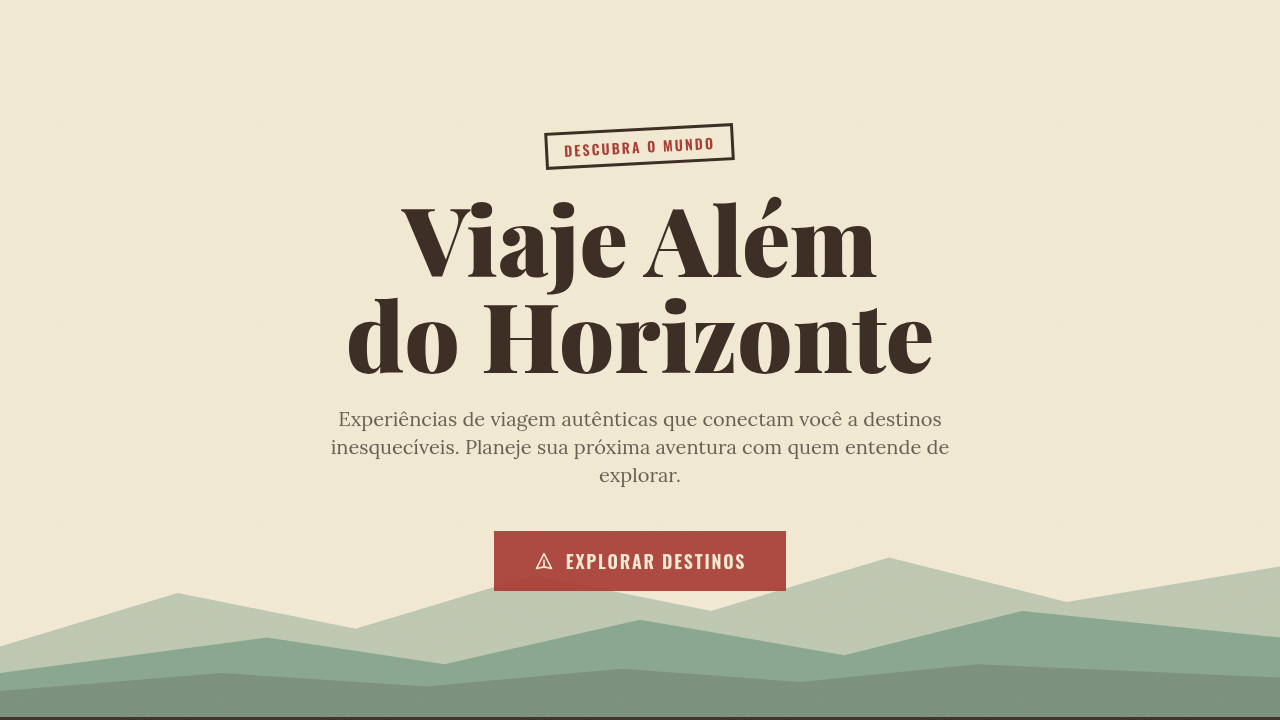
Historical Context
The retro travel poster owes everything to the WPA Federal Art Project of the 1930s. Government artists — many of them fresh out of art school, working for pennies — distilled entire national parks into three colors and a slab-serif headline. No photography. No realism. Just flat planes of saturated color stacked to suggest depth, and typography muscular enough to read from across a train station. That constraint became the aesthetic. Art Deco gave it the geometry. Streamlined curves, sunburst motifs, the obsession with speed and modernity — all of it filtered through lithographic printing limitations into something iconic. Then in 2016, the NASA JPL studio revived the whole language for their Visions of the Future series. Same playbook: simplified illustration, impossible color palettes, bold sans-serifs promising adventure. It worked because the formula never stopped working. Reduce a place to its emotional essence, frame it in confident type, and people want to go there. The poster doesn't describe a destination — it sells a feeling.
When to Use
Reach for this when the brief is aspirational. Tourism campaigns, airline branding, hospitality collateral, adventure brands — anywhere you need to romanticize a place or experience without photographic literalism. It's particularly effective for destinations that benefit from mystique over accuracy. Works beautifully at large scale (billboards, lobby art, hero sections) where the simplified shapes read instantly. Less suited to anything requiring nuance or detailed information hierarchy — this style is a single bold statement, not a conversation.
Design Principles
- Flatten aggressively — reduce landscapes to 3-5 planes of color with no gradients, no texture, no apology
- Let typography do the heavy lifting — one headline set in a period-appropriate face (geometric sans or condensed slab) carries the entire narrative
- Limit your palette to 4-6 colors maximum, biased warm, and commit to saturation levels that feel slightly unreal
- Use geometric simplification over organic detail — circles for suns, triangles for mountains, clean arcs for waves
- Compose with a clear foreground/midground/background stack that creates depth through overlap and value shift alone
DESIGN.md
---
version: "alpha"
name: "Retro Travel Poster"
description: "Retro travel poster interface. Ideal for landing pages, saas. AI-ready template."
colors:
  primary: "#F3EAD3"
  secondary: "#3E2F26"
  tertiary: "#A83E36"
  neutral: "#E8B67C"
  surface: "#5B8A72"
  accent: "#D4A574"
typography:
  h1:
    fontFamily: bold serif/sans display
    fontSize: 2.25rem
    fontWeight: 700
  body-md:
    fontFamily: bold serif/sans display
    fontSize: 1rem
    fontWeight: 400
  label-caps:
    fontFamily: bold serif/sans display
    fontSize: 0.75rem
    fontWeight: 500
components:
  button-primary:
    backgroundColor: "{colors.primary}"
    textColor: "{colors.neutral}"
    padding: 12px
---

## Overview

Retro travel poster interface. Ideal for landing pages, saas. AI-ready template. The retro travel poster owes everything to the WPA Federal Art Project of the 1930s. Government artists — many of them fresh out of art school, working for pennies — distilled entire national parks into three colors and a slab-serif headline. No photography. No realism. Just flat planes of saturated color stacked to suggest depth, and typography muscular enough to read from across a train station. That constraint became the aesthetic.

Art Deco gave it the geometry. Streamlined curves, sunburst motifs, the obsession with speed and modernity — all of it filtered through lithographic printing limitations into something iconic. Then in 2016, the NASA JPL studio revived the whole language for their Visions of the Future series. Same playbook: simplified illustration, impossible color palettes, bold sans-serifs promising adventure. It worked because the formula never stopped working. Reduce a place to its emotional essence, frame it in confident type, and people want to go there. The poster doesn't describe a destination — it sells a feeling.

- Density: 5/10 — Balanced
- Variance: 7/10 — Dynamic
- Motion: 1/10 — Static

- **Style:** Vintage, Illustrative, Warm, Travel
- **Keywords:** Simplified landscapes, bold geometric shapes, vintage typography, screen-printed look, flat colors, nostalgic, adventurous, mid-century, tourism
- **Era:** 1930s-60s Travel Poster
- **Light/Dark:** ✓ Full / ◐ Partial

## Colors

- **Warm Paper** (#F3EAD3) — Primary surface or dominant color
- **Dark Brown** (#3E2F26) — Dark surface, primary background
- **Rust Red** (#A83E36) — Error states, destructive actions
- **Warm Tan** (#E8B67C) — Supporting palette color
- **Forest Green** (#5B8A72) — Success states, positive indicators
- **Sandy Tan** (#D4A574) — Extended palette, decorative use


## Typography

- **Display / Hero:** bold serif/sans display — Weight 700, tight tracking, used for headline impact
- **Body:** bold serif/sans display — Weight 400, 16px/1.6 line-height, max 72ch per line
- **UI Labels / Captions:** bold serif/sans display — 0.875rem, weight 500, slight letter-spacing
- **Monospace:** JetBrains Mono — Used for code, metadata, and technical values

Scale:
- Hero: clamp(2.5rem, 5vw, 4rem)
- H1: 2.25rem
- H2: 1.5rem
- Body: 1rem / 1.6
- Small: 0.875rem


## Layout

- **Grid:** CSS Grid primary. Max-width containment: 1280px centered with 1.5rem side padding.
- **Spacing rhythm:** Balanced. Base unit: 0.5rem (8px).
- **Section vertical gaps:** clamp(4rem, 8vw, 8rem).
- **Hero layout:** Asymmetric composition.
- **Feature sections:** Asymmetric grid with varied card sizes. No 3-equal-columns.
- **Mobile collapse:** All multi-column layouts collapse below 768px. No horizontal overflow.
- **z-index contract:** base (0) / sticky-nav (100) / overlay (200) / modal (300) / toast (500).


## Elevation & Depth

Screen-printed flat lighting, no gradients, subtle texture overlay, bold shape reveals, vintage fade-in transitions

- Minimal motion design. Hover states use color transitions only (150ms).
- No entry animations. No page transitions. Instant, utilitarian feedback.
- Performance: No animation overhead. Static-first approach.


## Shapes

Base corner radius: 8px. See rounded tokens in front matter for the full scale.


## Components

- **Primary Button:** Subtly rounded (0.5rem) shape. Accent color fill. Hover: 8% darken + subtle lift shadow. Active: -1px translate tactile press. Font weight 600. No outer glows.
- **Secondary / Ghost Button:** Outline variant. 1.5px border in muted color. Text in primary color. Hover: subtle background fill.
- **Cards:** Subtly rounded (0.5rem) corners. Surface background. Subtle shadow (0 2px 12px rgba(0,0,0,0.06)). 1px border stroke.
- **Inputs:** Label above input. 1px border stroke. Focus ring: 2px accent color offset 2px. Error text below in semantic red. No floating labels.
- **Navigation:** Primary surface background. Active item: accent color indicator. Font weight 500 when active.
- **Skeletons:** Shimmer animation matching component dimensions. No circular spinners.
- **Empty States:** Icon-based composition with descriptive text and action button.


## Do's and Don'ts

- No emojis in UI — use icon system only (Lucide, Heroicons)
- No pure black (#000000) — use off-black or charcoal variants
- No oversaturated accent colors (saturation cap: 80%)
- No 3-column equal-width feature layouts — use zig-zag or asymmetric grid
- No `h-screen` — use `min-h-[100dvh]`
- No AI copywriting clichés: "Elevate", "Seamless", "Unleash", "Next-Gen"
- No broken external image links — use picsum.photos or inline SVG
- No generic lorem ipsum in demos

- Do Simplified landscapes
- Do Bold geometric shapes
- Do Vintage typography
- Do Screen-printed look
- Do Warm paper background
- Do Nostalgic feel


## Use Case

Landing pages, SaaS
Technical Specs
CSS
background: #F3EAD3 with subtle texture, color: limited earth palette, clip-path for landscape shapes, font-family: bold serif/sans display, flat colors (no gradients), layered SVG shapes for depth
Variables
--paper-bg: #F3EAD3, --dark-brown: #3E2F26, --rust-red: #A83E36, --warm-tan: #E8B67C, --forest-green: #5B8A72, --texture-opacity: 0.1
Checklist
☐ Simplified landscapes, ☐ Bold geometric shapes, ☐ Vintage typography, ☐ Screen-printed look, ☐ Warm paper background, ☐ Nostalgic feel
Colors
Primary
Secondary
Effects
Screen-printed flat lighting, no gradients, subtle texture overlay, bold shape reveals, vintage fade-in transitions
Light/Dark
✓ Full / ◐ Partial
AI Prompt
Act as a Senior Frontend Engineer and Expert UI Designer.
Your task is to code a complete Landing Page on the first attempt.
- Landing Page Theme: <INSERT THEME>
- Sections to add: <INSERT SECTIONS>

Generate the final code immediately following these definitions:

## Style

- **Name:** Retro Travel Poster
- **Type:** Vintage, Illustrative, Warm, Travel
- **Keywords:** Simplified landscapes, bold geometric shapes, vintage typography, screen-printed look, flat colors, nostalgic, adventurous, mid-century, tourism
- **Era:** 1930s-60s Travel Poster
- **Light/Dark:** ✓ Full / ◐ Partial

## Color Palette

- **Primary:** Warm Paper #F3EAD3, Dark Brown #3E2F26, Rust Red #A83E36, Warm Tan #E8B67C
- **Secondary:** Forest Green #5B8A72, Sandy Tan #D4A574, muted earth tones, limited palette

## Visual Effects

Screen-printed flat lighting, no gradients, subtle texture overlay, bold shape reveals, vintage fade-in transitions

## AI Visual Direction

Design a retro travel poster interface. Use: simplified landscape shapes, bold geometric forms, vintage typography, screen-printed flat colors, warm paper background (#F3EAD3), limited earth-tone palette, nostalgic mid-century aesthetic, layered depth.

## CSS Technical

```css
background: #F3EAD3 with subtle texture, color: limited earth palette, clip-path for landscape shapes, font-family: bold serif/sans display, flat colors (no gradients), layered SVG shapes for depth
```

## Design System Variables

```css
--paper-bg: #F3EAD3, --dark-brown: #3E2F26, --rust-red: #A83E36, --warm-tan: #E8B67C, --forest-green: #5B8A72, --texture-opacity: 0.1
```

## Implementation Checklist

- ☐ Simplified landscapes
- ☐ Bold geometric shapes
- ☐ Vintage typography
- ☐ Screen-printed look
- ☐ Warm paper background
- ☐ Nostalgic feel

## Execution Rules

1. Strictly follow the defined visual style.
2. Use high-quality inline SVG icons (Heroicons or Lucide style) — NEVER use emojis as icons.
3. Add `cursor-pointer` and smooth `hover` states (transition-all) on all interactive elements.
4. Required Page Structure:
   - Navbar (Logo + Links + CTA)
   - Hero Section (Impactful Headline + Subtitle + 2 buttons + 3D/Abstract visual element via CSS)
   - Features (3 cards with icons)
   - Testimonials (3 cards)
   - Pricing (3 tiers, highlight the middle one)
   - Final CTA
   - Full Footer with social links, privacy policy, terms of use, contact and SEO links.
5. All text content must be in English.
6. The visual must be CLEARLY distinct — do not create a "default Bootstrap" design. Force the use of the provided design system variables.
7. Use `<style>` tags in the head for custom classes (especially for complex backdrop-filter effects and animations) that Tailwind CDN doesn't cover.
8. Full Responsiveness: Layout must adapt perfectly to Mobile, Tablet and Desktop (vertical stack on mobile).
9. Include basic SEO, Viewport and Open Graph meta tags in `<head>`.
10. Footer must contain: Copyright 2026, Secondary navigation links and Social media icons.
11. Make the creative decisions needed to deliver the complete, functional result now.
Related
Last synced: 4/1/2026