Retro-Futurism
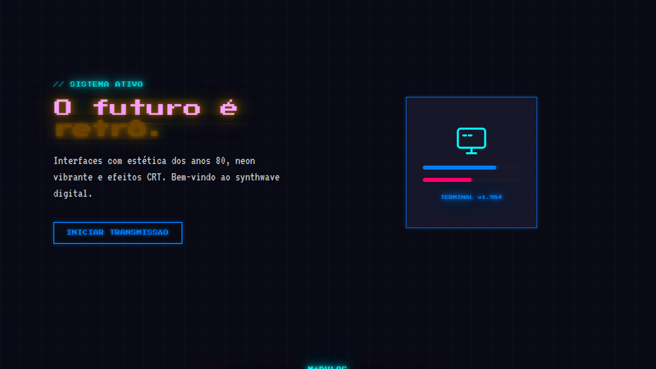
Retro-futuristic (cyberpunk/vaporwave) interface with neon colors (blue, pink, cyan), deep black background, 80s aesthetic, CRT scanlines, glitch effects, neon glow text/borders, monospace fonts, geometric patterns. Ideal for landing pages, saas. AI-ready template.
Use case: Landing pages, SaaS
Historical Context
Retro-futurism didn't start as a design trend. It started as a feeling — that electric hum of Vangelis synths over rain-soaked Los Angeles in Blade Runner, the light-cycle grids of Tron. These films didn't just imagine the future; they built an aesthetic language that refused to die. For decades it lived in the margins, in VHS cover art and forgotten arcade cabinets. Then synthwave happened. Musicians like Kavinsky and Perturbator weren't just making music — they were art-directing an entire visual movement. Album covers became mood boards. The neon grids, the chrome type, the sunset gradients — suddenly designers had a shared vocabulary that felt both familiar and impossibly cool. Stranger Things blew the door wide open in 2016. What had been a niche nostalgia play became mainstream visual language overnight. But here's what matters: it stuck. Unlike most nostalgia cycles that burn hot and vanish, retro-futurism evolved into a legitimate design system. Designers learned to extract the principles — the contrast, the glow, the geometry — without requiring a DeLorean in every hero image.
When to Use
Retro-futurism works when your product has energy, when you're selling an experience rather than enterprise compliance software. Gaming, entertainment, creative tools, music platforms — anything where emotion leads the conversion. It's killer for landing pages that need to stop the scroll. But be honest with yourself: if you're slapping neon on a B2B dashboard because it looks cool on Dribbble, you're doing cosplay, not design. The style connects when there's genuine cultural alignment between your audience and the aesthetic. Gen X and elder millennials feel it in their bones. Gen Z discovers it fresh. Either way, the intent has to be real.
Design Principles
- Contrast is everything — neon only glows against darkness. Build your palette around deep blacks and navy, then let two or three accent colors burn hot. No neon on white backgrounds, ever.
- Geometry over illustration — grids, triangles, parallel lines, and wireframe landscapes carry the aesthetic without becoming kitsch. The moment you add too many literal 80s objects, you've crossed into costume territory.
- Light as material — treat glow effects as physical elements with falloff, bloom, and reflection. A neon line should cast color onto nearby surfaces. Flat colored lines without light interaction look like clip art.
- Typography does the heavy lifting — chrome, outline, and condensed type styles establish era instantly. One display font sets the tone; pair it with something clean and modern for body text to keep readability intact.
- Restraint separates homage from parody — pick two or three retro-futurist elements per composition maximum. Scanlines plus neon type plus a grid horizon is plenty. Add a palm tree, a sunset, AND a sports car and you've made a meme.
DESIGN.md
---
version: "alpha"
name: "Retro-Futurism"
description: "Retro-futuristic (cyberpunk/vaporwave) interface with neon colors (blue, pink, cyan), deep black background, 80s aesthetic, CRT scanlines, glitch effects, neon glow text/borders, monospace fonts, geometric patterns. Ideal for landing pages, saas. AI-ready template."
colors:
  primary: "#0080FF"
  secondary: "#FF006E"
  tertiary: "#00FFFF"
  neutral: "#1A1A2E"
  surface: "#5D34D0"
  accent: "#C0C0C0"
typography:
  h1:
    fontFamily: monospace
    fontSize: 2.25rem
    fontWeight: 700
  body-md:
    fontFamily: monospace
    fontSize: 1rem
    fontWeight: 400
  label-caps:
    fontFamily: monospace
    fontSize: 0.75rem
    fontWeight: 500
components:
  button-primary:
    backgroundColor: "{colors.primary}"
    textColor: "{colors.neutral}"
    padding: 12px
---

## Overview

Retro-futuristic (cyberpunk/vaporwave) interface with neon colors (blue, pink, cyan), deep black background, 80s aesthetic, CRT scanlines, glitch effects, neon glow text/borders, monospace fonts, geometric patterns. Ideal for landing pages, saas. AI-ready template. Retro-futurism didn't start as a design trend. It started as a feeling — that electric hum of Vangelis synths over rain-soaked Los Angeles in Blade Runner, the light-cycle grids of Tron. These films didn't just imagine the future; they built an aesthetic language that refused to die. For decades it lived in the margins, in VHS cover art and forgotten arcade cabinets.

Then synthwave happened. Musicians like Kavinsky and Perturbator weren't just making music — they were art-directing an entire visual movement. Album covers became mood boards. The neon grids, the chrome type, the sunset gradients — suddenly designers had a shared vocabulary that felt both familiar and impossibly cool.

Stranger Things blew the door wide open in 2016. What had been a niche nostalgia play became mainstream visual language overnight. But here's what matters: it stuck. Unlike most nostalgia cycles that burn hot and vanish, retro-futurism evolved into a legitimate design system. Designers learned to extract the principles — the contrast, the glow, the geometry — without requiring a DeLorean in every hero image.

- Density: 5/10 — Balanced
- Variance: 8/10 — Expressive
- Motion: 4/10 — Subtle

- **Style:** Nostalgic, Neon, Futuristic, Retro
- **Keywords:** Vintage sci-fi, 80s aesthetic, neon glow, geometric patterns, CRT scanlines, pixel art, cyberpunk, synthwave
- **Era:** 1980s Retro
- **Light/Dark:** ✓ Full / ✓ Dark focused

## Colors

- **Neon Blue** (#0080FF) — Accent highlight, links and focus states
- **Hot Pink** (#FF006E) — Primary text color
- **Cyan** (#00FFFF) — Accent highlight, links and focus states
- **Deep Black** (#1A1A2E) — Dark surface, primary background
- **Purple** (#5D34D0) — Accent color, emphasis elements
- **Metallic Silver** (#C0C0C0) — Extended palette, decorative use
- **Gold** (#FFD700) — Premium accent, decorative highlights
- **80s Pink** (#FF10F0) — Primary text color


## Typography

- **Display / Hero:** monospace — Weight 700, tight tracking, used for headline impact
- **Body:** monospace — Weight 400, 16px/1.6 line-height, max 72ch per line
- **UI Labels / Captions:** monospace — 0.875rem, weight 500, slight letter-spacing
- **Monospace:** monospace — Used for code, metadata, and technical values

Scale:
- Hero: clamp(2.5rem, 5vw, 4rem)
- H1: 2.25rem
- H2: 1.5rem
- Body: 1rem / 1.6
- Small: 0.875rem


## Layout

- **Grid:** CSS Grid primary. Max-width containment: 1280px centered with 1.5rem side padding.
- **Spacing rhythm:** Balanced. Base unit: 0.5rem (8px).
- **Section vertical gaps:** clamp(4rem, 8vw, 8rem).
- **Hero layout:** Asymmetric composition.
- **Feature sections:** Asymmetric grid with varied card sizes. No 3-equal-columns.
- **Mobile collapse:** All multi-column layouts collapse below 768px. No horizontal overflow.
- **z-index contract:** base (0) / sticky-nav (100) / overlay (200) / modal (300) / toast (500).


## Elevation & Depth

CRT scanlines (::before overlay), neon glow (text-shadow+box-shadow), glitch effects (skew/offset keyframes)

- **Physics:** Ease-out curves, 200-300ms duration. Smooth and predictable.
- **Entry animations:** Fade + translate-Y (16px → 0) over 420ms ease-out. Staggered cascades for lists: 80ms between items.
- **Hover states:** Subtle color shift + shadow adjustment over 200ms.
- **Page transitions:** Fade only (200ms).
- **Performance:** Only transform and opacity animated. No layout-triggering properties.


## Shapes

Base corner radius: 8px. See rounded tokens in front matter for the full scale.


## Components

- **Primary Button:** Subtly rounded (0.5rem) shape. Accent color fill. Hover: 8% darken + subtle lift shadow. Active: -1px translate tactile press. Font weight 600. No outer glows.
- **Secondary / Ghost Button:** Outline variant. 1.5px border in muted color. Text in primary color. Hover: subtle background fill.
- **Cards:** Subtly rounded (0.5rem) corners. Surface background. Subtle shadow (0 2px 12px rgba(0,0,0,0.06)). 1px border stroke.
- **Inputs:** Label above input. 1px border stroke. Focus ring: 2px accent color offset 2px. Error text below in semantic red. No floating labels.
- **Navigation:** Primary surface background. Active item: accent color indicator. Font weight 500 when active.
- **Skeletons:** Shimmer animation matching component dimensions. No circular spinners.
- **Empty States:** Icon-based composition with descriptive text and action button.


## Do's and Don'ts

- No emojis in UI — use icon system only (Lucide, Heroicons)
- No pure white (#FFFFFF) backgrounds — use off-white or dark surfaces
- No oversaturated accent colors (saturation cap: 80%)
- No 3-column equal-width feature layouts — use zig-zag or asymmetric grid
- No `h-screen` — use `min-h-[100dvh]`
- No AI copywriting clichés: "Elevate", "Seamless", "Unleash", "Next-Gen"
- No broken external image links — use picsum.photos or inline SVG
- No generic lorem ipsum in demos

- Do Neon colors used
- Do CRT scanlines effect
- Do Glitch animations active
- Do Monospace font
- Do Deep black background
- Do Glow effects applied
- Do 80s patterns present


## Use Case

Landing pages, SaaS
Technical Specs
CSS
color: neon colors (#0080FF, #FF006E, #00FFFF), text-shadow: 0 0 10px neon, background: #000 or #1A1A2E, font-family: monospace, animation: glitch (skew+offset), filter: hue-rotate
Variables
--neon-colors: #0080FF #FF006E #00FFFF, --background: #000000, --font-family: monospace, --effect: glitch+glow, --scanline-opacity: 0.3, --crt-effect: true
Checklist
☐ Neon colors used, ☐ CRT scanlines effect, ☐ Glitch animations active, ☐ Monospace font, ☐ Deep black background, ☐ Glow effects applied, ☐ 80s patterns present
Colors
Primary
Secondary
Effects
CRT scanlines (::before overlay), neon glow (text-shadow+box-shadow), glitch effects (skew/offset keyframes)
Light/Dark
✓ Full / ✓ Dark focused
AI Prompt
Act as a Senior Frontend Engineer and Expert UI Designer.
Your task is to code a complete Landing Page on the first attempt.
- Landing Page Theme: <INSERT THEME>
- Sections to add: <INSERT SECTIONS>

Generate the final code immediately following these definitions:

## Style

- **Name:** Retro-Futurism
- **Type:** Nostalgic, Neon, Futuristic, Retro
- **Keywords:** Vintage sci-fi, 80s aesthetic, neon glow, geometric patterns, CRT scanlines, pixel art, cyberpunk, synthwave
- **Era:** 1980s Retro
- **Light/Dark:** ✓ Full / ✓ Dark focused

## Color Palette

- **Primary:** Neon Blue #0080FF, Hot Pink #FF006E, Cyan #00FFFF, Deep Black #1A1A2E, Purple #5D34D0
- **Secondary:** Metallic Silver #C0C0C0, Gold #FFD700, duotone, 80s Pink #FF10F0, neon accents

## Visual Effects

CRT scanlines (::before overlay), neon glow (text-shadow+box-shadow), glitch effects (skew/offset keyframes)

## AI Visual Direction

Build a retro-futuristic (cyberpunk/vaporwave) interface with neon colors (blue, pink, cyan), deep black background, 80s aesthetic, CRT scanlines, glitch effects, neon glow text/borders, monospace fonts, geometric patterns. Use neon text-shadow and animated glitch effects.

## CSS Technical

```css
color: neon colors (#0080FF, #FF006E, #00FFFF), text-shadow: 0 0 10px neon, background: #000 or #1A1A2E, font-family: monospace, animation: glitch (skew+offset), filter: hue-rotate
```

## Design System Variables

```css
--neon-colors: #0080FF #FF006E #00FFFF, --background: #000000, --font-family: monospace, --effect: glitch+glow, --scanline-opacity: 0.3, --crt-effect: true
```

## Implementation Checklist

- ☐ Neon colors used
- ☐ CRT scanlines effect
- ☐ Glitch animations active
- ☐ Monospace font
- ☐ Deep black background
- ☐ Glow effects applied
- ☐ 80s patterns present

## Execution Rules

1. Strictly follow the defined visual style.
2. Use high-quality inline SVG icons (Heroicons or Lucide style) — NEVER use emojis as icons.
3. Add `cursor-pointer` and smooth `hover` states (transition-all) on all interactive elements.
4. Required Page Structure:
   - Navbar (Logo + Links + CTA)
   - Hero Section (Impactful Headline + Subtitle + 2 buttons + 3D/Abstract visual element via CSS)
   - Features (3 cards with icons)
   - Testimonials (3 cards)
   - Pricing (3 tiers, highlight the middle one)
   - Final CTA
   - Full Footer with social links, privacy policy, terms of use, contact and SEO links.
5. All text content must be in English.
6. The visual must be CLEARLY distinct — do not create a "default Bootstrap" design. Force the use of the provided design system variables.
7. Use `<style>` tags in the head for custom classes (especially for complex backdrop-filter effects and animations) that Tailwind CDN doesn't cover.
8. Full Responsiveness: Layout must adapt perfectly to Mobile, Tablet and Desktop (vertical stack on mobile).
9. Include basic SEO, Viewport and Open Graph meta tags in `<head>`.
10. Footer must contain: Copyright 2026, Secondary navigation links and Social media icons.
11. Make the creative decisions needed to deliver the complete, functional result now.
Related
Last synced: 4/1/2026