Pointillism / Stipple Art
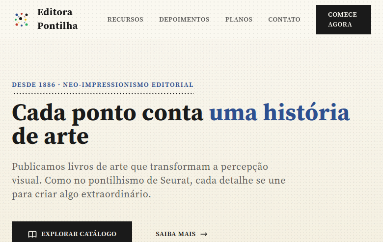
Pointillism/stipple art landing page where visual texture is created through thousands of tiny dots. Ideal for ilustrações editoriais, embalagens artísticas, marcas com margem artística, pôsteres. AI-ready template.
Use case: Editorial illustrations, Artistic packaging, Artistically-minded brands, Posters
Historical Context
Pointillism emerged in 1886 when Georges Seurat exhibited *A Sunday Afternoon on the Island of La Grande Jatte* and essentially told the Impressionists they were doing color mixing wrong. Instead of blending pigments on the palette — which dulls chroma — Seurat placed pure dots of color side by side, letting optical mixing happen in the viewer's eye. It was painting as systematic research. Neo-Impressionists like Signac followed, but the technique never became mainstream. It demanded insane patience and a scientific understanding of complementary color theory that most painters simply didn't care to pursue. Stippling — pointillism's ink-based cousin — found its real home in scientific illustration and engraving. Before halftone printing existed, stipple was how you rendered tonal gradation in single-color reproduction. Botanical illustrators, cartographers, and medical artists built entire visual languages from nothing but dots and patience. The technique survived the digital revolution precisely because no algorithm replicates the deliberate irregularity of hand-placed marks. Today pointillism lives in premium packaging, editorial illustration, and brand identities that need to signal craft without shouting. It's the opposite of speed — every dot is a decision.
When to Use
Deploy pointillism when you need to communicate meticulous craft, scientific rigor, or artisanal quality. It works beautifully for art-focused brands, museum identities, premium wine and spirits packaging, and editorial contexts where the illustration itself is the content — not decoration. Stipple is particularly effective in monochrome applications where you need rich tonal range without relying on gradients or photography. Avoid it for anything requiring fast iteration or responsive scalability; this technique rewards commitment.
Design Principles
- Density controls value — vary dot spacing to build tone, never rely on dot size alone for tonal shifts
- Embrace the grid's absence — hand-placed irregularity is the entire point; perfectly uniform dots read as halftone, not craft
- Limit your palette ruthlessly — pointillism gains power from chromatic restraint; two or three colors maximum forces optical mixing to do the heavy lifting
- Scale dictates legibility — dots that read as texture at arm's length must dissolve into pattern at distance; always test at final reproduction size
- Negative space is your fastest value — the paper or substrate does half the work; let it breathe instead of filling every surface with marks
DESIGN.md
---
version: "alpha"
name: "Pointillism / Stipple Art"
description: "Pointillism/stipple art landing page where visual texture is created through thousands of tiny dots. Ideal for ilustrações editoriais, embalagens artísticas, marcas com margem artística, pôsteres. AI-ready template."
colors:
  primary: "#FAF8F0"
  secondary: "#1A1A1A"
  tertiary: "#2E5090"
  neutral: "#C0392B"
  surface: "#27AE60"
  accent: "#F1C40F"
typography:
  h1:
    fontFamily: Source Serif Pro
    fontSize: 2.5rem
    fontWeight: 700
  body-md:
    fontFamily: Source Serif Pro
    fontSize: 1rem
    fontWeight: 400
rounded:
  sm: 2px
  md: 4px
  lg: 8px
spacing:
  sm: 2.0rem
  md: 4.0rem
  lg: 8.0rem
components:
  button-primary:
    backgroundColor: "{colors.primary}"
    textColor: "{colors.neutral}"
    rounded: "{rounded.sm}"
    padding: 12px
---

## Overview

Pointillism/stipple art landing page where visual texture is created through thousands of tiny dots. Ideal for ilustrações editoriais, embalagens artísticas, marcas com margem artística, pôsteres. AI-ready template. Pointillism emerged in 1886 when Georges Seurat exhibited *A Sunday Afternoon on the Island of La Grande Jatte* and essentially told the Impressionists they were doing color mixing wrong. Instead of blending pigments on the palette — which dulls chroma — Seurat placed pure dots of color side by side, letting optical mixing happen in the viewer's eye. It was painting as systematic research. Neo-Impressionists like Signac followed, but the technique never became mainstream. It demanded insane patience and a scientific understanding of complementary color theory that most painters simply didn't care to pursue.

Stippling — pointillism's ink-based cousin — found its real home in scientific illustration and engraving. Before halftone printing existed, stipple was how you rendered tonal gradation in single-color reproduction. Botanical illustrators, cartographers, and medical artists built entire visual languages from nothing but dots and patience. The technique survived the digital revolution precisely because no algorithm replicates the deliberate irregularity of hand-placed marks.

Today pointillism lives in premium packaging, editorial illustration, and brand identities that need to signal craft without shouting. It's the opposite of speed — every dot is a decision.

- Density: 5/10 — Balanced
- Variance: 8/10 — Expressive
- Motion: 6/10 — Expressive

- **Style:** Dot-Based, Hypnotic, Artistic, Textured
- **Keywords:** Pointillism, stipple, dots, tiny points, cohesive image, hypnotic, Seurat, texture, artistic, impressionist, pattern
- **Era:** 1880s Neo-Impressionism
- **Light/Dark:** ✓ Full / ◐ Partial

## Colors

- **Warm White** (#FAF8F0) — Light surface, card backgrounds
- **Ink Black** (#1A1A1A) — Dark surface, primary background
- **Stipple Blue** (#2E5090) — Accent highlight, links and focus states
- **Stipple Red** (#C0392B) — Error states, destructive actions
- **Stipple Green** (#27AE60) — Success states, positive indicators
- **Stipple Yellow** (#F1C40F) — Warning states, attention indicators
- **Warm Grey** (#7F8C8D) — Secondary text, borders, muted elements
- **Soft Cream** (#F5F0E0) — Secondary surface


## Typography

- **Display / Hero:** Source Serif Pro — Weight 700, tight tracking, used for headline impact
- **Body:** Source Serif Pro — Weight 400, 16px/1.6 line-height, max 72ch per line
- **UI Labels / Captions:** Source Serif Pro — 0.875rem, weight 500, slight letter-spacing
- **Monospace:** JetBrains Mono — Used for code, metadata, and technical values

Scale:
- Hero: clamp(2.5rem, 5vw, 4rem)
- H1: 2.25rem
- H2: 1.5rem
- Body: 1rem / 1.6
- Small: 0.875rem


## Layout

- **Grid:** CSS Grid primary. Max-width containment: 1280px centered with 1.5rem side padding.
- **Spacing rhythm:** Balanced. Base unit: 0.5rem (8px).
- **Section vertical gaps:** clamp(4rem, 8vw, 8rem).
- **Hero layout:** Asymmetric composition.
- **Feature sections:** Asymmetric grid with varied card sizes. No 3-equal-columns.
- **Mobile collapse:** All multi-column layouts collapse below 768px. No horizontal overflow.
- **z-index contract:** base (0) / sticky-nav (100) / overlay (200) / modal (300) / toast (500).


## Elevation & Depth

CSS radial-gradient dot patterns at various densities, stipple texture overlays, dot-based section dividers, pointillist gradient backgrounds (dots instead of smooth gradients), subtle dot animation on hover, grain/noise texture via SVG filter

- **Physics:** Spring — stiffness 120, damping 20. Confident, weighted transitions.
- **Entry animations:** Fade + translate-Y (16px → 0) over 480ms ease-out. Staggered cascades for lists: 100ms between items.
- **Hover states:** Scale(1.03) + shadow lift over 200ms.
- **Page transitions:** Fade + slide (300ms).
- **Performance:** Only transform and opacity animated. No layout-triggering properties.


## Shapes

Base corner radius: 0px. See rounded tokens in front matter for the full scale.


## Components

- **Primary Button:** Sharp edges (0px) shape. Accent color fill. Hover: 8% darken + subtle lift shadow. Active: -1px translate tactile press. Font weight 600. No outer glows.
- **Secondary / Ghost Button:** Outline variant. 1.5px border in muted color. Text in primary color. Hover: subtle background fill.
- **Cards:** Sharp edges (0px) corners. Surface background. Subtle shadow (0 2px 12px rgba(0,0,0,0.06)). 1px border stroke.
- **Inputs:** Label above input. 1px border stroke. Focus ring: 2px accent color offset 2px. Error text below in semantic red. No floating labels.
- **Navigation:** Primary surface background. Active item: accent color indicator. Font weight 500 when active.
- **Skeletons:** Shimmer animation matching component dimensions. No circular spinners.
- **Empty States:** Icon-based composition with descriptive text and action button.


## Do's and Don'ts

- No emojis in UI — use icon system only (Lucide, Heroicons)
- No pure black (#000000) — use off-black or charcoal variants
- No oversaturated accent colors (saturation cap: 80%)
- No 3-column equal-width feature layouts — use zig-zag or asymmetric grid
- No `h-screen` — use `min-h-[100dvh]`
- No AI copywriting clichés: "Elevate", "Seamless", "Unleash", "Next-Gen"
- No broken external image links — use picsum.photos or inline SVG
- No generic lorem ipsum in demos

- Do Dot pattern textures throughout
- Do Varying dot densities for depth
- Do Stipple-based section dividers
- Do Clean typography contrasting with dots
- Do Pointillist gradient backgrounds
- Do Artistic impressionist atmosphere
- Do Responsive with maintained dot textures


## Use Case

Editorial illustrations, Artistic packaging, Artistically-minded brands, Posters
Technical Specs
CSS
font-family: 'Source Serif Pro', serif, background: #FAF8F0 with radial-gradient(circle, #1A1A1A 1px, transparent 1px) for dot pattern, background-size: 8px 8px, color: #1A1A1A, border: none (use dot-pattern borders), box-shadow: none, line-height: 1.8, letter-spacing: 0.03em
Variables
--color-white: #FAF8F0, --color-ink: #1A1A1A, --color-blue: #2E5090, --color-red: #C0392B, --font-primary: 'Source Serif Pro', --dot-size: 1px, --dot-spacing: 8px, --spacing: 2rem, --border-radius: 0px
Checklist
☐ Dot pattern textures throughout, ☐ Varying dot densities for depth, ☐ Stipple-based section dividers, ☐ Clean typography contrasting with dots, ☐ Pointillist gradient backgrounds, ☐ Artistic impressionist atmosphere, ☐ Responsive with maintained dot textures
Colors
Primary
Secondary
Effects
CSS radial-gradient dot patterns at various densities, stipple texture overlays, dot-based section dividers, pointillist gradient backgrounds (dots instead of smooth gradients), subtle dot animation on hover, grain/noise texture via SVG filter
Light/Dark
✓ Full / ◐ Partial
AI Prompt
Act as a Senior Frontend Engineer and Expert UI Designer.
Your task is to code a complete Landing Page on the first attempt.
- Landing Page Theme: <INSERT THEME>
- Sections to add: <INSERT SECTIONS>

Generate the final code immediately following these definitions:

## Style

- **Name:** Pointillism / Stipple Art
- **Type:** Dot-Based, Hypnotic, Artistic, Textured
- **Keywords:** Pointillism, stipple, dots, tiny points, cohesive image, hypnotic, Seurat, texture, artistic, impressionist, pattern
- **Era:** 1880s Neo-Impressionism
- **Light/Dark:** ✓ Full / ◐ Partial

## Color Palette

- **Primary:** Warm White #FAF8F0, Ink Black #1A1A1A, Stipple Blue #2E5090, Stipple Red #C0392B
- **Secondary:** Stipple Green #27AE60, Stipple Yellow #F1C40F, Warm Grey #7F8C8D, Soft Cream #F5F0E0

## Visual Effects

CSS radial-gradient dot patterns at various densities, stipple texture overlays, dot-based section dividers, pointillist gradient backgrounds (dots instead of smooth gradients), subtle dot animation on hover, grain/noise texture via SVG filter

## AI Visual Direction

Design a pointillism/stipple art landing page where visual texture is created through thousands of tiny dots. Use CSS radial-gradient dot patterns at various densities, stipple texture overlays, dot-based dividers. Warm white, ink black with colored stipple accents. Typography should be clean to contrast with dotted textures. Hypnotic, artistic, impressionist atmosphere where dots blend into cohesive visuals.

## CSS Technical

```css
font-family: 'Source Serif Pro', serif, background: #FAF8F0 with radial-gradient(circle, #1A1A1A 1px, transparent 1px) for dot pattern, background-size: 8px 8px, color: #1A1A1A, border: none (use dot-pattern borders), box-shadow: none, line-height: 1.8, letter-spacing: 0.03em
```

## Design System Variables

```css
--color-white: #FAF8F0, --color-ink: #1A1A1A, --color-blue: #2E5090, --color-red: #C0392B, --font-primary: 'Source Serif Pro', --dot-size: 1px, --dot-spacing: 8px, --spacing: 2rem, --border-radius: 0px
```

## Implementation Checklist

- ☐ Dot pattern textures throughout
- ☐ Varying dot densities for depth
- ☐ Stipple-based section dividers
- ☐ Clean typography contrasting with dots
- ☐ Pointillist gradient backgrounds
- ☐ Artistic impressionist atmosphere
- ☐ Responsive with maintained dot textures

## Execution Rules

1. Strictly follow the defined visual style.
2. Use high-quality inline SVG icons (Heroicons or Lucide style) — NEVER use emojis as icons.
3. Add `cursor-pointer` and smooth `hover` states (transition-all) on all interactive elements.
4. Required Page Structure:
   - Navbar (Logo + Links + CTA)
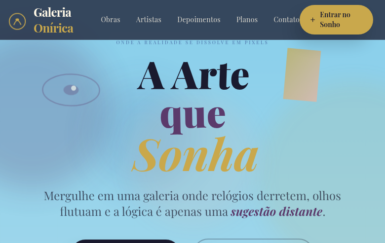
   - Hero Section (Impactful Headline + Subtitle + 2 buttons + 3D/Abstract visual element via CSS)
   - Features (3 cards with icons)
   - Testimonials (3 cards)
   - Pricing (3 tiers, highlight the middle one)
   - Final CTA
   - Full Footer with social links, privacy policy, terms of use, contact and SEO links.
5. All text content must be in English.
6. The visual must be CLEARLY distinct — do not create a "default Bootstrap" design. Force the use of the provided design system variables.
7. Use `<style>` tags in the head for custom classes (especially for complex backdrop-filter effects and animations) that Tailwind CDN doesn't cover.
8. Full Responsiveness: Layout must adapt perfectly to Mobile, Tablet and Desktop (vertical stack on mobile).
9. Include basic SEO, Viewport and Open Graph meta tags in `<head>`.
10. Footer must contain: Copyright 2026, Secondary navigation links and Social media icons.
11. Make the creative decisions needed to deliver the complete, functional result now.
Related
Last synced: 4/1/2026