Pixel Art 8-bit
Pixel art 8-bit landing page with retro gaming aesthetics. Ideal for jogos indie, marketing retro, designs nostálgicos, portfólios de desenvolvedores de games. AI-ready template.
Use case: Indie games, Retro marketing, Nostalgic designs, Game developer portfolios
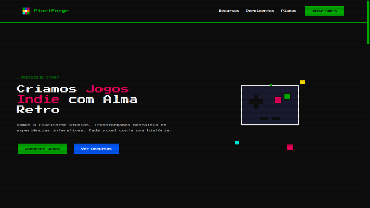
Historical Context
Pixel art wasn't an aesthetic choice — it was a hardware constraint. When the NES shipped with a 256×240 resolution and a 54-color palette, artists had no option but to make every single pixel count. That limitation bred a visual language so potent it outlived the technology that created it. Shigeru Miyamoto's team at Nintendo didn't think in pixels; they thought in readable silhouettes at thumbnail scale. Every sprite was a masterclass in economy. The 8-bit revival that started in the mid-2000s indie scene wasn't mere nostalgia — it was a rejection of the uncanny valley chase that AAA studios were losing. Games like Shovel Knight and Celeste proved that deliberate pixel work could carry emotional weight that photorealism struggles to match. The constraint became the point. Today pixel art sits at a fascinating crossroads: it's simultaneously a historical artifact, a living craft, and a shorthand for authenticity in a world drowning in AI-generated smoothness. Designers reach for it when they want to signal that every detail was placed with intention.
When to Use
Reach for 8-bit pixel art when your project needs to feel handmade and intentional. It works brilliantly for indie game interfaces, developer portfolios that want personality over polish, retro-themed brand campaigns, and any product targeting the 30-something demographic that grew up blowing into cartridges. It's also a smart choice when budget is tight — a well-crafted pixel system scales infinitely without asset bloat. Avoid it for anything requiring photographic fidelity or corporate gravitas.
Design Principles
- Honor the grid ruthlessly — every element must snap to your chosen pixel density. Sub-pixel rendering is cheating and it shows.
- Limit your palette like the hardware did. Four colors per sprite wasn't a bug, it was discipline. Constraint breeds coherence.
- Design for readability at 1x scale first. If your sprite isn't recognizable at native resolution, no amount of upscaling saves it.
- Animate with purpose — 2-3 frames of intentional movement beats 12 frames of smoothness. The staccato rhythm IS the aesthetic.
- Respect the dither. When you need gradients, hand-placed dithering patterns carry more character than any algorithmic solution.
DESIGN.md
---
version: "alpha"
name: "Pixel Art 8-bit"
description: "Pixel art 8-bit landing page with retro gaming aesthetics. Ideal for jogos indie, marketing retro, designs nostálgicos, portfólios de desenvolvedores de games. AI-ready template."
colors:
  primary: "#0D0D0D"
  secondary: "#00A800"
  tertiary: "#E40058"
  neutral: "#0058F8"
  surface: "#F8D800"
  accent: "#00E8D8"
typography:
  h1:
    fontFamily: Press Start 2P
    fontSize: 2.5rem
    fontWeight: 700
  body-md:
    fontFamily: Press Start 2P
    fontSize: 1rem
    fontWeight: 400
rounded:
  sm: 2px
  md: 4px
  lg: 8px
components:
  button-primary:
    backgroundColor: "{colors.primary}"
    textColor: "{colors.neutral}"
    rounded: "{rounded.sm}"
    padding: 12px
---

## Overview

Pixel art 8-bit landing page with retro gaming aesthetics. Ideal for jogos indie, marketing retro, designs nostálgicos, portfólios de desenvolvedores de games. AI-ready template. Pixel art wasn't an aesthetic choice — it was a hardware constraint. When the NES shipped with a 256×240 resolution and a 54-color palette, artists had no option but to make every single pixel count. That limitation bred a visual language so potent it outlived the technology that created it. Shigeru Miyamoto's team at Nintendo didn't think in pixels; they thought in readable silhouettes at thumbnail scale. Every sprite was a masterclass in economy.

The 8-bit revival that started in the mid-2000s indie scene wasn't mere nostalgia — it was a rejection of the uncanny valley chase that AAA studios were losing. Games like Shovel Knight and Celeste proved that deliberate pixel work could carry emotional weight that photorealism struggles to match. The constraint became the point.

Today pixel art sits at a fascinating crossroads: it's simultaneously a historical artifact, a living craft, and a shorthand for authenticity in a world drowning in AI-generated smoothness. Designers reach for it when they want to signal that every detail was placed with intention.

- Density: 5/10 — Balanced
- Variance: 7/10 — Dynamic
- Motion: 6/10 — Expressive

- **Style:** Retro, Blocky, Low-Resolution, Nostalgic
- **Keywords:** Pixel art, 8-bit, retro gaming, blocky graphics, limited palette, NES, nostalgic, low resolution, square pixels, arcade
- **Era:** 1970s-1980s Gaming
- **Light/Dark:** ✓ Full / ✓ Full

## Colors

- **NES Black** (#0D0D0D) — Dark surface, primary background
- **Pixel Green** (#00A800) — Secondary surface or text color
- **Pixel Red** (#E40058) — Error states, destructive actions
- **Pixel Blue** (#0058F8) — Accent highlight, links and focus states
- **Pixel Yellow** (#F8D800) — Warning states, attention indicators
- **Pixel Cyan** (#00E8D8) — Secondary accent
- **Pixel Orange** (#F87800) — Warm accent, call-to-action secondary
- **Pixel White** (#FCFCFC) — Secondary surface


## Typography

- **Display / Hero:** Press Start 2P — Weight 700, tight tracking, used for headline impact
- **Body:** Press Start 2P — Weight 400, 16px/1.6 line-height, max 72ch per line
- **UI Labels / Captions:** Press Start 2P — 0.875rem, weight 500, slight letter-spacing
- **Monospace:** JetBrains Mono — Used for code, metadata, and technical values

Scale:
- Hero: clamp(2.5rem, 5vw, 4rem)
- H1: 2.25rem
- H2: 1.5rem
- Body: 1rem / 1.6
- Small: 0.875rem


## Layout

- **Grid:** CSS Grid primary. Max-width containment: 1280px centered with 1.5rem side padding.
- **Spacing rhythm:** Balanced. Base unit: 0.5rem (8px).
- **Section vertical gaps:** clamp(4rem, 8vw, 8rem).
- **Hero layout:** Asymmetric composition.
- **Feature sections:** Asymmetric grid with varied card sizes. No 3-equal-columns.
- **Mobile collapse:** All multi-column layouts collapse below 768px. No horizontal overflow.
- **z-index contract:** base (0) / sticky-nav (100) / overlay (200) / modal (300) / toast (500).


## Elevation & Depth

image-rendering: pixelated, sharp pixel borders (no anti-aliasing), blocky box-shadows (4px steps), step-based animations (steps()), monospace pixel fonts, CRT scanline overlay effect

- **Physics:** Spring — stiffness 120, damping 20. Confident, weighted transitions.
- **Entry animations:** Fade + translate-Y (16px → 0) over 480ms ease-out. Staggered cascades for lists: 100ms between items.
- **Hover states:** Scale(1.03) + shadow lift over 200ms.
- **Page transitions:** Fade + slide (300ms).
- **Performance:** Only transform and opacity animated. No layout-triggering properties.


## Shapes

Base corner radius: 0px. See rounded tokens in front matter for the full scale.


## Components

- **Primary Button:** Sharp edges (0px) shape. Accent color fill. Hover: 8% darken + subtle lift shadow. Active: -1px translate tactile press. Font weight 600. No outer glows.
- **Secondary / Ghost Button:** Outline variant. 1.5px border in muted color. Text in primary color. Hover: subtle background fill.
- **Cards:** Sharp edges (0px) corners. Surface background. Subtle shadow (0 2px 12px rgba(0,0,0,0.06)). 1px border stroke.
- **Inputs:** Label above input. 1px border stroke. Focus ring: 2px accent color offset 2px. Error text below in semantic red. No floating labels.
- **Navigation:** Primary surface background. Active item: accent color indicator. Font weight 500 when active.
- **Skeletons:** Shimmer animation matching component dimensions. No circular spinners.
- **Empty States:** Icon-based composition with descriptive text and action button.


## Do's and Don'ts

- No emojis in UI — use icon system only (Lucide, Heroicons)
- No pure black (#000000) — use off-black or charcoal variants
- No oversaturated accent colors (saturation cap: 80%)
- No 3-column equal-width feature layouts — use zig-zag or asymmetric grid
- No `h-screen` — use `min-h-[100dvh]`
- No AI copywriting clichés: "Elevate", "Seamless", "Unleash", "Next-Gen"
- No broken external image links — use picsum.photos or inline SVG
- No generic lorem ipsum in demos

- Do image-rendering: pixelated applied
- Do Limited color palette (8-16 colors)
- Do Pixel font (Press Start 2P)
- Do No border-radius anywhere
- Do Step-based animations only
- Do CRT scanline overlay
- Do Blocky shadows (4px steps)


## Use Case

Indie games, Retro marketing, Nostalgic designs, Game developer portfolios
Technical Specs
CSS
image-rendering: pixelated, font-family: 'Press Start 2P', monospace, border: 4px solid #0D0D0D, box-shadow: 4px 4px 0 #0D0D0D, background: #0D0D0D, color: #FCFCFC, animation-timing-function: steps(4), no border-radius, no gradients
Variables
--pixel-size: 4px, --color-black: #0D0D0D, --color-green: #00A800, --color-red: #E40058, --font-pixel: 'Press Start 2P', --border: 4px solid #0D0D0D, --shadow: 4px 4px 0 #0D0D0D, --border-radius: 0px
Checklist
☐ image-rendering: pixelated applied, ☐ Limited color palette (8-16 colors), ☐ Pixel font (Press Start 2P), ☐ No border-radius anywhere, ☐ Step-based animations only, ☐ CRT scanline overlay, ☐ Blocky shadows (4px steps)
Colors
Primary
Secondary
Effects
image-rendering: pixelated, sharp pixel borders (no anti-aliasing), blocky box-shadows (4px steps), step-based animations (steps()), monospace pixel fonts, CRT scanline overlay effect
Light/Dark
✓ Full / ✓ Full
AI Prompt
Act as a Senior Frontend Engineer and Expert UI Designer.
Your task is to code a complete Landing Page on the first attempt.
- Landing Page Theme: <INSERT THEME>
- Sections to add: <INSERT SECTIONS>

Generate the final code immediately following these definitions:

## Style

- **Name:** Pixel Art 8-bit
- **Type:** Retro, Blocky, Low-Resolution, Nostalgic
- **Keywords:** Pixel art, 8-bit, retro gaming, blocky graphics, limited palette, NES, nostalgic, low resolution, square pixels, arcade
- **Era:** 1970s-1980s Gaming
- **Light/Dark:** ✓ Full / ✓ Full

## Color Palette

- **Primary:** NES Black #0D0D0D, Pixel Green #00A800, Pixel Red #E40058, Pixel Blue #0058F8
- **Secondary:** Pixel Yellow #F8D800, Pixel Cyan #00E8D8, Pixel Orange #F87800, Pixel White #FCFCFC

## Visual Effects

image-rendering: pixelated, sharp pixel borders (no anti-aliasing), blocky box-shadows (4px steps), step-based animations (steps()), monospace pixel fonts, CRT scanline overlay effect

## AI Visual Direction

Design a pixel art 8-bit landing page with retro gaming aesthetics. Use image-rendering: pixelated, limited color palette (8-16 colors), blocky shapes, pixel-perfect borders, monospace pixel fonts (Press Start 2P), CRT scanline overlay. All elements should look like they belong in an NES/arcade game. Step-based animations only.

## CSS Technical

```css
image-rendering: pixelated, font-family: 'Press Start 2P', monospace, border: 4px solid #0D0D0D, box-shadow: 4px 4px 0 #0D0D0D, background: #0D0D0D, color: #FCFCFC, animation-timing-function: steps(4), no border-radius, no gradients
```

## Design System Variables

```css
--pixel-size: 4px, --color-black: #0D0D0D, --color-green: #00A800, --color-red: #E40058, --font-pixel: 'Press Start 2P', --border: 4px solid #0D0D0D, --shadow: 4px 4px 0 #0D0D0D, --border-radius: 0px
```

## Implementation Checklist

- ☐ image-rendering: pixelated applied
- ☐ Limited color palette (8-16 colors)
- ☐ Pixel font (Press Start 2P)
- ☐ No border-radius anywhere
- ☐ Step-based animations only
- ☐ CRT scanline overlay
- ☐ Blocky shadows (4px steps)

## Execution Rules

1. Strictly follow the defined visual style.
2. Use high-quality inline SVG icons (Heroicons or Lucide style) — NEVER use emojis as icons.
3. Add `cursor-pointer` and smooth `hover` states (transition-all) on all interactive elements.
4. Required Page Structure:
   - Navbar (Logo + Links + CTA)
   - Hero Section (Impactful Headline + Subtitle + 2 buttons + 3D/Abstract visual element via CSS)
   - Features (3 cards with icons)
   - Testimonials (3 cards)
   - Pricing (3 tiers, highlight the middle one)
   - Final CTA
   - Full Footer with social links, privacy policy, terms of use, contact and SEO links.
5. All text content must be in English.
6. The visual must be CLEARLY distinct — do not create a "default Bootstrap" design. Force the use of the provided design system variables.
7. Use `<style>` tags in the head for custom classes (especially for complex backdrop-filter effects and animations) that Tailwind CDN doesn't cover.
8. Full Responsiveness: Layout must adapt perfectly to Mobile, Tablet and Desktop (vertical stack on mobile).
9. Include basic SEO, Viewport and Open Graph meta tags in `<head>`.
10. Footer must contain: Copyright 2026, Secondary navigation links and Social media icons.
11. Make the creative decisions needed to deliver the complete, functional result now.
Related
Last synced: 4/1/2026