Pixel Art
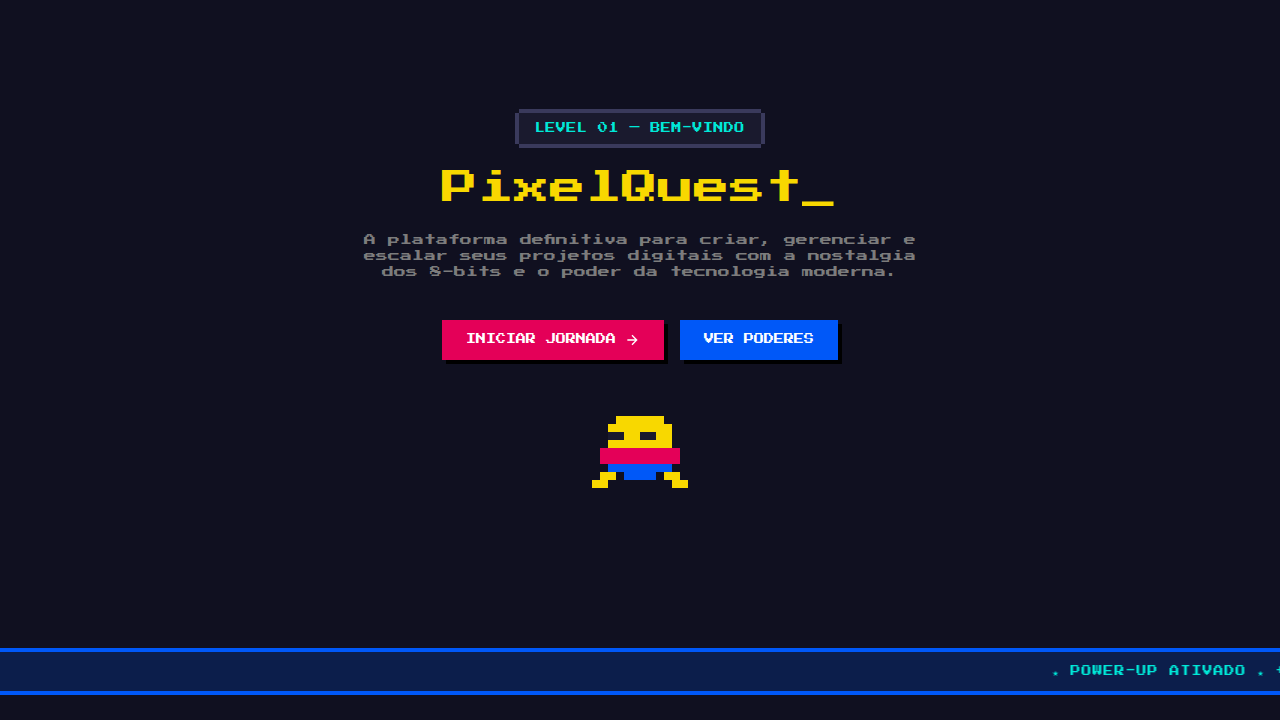
Pixel art inspired interface. Ideal for landing pages, saas. AI-ready template.
Use case: Landing pages, SaaS
Historical Context
Pixel art wasn't a choice — it was a constraint. When the Famicom pushed 52 colors and a 256×240 grid, artists had no option but to make every single pixel count. That limitation bred a visual language so potent it outlived the hardware by decades. The aesthetic became shorthand for craft, for intentionality, for giving a damn about each dot on screen. Then came the indie renaissance. Celeste proved pixel art could carry emotional weight that rivals any AAA cinematic. Undertale turned 8-bit faces into characters people genuinely mourned. These weren't nostalgic throwbacks — they were designers choosing constraint as a creative amplifier. The grid became a feature, not a bug. On the web, pixel art found a second life. Developer portfolios lean into it for personality. NFT projects adopted it because the aesthetic scales from 16×16 to billboard without losing identity. Brands wanting to signal playfulness without infantilism reach for those chunky squares. The pixel grid is honest — what you see is literally what you get, no anti-aliasing to hide behind.
When to Use
Reach for pixel art when your project needs personality that punches above its resolution. Indie games, obviously — but also developer portfolios that want to signal craft over corporate polish. Retro brands channeling arcade nostalgia without irony. NFT collections where scalability and recognizability at tiny sizes matter. It works when you want warmth and approachability but refuse to be cute about it. Skip it for anything requiring photorealism, luxury positioning, or contexts where your audience won't recognize the reference.
Design Principles
- Honor the grid — every element snaps to pixel boundaries. No half-pixels, no sub-pixel rendering. The constraint is the point.
- Limited palettes create cohesion. Pick 4–16 colors max and commit. Restriction forces better color relationships than any gradient ever could.
- Animation is frame-by-frame, not tweened. Two or three well-chosen frames communicate more than sixty smooth ones. Smear frames are your friend.
- Scale uniformly — 2x, 3x, 4x. Never fractional. Use nearest-neighbor interpolation or the crispness dies. image-rendering: pixelated is non-negotiable on web.
- Readability at native resolution first. If your sprite doesn't read at 1x, no amount of scaling saves it. Design at the smallest size, then zoom out to check.
DESIGN.md
---
version: "alpha"
name: "Pixel Art"
description: "Pixel art inspired interface. Ideal for landing pages, saas. AI-ready template."
colors:
  primary: "#1A1A1A"
  secondary: "#4A4A4A"
  tertiary: "#0066FF"
  neutral: "#FFFFFF"
typography:
  h1:
    fontFamily: Press Start 2P
    fontSize: 2.5rem
    fontWeight: 700
  body-md:
    fontFamily: Press Start 2P
    fontSize: 1rem
    fontWeight: 400
---

## Overview

Pixel art inspired interface. Ideal for landing pages, saas. AI-ready template. Pixel art wasn't a choice — it was a constraint. When the Famicom pushed 52 colors and a 256×240 grid, artists had no option but to make every single pixel count. That limitation bred a visual language so potent it outlived the hardware by decades. The aesthetic became shorthand for craft, for intentionality, for giving a damn about each dot on screen.

Then came the indie renaissance. Celeste proved pixel art could carry emotional weight that rivals any AAA cinematic. Undertale turned 8-bit faces into characters people genuinely mourned. These weren't nostalgic throwbacks — they were designers choosing constraint as a creative amplifier. The grid became a feature, not a bug.

On the web, pixel art found a second life. Developer portfolios lean into it for personality. NFT projects adopted it because the aesthetic scales from 16×16 to billboard without losing identity. Brands wanting to signal playfulness without infantilism reach for those chunky squares. The pixel grid is honest — what you see is literally what you get, no anti-aliasing to hide behind.

- Density: 5/10 — Balanced
- Variance: 7/10 — Dynamic
- Motion: 6/10 — Expressive

- **Style:** Pixelated, Retro, Colorful, Nostalgic
- **Keywords:** Retro, 8-bit, 16-bit, gaming, blocky, nostalgic, pixelated, arcade
- **Era:** 1980s Arcade
- **Light/Dark:** ✓ Full / ✓ Full

## Colors

- Palette derived from style keywords and era context


## Typography

- **Display / Hero:** Press Start 2P — Weight 700, tight tracking, used for headline impact
- **Body:** Press Start 2P — Weight 400, 16px/1.6 line-height, max 72ch per line
- **UI Labels / Captions:** Press Start 2P — 0.875rem, weight 500, slight letter-spacing
- **Monospace:** JetBrains Mono — Used for code, metadata, and technical values

Scale:
- Hero: clamp(2.5rem, 5vw, 4rem)
- H1: 2.25rem
- H2: 1.5rem
- Body: 1rem / 1.6
- Small: 0.875rem


## Layout

- **Grid:** CSS Grid primary. Max-width containment: 1280px centered with 1.5rem side padding.
- **Spacing rhythm:** Balanced. Base unit: 0.5rem (8px).
- **Section vertical gaps:** clamp(4rem, 8vw, 8rem).
- **Hero layout:** Asymmetric composition.
- **Feature sections:** Asymmetric grid with varied card sizes. No 3-equal-columns.
- **Mobile collapse:** All multi-column layouts collapse below 768px. No horizontal overflow.
- **z-index contract:** base (0) / sticky-nav (100) / overlay (200) / modal (300) / toast (500).


## Elevation & Depth

Frame-by-frame sprite animation, blinking cursor, instant transitions, marquee text

- **Physics:** Spring — stiffness 120, damping 20. Confident, weighted transitions.
- **Entry animations:** Fade + translate-Y (16px → 0) over 480ms ease-out. Staggered cascades for lists: 100ms between items.
- **Hover states:** Scale(1.03) + shadow lift over 200ms.
- **Page transitions:** Fade + slide (300ms).
- **Performance:** Only transform and opacity animated. No layout-triggering properties.


## Shapes

Base corner radius: 8px. See rounded tokens in front matter for the full scale.


## Components

- **Primary Button:** Subtly rounded (0.5rem) shape. Accent color fill. Hover: 8% darken + subtle lift shadow. Active: -1px translate tactile press. Font weight 600. No outer glows.
- **Secondary / Ghost Button:** Outline variant. 1.5px border in muted color. Text in primary color. Hover: subtle background fill.
- **Cards:** Subtly rounded (0.5rem) corners. Surface background. Subtle shadow (0 2px 12px rgba(0,0,0,0.06)). 1px border stroke.
- **Inputs:** Label above input. 1px border stroke. Focus ring: 2px accent color offset 2px. Error text below in semantic red. No floating labels.
- **Navigation:** Primary surface background. Active item: accent color indicator. Font weight 500 when active.
- **Skeletons:** Shimmer animation matching component dimensions. No circular spinners.
- **Empty States:** Icon-based composition with descriptive text and action button.


## Do's and Don'ts

- No emojis in UI — use icon system only (Lucide, Heroicons)
- No pure black (#000000) — use off-black or charcoal variants
- No oversaturated accent colors (saturation cap: 80%)
- No 3-column equal-width feature layouts — use zig-zag or asymmetric grid
- No `h-screen` — use `min-h-[100dvh]`
- No AI copywriting clichés: "Elevate", "Seamless", "Unleash", "Next-Gen"
- No broken external image links — use picsum.photos or inline SVG
- No generic lorem ipsum in demos

- Do Pixelated fonts loaded
- Do Images sharp (no blur)
- Do CSS box-shadow for pixel borders
- Do Retro palette
- Do Blocky layout


## Use Case

Landing pages, SaaS
Technical Specs
CSS
font-family: 'Press Start 2P', image-rendering: pixelated, box-shadow: 4px 0 0 #000 (pixel border), no anti-aliasing
Variables
--pixel-size: 4px, --font: pixel font, --border-style: pixel-shadow, --anti-alias: none
Checklist
☐ Pixelated fonts loaded, ☐ Images sharp (no blur), ☐ CSS box-shadow for pixel borders, ☐ Retro palette, ☐ Blocky layout
Colors
Effects
Frame-by-frame sprite animation, blinking cursor, instant transitions, marquee text
Light/Dark
✓ Full / ✓ Full
AI Prompt
Act as a Senior Frontend Engineer and Expert UI Designer.
Your task is to code a complete Landing Page on the first attempt.
- Landing Page Theme: <INSERT THEME>
- Sections to add: <INSERT SECTIONS>

Generate the final code immediately following these definitions:

## Style

- **Name:** Pixel Art
- **Type:** Pixelated, Retro, Colorful, Nostalgic
- **Keywords:** Retro, 8-bit, 16-bit, gaming, blocky, nostalgic, pixelated, arcade
- **Era:** 1980s Arcade
- **Light/Dark:** ✓ Full / ✓ Full

## Color Palette

- **Primary:** Primary colors (NES Palette), brights, limited palette
- **Secondary:** Black outlines, shading via dithering or block colors

## Visual Effects

Frame-by-frame sprite animation, blinking cursor, instant transitions, marquee text

## AI Visual Direction

Design a pixel art inspired interface. Use: pixelated fonts, 8-bit or 16-bit aesthetic, sharp edges (image-rendering: pixelated), limited color palette, blocky UI elements, retro gaming feel.

## CSS Technical

```css
font-family: 'Press Start 2P', image-rendering: pixelated, box-shadow: 4px 0 0 #000 (pixel border), no anti-aliasing
```

## Design System Variables

```css
--pixel-size: 4px, --font: pixel font, --border-style: pixel-shadow, --anti-alias: none
```

## Implementation Checklist

- ☐ Pixelated fonts loaded
- ☐ Images sharp (no blur)
- ☐ CSS box-shadow for pixel borders
- ☐ Retro palette
- ☐ Blocky layout

## Execution Rules

1. Strictly follow the defined visual style.
2. Use high-quality inline SVG icons (Heroicons or Lucide style) — NEVER use emojis as icons.
3. Add `cursor-pointer` and smooth `hover` states (transition-all) on all interactive elements.
4. Required Page Structure:
   - Navbar (Logo + Links + CTA)
   - Hero Section (Impactful Headline + Subtitle + 2 buttons + 3D/Abstract visual element via CSS)
   - Features (3 cards with icons)
   - Testimonials (3 cards)
   - Pricing (3 tiers, highlight the middle one)
   - Final CTA
   - Full Footer with social links, privacy policy, terms of use, contact and SEO links.
5. All text content must be in English.
6. The visual must be CLEARLY distinct — do not create a "default Bootstrap" design. Force the use of the provided design system variables.
7. Use `<style>` tags in the head for custom classes (especially for complex backdrop-filter effects and animations) that Tailwind CDN doesn't cover.
8. Full Responsiveness: Layout must adapt perfectly to Mobile, Tablet and Desktop (vertical stack on mobile).
9. Include basic SEO, Viewport and Open Graph meta tags in `<head>`.
10. Footer must contain: Copyright 2026, Secondary navigation links and Social media icons.
11. Make the creative decisions needed to deliver the complete, functional result now.
Related
Last synced: 4/1/2026