Pastel Geometry
Friendly, organized, modern landing page with pastel geometry. Ideal for apps de produtividade, educational platforms, saas friendly, health apps. AI-ready template.
Use case: Apps de produtividade, Educational platforms, SaaS friendly, Health apps
Historical Context
Pastel geometry didn't emerge from nowhere — it's the logical endpoint of two parallel movements colliding. On one side, you had the flat design revolution of 2012-2014 stripping interfaces down to pure color and shape. On the other, the wellness industry was quietly rejecting the clinical whites and sterile blues of healthcare UI, reaching instead for warmth. The merger happened around 2018 when apps like Calm and Headspace proved that soft color palettes could carry serious product experiences without feeling childish. What makes this system interesting is its deliberate rejection of edge. Where material design gave us shadows and depth, pastel geometry insists on flatness as a philosophical stance — nothing here demands attention aggressively. The rounded pills and blob shapes aren't decorative; they're functional signals that say 'this space is safe, slow down.' It borrows from Scandinavian product design's obsession with approachable form, translated into pixels. The geometry part matters more than people think. Without structural rigor — consistent radii, mathematical spacing, repeating shape languages — pastels collapse into nursery aesthetics. The geometry is what gives it adult credibility.
When to Use
Reach for this when your product needs to feel approachable without being patronizing. Wellness apps, meditation tools, period trackers, journaling products — anything where the user arrives slightly vulnerable and needs the interface to feel like a warm room rather than a control panel. It works beautifully for lifestyle brands selling candles, skincare, or supplements where the packaging aesthetic needs to extend into digital. Avoid it for anything requiring urgency, authority, or dense data. This system breathes slowly by design.
Design Principles
- Maintain consistent border-radius ratios across all elements — pills and rounded rectangles should share a mathematical relationship, not arbitrary softness
- Limit your palette to 3-4 pastels maximum with one grounding neutral; more than that and you're making confetti, not a system
- Whitespace is structural, not leftover — every element needs room to breathe or the softness becomes claustrophobic
- Typography should contrast the roundness: use geometric sans-serifs with clean cuts to prevent the whole composition from melting into itself
- Flat means flat — resist the temptation to add subtle gradients or micro-shadows; commit to the constraint and let color do the hierarchy work
DESIGN.md
---
version: "alpha"
name: "Pastel Geometry"
description: "Friendly, organized, modern landing page with pastel geometry. Ideal for apps de produtividade, educational platforms, saas friendly, health apps. AI-ready template."
colors:
primary: "#c8d9e6"
secondary: "#faf9f7"
tertiary: "#1a1a1a"
neutral: "#f0b4d4"
surface: "#a8d4c4"
accent: "#5a7c6a"
typography:
h1:
fontFamily: Plus Jakarta Sans
fontSize: 2.5rem
fontWeight: 700
body-md:
fontFamily: Plus Jakarta Sans
fontSize: 1rem
fontWeight: 400
rounded:
sm: 24px
md: 48px
lg: 72px
components:
button-primary:
backgroundColor: "{colors.primary}"
textColor: "{colors.neutral}"
rounded: "{rounded.sm}"
padding: 12px
---
## Overview
Friendly, organized, modern landing page with pastel geometry. Ideal for apps de produtividade, educational platforms, saas friendly, health apps. AI-ready template. Pastel geometry didn't emerge from nowhere — it's the logical endpoint of two parallel movements colliding. On one side, you had the flat design revolution of 2012-2014 stripping interfaces down to pure color and shape. On the other, the wellness industry was quietly rejecting the clinical whites and sterile blues of healthcare UI, reaching instead for warmth. The merger happened around 2018 when apps like Calm and Headspace proved that soft color palettes could carry serious product experiences without feeling childish.
What makes this system interesting is its deliberate rejection of edge. Where material design gave us shadows and depth, pastel geometry insists on flatness as a philosophical stance — nothing here demands attention aggressively. The rounded pills and blob shapes aren't decorative; they're functional signals that say 'this space is safe, slow down.' It borrows from Scandinavian product design's obsession with approachable form, translated into pixels.
The geometry part matters more than people think. Without structural rigor — consistent radii, mathematical spacing, repeating shape languages — pastels collapse into nursery aesthetics. The geometry is what gives it adult credibility.
- Density: 5/10 — Balanced
- Variance: 4/10 — Moderate
- Motion: 4/10 — Subtle
- **Style:** Friendly, Organized, Modern, Approachable
- **Keywords:** pastel, geometry, pills, vertical pills, Plus Jakarta Sans, friendly, organized, modern, approachable, soft shadow, rounded card
- **Era:** 2024-2026 Friendly Modern
- **Light/Dark:** ✓ Full / ✗ No
## Colors
- **Pastel Blue BG** (#c8d9e6) — Primary background surface
- **Card White** (#faf9f7) — Light surface, card backgrounds
- **Text Dark** (#1a1a1a) — Dark surface, primary background
- **Pill Pink** (#f0b4d4) — Primary text color
- **Pill Mint** (#a8d4c4) — Extended palette, decorative use
- **Pill Sage** (#5a7c6a) — Extended palette, decorative use
- **Pill Lavender** (#9b8dc4) — Extended palette, decorative use
- **Pill Violet** (#7c6aad) — Accent color, emphasis elements
## Typography
- **Display / Hero:** Plus Jakarta Sans — Weight 700, tight tracking, used for headline impact
- **Body:** Plus Jakarta Sans — Weight 400, 16px/1.6 line-height, max 72ch per line
- **UI Labels / Captions:** Plus Jakarta Sans — 0.875rem, weight 500, slight letter-spacing
- **Monospace:** JetBrains Mono — Used for code, metadata, and technical values
Scale:
- Hero: clamp(2.5rem, 5vw, 4rem)
- H1: 2.25rem
- H2: 1.5rem
- Body: 1rem / 1.6
- Small: 0.875rem
## Layout
- **Grid:** CSS Grid primary. Max-width containment: 1280px centered with 1.5rem side padding.
- **Spacing rhythm:** Balanced. Base unit: 0.5rem (8px).
- **Section vertical gaps:** clamp(4rem, 8vw, 8rem).
- **Hero layout:** Split-screen (text left, visual right).
- **Feature sections:** Zig-zag alternating text+image rows. No 3-equal-columns.
- **Mobile collapse:** All multi-column layouts collapse below 768px. No horizontal overflow.
- **z-index contract:** base (0) / sticky-nav (100) / overlay (200) / modal (300) / toast (500).
## Elevation & Depth
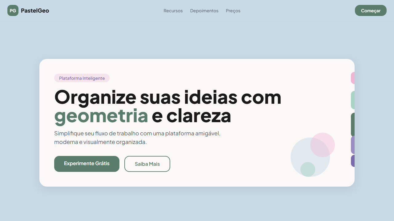
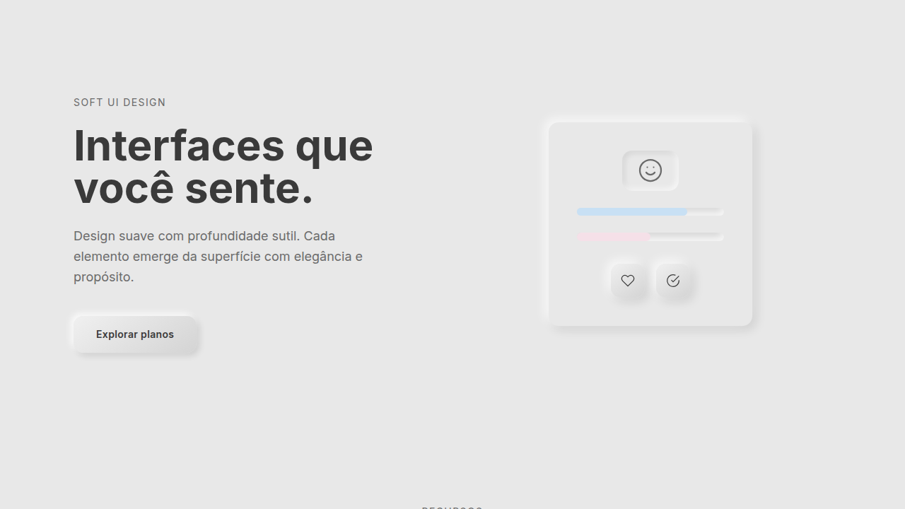
Rounded card with soft shadow, vertical pills on right edge with varying heights (short-medium-tall-medium-short), consistent pill width, download/action icon in corner, smooth hover 250ms
- **Physics:** Ease-out curves, 200-300ms duration. Smooth and predictable.
- **Entry animations:** Fade + translate-Y (16px → 0) over 420ms ease-out. Staggered cascades for lists: 80ms between items.
- **Hover states:** Subtle color shift + shadow adjustment over 200ms.
- **Page transitions:** Fade only (200ms).
- **Performance:** Only transform and opacity animated. No layout-triggering properties.
## Shapes
Base corner radius: 24px. See rounded tokens in front matter for the full scale.
## Components
- **Primary Button:** Pill-shaped (9999px) shape. Accent color fill. Hover: 8% darken + subtle lift shadow. Active: -1px translate tactile press. Font weight 600. No outer glows.
- **Secondary / Ghost Button:** Outline variant. 1.5px border in muted color. Text in primary color. Hover: subtle background fill.
- **Cards:** Pill-shaped (9999px) corners. Surface background. Subtle shadow (0 2px 12px rgba(0,0,0,0.06)). 1px border stroke.
- **Inputs:** Label above input. 1px border stroke. Focus ring: 2px accent color offset 2px. Error text below in semantic red. No floating labels.
- **Navigation:** Primary surface background. Active item: accent color indicator. Font weight 500 when active.
- **Skeletons:** Shimmer animation matching component dimensions. No circular spinners.
- **Empty States:** Icon-based composition with descriptive text and action button.
## Do's and Don'ts
- No emojis in UI — use icon system only (Lucide, Heroicons)
- No pure black (#000000) — use off-black or charcoal variants
- No oversaturated accent colors (saturation cap: 80%)
- No 3-column equal-width feature layouts — use zig-zag or asymmetric grid
- No `h-screen` — use `min-h-[100dvh]`
- No AI copywriting clichés: "Elevate", "Seamless", "Unleash", "Next-Gen"
- No broken external image links — use picsum.photos or inline SVG
- No generic lorem ipsum in demos
- Do Plus Jakarta Sans carregada
- Do Pastel blue background #c8d9e6
- Do White card com soft shadow
- Do Vertical pills na borda direita
- Do Pills com alturas variadas
- Do Cores pastel consistentes
- Do Responsivo mobile/tablet/desktop
## Use Case
Apps de produtividade, Educational platforms, SaaS friendly, Health apps
Technical Specs
CSS
font-family: 'Plus Jakarta Sans', background: #c8d9e6, .card { background: #faf9f7; border-radius: 24px; box-shadow: 0 8px 32px rgba(0,0,0,0.08) }, .pill { width: 24px; border-radius: 12px; position: absolute; right: -12px }, .pill-short { height: 40px }, .pill-medium { height: 60px }, .pill-tall { height: 80px } Variables
--bg-primary: #c8d9e6, --card-bg: #faf9f7, --pill-pink: #f0b4d4, --pill-mint: #a8d4c4, --pill-sage: #5a7c6a, --pill-lavender: #9b8dc4, --pill-violet: #7c6aad, --font-primary: 'Plus Jakarta Sans', --card-radius: 24px, --pill-width: 24px
Checklist
☐ Plus Jakarta Sans carregada, ☐ Pastel blue background #c8d9e6, ☐ White card com soft shadow, ☐ Vertical pills na borda direita, ☐ Pills com alturas variadas, ☐ Cores pastel consistentes, ☐ Responsivo mobile/tablet/desktop
Colors
Primary
Secondary
Effects
Rounded card with soft shadow, vertical pills on right edge with varying heights (short-medium-tall-medium-short), consistent pill width, download/action icon in corner, smooth hover 250ms
Light/Dark
✓ Full / ✗ No
AI Prompt
Act as a Senior Frontend Engineer and Expert UI Designer.
Your task is to code a complete Landing Page on the first attempt.
- Landing Page Theme: <INSERT THEME>
- Sections to add: <INSERT SECTIONS>

Generate the final code immediately following these definitions:

## Style

- **Name:** Pastel Geometry
- **Type:** Friendly, Organized, Modern, Approachable
- **Keywords:** pastel, geometry, pills, vertical pills, Plus Jakarta Sans, friendly, organized, modern, approachable, soft shadow, rounded card
- **Era:** 2024-2026 Friendly Modern
- **Light/Dark:** ✓ Full / ✗ No

## Color Palette

- **Primary:** Pastel Blue BG #c8d9e6, Card White #faf9f7, Text Dark #1a1a1a
- **Secondary:** Pill Pink #f0b4d4, Pill Mint #a8d4c4, Pill Sage #5a7c6a, Pill Lavender #9b8dc4, Pill Violet #7c6aad

## Visual Effects

Rounded card with soft shadow, vertical pills on right edge with varying heights (short-medium-tall-medium-short), consistent pill width, download/action icon in corner, smooth hover 250ms

## AI Visual Direction

Design a friendly, organized, modern landing page with pastel geometry. Use white card (#faf9f7) on pastel blue background (#c8d9e6). Add vertical pills on the right edge with varying heights (short → medium → tall → medium → short) in pink, mint, sage, lavender, violet. Use Plus Jakarta Sans (700/800 for display, 400/500 for body). Rounded card with soft shadow. Download/action icon in corner.

## CSS Technical

```css
font-family: 'Plus Jakarta Sans', background: #c8d9e6, .card { background: #faf9f7; border-radius: 24px; box-shadow: 0 8px 32px rgba(0,0,0,0.08) }, .pill { width: 24px; border-radius: 12px; position: absolute; right: -12px }, .pill-short { height: 40px }, .pill-medium { height: 60px }, .pill-tall { height: 80px }
```

## Design System Variables

```css
--bg-primary: #c8d9e6, --card-bg: #faf9f7, --pill-pink: #f0b4d4, --pill-mint: #a8d4c4, --pill-sage: #5a7c6a, --pill-lavender: #9b8dc4, --pill-violet: #7c6aad, --font-primary: 'Plus Jakarta Sans', --card-radius: 24px, --pill-width: 24px
```

## Implementation Checklist

- ☐ Plus Jakarta Sans carregada
- ☐ Pastel blue background #c8d9e6
- ☐ White card com soft shadow
- ☐ Vertical pills na borda direita
- ☐ Pills com alturas variadas
- ☐ Cores pastel consistentes
- ☐ Responsivo mobile/tablet/desktop

## Execution Rules

1. Strictly follow the defined visual style.
2. Use high-quality inline SVG icons (Heroicons or Lucide style) — NEVER use emojis as icons.
3. Add `cursor-pointer` and smooth `hover` states (transition-all) on all interactive elements.
4. Required Page Structure:
   - Navbar (Logo + Links + CTA)
   - Hero Section (Impactful Headline + Subtitle + 2 buttons + 3D/Abstract visual element via CSS)
   - Features (3 cards with icons)
   - Testimonials (3 cards)
   - Pricing (3 tiers, highlight the middle one)
   - Final CTA
   - Full Footer with social links, privacy policy, terms of use, contact and SEO links.
5. All text content must be in English.
6. The visual must be CLEARLY distinct — do not create a "default Bootstrap" design. Force the use of the provided design system variables.
7. Use `<style>` tags in the head for custom classes (especially for complex backdrop-filter effects and animations) that Tailwind CDN doesn't cover.
8. Full Responsiveness: Layout must adapt perfectly to Mobile, Tablet and Desktop (vertical stack on mobile).
9. Include basic SEO, Viewport and Open Graph meta tags in `<head>`.
10. Footer must contain: Copyright 2026, Secondary navigation links and Social media icons.
11. Make the creative decisions needed to deliver the complete, functional result now. Related
Last synced: 4/1/2026