Neumorphism
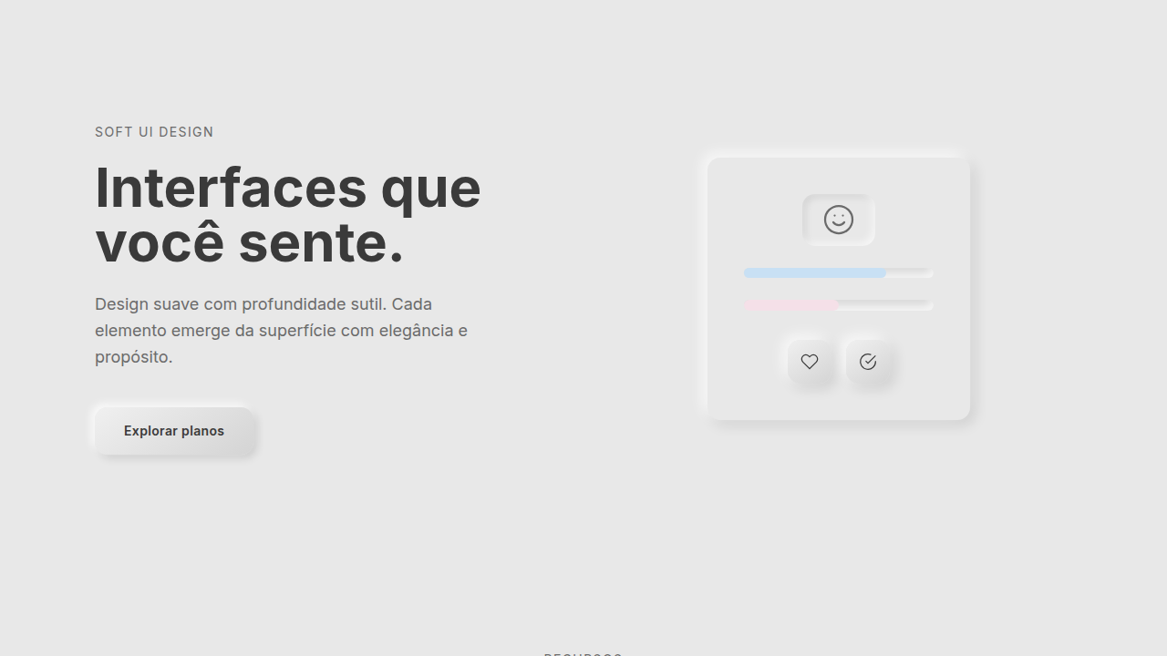
Neumorphic UI with soft 3D effects. Ideal for modern apps, dashboards, health/fitness, productivity. AI-ready template.
Use case: Modern apps, Dashboards, Health/Fitness, Productivity
Historical Context
It started with a single Dribbble shot. In late 2019, Ukrainian designer Alexander Plyuto posted a soft, pillowy UI concept that looked like buttons extruded from clay. The internet lost its mind. By early 2020, "neumorphism" was everywhere — every design blog, every Twitter thread, every junior designer's portfolio. The name itself (new + skeuomorphism) promised a middle ground between the dead realism of iOS 6 and the sterile flatness that replaced it. The backlash came fast. Accessibility experts pointed out the obvious: when your entire UI relies on subtle shadow differences against a same-color background, contrast ratios tank. Buttons become invisible to low-vision users. Interactive states blur into decoration. WCAG compliance? Good luck. Six years later, neumorphism occupies a weird niche. Nobody ships a full neumorphic interface anymore — that experiment failed. But the technique survived as an accent. A toggle here, a card there, a dashboard widget that needs to feel tactile. It works best in controlled doses, on personal projects or internal tools where you control the audience. The hype died. The aesthetic didn't.
When to Use
Neumorphism works for low-density interfaces where each element has breathing room — think fitness trackers, meditation apps, smart home controls, single-purpose dashboards. It's great when you want physicality without literal textures. Don't use it for text-heavy interfaces, complex forms, or anything requiring clear visual hierarchy at a glance. The contrast problem is real and unsolved — if your users include anyone with even mild visual impairment, neumorphism will fail them. Never use it for primary navigation or critical actions where discoverability matters more than aesthetics.
Design Principles
- Single light source, always. Pick top-left or top-right and commit. Mixed lighting kills the illusion instantly and makes the UI look broken rather than intentional.
- Background and element colors must share the same hue. Neumorphism only works when shadows create the depth — introduce color contrast between surface and element and you've just made a regular card with weird shadows.
- Pair every neumorphic element with a non-shadow affordance. A label, an icon, a color accent — something that communicates interactivity even if the shadows disappeared. This is your accessibility escape hatch.
- Keep shadow distances tight (4-8px) and blurs generous (12-20px). Harsh shadows break the soft illusion. You want the viewer to feel depth, not see edges.
- Reserve pressed/concave states for active selections only. If everything looks pushed in, nothing looks pushed in. The convex-to-concave transition is your most powerful feedback tool — don't waste it on hover.
DESIGN.md
---
version: "alpha"
name: "Neumorphism"
description: "Neumorphic UI with soft 3D effects. Ideal for modern apps, dashboards, health/fitness, productivity. AI-ready template."
colors:
  primary: "#C8E0F4"
  secondary: "#F5E0E8"
  tertiary: "#E8E8E8"

typography:
  h1:
    fontFamily: -apple-system, sans-serif
    fontSize: 2.25rem
    fontWeight: 700
  body-md:
    fontFamily: -apple-system, sans-serif
    fontSize: 1rem
    fontWeight: 400
  label-caps:
    fontFamily: -apple-system, sans-serif
    fontSize: 0.75rem
    fontWeight: 500
rounded:
  sm: 14px
  md: 28px
  lg: 42px
components:
  button-primary:
    backgroundColor: "{colors.primary}"
    rounded: "{rounded.sm}"
    padding: 12px
---

## Overview

Neumorphic UI with soft 3D effects. Ideal for modern apps, dashboards, health/fitness, productivity. AI-ready template. It started with a single Dribbble shot. In late 2019, Ukrainian designer Alexander Plyuto posted a soft, pillowy UI concept that looked like buttons extruded from clay. The internet lost its mind. By early 2020, "neumorphism" was everywhere — every design blog, every Twitter thread, every junior designer's portfolio. The name itself (new + skeuomorphism) promised a middle ground between the dead realism of iOS 6 and the sterile flatness that replaced it.

The backlash came fast. Accessibility experts pointed out the obvious: when your entire UI relies on subtle shadow differences against a same-color background, contrast ratios tank. Buttons become invisible to low-vision users. Interactive states blur into decoration. WCAG compliance? Good luck.

Six years later, neumorphism occupies a weird niche. Nobody ships a full neumorphic interface anymore — that experiment failed. But the technique survived as an accent. A toggle here, a card there, a dashboard widget that needs to feel tactile. It works best in controlled doses, on personal projects or internal tools where you control the audience. The hype died. The aesthetic didn't.

- Density: 5/10 — Balanced
- Variance: 4/10 — Moderate
- Motion: 4/10 — Subtle

- **Style:** Soft, Embossed, Monochromatic, Rounded
- **Keywords:** Soft UI, embossed, debossed, convex, concave, light source, subtle depth, rounded (12-16px), monochromatic
- **Era:** 2020s Modern
- **Light/Dark:** ✓ Full / ◐ Partial

## Colors

- **Soft Blue** (#C8E0F4) — Accent highlight, links and focus states
- **Soft Pink** (#F5E0E8) — Primary text color
- **Soft Grey** (#E8E8E8) — Secondary text, borders, muted elements


## Typography

- **Display / Hero:** System UI stack (-apple-system, sans-serif) — Weight 700, tight tracking, used for headline impact
- **Body:** System UI stack (-apple-system, sans-serif) — Weight 400, 16px/1.6 line-height, max 72ch per line
- **UI Labels / Captions:** System UI stack (-apple-system, sans-serif) — 0.875rem, weight 500, slight letter-spacing
- **Monospace:** JetBrains Mono — Used for code, metadata, and technical values

Scale:
- Hero: clamp(2.5rem, 5vw, 4rem)
- H1: 2.25rem
- H2: 1.5rem
- Body: 1rem / 1.6
- Small: 0.875rem


## Layout

- **Grid:** CSS Grid primary. Max-width containment: 1280px centered with 1.5rem side padding.
- **Spacing rhythm:** Balanced. Base unit: 0.5rem (8px).
- **Section vertical gaps:** clamp(4rem, 8vw, 8rem).
- **Hero layout:** Split-screen (text left, visual right).
- **Feature sections:** Zig-zag alternating text+image rows. No 3-equal-columns.
- **Mobile collapse:** All multi-column layouts collapse below 768px. No horizontal overflow.
- **z-index contract:** base (0) / sticky-nav (100) / overlay (200) / modal (300) / toast (500).


## Elevation & Depth

Soft box-shadow (multiple: -5px -5px 15px, 5px 5px 15px), smooth press (150ms), inner subtle shadow

- **Physics:** Ease-out curves, 200-300ms duration. Smooth and predictable.
- **Entry animations:** Fade + translate-Y (16px → 0) over 420ms ease-out. Staggered cascades for lists: 80ms between items.
- **Hover states:** Subtle color shift + shadow adjustment over 200ms.
- **Page transitions:** Fade only (200ms).
- **Performance:** Only transform and opacity animated. No layout-triggering properties.


## Shapes

Base corner radius: 14px. See rounded tokens in front matter for the full scale.


## Components

- **Primary Button:** Rounded (14px) shape. Accent color fill. Hover: 8% darken + subtle lift shadow. Active: -1px translate tactile press. Font weight 600. No outer glows.
- **Secondary / Ghost Button:** Outline variant. 1.5px border in muted color. Text in primary color. Hover: subtle background fill.
- **Cards:** Rounded (14px) corners. Surface background. Subtle shadow (0 2px 12px rgba(0,0,0,0.06)). 1px border stroke.
- **Inputs:** Label above input. 1px border stroke. Focus ring: 2px accent color offset 2px. Error text below in semantic red. No floating labels.
- **Navigation:** Primary surface background. Active item: accent color indicator. Font weight 500 when active.
- **Skeletons:** Shimmer animation matching component dimensions. No circular spinners.
- **Empty States:** Icon-based composition with descriptive text and action button.


## Do's and Don'ts

- No emojis in UI — use icon system only (Lucide, Heroicons)
- No pure black (#000000) — use off-black or charcoal variants
- No oversaturated accent colors (saturation cap: 80%)
- No 3-column equal-width feature layouts — use zig-zag or asymmetric grid
- No `h-screen` — use `min-h-[100dvh]`
- No AI copywriting clichés: "Elevate", "Seamless", "Unleash", "Next-Gen"
- No broken external image links — use picsum.photos or inline SVG
- No generic lorem ipsum in demos

- Do Rounded corners 12-16px consistent
- Do Multiple shadow layers (2-3)
- Do Pastel color verified
- Do Monochromatic palette checked
- Do Press animation smooth 150ms


## Use Case

Modern apps, Dashboards, Health/Fitness, Productivity
Technical Specs
CSS
border-radius: 12-16px, box-shadow: -5px -5px 15px rgba(0,0,0,0.1), 5px 5px 15px rgba(255,255,255,0.8), background: linear-gradient(145deg, color1, color2), transform: scale on press
Variables
--border-radius: 14px, --shadow-soft-1: -5px -5px 15px, --shadow-soft-2: 5px 5px 15px, --color-light: #F5F5F5, --color-primary: single pastel
Checklist
☐ Rounded corners 12-16px consistent, ☐ Multiple shadow layers (2-3), ☐ Pastel color verified, ☐ Monochromatic palette checked, ☐ Press animation smooth 150ms
Colors
Primary
Effects
Soft box-shadow (multiple: -5px -5px 15px, 5px 5px 15px), smooth press (150ms), inner subtle shadow
Light/Dark
✓ Full / ◐ Partial
AI Prompt
Act as a Senior Frontend Engineer and Expert UI Designer.
Your task is to code a complete Landing Page on the first attempt.
- Landing Page Theme: <INSERT THEME>
- Sections to add: <INSERT SECTIONS>

Generate the final code immediately following these definitions:

## Style

- **Name:** Neumorphism
- **Type:** Soft, Embossed, Monochromatic, Rounded
- **Keywords:** Soft UI, embossed, debossed, convex, concave, light source, subtle depth, rounded (12-16px), monochromatic
- **Era:** 2020s Modern
- **Light/Dark:** ✓ Full / ◐ Partial

## Color Palette

- **Primary:** Light pastels: Soft Blue #C8E0F4, Soft Pink #F5E0E8, Soft Grey #E8E8E8
- **Secondary:** Tints/shades (±30%), gradient subtlety, color harmony

## Visual Effects

Soft box-shadow (multiple: -5px -5px 15px, 5px 5px 15px), smooth press (150ms), inner subtle shadow

## AI Visual Direction

Create a neumorphic UI with soft 3D effects. Use light pastels, rounded corners (12-16px), subtle soft shadows (multiple layers), no hard lines, monochromatic color scheme with light/dark variations. Embossed/debossed effect on interactive elements.

## CSS Technical

```css
border-radius: 12-16px, box-shadow: -5px -5px 15px rgba(0,0,0,0.1), 5px 5px 15px rgba(255,255,255,0.8), background: linear-gradient(145deg, color1, color2), transform: scale on press
```

## Design System Variables

```css
--border-radius: 14px, --shadow-soft-1: -5px -5px 15px, --shadow-soft-2: 5px 5px 15px, --color-light: #F5F5F5, --color-primary: single pastel
```

## Implementation Checklist

- ☐ Rounded corners 12-16px consistent
- ☐ Multiple shadow layers (2-3)
- ☐ Pastel color verified
- ☐ Monochromatic palette checked
- ☐ Press animation smooth 150ms

## Execution Rules

1. Strictly follow the defined visual style.
2. Use high-quality inline SVG icons (Heroicons or Lucide style) — NEVER use emojis as icons.
3. Add `cursor-pointer` and smooth `hover` states (transition-all) on all interactive elements.
4. Required Page Structure:
   - Navbar (Logo + Links + CTA)
   - Hero Section (Impactful Headline + Subtitle + 2 buttons + 3D/Abstract visual element via CSS)
   - Features (3 cards with icons)
   - Testimonials (3 cards)
   - Pricing (3 tiers, highlight the middle one)
   - Final CTA
   - Full Footer with social links, privacy policy, terms of use, contact and SEO links.
5. All text content must be in English.
6. The visual must be CLEARLY distinct — do not create a "default Bootstrap" design. Force the use of the provided design system variables.
7. Use `<style>` tags in the head for custom classes (especially for complex backdrop-filter effects and animations) that Tailwind CDN doesn't cover.
8. Full Responsiveness: Layout must adapt perfectly to Mobile, Tablet and Desktop (vertical stack on mobile).
9. Include basic SEO, Viewport and Open Graph meta tags in `<head>`.
10. Footer must contain: Copyright 2026, Secondary navigation links and Social media icons.
11. Make the creative decisions needed to deliver the complete, functional result now.
Related
Last synced: 4/1/2026