Micro-interactions
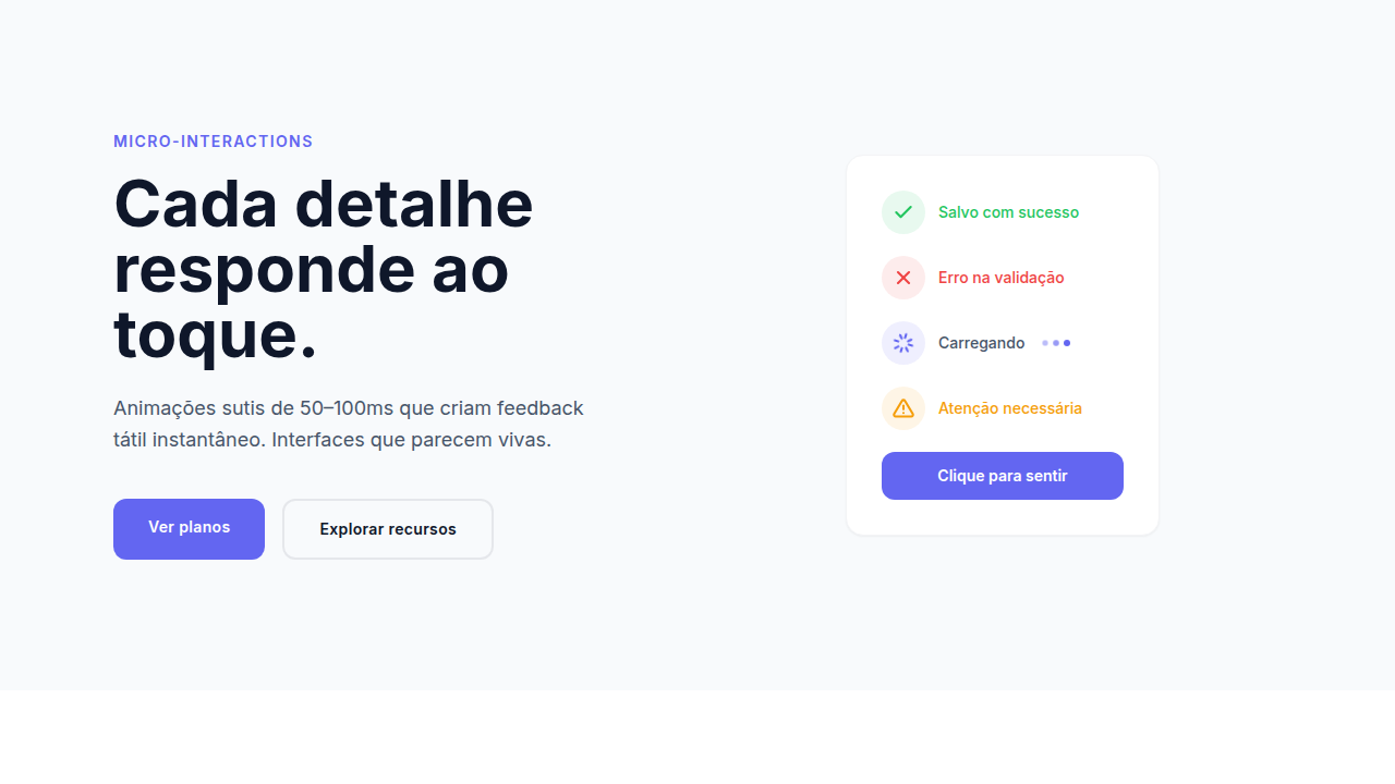
Design with delightful micro-interactions: small 50-100ms animations, gesture-based responses, tactile feedback, loading spinners, success/error states, subtle hover effects, haptic feedback triggers for mobile. Ideal for landing pages, saas. AI-ready template.
Use case: Landing pages, SaaS
Historical Context
Dan Saffer literally wrote the book on this in 2013. 'Microinteractions: Designing with Details' gave us the vocabulary — triggers, rules, feedback, loops. Before that, we were just calling them 'little animations' and hoping for the best. The framework mattered because it forced designers to think about *why* something moves, not just *how*. Then mobile happened. iOS 7's physics-based animations, Android's Material Motion — suddenly users expected every tap to respond, every swipe to feel weighted. The smartphone trained an entire generation to notice when feedback is missing. A button that doesn't acknowledge your press? Broken. A toggle that just snaps? Cheap. Here's the tension though: there's a razor-thin line between 'this feels alive' and 'this is wasting my time.' By 2026, the conversation has shifted from 'should we add microinteractions?' to 'how do we keep them from becoming noise?' Every design system ships them as primitives now. The debate isn't whether — it's how much.
When to Use
Add them where users need confirmation that something happened. Form submissions, state changes, destructive actions — moments of uncertainty. They earn their keep when they reduce cognitive load: a loading spinner tells you to wait, a checkmark tells you it worked, a shake tells you it didn't. Pull back when speed matters more than delight. Data-heavy dashboards, rapid-fire workflows, power-user tools — these contexts punish unnecessary motion. If your user repeats an action fifty times a day, that 300ms animation becomes a prison. Test with real usage patterns, not demo scenarios.
Design Principles
- Duration under 400ms or it stops feeling like feedback and starts feeling like a wait — 200-300ms is the sweet spot for most state transitions
- Match the interaction's importance to the animation's intensity — a toggle flip gets subtle easing, a successful payment gets celebration
- Never block user input during an animation — the interface should remain interactive even while transitioning, or you've traded delight for frustration
- Use consistent motion language across your system — if buttons scale down on press, all buttons scale down on press, no exceptions
- Design the unhappy path first — error states, failed loads, timeout recoveries need more attention than success states because that's where users actually need guidance
DESIGN.md
---
version: "alpha"
name: "Micro-interactions"
description: "Design with delightful micro-interactions: small 50-100ms animations, gesture-based responses, tactile feedback, loading spinners, success/error states, subtle hover effects, haptic feedback triggers for mobile. Ideal for landing pages, saas. AI-ready template."
colors:
  primary: "#22C55E"
  secondary: "#EF4444"
  tertiary: "#F59E0B"
typography:
  h1:
    fontFamily: System UI stack
    fontSize: 2.25rem
    fontWeight: 700
  body-md:
    fontFamily: System UI stack
    fontSize: 1rem
    fontWeight: 400
  label-caps:
    fontFamily: System UI stack
    fontSize: 0.75rem
    fontWeight: 500
components:
  button-primary:
    backgroundColor: "{colors.primary}"
    padding: 12px
---

## Overview

Design with delightful micro-interactions: small 50-100ms animations, gesture-based responses, tactile feedback, loading spinners, success/error states, subtle hover effects, haptic feedback triggers for mobile. Ideal for landing pages, saas. AI-ready template. Dan Saffer literally wrote the book on this in 2013. 'Microinteractions: Designing with Details' gave us the vocabulary — triggers, rules, feedback, loops. Before that, we were just calling them 'little animations' and hoping for the best. The framework mattered because it forced designers to think about *why* something moves, not just *how*.

Then mobile happened. iOS 7's physics-based animations, Android's Material Motion — suddenly users expected every tap to respond, every swipe to feel weighted. The smartphone trained an entire generation to notice when feedback is missing. A button that doesn't acknowledge your press? Broken. A toggle that just snaps? Cheap.

Here's the tension though: there's a razor-thin line between 'this feels alive' and 'this is wasting my time.' By 2026, the conversation has shifted from 'should we add microinteractions?' to 'how do we keep them from becoming noise?' Every design system ships them as primitives now. The debate isn't whether — it's how much.

- Density: 5/10 — Balanced
- Variance: 4/10 — Moderate
- Motion: 6/10 — Expressive

- **Style:** Interactive, Responsive, Subtle, Engaging
- **Keywords:** Small animations, gesture-based, tactile feedback, subtle animations, contextual interactions, responsive
- **Era:** 2020s Modern
- **Light/Dark:** ✓ Full / ✓ Full

## Colors

- **Green** (#22C55E) — Primary surface or dominant color
- **Red** (#EF4444) — Error states, destructive actions
- **Amber** (#F59E0B) — Warning states, attention indicators


## Typography

- **Display / Hero:** System UI stack (-apple-system, sans-serif) — Weight 700, tight tracking, used for headline impact
- **Body:** System UI stack (-apple-system, sans-serif) — Weight 400, 16px/1.6 line-height, max 72ch per line
- **UI Labels / Captions:** System UI stack (-apple-system, sans-serif) — 0.875rem, weight 500, slight letter-spacing
- **Monospace:** JetBrains Mono — Used for code, metadata, and technical values

Scale:
- Hero: clamp(2.5rem, 5vw, 4rem)
- H1: 2.25rem
- H2: 1.5rem
- Body: 1rem / 1.6
- Small: 0.875rem


## Layout

- **Grid:** CSS Grid primary. Max-width containment: 1280px centered with 1.5rem side padding.
- **Spacing rhythm:** Balanced. Base unit: 0.5rem (8px).
- **Section vertical gaps:** clamp(4rem, 8vw, 8rem).
- **Hero layout:** Split-screen (text left, visual right).
- **Feature sections:** Zig-zag alternating text+image rows. No 3-equal-columns.
- **Mobile collapse:** All multi-column layouts collapse below 768px. No horizontal overflow.
- **z-index contract:** base (0) / sticky-nav (100) / overlay (200) / modal (300) / toast (500).


## Elevation & Depth

Small hover (50-100ms), loading spinners, success/error state anim, gesture-triggered (swipe/pinch), haptic

- **Physics:** Spring — stiffness 120, damping 20. Confident, weighted transitions.
- **Entry animations:** Fade + translate-Y (16px → 0) over 480ms ease-out. Staggered cascades for lists: 100ms between items.
- **Hover states:** Scale(1.03) + shadow lift over 200ms.
- **Page transitions:** Fade + slide (300ms).
- **Performance:** Only transform and opacity animated. No layout-triggering properties.


## Shapes

Base corner radius: 12px. See rounded tokens in front matter for the full scale.


## Components

- **Primary Button:** Moderately rounded (0.75rem) shape. Accent color fill. Hover: 8% darken + subtle lift shadow. Active: -1px translate tactile press. Font weight 600. No outer glows.
- **Secondary / Ghost Button:** Outline variant. 1.5px border in muted color. Text in primary color. Hover: subtle background fill.
- **Cards:** Moderately rounded (0.75rem) corners. Surface background. Subtle shadow (0 2px 12px rgba(0,0,0,0.06)). 1px border stroke.
- **Inputs:** Label above input. 1px border stroke. Focus ring: 2px accent color offset 2px. Error text below in semantic red. No floating labels.
- **Navigation:** Primary surface background. Active item: accent color indicator. Font weight 500 when active.
- **Skeletons:** Shimmer animation matching component dimensions. No circular spinners.
- **Empty States:** Icon-based composition with descriptive text and action button.


## Do's and Don'ts

- No emojis in UI — use icon system only (Lucide, Heroicons)
- No pure black (#000000) — use off-black or charcoal variants
- No oversaturated accent colors (saturation cap: 80%)
- No 3-column equal-width feature layouts — use zig-zag or asymmetric grid
- No `h-screen` — use `min-h-[100dvh]`
- No AI copywriting clichés: "Elevate", "Seamless", "Unleash", "Next-Gen"
- No broken external image links — use picsum.photos or inline SVG
- No generic lorem ipsum in demos

- Do Micro-animations 50-100ms
- Do Gesture-responsive
- Do Tactile feedback visual/haptic
- Do Loading spinners smooth
- Do Success/error states clear
- Do Hover effects subtle


## Use Case

Landing pages, SaaS
Technical Specs
CSS
animation: short 50-100ms, transition: hover states, @media (hover: hover) for desktop, :active for press, haptic-feedback CSS/API, loading animation smooth loop
Variables
--micro-animation-duration: 50-100ms, --gesture-responsive: true, --haptic-feedback: true, --loading-animation: smooth, --state-feedback: success+error
Checklist
☐ Micro-animations 50-100ms, ☐ Gesture-responsive, ☐ Tactile feedback visual/haptic, ☐ Loading spinners smooth, ☐ Success/error states clear, ☐ Hover effects subtle
Colors
Primary
Effects
Small hover (50-100ms), loading spinners, success/error state anim, gesture-triggered (swipe/pinch), haptic
Light/Dark
✓ Full / ✓ Full
AI Prompt
Act as a Senior Frontend Engineer and Expert UI Designer.
Your task is to code a complete Landing Page on the first attempt.
- Landing Page Theme: <INSERT THEME>
- Sections to add: <INSERT SECTIONS>

Generate the final code immediately following these definitions:

## Style

- **Name:** Micro-interactions
- **Type:** Interactive, Responsive, Subtle, Engaging
- **Keywords:** Small animations, gesture-based, tactile feedback, subtle animations, contextual interactions, responsive
- **Era:** 2020s Modern
- **Light/Dark:** ✓ Full / ✓ Full

## Color Palette

- **Primary:** Subtle color shifts (10-20%), feedback: Green #22C55E, Red #EF4444, Amber #F59E0B
- **Secondary:** Accent feedback, neutral supporting, clear action indicators

## Visual Effects

Small hover (50-100ms), loading spinners, success/error state anim, gesture-triggered (swipe/pinch), haptic

## AI Visual Direction

Design with delightful micro-interactions: small 50-100ms animations, gesture-based responses, tactile feedback, loading spinners, success/error states, subtle hover effects, haptic feedback triggers for mobile. Focus on responsive, contextual interactions.

## CSS Technical

```css
animation: short 50-100ms, transition: hover states, @media (hover: hover) for desktop, :active for press, haptic-feedback CSS/API, loading animation smooth loop
```

## Design System Variables

```css
--micro-animation-duration: 50-100ms, --gesture-responsive: true, --haptic-feedback: true, --loading-animation: smooth, --state-feedback: success+error
```

## Implementation Checklist

- ☐ Micro-animations 50-100ms
- ☐ Gesture-responsive
- ☐ Tactile feedback visual/haptic
- ☐ Loading spinners smooth
- ☐ Success/error states clear
- ☐ Hover effects subtle

## Execution Rules

1. Strictly follow the defined visual style.
2. Use high-quality inline SVG icons (Heroicons or Lucide style) — NEVER use emojis as icons.
3. Add `cursor-pointer` and smooth `hover` states (transition-all) on all interactive elements.
4. Required Page Structure:
   - Navbar (Logo + Links + CTA)
   - Hero Section (Impactful Headline + Subtitle + 2 buttons + 3D/Abstract visual element via CSS)
   - Features (3 cards with icons)
   - Testimonials (3 cards)
   - Pricing (3 tiers, highlight the middle one)
   - Final CTA
   - Full Footer with social links, privacy policy, terms of use, contact and SEO links.
5. All text content must be in English.
6. The visual must be CLEARLY distinct — do not create a "default Bootstrap" design. Force the use of the provided design system variables.
7. Use `<style>` tags in the head for custom classes (especially for complex backdrop-filter effects and animations) that Tailwind CDN doesn't cover.
8. Full Responsiveness: Layout must adapt perfectly to Mobile, Tablet and Desktop (vertical stack on mobile).
9. Include basic SEO, Viewport and Open Graph meta tags in `<head>`.
10. Footer must contain: Copyright 2026, Secondary navigation links and Social media icons.
11. Make the creative decisions needed to deliver the complete, functional result now.
Related
Last synced: 4/1/2026