Kitsch
Kitsch landing page with intentionally bright, exaggerated, over-the-top aesthetics. Ideal for branding satírico, produtos de novidade, autocolantes, campanhas de marketing exageradas. AI-ready template.
Use case: Satirical branding, Novelty products, Stickers, Over-the-top marketing campaigns
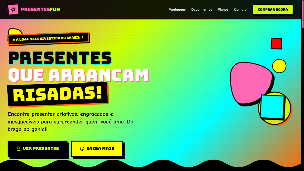
Historical Context
Kitsch never asked for permission. It crawled out of post-war consumer culture — cheap souvenirs, velvet paintings, plastic flamingos — everything the art establishment despised. The term itself carried German disdain for sentimental trash, but that's exactly what gave it power. By the time Susan Sontag wrote 'Notes on Camp' in 1964, the conversation shifted: what if bad taste, deployed with full awareness, becomes its own aesthetic statement? Suddenly the line between sincere and ironic collapsed entirely. The 1980s and 90s turned kitsch into a design weapon. Jeff Koons put balloon dogs in galleries. John Waters built an entire filmography on it. Memphis Group furniture made modernists physically uncomfortable. These weren't accidents — they were deliberate provocations against good taste as a gatekeeping mechanism. Kitsch said: your hierarchies are boring, and we're going to make something louder, cheaper-looking, and more memorable than anything in your approved canon. Today kitsch lives in brand identities that refuse subtlety, in maximalist web design that treats whitespace as cowardice, in the entire aesthetic vocabulary of internet irony. It's not retro nostalgia — it's an active rejection of the idea that restraint equals sophistication.
When to Use
Deploy kitsch when your project needs to signal self-awareness and cultural fluency simultaneously. It works for entertainment brands that thrive on excess, ironic product lines that wink at the audience, pop culture commentary that needs visual volume, and any context where sincerity and absurdity coexist without apology. Kitsch fails completely when used timidly — half-committed kitsch just looks like a mistake. You either crank every dial past ten or you pick a different direction entirely.
Design Principles
- Commit fully or don't bother — kitsch at 60% just looks like bad design with no alibi
- Clash colors with intention: hot pink against lime green isn't random, it's confrontational palette work that rejects harmony as a default
- Exaggerate proportions, borders, and ornamentation until the viewer understands this is a choice, not incompetence
- Layer cultural references shamelessly — mix decades, mix high and low, treat the mood board like a thrift store bin
- Maintain ironic distance through typography and copywriting: the visuals scream sincerity while the voice stays knowing
DESIGN.md
---
version: "alpha"
name: "Kitsch"
description: "Kitsch landing page with intentionally bright, exaggerated, over-the-top aesthetics. Ideal for branding satírico, produtos de novidade, autocolantes, campanhas de marketing exageradas. AI-ready template."
colors:
  primary: "#FF69B4"
  secondary: "#CCFF00"
  tertiary: "#FF6600"
  neutral: "#00FFFF"
  surface: "#FFFF00"
  accent: "#FF00FF"
typography:
  h1:
    fontFamily: Bungee
    fontSize: 2.5rem
    fontWeight: 700
  body-md:
    fontFamily: Bungee
    fontSize: 1rem
    fontWeight: 400
rounded:
  sm: 2px
  md: 4px
  lg: 8px
spacing:
  sm: 1.5rem
  md: 3.0rem
  lg: 6.0rem
components:
  button-primary:
    backgroundColor: "{colors.primary}"
    textColor: "{colors.neutral}"
    rounded: "{rounded.sm}"
    padding: 12px
---

## Overview

Kitsch landing page with intentionally bright, exaggerated, over-the-top aesthetics. Ideal for branding satírico, produtos de novidade, autocolantes, campanhas de marketing exageradas. AI-ready template. Kitsch never asked for permission. It crawled out of post-war consumer culture — cheap souvenirs, velvet paintings, plastic flamingos — everything the art establishment despised. The term itself carried German disdain for sentimental trash, but that's exactly what gave it power. By the time Susan Sontag wrote 'Notes on Camp' in 1964, the conversation shifted: what if bad taste, deployed with full awareness, becomes its own aesthetic statement? Suddenly the line between sincere and ironic collapsed entirely.

The 1980s and 90s turned kitsch into a design weapon. Jeff Koons put balloon dogs in galleries. John Waters built an entire filmography on it. Memphis Group furniture made modernists physically uncomfortable. These weren't accidents — they were deliberate provocations against good taste as a gatekeeping mechanism. Kitsch said: your hierarchies are boring, and we're going to make something louder, cheaper-looking, and more memorable than anything in your approved canon.

Today kitsch lives in brand identities that refuse subtlety, in maximalist web design that treats whitespace as cowardice, in the entire aesthetic vocabulary of internet irony. It's not retro nostalgia — it's an active rejection of the idea that restraint equals sophistication.

- Density: 5/10 — Balanced
- Variance: 7/10 — Dynamic
- Motion: 6/10 — Expressive

- **Style:** Bright, Exaggerated, Ironic, Pop-Culture
- **Keywords:** Kitsch, bright colors, exaggerated, pop culture, ironic, nostalgic, tacky-as-art, bold, campy, over-the-top
- **Era:** 1950s-Present Pop Culture
- **Light/Dark:** ✓ Full / ◐ Partial

## Colors

- **Hot Pink** (#FF69B4) — Primary text color
- **Electric Lime** (#CCFF00) — Secondary surface or text color
- **Bright Orange** (#FF6600) — Warm accent, call-to-action secondary
- **Vivid Cyan** (#00FFFF) — Accent highlight, links and focus states
- **Neon Yellow** (#FFFF00) — Warning states, attention indicators
- **Magenta** (#FF00FF) — Decorative accent, highlight elements
- **Bright Red** (#FF0000) — Error states, destructive actions
- **Royal Blue** (#4169E1) — Secondary accent


## Typography

- **Display / Hero:** Bungee — Weight 700, tight tracking, used for headline impact
- **Accent:** Comic Neue — Used for decorative or emphasis text
- **Body:** Bungee — Weight 400, 16px/1.6 line-height, max 72ch per line
- **UI Labels / Captions:** Bungee — 0.875rem, weight 500, slight letter-spacing
- **Monospace:** JetBrains Mono — Used for code, metadata, and technical values

Scale:
- Hero: clamp(2.5rem, 5vw, 4rem)
- H1: 2.25rem
- H2: 1.5rem
- Body: 1rem / 1.6
- Small: 0.875rem


## Layout

- **Grid:** CSS Grid primary. Max-width containment: 1280px centered with 1.5rem side padding.
- **Spacing rhythm:** Balanced. Base unit: 0.5rem (8px).
- **Section vertical gaps:** clamp(4rem, 8vw, 8rem).
- **Hero layout:** Asymmetric composition.
- **Feature sections:** Asymmetric grid with varied card sizes. No 3-equal-columns.
- **Mobile collapse:** All multi-column layouts collapse below 768px. No horizontal overflow.
- **z-index contract:** base (0) / sticky-nav (100) / overlay (200) / modal (300) / toast (500).


## Elevation & Depth

Clashing color combinations, exaggerated drop shadows (8px), bold thick borders (4px+), retro halftone dot patterns, pop-up/bounce animations, rotating decorative elements, intentionally 'tacky' gradient backgrounds

- **Physics:** Spring — stiffness 120, damping 20. Confident, weighted transitions.
- **Entry animations:** Fade + translate-Y (16px → 0) over 480ms ease-out. Staggered cascades for lists: 100ms between items.
- **Hover states:** Scale(1.03) + shadow lift over 200ms.
- **Page transitions:** Fade + slide (300ms).
- **Performance:** Only transform and opacity animated. No layout-triggering properties.


## Shapes

Base corner radius: 0px. See rounded tokens in front matter for the full scale.


## Components

- **Primary Button:** Sharp edges (0px) shape. Accent color fill. Hover: 8% darken + subtle lift shadow. Active: -1px translate tactile press. Font weight 600. No outer glows.
- **Secondary / Ghost Button:** Outline variant. 1.5px border in muted color. Text in primary color. Hover: subtle background fill.
- **Cards:** Sharp edges (0px) corners. Surface background. Subtle shadow (0 2px 12px rgba(0,0,0,0.06)). 1px border stroke.
- **Inputs:** Label above input. 1px border stroke. Focus ring: 2px accent color offset 2px. Error text below in semantic red. No floating labels.
- **Navigation:** Primary surface background. Active item: accent color indicator. Font weight 500 when active.
- **Skeletons:** Shimmer animation matching component dimensions. No circular spinners.
- **Empty States:** Icon-based composition with descriptive text and action button.


## Do's and Don'ts

- No emojis in UI — use icon system only (Lucide, Heroicons)
- No pure black (#000000) — use off-black or charcoal variants
- No oversaturated accent colors (saturation cap: 80%)
- No 3-column equal-width feature layouts — use zig-zag or asymmetric grid
- No `h-screen` — use `min-h-[100dvh]`
- No AI copywriting clichés: "Elevate", "Seamless", "Unleash", "Next-Gen"
- No broken external image links — use picsum.photos or inline SVG
- No generic lorem ipsum in demos

- Do Intentionally clashing bright colors
- Do Exaggerated shadows and borders
- Do Retro halftone patterns
- Do Bold varied typography
- Do Bounce/pop animations
- Do Over-the-top decorative elements
- Do Ironic campy atmosphere
- Do Responsive with maintained energy


## Use Case

Satirical branding, Novelty products, Stickers, Over-the-top marketing campaigns
Technical Specs
CSS
font-family: 'Bungee', 'Comic Neue', sans-serif, background: linear-gradient(45deg, #FF69B4, #CCFF00, #00FFFF), color: #FF0000 or #4169E1, border: 4px solid #FF6600, box-shadow: 8px 8px 0 #000, border-radius: 0px, transform: rotate(-3deg) on elements, animation: bounce 0.5s
Variables
--color-pink: #FF69B4, --color-lime: #CCFF00, --color-orange: #FF6600, --color-cyan: #00FFFF, --font-display: 'Bungee', --border: 4px solid, --shadow: 8px 8px 0 #000, --rotation: -3deg, --spacing: 1.5rem
Checklist
☐ Intentionally clashing bright colors, ☐ Exaggerated shadows and borders, ☐ Retro halftone patterns, ☐ Bold varied typography, ☐ Bounce/pop animations, ☐ Over-the-top decorative elements, ☐ Ironic campy atmosphere, ☐ Responsive with maintained energy
Colors
Primary
Secondary
Effects
Clashing color combinations, exaggerated drop shadows (8px), bold thick borders (4px+), retro halftone dot patterns, pop-up/bounce animations, rotating decorative elements, intentionally 'tacky' gradient backgrounds
Light/Dark
✓ Full / ◐ Partial
AI Prompt
Act as a Senior Frontend Engineer and Expert UI Designer.
Your task is to code a complete Landing Page on the first attempt.
- Landing Page Theme: <INSERT THEME>
- Sections to add: <INSERT SECTIONS>

Generate the final code immediately following these definitions:

## Style

- **Name:** Kitsch
- **Type:** Bright, Exaggerated, Ironic, Pop-Culture
- **Keywords:** Kitsch, bright colors, exaggerated, pop culture, ironic, nostalgic, tacky-as-art, bold, campy, over-the-top
- **Era:** 1950s-Present Pop Culture
- **Light/Dark:** ✓ Full / ◐ Partial

## Color Palette

- **Primary:** Hot Pink #FF69B4, Electric Lime #CCFF00, Bright Orange #FF6600, Vivid Cyan #00FFFF
- **Secondary:** Neon Yellow #FFFF00, Magenta #FF00FF, Bright Red #FF0000, Royal Blue #4169E1

## Visual Effects

Clashing color combinations, exaggerated drop shadows (8px), bold thick borders (4px+), retro halftone dot patterns, pop-up/bounce animations, rotating decorative elements, intentionally 'tacky' gradient backgrounds

## AI Visual Direction

Design a kitsch landing page with intentionally bright, exaggerated, over-the-top aesthetics. Use hot pink, electric lime, bright orange, vivid cyan — clashing on purpose. Apply bold thick borders, exaggerated drop shadows, retro halftone patterns, pop-up bounce animations. Typography should be bold, playful and varied. Ironic, campy, pop-culture-referencing atmosphere that celebrates tackiness as art.

## CSS Technical

```css
font-family: 'Bungee', 'Comic Neue', sans-serif, background: linear-gradient(45deg, #FF69B4, #CCFF00, #00FFFF), color: #FF0000 or #4169E1, border: 4px solid #FF6600, box-shadow: 8px 8px 0 #000, border-radius: 0px, transform: rotate(-3deg) on elements, animation: bounce 0.5s
```

## Design System Variables

```css
--color-pink: #FF69B4, --color-lime: #CCFF00, --color-orange: #FF6600, --color-cyan: #00FFFF, --font-display: 'Bungee', --border: 4px solid, --shadow: 8px 8px 0 #000, --rotation: -3deg, --spacing: 1.5rem
```

## Implementation Checklist

- ☐ Intentionally clashing bright colors
- ☐ Exaggerated shadows and borders
- ☐ Retro halftone patterns
- ☐ Bold varied typography
- ☐ Bounce/pop animations
- ☐ Over-the-top decorative elements
- ☐ Ironic campy atmosphere
- ☐ Responsive with maintained energy

## Execution Rules

1. Strictly follow the defined visual style.
2. Use high-quality inline SVG icons (Heroicons or Lucide style) — NEVER use emojis as icons.
3. Add `cursor-pointer` and smooth `hover` states (transition-all) on all interactive elements.
4. Required Page Structure:
   - Navbar (Logo + Links + CTA)
   - Hero Section (Impactful Headline + Subtitle + 2 buttons + 3D/Abstract visual element via CSS)
   - Features (3 cards with icons)
   - Testimonials (3 cards)
   - Pricing (3 tiers, highlight the middle one)
   - Final CTA
   - Full Footer with social links, privacy policy, terms of use, contact and SEO links.
5. All text content must be in English.
6. The visual must be CLEARLY distinct — do not create a "default Bootstrap" design. Force the use of the provided design system variables.
7. Use `<style>` tags in the head for custom classes (especially for complex backdrop-filter effects and animations) that Tailwind CDN doesn't cover.
8. Full Responsiveness: Layout must adapt perfectly to Mobile, Tablet and Desktop (vertical stack on mobile).
9. Include basic SEO, Viewport and Open Graph meta tags in `<head>`.
10. Footer must contain: Copyright 2026, Secondary navigation links and Social media icons.
11. Make the creative decisions needed to deliver the complete, functional result now.
Related
Last synced: 4/1/2026