Inclusive Design
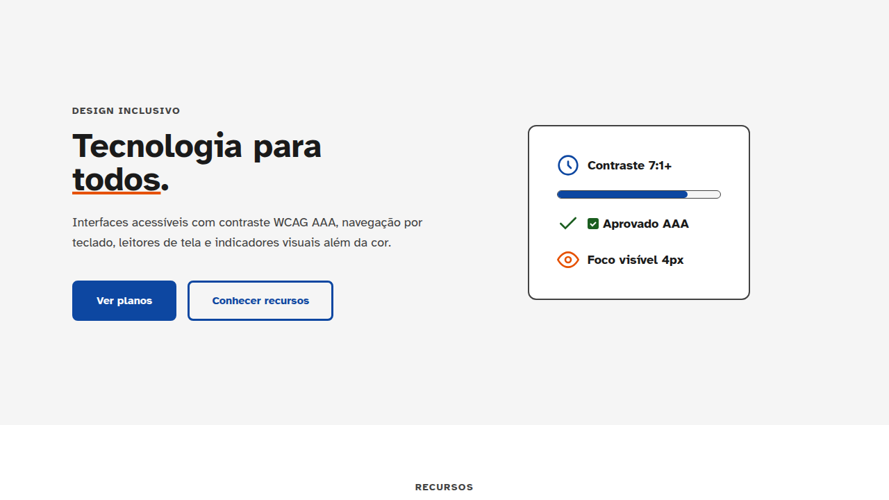
Design for universal accessibility: high contrast (7:1+), large text (16px+), keyboard-only navigation, screen reader optimization, WCAG AAA compliance, symbol-based color indicators (not color-only), haptic feedback, voice interaction support, reduced motion options. Ideal for landing pages, saas. AI-ready template.
Use case: Landing pages, SaaS
Historical Context
Microsoft's Inclusive Design toolkit, released around 2016, changed how our industry talked about disability. Instead of framing accessibility as a checklist you grudgingly complete before launch, it introduced the permanent-temporary-situational spectrum. A person with one arm, someone holding a baby, a developer with a broken wrist: same design problem. That reframe mattered. It gave designers permission to care about this stuff without needing a compliance officer breathing down their neck. Then came the lawsuits. Domino's Pizza. Beyoncé's website. Thousands of ADA cases filed every year. Companies started paying attention, but often for the wrong reasons. The curb-cut effect proved the business case anyway: captions help people in noisy rooms, high contrast helps everyone outdoors, keyboard navigation helps power users. Designing for the edges improves the center. By 2026, inclusive design isn't a differentiator. It's table stakes. If your component library doesn't ship with focus management, skip links, and reduced motion support baked in, you're shipping broken software. Full stop.
When to Use
Go beyond WCAG AA whenever your product touches people who didn't choose to use it. Government services, hospital check-in kiosks, school platforms, public transit apps. These aren't optional interactions. People can't switch to a competitor. The real cost of exclusion isn't a lawsuit (though that's coming too). It's a parent who can't enroll their kid in school. A patient who misses medication instructions. You build for the widest range of humans possible, or you build something that actively harms people. There's no neutral position here.
Design Principles
- Design for one-handed, one-eyed, and no-mouse interaction from the start, not as a retrofit. Every interactive element should be reachable and operable without assuming two hands, perfect vision, or a pointer device.
- Make focus visible and intentional. Custom focus rings should be at least 2px solid with 3:1 contrast against adjacent colors. Never remove outline without replacing it with something better.
- Respect user preferences as system-level contracts. prefers-reduced-motion, prefers-contrast, prefers-color-scheme are not suggestions. They're the user telling you what they need. Honor them by default in every component.
- Build information hierarchy through multiple channels simultaneously. Never rely on color alone, never rely on position alone, never rely on sound alone. Pair color with icons, pair position with labels, pair sound with haptic feedback.
- Ship ARIA patterns as tested primitives, not documentation suggestions. Your combobox, dialog, and tab components should implement APG patterns correctly so product teams never have to think about aria-activedescendant themselves.
DESIGN.md
---
version: "alpha"
name: "Inclusive Design"
description: "Design for universal accessibility: high contrast (7:1+), large text (16px+), keyboard-only navigation, screen reader optimization, WCAG AAA compliance, symbol-based color indicators (not color-only), haptic feedback, voice interaction support, reduced motion options. Ideal for landing pages, saas. AI-ready template."
colors:
  primary: "#1A1A1A"
  secondary: "#4A4A4A"
  tertiary: "#0066FF"
  neutral: "#FFFFFF"
typography:
  h1:
    fontFamily: System UI stack
    fontSize: 2.25rem
    fontWeight: 700
  body-md:
    fontFamily: System UI stack
    fontSize: 1rem
    fontWeight: 400
  label-caps:
    fontFamily: System UI stack
    fontSize: 0.75rem
    fontWeight: 500
---

## Overview

Design for universal accessibility: high contrast (7:1+), large text (16px+), keyboard-only navigation, screen reader optimization, WCAG AAA compliance, symbol-based color indicators (not color-only), haptic feedback, voice interaction support, reduced motion options. Ideal for landing pages, saas. AI-ready template. Microsoft's Inclusive Design toolkit, released around 2016, changed how our industry talked about disability. Instead of framing accessibility as a checklist you grudgingly complete before launch, it introduced the permanent-temporary-situational spectrum. A person with one arm, someone holding a baby, a developer with a broken wrist: same design problem. That reframe mattered. It gave designers permission to care about this stuff without needing a compliance officer breathing down their neck.

Then came the lawsuits. Domino's Pizza. Beyoncé's website. Thousands of ADA cases filed every year. Companies started paying attention, but often for the wrong reasons. The curb-cut effect proved the business case anyway: captions help people in noisy rooms, high contrast helps everyone outdoors, keyboard navigation helps power users. Designing for the edges improves the center.

By 2026, inclusive design isn't a differentiator. It's table stakes. If your component library doesn't ship with focus management, skip links, and reduced motion support baked in, you're shipping broken software. Full stop.

- Density: 5/10 — Balanced
- Variance: 4/10 — Moderate
- Motion: 6/10 — Expressive

- **Style:** Accessible, Inclusive, Clear, Universal
- **Keywords:** Accessible, color-blind friendly, high contrast, haptic feedback, voice interaction, screen reader, WCAG AAA, universal
- **Era:** Universal
- **Light/Dark:** ✓ Full / ✓ Full

## Colors

- Palette derived from style keywords and era context


## Typography

- **Display / Hero:** System UI stack (-apple-system, sans-serif) — Weight 700, tight tracking, used for headline impact
- **Body:** System UI stack (-apple-system, sans-serif) — Weight 400, 16px/1.6 line-height, max 72ch per line
- **UI Labels / Captions:** System UI stack (-apple-system, sans-serif) — 0.875rem, weight 500, slight letter-spacing
- **Monospace:** JetBrains Mono — Used for code, metadata, and technical values

Scale:
- Hero: clamp(2.5rem, 5vw, 4rem)
- H1: 2.25rem
- H2: 1.5rem
- Body: 1rem / 1.6
- Small: 0.875rem


## Layout

- **Grid:** CSS Grid primary. Max-width containment: 1280px centered with 1.5rem side padding.
- **Spacing rhythm:** Balanced. Base unit: 0.5rem (8px).
- **Section vertical gaps:** clamp(4rem, 8vw, 8rem).
- **Hero layout:** Split-screen (text left, visual right).
- **Feature sections:** Zig-zag alternating text+image rows. No 3-equal-columns.
- **Mobile collapse:** All multi-column layouts collapse below 768px. No horizontal overflow.
- **z-index contract:** base (0) / sticky-nav (100) / overlay (200) / modal (300) / toast (500).


## Elevation & Depth

Haptic feedback (vibration), voice guidance, focus indicators (4px+ ring), motion options, alt content, semantic

- **Physics:** Spring — stiffness 120, damping 20. Confident, weighted transitions.
- **Entry animations:** Fade + translate-Y (16px → 0) over 480ms ease-out. Staggered cascades for lists: 100ms between items.
- **Hover states:** Scale(1.03) + shadow lift over 200ms.
- **Page transitions:** Fade + slide (300ms).
- **Performance:** Only transform and opacity animated. No layout-triggering properties.


## Shapes

Base corner radius: 8px. See rounded tokens in front matter for the full scale.


## Components

- **Primary Button:** Subtly rounded (0.5rem) shape. Accent color fill. Hover: 8% darken + subtle lift shadow. Active: -1px translate tactile press. Font weight 600. No outer glows.
- **Secondary / Ghost Button:** Outline variant. 1.5px border in muted color. Text in primary color. Hover: subtle background fill.
- **Cards:** Subtly rounded (0.5rem) corners. Surface background. Subtle shadow (0 2px 12px rgba(0,0,0,0.06)). 1px border stroke.
- **Inputs:** Label above input. 1px border stroke. Focus ring: 2px accent color offset 2px. Error text below in semantic red. No floating labels.
- **Navigation:** Primary surface background. Active item: accent color indicator. Font weight 500 when active.
- **Skeletons:** Shimmer animation matching component dimensions. No circular spinners.
- **Empty States:** Icon-based composition with descriptive text and action button.


## Do's and Don'ts

- No emojis in UI — use icon system only (Lucide, Heroicons)
- No pure black (#000000) — use off-black or charcoal variants
- No oversaturated accent colors (saturation cap: 80%)
- No 3-column equal-width feature layouts — use zig-zag or asymmetric grid
- No `h-screen` — use `min-h-[100dvh]`
- No AI copywriting clichés: "Elevate", "Seamless", "Unleash", "Next-Gen"
- No broken external image links — use picsum.photos or inline SVG
- No generic lorem ipsum in demos

- Do WCAG AAA verified
- Do 7:1+ contrast all text
- Do Keyboard accessible (Tab/Enter)
- Do Screen reader tested
- Do Focus visible 3-4px
- Do No color-only indicators
- Do Haptic fallback


## Use Case

Landing pages, SaaS
Technical Specs
CSS
aria-* attributes complete, role attributes semantic, focus-visible: 3-4px ring, color-contrast: 7:1+, @media (prefers-reduced-motion), alt text on all images, form labels properly associated
Variables
--contrast-ratio: 7:1, --font-size: 16px+, --keyboard-accessible: true, --sr-compatible: true, --wcag-level: AAA, --color-symbols: true, --haptic: enabled
Checklist
☐ WCAG AAA verified, ☐ 7:1+ contrast all text, ☐ Keyboard accessible (Tab/Enter), ☐ Screen reader tested, ☐ Focus visible 3-4px, ☐ No color-only indicators, ☐ Haptic fallback
Colors
Effects
Haptic feedback (vibration), voice guidance, focus indicators (4px+ ring), motion options, alt content, semantic
Light/Dark
✓ Full / ✓ Full
AI Prompt
Act as a Senior Frontend Engineer and Expert UI Designer.
Your task is to code a complete Landing Page on the first attempt.
- Landing Page Theme: <INSERT THEME>
- Sections to add: <INSERT SECTIONS>

Generate the final code immediately following these definitions:

## Style

- **Name:** Inclusive Design
- **Type:** Accessible, Inclusive, Clear, Universal
- **Keywords:** Accessible, color-blind friendly, high contrast, haptic feedback, voice interaction, screen reader, WCAG AAA, universal
- **Era:** Universal
- **Light/Dark:** ✓ Full / ✓ Full

## Color Palette

- **Primary:** WCAG AAA (7:1+ contrast), avoid red-green only, symbol-based indicators, high contrast primary
- **Secondary:** Supporting patterns (stripes, dots, hatch), symbols, combinations, clear non-color indicators

## Visual Effects

Haptic feedback (vibration), voice guidance, focus indicators (4px+ ring), motion options, alt content, semantic

## AI Visual Direction

Design for universal accessibility: high contrast (7:1+), large text (16px+), keyboard-only navigation, screen reader optimization, WCAG AAA compliance, symbol-based color indicators (not color-only), haptic feedback, voice interaction support, reduced motion options.

## CSS Technical

```css
aria-* attributes complete, role attributes semantic, focus-visible: 3-4px ring, color-contrast: 7:1+, @media (prefers-reduced-motion), alt text on all images, form labels properly associated
```

## Design System Variables

```css
--contrast-ratio: 7:1, --font-size: 16px+, --keyboard-accessible: true, --sr-compatible: true, --wcag-level: AAA, --color-symbols: true, --haptic: enabled
```

## Implementation Checklist

- ☐ WCAG AAA verified
- ☐ 7:1+ contrast all text
- ☐ Keyboard accessible (Tab/Enter)
- ☐ Screen reader tested
- ☐ Focus visible 3-4px
- ☐ No color-only indicators
- ☐ Haptic fallback

## Execution Rules

1. Strictly follow the defined visual style.
2. Use high-quality inline SVG icons (Heroicons or Lucide style) — NEVER use emojis as icons.
3. Add `cursor-pointer` and smooth `hover` states (transition-all) on all interactive elements.
4. Required Page Structure:
   - Navbar (Logo + Links + CTA)
   - Hero Section (Impactful Headline + Subtitle + 2 buttons + 3D/Abstract visual element via CSS)
   - Features (3 cards with icons)
   - Testimonials (3 cards)
   - Pricing (3 tiers, highlight the middle one)
   - Final CTA
   - Full Footer with social links, privacy policy, terms of use, contact and SEO links.
5. All text content must be in English.
6. The visual must be CLEARLY distinct — do not create a "default Bootstrap" design. Force the use of the provided design system variables.
7. Use `<style>` tags in the head for custom classes (especially for complex backdrop-filter effects and animations) that Tailwind CDN doesn't cover.
8. Full Responsiveness: Layout must adapt perfectly to Mobile, Tablet and Desktop (vertical stack on mobile).
9. Include basic SEO, Viewport and Open Graph meta tags in `<head>`.
10. Footer must contain: Copyright 2026, Secondary navigation links and Social media icons.
11. Make the creative decisions needed to deliver the complete, functional result now.
Related
Last synced: 4/1/2026