E-Ink / Paper
Design an e-ink/paper style interface. Ideal for landing pages, saas. AI-ready template.
Use case: Landing pages, SaaS
Historical Context
E-ink changed how we think about screens. Not by adding pixels — by removing everything that made screens exhausting. When Amazon shipped the Kindle in 2007, it wasn't just a reading device. It was a quiet argument: maybe interfaces don't need to glow. The reMarkable tablet pushed this further. A $400 device that deliberately couldn't do most things. No color. No apps. No notifications. Just paper-like texture under a stylus. Designers noticed. If people were paying premium prices for *less*, something had shifted. By the early 2020s, digital well-being wasn't a niche concern — it was a design constraint. Screen Time reports made overuse visible. Grayscale mode became a wellness hack. And slowly, web designers started borrowing the vocabulary of paper: matte surfaces, generous whitespace, typography that breathes. Calm technology — Amber Case's term from 2015 — finally had a visual language. Not retro. Not skeuomorphic. Just... quiet. Interfaces that respect the reader's attention as a finite resource.
When to Use
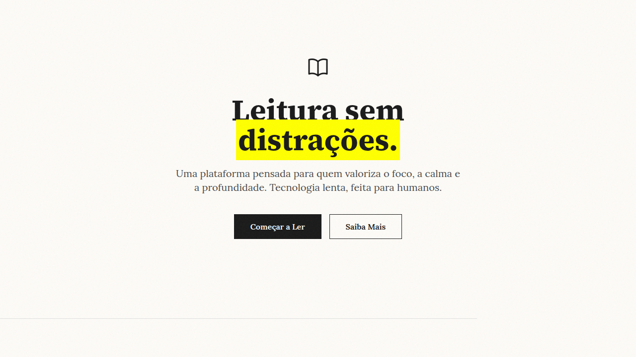
Reach for this when the content matters more than the container. Reading-heavy apps, documentation sites, note-taking tools, journaling interfaces — anywhere sustained attention is the goal. It works beautifully for digital well-being products that need to practice what they preach. Also strong for long-form editorial, knowledge bases, and any context where users spend 10+ minutes per session. Skip it for dashboards, e-commerce, or anything requiring quick scanning across many data points.
Design Principles
- Content is the interface — strip chrome until only the words remain. If a UI element doesn't serve the reader, it's noise.
- Matte over luminance — favor warm whites (#FAFAF8, not #FFFFFF), subtle texture, and backgrounds that don't compete with text. Screens should feel like paper, not lightboxes.
- Typographic hierarchy does the heavy lifting — with minimal color and no decorative elements, your type system must be impeccable. Size, weight, and spacing become your only tools. Use them precisely.
- Respect temporal attention — no autoplay, no infinite scroll traps, no engagement dark patterns. Design for sessions that end. Progress indicators, bookmarks, estimated read times.
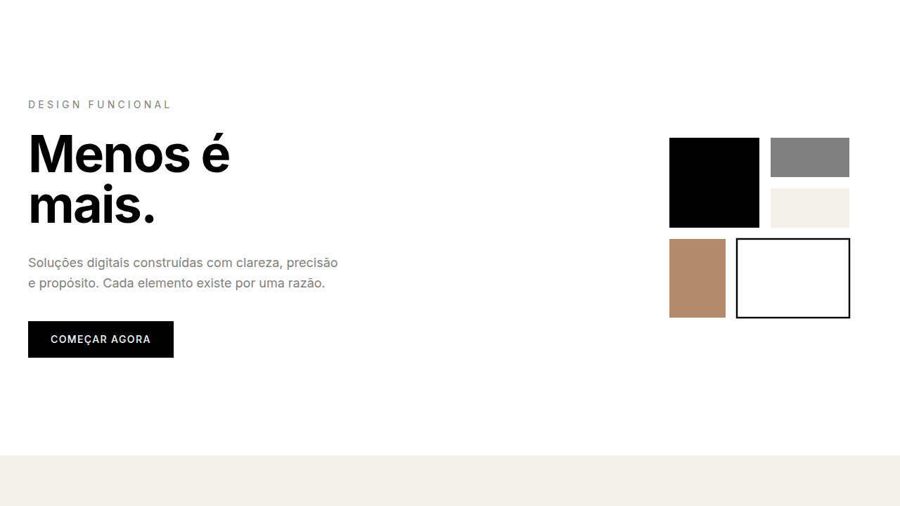
- High contrast where it counts — pare the palette to near-monochrome, then use contrast strategically. Black text on warm white. One accent color, used sparingly, only for actionable elements.
Technical Specs
Colors
Primary
Secondary
Effects
No motion blur, distinct page turns, grain/noise texture, sharp transitions (no fade)
Light/Dark
✓ Full / ✗ Low (inverted only)
Related
Last synced: 4/1/2026