Happy Art Tropical
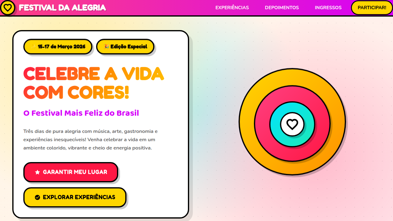
Happy Art tropical landing page with vibrant saturated colors. Ideal for landing pages, saas. AI-ready template.
Use case: Landing pages, SaaS
Historical Context
Brazil never learned to whisper with color. From the azulejo tiles of colonial Salvador to the hand-painted truck lettering on BR-101, visual excess isn't decoration — it's communication. The tropical happy art tradition pulls from this lineage directly: Carnival's sequined typography, the psychedelic album covers of Tropicália, the fruit-stand signage of São Paulo's Zona Cerealista. Color isn't applied; it's structural. When this sensibility hits digital interfaces, something interesting happens. The warmth doesn't flatten. Saturated magentas, papaya oranges, and guava pinks carry emotional weight that cooler palettes simply can't replicate. Brazilian designers have always understood that joy is a valid design objective — not frivolity, but a deliberate choice to make people feel welcomed before they read a single word. The movement owes as much to Hélio Oiticica's Parangolés as it does to contemporary street art in Beco do Batman. It's folk and future simultaneously. In UI terms: maximalism with purpose, density without chaos, celebration without apology.
When to Use
When the brief says 'energy' and means it. Brazilian brands that refuse the safe corporate blue. Tropical product lines — açaí, swimwear, cachaça — where the packaging already screams and the digital needs to match. Summer campaigns that should feel like stepping off an air-conditioned plane into humid heat. Lifestyle brands targeting younger Latin American audiences who read minimalism as coldness. Not for finance. Not for healthcare. For moments when restraint would be dishonest.
Design Principles
- Saturation is structural, not decorative — treat high-chroma color as load-bearing architecture, not garnish sprinkled on neutral layouts
- Rhythm over symmetry — syncopated spacing and uneven visual weight mirror samba's off-beat pulse; rigid grids kill the energy
- Layer without suffocating — overlap textures, illustrations, and type freely but maintain one clear breathing point per composition
- Warmth in every neutral — when you need rest areas, use cream, sand, and terracotta instead of clinical grays or pure whites
- Joy requires confidence — commit fully to the palette and density; half-measures read as amateur, not restrained
DESIGN.md
---
version: "alpha"
name: "Happy Art Tropical"
description: "Happy Art tropical landing page with vibrant saturated colors. Ideal for landing pages, saas. AI-ready template."
colors:
  primary: "#FF1744"
  secondary: "#FFD600"
  tertiary: "#00E5FF"
  neutral: "#FF4081"
  surface: "#76FF03"
  accent: "#FF9100"
typography:
  h1:
    fontFamily: Fredoka One
    fontSize: 2.5rem
    fontWeight: 700
  body-md:
    fontFamily: Fredoka One
    fontSize: 1rem
    fontWeight: 400
rounded:
  sm: 25px
  md: 50px
  lg: 75px
components:
  button-primary:
    backgroundColor: "{colors.primary}"
    textColor: "{colors.neutral}"
    rounded: "{rounded.sm}"
    padding: 12px
---

## Overview

Happy Art tropical landing page with vibrant saturated colors. Ideal for landing pages, saas. AI-ready template. Brazil never learned to whisper with color. From the azulejo tiles of colonial Salvador to the hand-painted truck lettering on BR-101, visual excess isn't decoration — it's communication. The tropical happy art tradition pulls from this lineage directly: Carnival's sequined typography, the psychedelic album covers of Tropicália, the fruit-stand signage of São Paulo's Zona Cerealista. Color isn't applied; it's structural.

When this sensibility hits digital interfaces, something interesting happens. The warmth doesn't flatten. Saturated magentas, papaya oranges, and guava pinks carry emotional weight that cooler palettes simply can't replicate. Brazilian designers have always understood that joy is a valid design objective — not frivolity, but a deliberate choice to make people feel welcomed before they read a single word.

The movement owes as much to Hélio Oiticica's Parangolés as it does to contemporary street art in Beco do Batman. It's folk and future simultaneously. In UI terms: maximalism with purpose, density without chaos, celebration without apology.

- Density: 5/10 — Balanced
- Variance: 7/10 — Dynamic
- Motion: 4/10 — Subtle

- **Style:** Alegre, Tropical, Colorido, Brasileiro
- **Keywords:** happy art, vibrant, colorful, pop art, cubism, graffiti, hearts, circles, dots, stripes, patterns, bold lines, optimistic, joyful, playful, geometric, rounded shapes, tropical, bright colors, high contrast
- **Era:** Happy Art Movement Contemporâneo
- **Light/Dark:** ✓ Full / ✓ Full

## Colors

- **Vermelho Vibrante** (#FF1744) — Error states, destructive actions
- **Amarelo Brilhante** (#FFD600) — Warning states, attention indicators
- **Azul Elétrico** (#00E5FF) — Accent highlight, links and focus states
- **Rosa Intenso** (#FF4081) — Decorative accent, highlight elements
- **Verde Limão** (#76FF03) — Supporting palette color
- **Laranja Radiante** (#FF9100) — Warm accent, call-to-action secondary
- **Roxo Vibrante** (#D500F9) — Accent color, emphasis elements
- **Turquesa** (#1DE9B6) — Extended palette, decorative use
- **Magenta** (#F50057) — Decorative accent, highlight elements
- **Ciano** (#00B8D4) — Extended palette, decorative use
- **Branco** (#FFFFFF) — Secondary surface
- **Preto** (#000000) — Deep contrast surface


## Typography

- **Display / Hero:** Fredoka One — Weight 700, tight tracking, used for headline impact
- **Accent:** Nunito — Used for decorative or emphasis text
- **Body:** Fredoka One — Weight 400, 16px/1.6 line-height, max 72ch per line
- **UI Labels / Captions:** Fredoka One — 0.875rem, weight 500, slight letter-spacing
- **Monospace:** JetBrains Mono — Used for code, metadata, and technical values

Scale:
- Hero: clamp(2.5rem, 5vw, 4rem)
- H1: 2.25rem
- H2: 1.5rem
- Body: 1rem / 1.6
- Small: 0.875rem


## Layout

- **Grid:** CSS Grid primary. Max-width containment: 1280px centered with 1.5rem side padding.
- **Spacing rhythm:** Balanced. Base unit: 0.5rem (8px).
- **Section vertical gaps:** clamp(4rem, 8vw, 8rem).
- **Hero layout:** Asymmetric composition.
- **Feature sections:** Asymmetric grid with varied card sizes. No 3-equal-columns.
- **Mobile collapse:** All multi-column layouts collapse below 768px. No horizontal overflow.
- **z-index contract:** base (0) / sticky-nav (100) / overlay (200) / modal (300) / toast (500).


## Elevation & Depth

Formas arredondadas e curvilíneas em toda composição, padrões ousados repetitivos (círculos, pontos, listras, corações), linhas grossas e pretas delineando formas, cores planas saturadas de alto contraste, composições geométricas simplificadas, sobreposições de padrões coloridos, elementos lúdicos e divertidos, texturas visuais através de cores contrastantes, sombras suaves, gradientes sutis, áreas preenchidas com padrões intrincados

- **Physics:** Ease-out curves, 200-300ms duration. Smooth and predictable.
- **Entry animations:** Fade + translate-Y (16px → 0) over 420ms ease-out. Staggered cascades for lists: 80ms between items.
- **Hover states:** Subtle color shift + shadow adjustment over 200ms.
- **Page transitions:** Fade only (200ms).
- **Performance:** Only transform and opacity animated. No layout-triggering properties.


## Shapes

Base corner radius: 25px. See rounded tokens in front matter for the full scale.


## Components

- **Primary Button:** Rounded (25px) shape. Accent color fill. Hover: 8% darken + subtle lift shadow. Active: -1px translate tactile press. Font weight 600. No outer glows.
- **Secondary / Ghost Button:** Outline variant. 1.5px border in muted color. Text in primary color. Hover: subtle background fill.
- **Cards:** Rounded (25px) corners. Surface background. Subtle shadow (0 2px 12px rgba(0,0,0,0.06)). 1px border stroke.
- **Inputs:** Label above input. 1px border stroke. Focus ring: 2px accent color offset 2px. Error text below in semantic red. No floating labels.
- **Navigation:** Primary surface background. Active item: accent color indicator. Font weight 500 when active.
- **Skeletons:** Shimmer animation matching component dimensions. No circular spinners.
- **Empty States:** Icon-based composition with descriptive text and action button.


## Do's and Don'ts

- No emojis in UI — use icon system only (Lucide, Heroicons)
- No pure black (#000000) — use off-black or charcoal variants
- No oversaturated accent colors (saturation cap: 80%)
- No 3-column equal-width feature layouts — use zig-zag or asymmetric grid
- No `h-screen` — use `min-h-[100dvh]`
- No AI copywriting clichés: "Elevate", "Seamless", "Unleash", "Next-Gen"
- No broken external image links — use picsum.photos or inline SVG
- No generic lorem ipsum in demos

- Do Formas arredondadas 20-30px consistentes
- Do Cores vibrantes saturadas
- Do Padrões repetitivos (círculos/pontos/listras)
- Do Linhas grossas pretas delineando
- Do Alto contraste visual
- Do Elementos lúdicos e geométricos
- Do Sombra suave 6px


## Use Case

Landing pages, SaaS
Technical Specs
CSS
font-family: 'Fredoka One', 'Baloo 2', 'Nunito', or rounded sans-serif fonts, border-radius: 20-30px for all elements, border: 3-4px solid #000, box-shadow: 6px 6px 0px rgba(0,0,0,0.2), background: vibrant gradients or flat saturated colors, pattern-overlays with CSS radial-gradient and repeating-linear-gradient, transition: all 0.3s cubic-bezier(0.4, 0, 0.2, 1)
Variables
--color-red: #FF1744, --color-yellow: #FFD600, --color-blue: #00E5FF, --color-pink: #FF4081, --color-green: #76FF03, --color-orange: #FF9100, --color-purple: #D500F9, --color-teal: #1DE9B6, --font-rounded: 'Fredoka One', cursive, --border-radius: 25px, --border-thick: 4px solid #000, --shadow-soft: 6px 6px 0px rgba(0,0,0,0.2)
Checklist
☐ Formas arredondadas 20-30px consistentes, ☐ Cores vibrantes saturadas, ☐ Padrões repetitivos (círculos/pontos/listras), ☐ Linhas grossas pretas delineando, ☐ Alto contraste visual, ☐ Elementos lúdicos e geométricos, ☐ Sombra suave 6px
Colors
Primary
Secondary
Effects
Formas arredondadas e curvilíneas em toda composição, padrões ousados repetitivos (círculos, pontos, listras, corações), linhas grossas e pretas delineando formas, cores planas saturadas de alto contraste, composições geométricas simplificadas, sobreposições de padrões coloridos, elementos lúdicos e divertidos, texturas visuais através de cores contrastantes, sombras suaves, gradientes sutis, áreas preenchidas com padrões intrincados
Light/Dark
✓ Full / ✓ Full
AI Prompt
Act as a Senior Frontend Engineer and Expert UI Designer.
Your task is to code a complete Landing Page on the first attempt.
- Landing Page Theme: <INSERT THEME>
- Sections to add: <INSERT SECTIONS>

Generate the final code immediately following these definitions:

## Style

- **Name:** Happy Art Tropical
- **Type:** Alegre, Tropical, Colorido, Brasileiro
- **Keywords:** happy art, vibrant, colorful, pop art, cubism, graffiti, hearts, circles, dots, stripes, patterns, bold lines, optimistic, joyful, playful, geometric, rounded shapes, tropical, bright colors, high contrast
- **Era:** Happy Art Movement Contemporâneo
- **Light/Dark:** ✓ Full / ✓ Full

## Color Palette

- **Primary:** Vermelho Vibrante #FF1744, Amarelo Brilhante #FFD600, Azul Elétrico #00E5FF, Rosa Intenso #FF4081, Verde Limão #76FF03, Laranja Radiante #FF9100
- **Secondary:** Roxo Vibrante #D500F9, Turquesa #1DE9B6, Magenta #F50057, Ciano #00B8D4, Branco #FFFFFF, Preto #000000

## Visual Effects

Formas arredondadas e curvilíneas em toda composição, padrões ousados repetitivos (círculos, pontos, listras, corações), linhas grossas e pretas delineando formas, cores planas saturadas de alto contraste, composições geométricas simplificadas, sobreposições de padrões coloridos, elementos lúdicos e divertidos, texturas visuais através de cores contrastantes, sombras suaves, gradientes sutis, áreas preenchidas com padrões intrincados

## AI Visual Direction

Design a Happy Art tropical landing page with vibrant saturated colors. Use: rounded curved shapes throughout, bold repetitive patterns (circles, dots, stripes, hearts), thick black outlines, flat high-contrast colors, simplified geometric compositions, overlapping colorful patterns, playful whimsical elements, visual textures through contrasting colors, soft shadows, subtle gradients, intricate pattern-filled areas. Combining Pop Art, Cubism and Graffiti influences. Optimistic and joyful aesthetic.

## CSS Technical

```css
font-family: 'Fredoka One', 'Baloo 2', 'Nunito', or rounded sans-serif fonts, border-radius: 20-30px for all elements, border: 3-4px solid #000, box-shadow: 6px 6px 0px rgba(0,0,0,0.2), background: vibrant gradients or flat saturated colors, pattern-overlays with CSS radial-gradient and repeating-linear-gradient, transition: all 0.3s cubic-bezier(0.4, 0, 0.2, 1)
```

## Design System Variables

```css
--color-red: #FF1744, --color-yellow: #FFD600, --color-blue: #00E5FF, --color-pink: #FF4081, --color-green: #76FF03, --color-orange: #FF9100, --color-purple: #D500F9, --color-teal: #1DE9B6, --font-rounded: 'Fredoka One', cursive, --border-radius: 25px, --border-thick: 4px solid #000, --shadow-soft: 6px 6px 0px rgba(0,0,0,0.2)
```

## Implementation Checklist

- ☐ Formas arredondadas 20-30px consistentes
- ☐ Cores vibrantes saturadas
- ☐ Padrões repetitivos (círculos/pontos/listras)
- ☐ Linhas grossas pretas delineando
- ☐ Alto contraste visual
- ☐ Elementos lúdicos e geométricos
- ☐ Sombra suave 6px

## Execution Rules

1. Strictly follow the defined visual style.
2. Use high-quality inline SVG icons (Heroicons or Lucide style) — NEVER use emojis as icons.
3. Add `cursor-pointer` and smooth `hover` states (transition-all) on all interactive elements.
4. Required Page Structure:
   - Navbar (Logo + Links + CTA)
   - Hero Section (Impactful Headline + Subtitle + 2 buttons + 3D/Abstract visual element via CSS)
   - Features (3 cards with icons)
   - Testimonials (3 cards)
   - Pricing (3 tiers, highlight the middle one)
   - Final CTA
   - Full Footer with social links, privacy policy, terms of use, contact and SEO links.
5. All text content must be in English.
6. The visual must be CLEARLY distinct — do not create a "default Bootstrap" design. Force the use of the provided design system variables.
7. Use `<style>` tags in the head for custom classes (especially for complex backdrop-filter effects and animations) that Tailwind CDN doesn't cover.
8. Full Responsiveness: Layout must adapt perfectly to Mobile, Tablet and Desktop (vertical stack on mobile).
9. Include basic SEO, Viewport and Open Graph meta tags in `<head>`.
10. Footer must contain: Copyright 2026, Secondary navigation links and Social media icons.
11. Make the creative decisions needed to deliver the complete, functional result now.
Related
Last synced: 4/1/2026