Graffiti
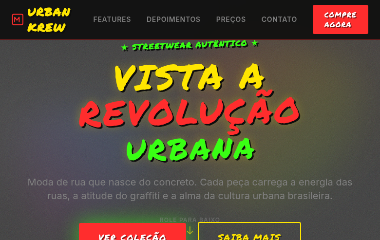
Graffiti-inspired landing page with bright spray-paint colors on gritty urban backgrounds. Ideal for campanhas de marcas provocadoras, pôsteres de música, linhas de streetwear, eventos urbanos. AI-ready template.
Use case: Provocative brand campaigns, Music posters, Streetwear lines, Urban events
Historical Context
Graffiti didn't ask for permission. It emerged from the subway tunnels and freight yards of 1970s New York — writers like TAKI 183, Phase 2, and Dondi tagging their names across a city that refused to see them. It was territorial, political, and deeply personal. The wildstyle lettering that evolved wasn't decoration; it was encryption. Messages meant for those who knew how to read them. By the 1980s, graffiti collided with gallery culture through figures like Basquiat and Keith Haring, but the tension never resolved. The street version stayed raw — dripping fills, cracked caps, paint running down concrete. That imperfection is the point. Every surface tells you about the hand that made it, the weather that day, the urgency of the moment. Today graffiti's visual language has been absorbed into everything from typeface design to motion graphics. But the best applications remember where it came from: unauthorized, loud, and impossible to ignore. The grit isn't a filter you apply — it's the DNA of the form.
When to Use
When your brand needs to feel like it belongs on a wall, not a boardroom. Graffiti aesthetics work when you're speaking to audiences who distrust polish — youth culture, underground music, streetwear, skate, and any brand that earns credibility through rawness rather than refinement. It's the right call when you want energy over elegance, when the brief says 'loud' and means it. Avoid it for anything requiring institutional trust or quiet authority — graffiti whispers to nobody.
Design Principles
- Let imperfection lead — drips, overspray, uneven edges, and texture artifacts are features, not bugs to clean up
- Color should hit like a punch: saturated, high-contrast, unapologetic — neons against black, primaries clashing without apology
- Typography must feel hand-made even when digital — distressed baselines, variable stroke weight, letters that crowd and overlap
- Layering creates history — build surfaces that feel like they've been tagged over, peeled back, and tagged again
- Respect the culture's codes: don't sanitize the aesthetic into corporate-safe decoration — if it doesn't feel slightly dangerous, you've gone too far toward safe
DESIGN.md
---
version: "alpha"
name: "Graffiti"
description: "Graffiti-inspired landing page with bright spray-paint colors on gritty urban backgrounds. Ideal for campanhas de marcas provocadoras, pôsteres de música, linhas de streetwear, eventos urbanos. AI-ready template."
colors:
  primary: "#FF2D2D"
  secondary: "#FFE600"
  tertiary: "#39FF14"
  neutral: "#0D0D0D"
  surface: "#0080FF"
  accent: "#FF1493"
typography:
  h1:
    fontFamily: Permanent Marker
    fontSize: 2.5rem
    fontWeight: 700
  body-md:
    fontFamily: Permanent Marker
    fontSize: 1rem
    fontWeight: 400
spacing:
  sm: 1.5rem
  md: 3.0rem
  lg: 6.0rem
components:
  button-primary:
    backgroundColor: "{colors.primary}"
    textColor: "{colors.neutral}"
    padding: 12px
---

## Overview

Graffiti-inspired landing page with bright spray-paint colors on gritty urban backgrounds. Ideal for campanhas de marcas provocadoras, pôsteres de música, linhas de streetwear, eventos urbanos. AI-ready template. Graffiti didn't ask for permission. It emerged from the subway tunnels and freight yards of 1970s New York — writers like TAKI 183, Phase 2, and Dondi tagging their names across a city that refused to see them. It was territorial, political, and deeply personal. The wildstyle lettering that evolved wasn't decoration; it was encryption. Messages meant for those who knew how to read them.

By the 1980s, graffiti collided with gallery culture through figures like Basquiat and Keith Haring, but the tension never resolved. The street version stayed raw — dripping fills, cracked caps, paint running down concrete. That imperfection is the point. Every surface tells you about the hand that made it, the weather that day, the urgency of the moment.

Today graffiti's visual language has been absorbed into everything from typeface design to motion graphics. But the best applications remember where it came from: unauthorized, loud, and impossible to ignore. The grit isn't a filter you apply — it's the DNA of the form.

- Density: 5/10 — Balanced
- Variance: 4/10 — Moderate
- Motion: 6/10 — Expressive

- **Style:** Bright, Gritty, Spray-Paint, Urban-Rebel
- **Keywords:** Graffiti, bright colors, gritty, spray paint, urban art, street art, rebel, concrete, tags, bold lettering, personality
- **Era:** 1970s-Present Street Art Culture
- **Light/Dark:** ✓ Full / ✓ Full

## Colors

- **Spray Red** (#FF2D2D) — Error states, destructive actions
- **Electric Yellow** (#FFE600) — Warning states, attention indicators
- **Neon Green** (#39FF14) — Supporting palette color
- **Deep Black** (#0D0D0D) — Dark surface, primary background
- **Spray Blue** (#0080FF) — Secondary accent
- **Hot Pink** (#FF1493) — Primary text color
- **Concrete Grey** (#808080) — Secondary text, borders, muted elements
- **Brick Brown** (#8B4513) — Extended palette, decorative use


## Typography

- **Display / Hero:** Permanent Marker — Weight 700, tight tracking, used for headline impact
- **Body:** Permanent Marker — Weight 400, 16px/1.6 line-height, max 72ch per line
- **UI Labels / Captions:** Permanent Marker — 0.875rem, weight 500, slight letter-spacing
- **Monospace:** JetBrains Mono — Used for code, metadata, and technical values

Scale:
- Hero: clamp(2.5rem, 5vw, 4rem)
- H1: 2.25rem
- H2: 1.5rem
- Body: 1rem / 1.6
- Small: 0.875rem


## Layout

- **Grid:** CSS Grid primary. Max-width containment: 1280px centered with 1.5rem side padding.
- **Spacing rhythm:** Balanced. Base unit: 0.5rem (8px).
- **Section vertical gaps:** clamp(4rem, 8vw, 8rem).
- **Hero layout:** Split-screen (text left, visual right).
- **Feature sections:** Zig-zag alternating text+image rows. No 3-equal-columns.
- **Mobile collapse:** All multi-column layouts collapse below 768px. No horizontal overflow.
- **z-index contract:** base (0) / sticky-nav (100) / overlay (200) / modal (300) / toast (500).


## Elevation & Depth

Spray paint texture overlays (CSS noise/grain), drip effects on borders via SVG, concrete/brick texture backgrounds, bold graffiti-style lettering, tag-style decorative elements, gritty shadow effects, splatter animations on hover

- **Physics:** Spring — stiffness 120, damping 20. Confident, weighted transitions.
- **Entry animations:** Fade + translate-Y (16px → 0) over 480ms ease-out. Staggered cascades for lists: 100ms between items.
- **Hover states:** Scale(1.03) + shadow lift over 200ms.
- **Page transitions:** Fade + slide (300ms).
- **Performance:** Only transform and opacity animated. No layout-triggering properties.


## Shapes

Base corner radius: 24px. See rounded tokens in front matter for the full scale.


## Components

- **Primary Button:** Generously rounded (1.5rem) shape. Accent color fill. Hover: 8% darken + subtle lift shadow. Active: -1px translate tactile press. Font weight 600. No outer glows.
- **Secondary / Ghost Button:** Outline variant. 1.5px border in muted color. Text in primary color. Hover: subtle background fill.
- **Cards:** Generously rounded (1.5rem) corners. Surface background. Subtle shadow (0 2px 12px rgba(0,0,0,0.06)). 1px border stroke.
- **Inputs:** Label above input. 1px border stroke. Focus ring: 2px accent color offset 2px. Error text below in semantic red. No floating labels.
- **Navigation:** Primary surface background. Active item: accent color indicator. Font weight 500 when active.
- **Skeletons:** Shimmer animation matching component dimensions. No circular spinners.
- **Empty States:** Icon-based composition with descriptive text and action button.


## Do's and Don'ts

- No emojis in UI — use icon system only (Lucide, Heroicons)
- No pure black (#000000) — use off-black or charcoal variants
- No oversaturated accent colors (saturation cap: 80%)
- No 3-column equal-width feature layouts — use zig-zag or asymmetric grid
- No `h-screen` — use `min-h-[100dvh]`
- No AI copywriting clichés: "Elevate", "Seamless", "Unleash", "Next-Gen"
- No broken external image links — use picsum.photos or inline SVG
- No generic lorem ipsum in demos

- Do Bright spray-paint colors
- Do Concrete/brick texture backgrounds
- Do Drip effect borders
- Do Bold graffiti-style lettering
- Do Tag-style decorative elements
- Do Gritty urban atmosphere
- Do Irregular rotation on elements
- Do Responsive with maintained street energy


## Use Case

Provocative brand campaigns, Music posters, Streetwear lines, Urban events
Technical Specs
CSS
font-family: 'Permanent Marker', cursive, background: #808080 with CSS noise texture, color: #FFE600 or #FF2D2D, border: none (use SVG drip borders), text-shadow: 3px 3px 0 #0D0D0D, font-weight: 700, text-transform: uppercase, transform: rotate(-2deg to 3deg) for irregular feel, letter-spacing: 0.05em
Variables
--color-red: #FF2D2D, --color-yellow: #FFE600, --color-green: #39FF14, --color-black: #0D0D0D, --color-concrete: #808080, --font-graffiti: 'Permanent Marker', --text-shadow: 3px 3px 0 #0D0D0D, --rotation-range: -2deg to 3deg, --spacing: 1.5rem
Checklist
☐ Bright spray-paint colors, ☐ Concrete/brick texture backgrounds, ☐ Drip effect borders, ☐ Bold graffiti-style lettering, ☐ Tag-style decorative elements, ☐ Gritty urban atmosphere, ☐ Irregular rotation on elements, ☐ Responsive with maintained street energy
Colors
Primary
Secondary
Effects
Spray paint texture overlays (CSS noise/grain), drip effects on borders via SVG, concrete/brick texture backgrounds, bold graffiti-style lettering, tag-style decorative elements, gritty shadow effects, splatter animations on hover
Light/Dark
✓ Full / ✓ Full
AI Prompt
Act as a Senior Frontend Engineer and Expert UI Designer.
Your task is to code a complete Landing Page on the first attempt.
- Landing Page Theme: <INSERT THEME>
- Sections to add: <INSERT SECTIONS>

Generate the final code immediately following these definitions:

## Style

- **Name:** Graffiti
- **Type:** Bright, Gritty, Spray-Paint, Urban-Rebel
- **Keywords:** Graffiti, bright colors, gritty, spray paint, urban art, street art, rebel, concrete, tags, bold lettering, personality
- **Era:** 1970s-Present Street Art Culture
- **Light/Dark:** ✓ Full / ✓ Full

## Color Palette

- **Primary:** Spray Red #FF2D2D, Electric Yellow #FFE600, Neon Green #39FF14, Deep Black #0D0D0D
- **Secondary:** Spray Blue #0080FF, Hot Pink #FF1493, Concrete Grey #808080, Brick Brown #8B4513

## Visual Effects

Spray paint texture overlays (CSS noise/grain), drip effects on borders via SVG, concrete/brick texture backgrounds, bold graffiti-style lettering, tag-style decorative elements, gritty shadow effects, splatter animations on hover

## AI Visual Direction

Design a graffiti-inspired landing page with bright spray-paint colors on gritty urban backgrounds. Use spray red, electric yellow, neon green on deep black and concrete grey. Apply spray paint textures, drip effect SVG borders, concrete/brick backgrounds, bold graffiti lettering, tag-style decorations, splatter effects. Typography should be bold, irregular, street-art-style. Rebel, urban, full of personality.

## CSS Technical

```css
font-family: 'Permanent Marker', cursive, background: #808080 with CSS noise texture, color: #FFE600 or #FF2D2D, border: none (use SVG drip borders), text-shadow: 3px 3px 0 #0D0D0D, font-weight: 700, text-transform: uppercase, transform: rotate(-2deg to 3deg) for irregular feel, letter-spacing: 0.05em
```

## Design System Variables

```css
--color-red: #FF2D2D, --color-yellow: #FFE600, --color-green: #39FF14, --color-black: #0D0D0D, --color-concrete: #808080, --font-graffiti: 'Permanent Marker', --text-shadow: 3px 3px 0 #0D0D0D, --rotation-range: -2deg to 3deg, --spacing: 1.5rem
```

## Implementation Checklist

- ☐ Bright spray-paint colors
- ☐ Concrete/brick texture backgrounds
- ☐ Drip effect borders
- ☐ Bold graffiti-style lettering
- ☐ Tag-style decorative elements
- ☐ Gritty urban atmosphere
- ☐ Irregular rotation on elements
- ☐ Responsive with maintained street energy

## Execution Rules

1. Strictly follow the defined visual style.
2. Use high-quality inline SVG icons (Heroicons or Lucide style) — NEVER use emojis as icons.
3. Add `cursor-pointer` and smooth `hover` states (transition-all) on all interactive elements.
4. Required Page Structure:
   - Navbar (Logo + Links + CTA)
   - Hero Section (Impactful Headline + Subtitle + 2 buttons + 3D/Abstract visual element via CSS)
   - Features (3 cards with icons)
   - Testimonials (3 cards)
   - Pricing (3 tiers, highlight the middle one)
   - Final CTA
   - Full Footer with social links, privacy policy, terms of use, contact and SEO links.
5. All text content must be in English.
6. The visual must be CLEARLY distinct — do not create a "default Bootstrap" design. Force the use of the provided design system variables.
7. Use `<style>` tags in the head for custom classes (especially for complex backdrop-filter effects and animations) that Tailwind CDN doesn't cover.
8. Full Responsiveness: Layout must adapt perfectly to Mobile, Tablet and Desktop (vertical stack on mobile).
9. Include basic SEO, Viewport and Open Graph meta tags in `<head>`.
10. Footer must contain: Copyright 2026, Secondary navigation links and Social media icons.
11. Make the creative decisions needed to deliver the complete, functional result now.
Related

Last synced: 4/1/2026