Conceptual Sketch / Doodle Art
Doodle art landing page with hand-drawn, sketch-like aesthetics. Ideal for branding lúdico, creative agencies, produtos para público jovem, editoriais divertidos. AI-ready template.
Use case: Playful branding, Creative agencies, Youth products, Fun editorial design
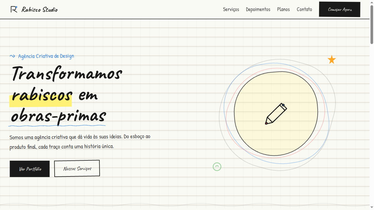
Historical Context
The doodle is older than graphic design itself. Marginalia in medieval manuscripts, Leonardo's notebook sketches, Saul Steinberg's deceptively simple line work for The New Yorker — the conceptual sketch has always been the thinking person's visual language. It's not decoration; it's cognition made visible. The hand-drawn line carries something a vector never will: the tremor of an idea still forming. In the 1960s and 70s, designers like Corita Kent and Sister Mary Corita proved that raw, unpolished mark-making could carry enormous conceptual weight. Later, Stefan Sagmeister's hand-scrawled typography and Christoph Niemann's abstract Sunday Sketches demonstrated that the doodle wasn't primitive — it was deliberately unfinished, inviting the viewer to complete the thought. Today, tools like Excalidraw and FigJam have digitized the aesthetic, but the best implementations still honor the original premise: a sketch is a conversation, not a deliverable.
When to Use
Deploy doodle art when you need to signal that ideas are still in motion — brainstorming interfaces, workshop facilitation tools, creative agency portfolios, or any context where polish would feel premature and dishonest. It works beautifully for onboarding flows that want to feel approachable rather than intimidating, and for ideation platforms where the UI itself should whisper 'nothing here is precious yet.' Avoid it for anything requiring authority or precision. A bank should not doodle.
Design Principles
- Embrace imperfection deliberately — wobbly lines, uneven spacing, and visible corrections signal authenticity; if your doodles look too consistent, you've over-produced them
- Limit your palette to 2-3 colors maximum, treating ink-on-paper as the default mental model; monochrome with one accent color almost always outperforms a rainbow
- Maintain generous whitespace around sketched elements — doodles need breathing room or they collapse into visual noise that reads as clutter rather than creativity
- Keep stroke weight variation organic but controlled; mix thin exploratory lines with confident thick strokes to create hierarchy without resorting to traditional typographic scale
- Never animate doodles with mechanical easing — if you must animate, use hand-drawn frame sequences or deliberately jerky timing that preserves the human quality of the mark
DESIGN.md
---
version: "alpha"
name: "Conceptual Sketch / Doodle Art"
description: "Doodle art landing page with hand-drawn, sketch-like aesthetics. Ideal for branding lúdico, creative agencies, produtos para público jovem, editoriais divertidos. AI-ready template."
colors:
  primary: "#FAFAF5"
  secondary: "#4A4A4A"
  tertiary: "#1A1A1A"
  neutral: "#4A90D9"
  surface: "#FFF176"
  accent: "#EF5350"
typography:
  h1:
    fontFamily: Caveat
    fontSize: 2.5rem
    fontWeight: 700
  body-md:
    fontFamily: Caveat
    fontSize: 1rem
    fontWeight: 400
rounded:
  sm: 2px
  md: 4px
  lg: 8px
spacing:
  sm: 1.5rem
  md: 3.0rem
  lg: 6.0rem
components:
  button-primary:
    backgroundColor: "{colors.primary}"
    textColor: "{colors.neutral}"
    rounded: "{rounded.sm}"
    padding: 12px
---

## Overview

Doodle art landing page with hand-drawn, sketch-like aesthetics. Ideal for branding lúdico, creative agencies, produtos para público jovem, editoriais divertidos. AI-ready template. The doodle is older than graphic design itself. Marginalia in medieval manuscripts, Leonardo's notebook sketches, Saul Steinberg's deceptively simple line work for The New Yorker — the conceptual sketch has always been the thinking person's visual language. It's not decoration; it's cognition made visible. The hand-drawn line carries something a vector never will: the tremor of an idea still forming.

In the 1960s and 70s, designers like Corita Kent and Sister Mary Corita proved that raw, unpolished mark-making could carry enormous conceptual weight. Later, Stefan Sagmeister's hand-scrawled typography and Christoph Niemann's abstract Sunday Sketches demonstrated that the doodle wasn't primitive — it was deliberately unfinished, inviting the viewer to complete the thought. Today, tools like Excalidraw and FigJam have digitized the aesthetic, but the best implementations still honor the original premise: a sketch is a conversation, not a deliverable.

- Density: 5/10 — Balanced
- Variance: 8/10 — Expressive
- Motion: 6/10 — Expressive

- **Style:** Freeform, Spontaneous, Hand-Drawn, Playful
- **Keywords:** Doodle, sketch, hand-drawn, freeform, spontaneous, childlike, naive, unpolished, creative, notebook, scribble
- **Era:** Timeless Creative Expression
- **Light/Dark:** ✓ Full / ◐ Partial

## Colors

- **Notebook White** (#FAFAF5) — Light surface, card backgrounds
- **Pencil Grey** (#4A4A4A) — Secondary text, borders, muted elements
- **Ink Black** (#1A1A1A) — Dark surface, primary background
- **Sketch Blue** (#4A90D9) — Accent highlight, links and focus states
- **Highlighter Yellow** (#FFF176) — Warning states, attention indicators
- **Marker Red** (#EF5350) — Error states, destructive actions
- **Doodle Green** (#66BB6A) — Success states, positive indicators
- **Crayon Orange** (#FFA726) — Warm accent, call-to-action secondary


## Typography

- **Display / Hero:** Caveat — Weight 700, tight tracking, used for headline impact
- **Body:** Caveat — Weight 400, 16px/1.6 line-height, max 72ch per line
- **UI Labels / Captions:** Caveat — 0.875rem, weight 500, slight letter-spacing
- **Monospace:** JetBrains Mono — Used for code, metadata, and technical values

Scale:
- Hero: clamp(2.5rem, 5vw, 4rem)
- H1: 2.25rem
- H2: 1.5rem
- Body: 1rem / 1.6
- Small: 0.875rem


## Layout

- **Grid:** CSS Grid primary. Max-width containment: 1280px centered with 1.5rem side padding.
- **Spacing rhythm:** Balanced. Base unit: 0.5rem (8px).
- **Section vertical gaps:** clamp(4rem, 8vw, 8rem).
- **Hero layout:** Asymmetric composition.
- **Feature sections:** Asymmetric grid with varied card sizes. No 3-equal-columns.
- **Mobile collapse:** All multi-column layouts collapse below 768px. No horizontal overflow.
- **z-index contract:** base (0) / sticky-nav (100) / overlay (200) / modal (300) / toast (500).


## Elevation & Depth

Hand-drawn SVG borders (wavy/irregular), sketch-style underlines, notebook paper background (lined or grid), doodle arrow decorations, wiggle animations on hover, pencil texture overlays

- **Physics:** Spring — stiffness 120, damping 20. Confident, weighted transitions.
- **Entry animations:** Fade + translate-Y (16px → 0) over 480ms ease-out. Staggered cascades for lists: 100ms between items.
- **Hover states:** Scale(1.03) + shadow lift over 200ms.
- **Page transitions:** Fade + slide (300ms).
- **Performance:** Only transform and opacity animated. No layout-triggering properties.


## Shapes

Base corner radius: 0px. See rounded tokens in front matter for the full scale.


## Components

- **Primary Button:** Sharp edges (0px) shape. Accent color fill. Hover: 8% darken + subtle lift shadow. Active: -1px translate tactile press. Font weight 600. No outer glows.
- **Secondary / Ghost Button:** Outline variant. 1.5px border in muted color. Text in primary color. Hover: subtle background fill.
- **Cards:** Sharp edges (0px) corners. Surface background. Subtle shadow (0 2px 12px rgba(0,0,0,0.06)). 1px border stroke.
- **Inputs:** Label above input. 1px border stroke. Focus ring: 2px accent color offset 2px. Error text below in semantic red. No floating labels.
- **Navigation:** Primary surface background. Active item: accent color indicator. Font weight 500 when active.
- **Skeletons:** Shimmer animation matching component dimensions. No circular spinners.
- **Empty States:** Icon-based composition with descriptive text and action button.


## Do's and Don'ts

- No emojis in UI — use icon system only (Lucide, Heroicons)
- No pure black (#000000) — use off-black or charcoal variants
- No oversaturated accent colors (saturation cap: 80%)
- No 3-column equal-width feature layouts — use zig-zag or asymmetric grid
- No `h-screen` — use `min-h-[100dvh]`
- No AI copywriting clichés: "Elevate", "Seamless", "Unleash", "Next-Gen"
- No broken external image links — use picsum.photos or inline SVG
- No generic lorem ipsum in demos

- Do Hand-drawn style borders (wavy SVG)
- Do Notebook paper background
- Do Handwritten font family
- Do Doodle decorative elements
- Do Slight rotation on elements for sketch feel
- Do Colorful marker accent colors
- Do Responsive with maintained sketch aesthetic


## Use Case

Playful branding, Creative agencies, Youth products, Fun editorial design
Technical Specs
CSS
font-family: 'Caveat', cursive, background: #FAFAF5 with CSS grid lines, color: #1A1A1A, border: 2px solid #4A4A4A with SVG wavy filter, box-shadow: none, transform: rotate(-1deg to 1deg) for hand-drawn feel, animation: wiggle 0.3s on hover
Variables
--color-paper: #FAFAF5, --color-pencil: #4A4A4A, --color-ink: #1A1A1A, --font-handwritten: 'Caveat', --border-sketch: 2px solid #4A4A4A, --rotation-range: -1deg to 1deg, --spacing: 1.5rem, --border-radius: 0px
Checklist
☐ Hand-drawn style borders (wavy SVG), ☐ Notebook paper background, ☐ Handwritten font family, ☐ Doodle decorative elements, ☐ Slight rotation on elements for sketch feel, ☐ Colorful marker accent colors, ☐ Responsive with maintained sketch aesthetic
Colors
Primary
Secondary
Effects
Hand-drawn SVG borders (wavy/irregular), sketch-style underlines, notebook paper background (lined or grid), doodle arrow decorations, wiggle animations on hover, pencil texture overlays
Light/Dark
✓ Full / ◐ Partial
AI Prompt
Act as a Senior Frontend Engineer and Expert UI Designer.
Your task is to code a complete Landing Page on the first attempt.
- Landing Page Theme: <INSERT THEME>
- Sections to add: <INSERT SECTIONS>

Generate the final code immediately following these definitions:

## Style

- **Name:** Conceptual Sketch / Doodle Art
- **Type:** Freeform, Spontaneous, Hand-Drawn, Playful
- **Keywords:** Doodle, sketch, hand-drawn, freeform, spontaneous, childlike, naive, unpolished, creative, notebook, scribble
- **Era:** Timeless Creative Expression
- **Light/Dark:** ✓ Full / ◐ Partial

## Color Palette

- **Primary:** Notebook White #FAFAF5, Pencil Grey #4A4A4A, Ink Black #1A1A1A, Sketch Blue #4A90D9
- **Secondary:** Highlighter Yellow #FFF176, Marker Red #EF5350, Doodle Green #66BB6A, Crayon Orange #FFA726

## Visual Effects

Hand-drawn SVG borders (wavy/irregular), sketch-style underlines, notebook paper background (lined or grid), doodle arrow decorations, wiggle animations on hover, pencil texture overlays

## AI Visual Direction

Design a doodle art landing page with hand-drawn, sketch-like aesthetics. Use notebook paper backgrounds (lined or grid), wavy irregular SVG borders, pencil-grey and ink-black with colorful marker accents. Typography should look handwritten (Caveat, Patrick Hand). Include doodle arrows, scribble decorations, and wiggle animations. Playful, spontaneous and creative atmosphere.

## CSS Technical

```css
font-family: 'Caveat', cursive, background: #FAFAF5 with CSS grid lines, color: #1A1A1A, border: 2px solid #4A4A4A with SVG wavy filter, box-shadow: none, transform: rotate(-1deg to 1deg) for hand-drawn feel, animation: wiggle 0.3s on hover
```

## Design System Variables

```css
--color-paper: #FAFAF5, --color-pencil: #4A4A4A, --color-ink: #1A1A1A, --font-handwritten: 'Caveat', --border-sketch: 2px solid #4A4A4A, --rotation-range: -1deg to 1deg, --spacing: 1.5rem, --border-radius: 0px
```

## Implementation Checklist

- ☐ Hand-drawn style borders (wavy SVG)
- ☐ Notebook paper background
- ☐ Handwritten font family
- ☐ Doodle decorative elements
- ☐ Slight rotation on elements for sketch feel
- ☐ Colorful marker accent colors
- ☐ Responsive with maintained sketch aesthetic

## Execution Rules

1. Strictly follow the defined visual style.
2. Use high-quality inline SVG icons (Heroicons or Lucide style) — NEVER use emojis as icons.
3. Add `cursor-pointer` and smooth `hover` states (transition-all) on all interactive elements.
4. Required Page Structure:
   - Navbar (Logo + Links + CTA)
   - Hero Section (Impactful Headline + Subtitle + 2 buttons + 3D/Abstract visual element via CSS)
   - Features (3 cards with icons)
   - Testimonials (3 cards)
   - Pricing (3 tiers, highlight the middle one)
   - Final CTA
   - Full Footer with social links, privacy policy, terms of use, contact and SEO links.
5. All text content must be in English.
6. The visual must be CLEARLY distinct — do not create a "default Bootstrap" design. Force the use of the provided design system variables.
7. Use `<style>` tags in the head for custom classes (especially for complex backdrop-filter effects and animations) that Tailwind CDN doesn't cover.
8. Full Responsiveness: Layout must adapt perfectly to Mobile, Tablet and Desktop (vertical stack on mobile).
9. Include basic SEO, Viewport and Open Graph meta tags in `<head>`.
10. Footer must contain: Copyright 2026, Secondary navigation links and Social media icons.
11. Make the creative decisions needed to deliver the complete, functional result now.
Related

Last synced: 4/1/2026