BlockFrame
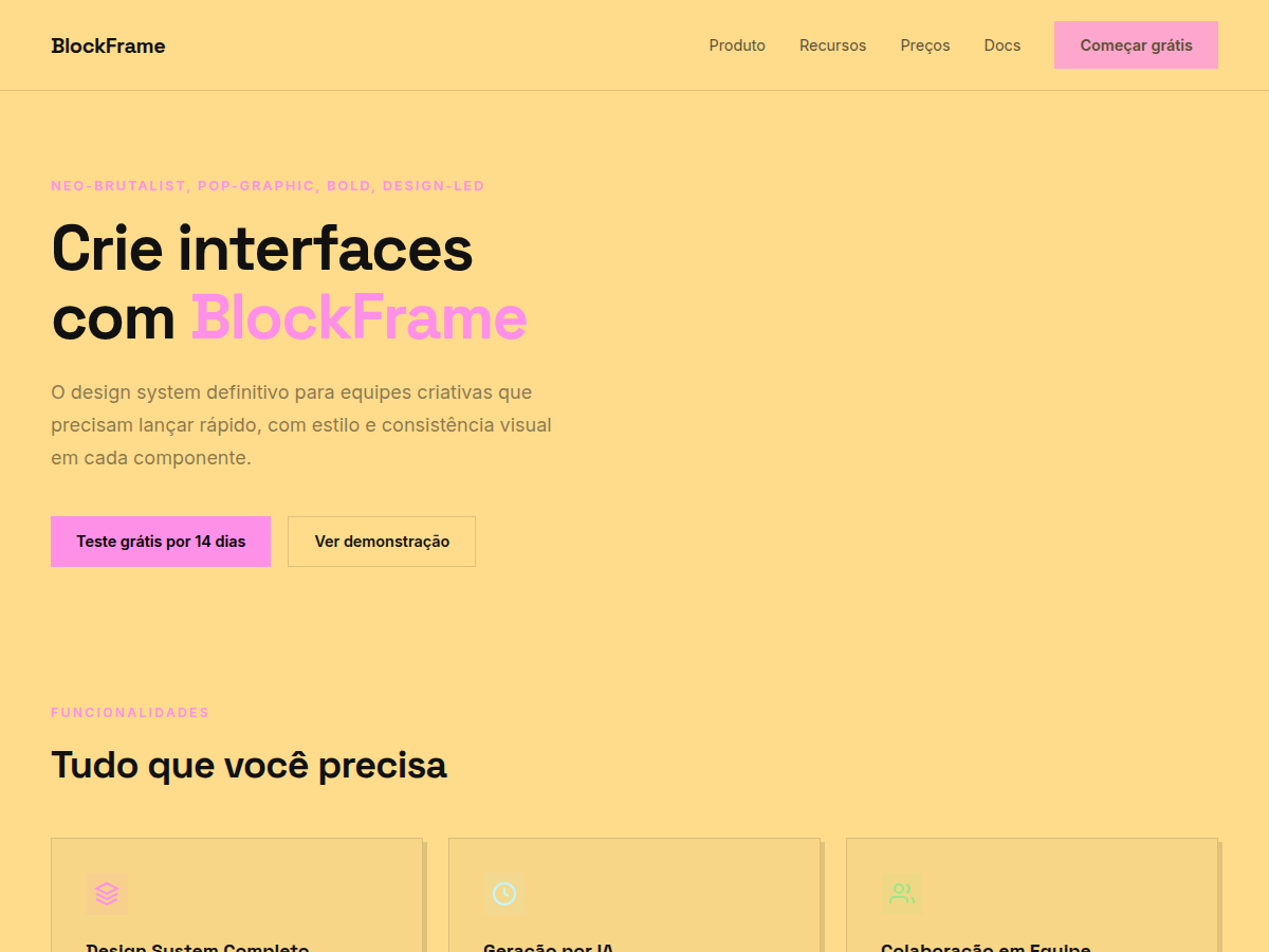
BlockFrame — Neobrutalist deck with pastel-neon color blocks and chunky black borders. Space Grotesk typography. off-white background with neon pastel blocks (hot pink, sky blue, lime green, go. Best for creative agency pitch, indie SaaS launch, designer portfolio. AI-ready design system.
Use case: creative agency pitch, indie SaaS launch, designer portfolio, brand redesign, modern startup deck
Historical Context
Brutalism in graphic design was never meant to be pretty — it was a rejection of the polished, the corporate, the safe. When it migrated to the web in the mid-2010s, it carried that same defiance: raw HTML energy, system fonts, borders that screamed rather than whispered. But something interesting happened around 2020. Designers started softening the edges — literally. Pastel backgrounds crept in. Neon accents replaced monochrome severity. The chunky borders stayed, but they became playful rather than aggressive. Neobrutalism was born from this tension. BlockFrame sits squarely in this lineage. It takes the structural honesty of brutalism — visible borders, flat surfaces, no pretense of depth — and wraps it in candy colors. The hard drop shadows aren't decorative; they're architectural. They tell you exactly where one element ends and another begins. There's no blur, no gradient trying to fake materiality. Every pixel knows its place. What makes this approach endure is its legibility. In an era of glassmorphism and blurred overlays competing for attention, neobrutalism cuts through by being unapologetically flat and loud. It's the design equivalent of speaking in a clear voice instead of whispering through frosted glass.
When to Use
BlockFrame works when your product refuses to take itself too seriously but still needs to function. Indie SaaS tools, creative platforms, Web3 projects that want to signal 'we're different' without resorting to dark-mode-everything. It's perfect for products where personality is a feature — where the interface itself communicates that this isn't another sterile enterprise dashboard. Avoid it for anything requiring gravitas: healthcare, finance, legal. The chunky borders and neon palette will fight you every step of the way if your users expect quiet professionalism.
Design Principles
- Borders are structural, not decorative — use consistent 2-4px solid strokes to define hierarchy, never as afterthought ornamentation
- Shadows are flat and offset, never blurred — hard drop shadows (4-8px) in a single direction create depth without faking three-dimensionality
- Color is bold but controlled — pair one pastel background with one neon accent maximum per component; restraint prevents carnival
- Typography is chunky and confident — heavy weights, tight tracking, generous size contrast between headings and body to match the weight of the borders
- Whitespace is generous inside, tight outside — pad interiors liberally but let components sit close together so the border grid reads as a cohesive system
DESIGN.md
---
version: "alpha"
name: "BlockFrame"
description: "BlockFrame — Neobrutalist deck with pastel-neon color blocks and chunky black borders. Space Grotesk typography. off-white background with neon pastel blocks (hot pink, sky blue, lime green, go. Best for creative agency pitch, indie SaaS launch, designer portfolio. AI-ready design system."
colors:
  primary: "#FE90E8"
  secondary: "#C0F7FE"
  tertiary: "#99E885"
  neutral: "#F7CB46"
  surface: "#FFDC8B"
  accent: "#000000"
typography:
  h1:
    fontFamily: Space Grotesk
    fontSize: 2.5rem
    fontWeight: 700
  body-md:
    fontFamily: Space Grotesk
    fontSize: 1rem
    fontWeight: 400
spacing:
  sm: 1.0rem
  md: 2.0rem
  lg: 4.0rem
components:
  button-primary:
    backgroundColor: "{colors.primary}"
    textColor: "{colors.neutral}"
    padding: 12px
---

## Overview

BlockFrame — Neobrutalist deck with pastel-neon color blocks and chunky black borders. Space Grotesk typography. off-white background with neon pastel blocks (hot pink, sky blue, lime green, go. Best for creative agency pitch, indie SaaS launch, designer portfolio. AI-ready design system. Brutalism in graphic design was never meant to be pretty — it was a rejection of the polished, the corporate, the safe. When it migrated to the web in the mid-2010s, it carried that same defiance: raw HTML energy, system fonts, borders that screamed rather than whispered. But something interesting happened around 2020. Designers started softening the edges — literally. Pastel backgrounds crept in. Neon accents replaced monochrome severity. The chunky borders stayed, but they became playful rather than aggressive. Neobrutalism was born from this tension.

BlockFrame sits squarely in this lineage. It takes the structural honesty of brutalism — visible borders, flat surfaces, no pretense of depth — and wraps it in candy colors. The hard drop shadows aren't decorative; they're architectural. They tell you exactly where one element ends and another begins. There's no blur, no gradient trying to fake materiality. Every pixel knows its place.

What makes this approach endure is its legibility. In an era of glassmorphism and blurred overlays competing for attention, neobrutalism cuts through by being unapologetically flat and loud. It's the design equivalent of speaking in a clear voice instead of whispering through frosted glass.

- Density: 8/10 — Dense
- Variance: 5/10 — Moderate
- Motion: 7/10 — Kinetic

- **Style:** Neo-Brutalist, Pop-Graphic, Bold, Design-Led
- **Keywords:** Neobrutalist, pastel-neon, chunky borders, color blocks, Space Grotesk, pop-graphic, bold, offset shadow
- **Era:** 2020s Neo-Brutalist
- **Light/Dark:** ✓ Full / ✗ None

## Colors

- **Pink** (#FE90E8) — Primary surface or dominant color
- **Blue** (#C0F7FE) — Accent highlight, links and focus states
- **Green** (#99E885) — Secondary accent
- **Yellow** (#F7CB46) — Accent color, emphasis elements
- **Cream** (#FFDC8B) — Extended palette, decorative use
- **Black** (#000000) — Background alternate
- **Offwhite** (#FFFDF5) — Muted text / borders


## Typography

- **Display / Hero:** Space Grotesk — Weight 700, tight tracking, used for headline impact
- **Body:** Inter — Weight 400, 16px/1.6 line-height, max 72ch per line
- **UI Labels / Captions:** Inter — 0.875rem, weight 500, slight letter-spacing
- **Monospace:** JetBrains Mono — Used for code, metadata, and technical values

Scale:
- Hero: clamp(2.5rem, 5vw, 4rem)
- H1: 2.25rem
- H2: 1.5rem
- Body: 1rem / 1.6
- Small: 0.875rem


## Layout

- **Grid:** CSS Grid primary. Max-width containment: 1280px centered with 1.5rem side padding.
- **Spacing rhythm:** Balanced. Base unit: 0.5rem (8px).
- **Section vertical gaps:** clamp(4rem, 8vw, 8rem).
- **Hero layout:** Split-screen (text left, visual right).
- **Feature sections:** Zig-zag alternating text+image rows. No 3-equal-columns.
- **Mobile collapse:** All multi-column layouts collapse below 768px. No horizontal overflow.
- **z-index contract:** base (0) / sticky-nav (100) / overlay (200) / modal (300) / toast (500).


## Elevation & Depth

display font Space Grotesk for hero headlines, bold hover color shift (150ms), high-contrast active states, chunky 3px black borders, offset box-shadow brutalist cards, dense grid, compact 1.2rem gaps

- **Physics:** Ease-out curves, 200-300ms duration. Smooth and predictable.
- **Entry animations:** Fade + translate-Y (16px → 0) over 420ms ease-out. Staggered cascades for lists: 80ms between items.
- **Hover states:** Subtle color shift + shadow adjustment over 200ms.
- **Page transitions:** Fade only (200ms).
- **Performance:** Only transform and opacity animated. No layout-triggering properties.


## Shapes

Base corner radius: 0px. See rounded tokens in front matter for the full scale.


## Components

- **Primary Button:** 0px border-radius. Accent color fill. Hover: 8% darken + subtle lift shadow. Active: -1px translate tactile press. Font weight 600. No outer glows.
- **Secondary / Ghost Button:** Outline variant. 1.5px border in muted color. Text in primary color. Hover: subtle background fill.
- **Cards:** 0px corners. Surface background. Subtle shadow (0 2px 12px rgba(0,0,0,0.06)). 1px border stroke.
- **Inputs:** Label above input. 1px border stroke. Focus ring: 2px accent color offset 2px. Error text below in semantic red. No floating labels.
- **Navigation:** Primary surface background. Active item: accent color indicator. Font weight 500 when active.
- **Skeletons:** Shimmer animation matching component dimensions. No circular spinners.
- **Empty States:** Icon-based composition with descriptive text and action button.


## Do's and Don'ts

- No emojis in UI — use icon system only (Lucide, Heroicons)
- No pure black (#000000) — use off-black or charcoal variants
- No oversaturated accent colors (saturation cap: 80%)
- No 3-column equal-width feature layouts — use zig-zag or asymmetric grid
- No `h-screen` — use `min-h-[100dvh]`
- No AI copywriting clichés: "Elevate", "Seamless", "Unleash", "Next-Gen"
- No broken external image links — use picsum.photos or inline SVG
- No generic lorem ipsum in demos

- Do Space Grotesk display font loaded via Google Fonts
- Do Color palette variables applied consistently
- Do Typography scale: hero clamp(2.5rem,5vw,4rem)
- Do H1 2.25rem
- Do body 1rem/1.6
- Do WCAG AA contrast ratio verified (4.5:1 body text)
- Do Brutalist borders 2-3px solid applied
- Do Offset box-shadow on cards
- Do Mobile responsive layout (stack below 768px)


## Use Case

creative agency pitch, indie SaaS launch, designer portfolio, brand redesign, modern startup deck
Technical Specs
CSS
font-family: 'Space Grotesk', sans-serif; background: #FFFDF5; color: #000000; border: 3px solid #000000; box-shadow: 4px 4px 0 #000000
Variables
--bg: #FFDC8B, --fg: #111111, --accent: #FE90E8, --font-display: 'Space Grotesk', --font-body: 'Inter', --radius: 0px, --spacing: 1rem
Checklist
☐ Space Grotesk display font loaded via Google Fonts, ☐ Color palette variables applied consistently, ☐ Typography scale: hero clamp(2.5rem,5vw,4rem), H1 2.25rem, body 1rem/1.6, ☐ WCAG AA contrast ratio verified (4.5:1 body text), ☐ Brutalist borders 2-3px solid applied, ☐ Offset box-shadow on cards, ☐ Mobile responsive layout (stack below 768px)
Colors
Primary
Secondary
Effects
display font Space Grotesk for hero headlines, bold hover color shift (150ms), high-contrast active states, chunky 3px black borders, offset box-shadow brutalist cards, dense grid, compact 1.2rem gaps
Light/Dark
✓ Full / ✗ None
AI Prompt
Act as a Senior Frontend Engineer and Expert UI Designer.
Your task is to code a complete Landing Page on the first attempt.
- Landing Page Theme: <INSERT THEME>
- Sections to add: <INSERT SECTIONS>

Generate the final code immediately following these definitions:

## Style

- **Name:** BlockFrame
- **Type:** Neo-Brutalist, Pop-Graphic, Bold, Design-Led
- **Keywords:** Neobrutalist, pastel-neon, chunky borders, color blocks, Space Grotesk, pop-graphic, bold, offset shadow
- **Era:** 2020s Neo-Brutalist
- **Light/Dark:** ✓ Full / ✗ None

## Color Palette

- **Primary:** Pink #FE90E8, Blue #C0F7FE, Green #99E885
- **Secondary:** Yellow #F7CB46, Cream #FFDC8B, Black #000000, Offwhite #FFFDF5

## Visual Effects

display font Space Grotesk for hero headlines, bold hover color shift (150ms), high-contrast active states, chunky 3px black borders, offset box-shadow brutalist cards, dense grid, compact 1.2rem gaps

## AI Visual Direction

Design a neobrutalist pop-graphic interface. Use: off-white background (#FFFDF5), pastel-neon blocks (hot pink #FE90E8, sky blue #C0F7FE, lime green #99E885, golden yellow #F7CB46) framed in 3px black borders, box-shadow 4px 4px 0 #000. Space Grotesk in heavy weights. No border-radius.

## CSS Technical

```css
font-family: 'Space Grotesk', sans-serif; background: #FFFDF5; color: #000000; border: 3px solid #000000; box-shadow: 4px 4px 0 #000000
```

## Design System Variables

```css
--bg: #FFDC8B, --fg: #111111, --accent: #FE90E8, --font-display: 'Space Grotesk', --font-body: 'Inter', --radius: 0px, --spacing: 1rem
```

## Implementation Checklist

- ☐ Space Grotesk display font loaded via Google Fonts
- ☐ Color palette variables applied consistently
- ☐ Typography scale: hero clamp(2.5rem,5vw,4rem)
- H1 2.25rem
- body 1rem/1.6
- ☐ WCAG AA contrast ratio verified (4.5:1 body text)
- ☐ Brutalist borders 2-3px solid applied
- ☐ Offset box-shadow on cards
- ☐ Mobile responsive layout (stack below 768px)

## Execution Rules

1. Strictly follow the defined visual style.
2. Use high-quality inline SVG icons (Heroicons or Lucide style) — NEVER use emojis as icons.
3. Add `cursor-pointer` and smooth `hover` states (transition-all) on all interactive elements.
4. Required Page Structure:
   - Navbar (Logo + Links + CTA)
   - Hero Section (Impactful Headline + Subtitle + 2 buttons + 3D/Abstract visual element via CSS)
   - Features (3 cards with icons)
   - Testimonials (3 cards)
   - Pricing (3 tiers, highlight the middle one)
   - Final CTA
   - Full Footer with social links, privacy policy, terms of use, contact and SEO links.
5. All text content must be in English.
6. The visual must be CLEARLY distinct — do not create a "default Bootstrap" design. Force the use of the provided design system variables.
7. Use `<style>` tags in the head for custom classes (especially for complex backdrop-filter effects and animations) that Tailwind CDN doesn't cover.
8. Full Responsiveness: Layout must adapt perfectly to Mobile, Tablet and Desktop (vertical stack on mobile).
9. Include basic SEO, Viewport and Open Graph meta tags in `<head>`.
10. Footer must contain: Copyright 2026, Secondary navigation links and Social media icons.
11. Make the creative decisions needed to deliver the complete, functional result now.
Related
Last synced: 5/6/2026