Whiteboard Flowchart
Whiteboard-style landing page with metallic aluminum frame border (gray gradient with dual box-shadow). Ideal for processos e fluxogramas, onboarding e tutoriais, educacao e cursos, startups criativas, brainstorming e ideacao. AI-ready template.
Use case: Processos e fluxogramas, Onboarding e tutoriais, Educacao e cursos, Startups creative, Brainstorming e ideacao
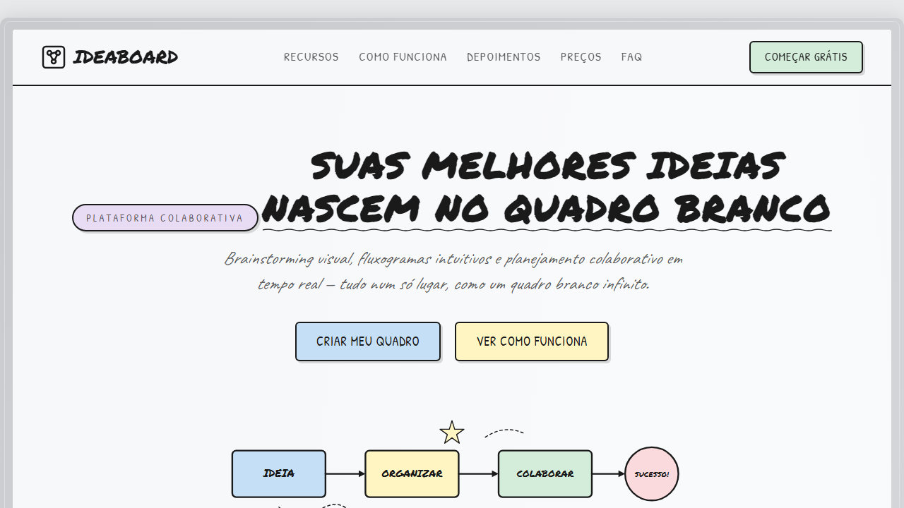
Historical Context
The whiteboard flowchart is one of those artifacts that refuses to die — and for good reason. Before Miro, before Lucidchart, before any drag-and-drop diagramming tool existed, every meaningful process was born on a whiteboard. Marker in hand, someone would draw boxes, arrows, decision diamonds, and suddenly a complex system became legible. The handmade quality wasn't a limitation; it was the point. It signaled "this is a living document, not a finished decree." When digital design adopted this aesthetic, it carried that same psychological weight. Basecamp used hand-drawn diagrams in their marketing for years. Balsamiq built an entire product around the wireframe-sketch metaphor. The whiteboard flowchart style works because it disarms the viewer — it says "this is approachable, you can understand this, you can even challenge this." It strips away the intimidation that polished vector diagrams often introduce. Today the style persists because onboarding flows and how-it-works sections need warmth. Users don't want to read a technical spec. They want someone to sketch it out for them on a napkin.
When to Use
Reach for whiteboard flowcharts when you need to explain a multi-step process without making users feel like they're reading documentation. Perfect for onboarding sequences, how-it-works sections, and any moment where you're asking someone to trust a process they haven't experienced yet. The handmade quality reduces cognitive load and builds trust. Avoid it for anything requiring precision — API docs, legal flows, or anywhere ambiguity could cause real confusion.
Design Principles
- Imperfection is intentional — wobbly lines, uneven spacing, and slightly off-center text all communicate 'human made this' rather than 'machine generated this'
- Limit your palette to 2-3 marker colors maximum; real whiteboards don't have gradients or seventeen shades of blue
- Arrows do the heavy lifting — make them confident and directional, not tentative; the flow must be instantly scannable
- Leave breathing room between nodes; cramped flowcharts defeat the entire purpose of choosing a casual, approachable style
- Every decision diamond or branch point needs to feel like a genuine fork, not decoration — if your flowchart is purely linear, you don't need a flowchart
DESIGN.md
---
version: "alpha"
name: "Whiteboard Flowchart"
description: "Whiteboard-style landing page with metallic aluminum frame border (gray gradient with dual box-shadow). Ideal for processos e fluxogramas, onboarding e tutoriais, educacao e cursos, startups criativas, brainstorming e ideacao. AI-ready template."
colors:
  primary: "#F7F8FA"
  secondary: "#1A1A1A"
  tertiary: "#B8BBBE"
  neutral: "#E8E9EB"
  surface: "#C4DFF6"
  accent: "#FFF5C3"
typography:
  h1:
    fontFamily: Permanent Marker
    fontSize: 2.5rem
    fontWeight: 700
  body-md:
    fontFamily: Permanent Marker
    fontSize: 1rem
    fontWeight: 400
components:
  button-primary:
    backgroundColor: "{colors.primary}"
    textColor: "{colors.neutral}"
    padding: 12px
---

## Overview

Whiteboard-style landing page with metallic aluminum frame border (gray gradient with dual box-shadow). Ideal for processos e fluxogramas, onboarding e tutoriais, educacao e cursos, startups criativas, brainstorming e ideacao. AI-ready template. The whiteboard flowchart is one of those artifacts that refuses to die — and for good reason. Before Miro, before Lucidchart, before any drag-and-drop diagramming tool existed, every meaningful process was born on a whiteboard. Marker in hand, someone would draw boxes, arrows, decision diamonds, and suddenly a complex system became legible. The handmade quality wasn't a limitation; it was the point. It signaled "this is a living document, not a finished decree."

When digital design adopted this aesthetic, it carried that same psychological weight. Basecamp used hand-drawn diagrams in their marketing for years. Balsamiq built an entire product around the wireframe-sketch metaphor. The whiteboard flowchart style works because it disarms the viewer — it says "this is approachable, you can understand this, you can even challenge this." It strips away the intimidation that polished vector diagrams often introduce.

Today the style persists because onboarding flows and how-it-works sections need warmth. Users don't want to read a technical spec. They want someone to sketch it out for them on a napkin.

- Density: 5/10 — Balanced
- Variance: 8/10 — Expressive
- Motion: 4/10 — Subtle

- **Style:** Handmade, Sketch, Flowchart, Whiteboard, Doodle, Organic
- **Keywords:** whiteboard, flowchart, handmade, sketch, doodle, sticky notes, post-it, moldura metalica, canetao, Permanent Marker, Kalam, Patrick Hand, Caveat, sombras hard, rotacoes organicas, fita adesiva, pastel fills
- **Era:** 2024-2026 Handmade Digital / Sketchnote Revival
- **Light/Dark:** ✓ Full / ✗ None

## Colors

- **Branco-Gelo** (#F7F8FA) — Light surface, card backgrounds
- **Tinta Preta** (#1A1A1A) — Secondary surface or text color
- **Moldura Cinza** (#B8BBBE) — Secondary text, borders, muted elements
- **Fundo Pagina** (#E8E9EB) — Primary background surface
- **Azul Pastel** (#C4DFF6) — Secondary accent
- **Amarelo Pastel** (#FFF5C3) — Warning states, attention indicators
- **Verde Pastel** (#D4EDDA) — Success states, positive indicators
- **Rosa Pastel** (#FADADD) — Decorative accent, highlight elements
- **Lavanda** (#E8DCF5) — Extended palette, decorative use
- **Laranja Pastel** (#FFE0C2) — Warm accent, call-to-action secondary


## Typography

- **Display / Hero:** Permanent Marker — Weight 700, tight tracking, used for headline impact
- **Accent:** Kalam — Used for decorative or emphasis text
- **Body:** Permanent Marker — Weight 400, 16px/1.6 line-height, max 72ch per line
- **UI Labels / Captions:** Permanent Marker — 0.875rem, weight 500, slight letter-spacing
- **Monospace:** JetBrains Mono — Used for code, metadata, and technical values

Scale:
- Hero: clamp(2.5rem, 5vw, 4rem)
- H1: 2.25rem
- H2: 1.5rem
- Body: 1rem / 1.6
- Small: 0.875rem


## Layout

- **Grid:** CSS Grid primary. Max-width containment: 1280px centered with 1.5rem side padding.
- **Spacing rhythm:** Balanced. Base unit: 0.5rem (8px).
- **Section vertical gaps:** clamp(4rem, 8vw, 8rem).
- **Hero layout:** Asymmetric composition.
- **Feature sections:** Asymmetric grid with varied card sizes. No 3-equal-columns.
- **Mobile collapse:** All multi-column layouts collapse below 768px. No horizontal overflow.
- **z-index contract:** base (0) / sticky-nav (100) / overlay (200) / modal (300) / toast (500).


## Elevation & Depth

MOLDURA METALICA: Borda cinza com gradient multi-stop simulando frame de aluminio de whiteboard fisico, com box-shadow duplo para profundidade. | TEXTURA WHITEBOARD: Radial-gradients sobrepostos com opacidade baixa simulando reflexo e variacao tonal da superficie. | SOMBRAS HARD: box-shadow 3px 3px 0px sem nenhum blur — offset solido que simula papel colado sobre o quadro. | ROTACOES ORGANICAS: Cada card recebe rotacao aleatoria entre -1 e 1 grau, nunca repetindo angulo em adjacentes — caos controlado. | STICKY NOTES: Post-its com pseudo-element ::before simulando fita adesiva no topo. | RIBBONS: Faixas de titulo com fill pastel, borda preta solida e rotacao sutil. | CONECTORES SVG: Paths com curvas Bezier e pontas de seta triangulares, animacao draw-in com stroke-dasharray. | STEP BADGES: Circulos numerados com fill pastel e borda preta.

- **Physics:** Ease-out curves, 200-300ms duration. Smooth and predictable.
- **Entry animations:** Fade + translate-Y (16px → 0) over 420ms ease-out. Staggered cascades for lists: 80ms between items.
- **Hover states:** Subtle color shift + shadow adjustment over 200ms.
- **Page transitions:** Fade only (200ms).
- **Performance:** Only transform and opacity animated. No layout-triggering properties.


## Shapes

Base corner radius: 12px. See rounded tokens in front matter for the full scale.


## Components

- **Primary Button:** Moderately rounded (0.75rem) shape. Accent color fill. Hover: 8% darken + subtle lift shadow. Active: -1px translate tactile press. Font weight 600. No outer glows.
- **Secondary / Ghost Button:** Outline variant. 1.5px border in muted color. Text in primary color. Hover: subtle background fill.
- **Cards:** Moderately rounded (0.75rem) corners. Surface background. Subtle shadow (0 2px 12px rgba(0,0,0,0.06)). 1px border stroke.
- **Inputs:** Label above input. 1px border stroke. Focus ring: 2px accent color offset 2px. Error text below in semantic red. No floating labels.
- **Navigation:** Primary surface background. Active item: accent color indicator. Font weight 500 when active.
- **Skeletons:** Shimmer animation matching component dimensions. No circular spinners.
- **Empty States:** Icon-based composition with descriptive text and action button.


## Do's and Don'ts

- No emojis in UI — use icon system only (Lucide, Heroicons)
- No pure black (#000000) — use off-black or charcoal variants
- No oversaturated accent colors (saturation cap: 80%)
- No 3-column equal-width feature layouts — use zig-zag or asymmetric grid
- No `h-screen` — use `min-h-[100dvh]`
- No AI copywriting clichés: "Elevate", "Seamless", "Unleash", "Next-Gen"
- No broken external image links — use picsum.photos or inline SVG
- No generic lorem ipsum in demos

- Do Moldura metalica com gradient cinza e box-shadow duplo
- Do Fundo whiteboard branco-gelo com textura radial-gradient
- Do 4 fontes Google: Permanent Marker + Kalam + Patrick Hand + Caveat
- Do Sombras hard sem blur em todos os cards
- Do Rotacoes organicas (-1 a 1 grau) em cada card
- Do Sticky notes com fita adesiva (::before)
- Do Ribbons com fill pastel e borda preta
- Do Step badges com circulos numerados
- Do Icones SVG doodle stroke-only
- Do Conectores SVG com animacao draw-in
- Do Bordas pretas solidas 2-3px
- Do Responsivo grid para stack em mobile


## Use Case

Processos e fluxogramas, Onboarding e tutoriais, Educacao e cursos, Startups creative, Brainstorming e ideacao
Technical Specs
CSS
font-family: 'Permanent Marker'/'Kalam'/'Patrick Hand'/'Caveat', box-shadow: 3px 3px 0px rgba(26,26,26,0.15) NO BLUR, border: 2.5px solid #1A1A1A, transform: rotate(-0.8deg/0.6deg/-0.4deg), background: linear-gradient(135deg, #C8CACD, #D8DADD, #C0C2C5, #B0B2B5) for frame, background-image: radial-gradient overlay for whiteboard texture, ::before pseudo-element for tape on sticky notes, stroke-dasharray animation for SVG connectors, grid-template-columns: repeat(3, 1fr) collapsing to 1fr at 900px
Variables
--wb-bg: #F7F8FA, --wb-bg-texture: #F0F1F3, --wb-frame: #B8BBBE, --wb-frame-inner: #D4D6D9, --wb-ink: #1A1A1A, --wb-ink-soft: rgba(26,26,26,0.7), --wb-ink-faint: rgba(26,26,26,0.35), --wb-blue: #C4DFF6, --wb-yellow: #FFF5C3, --wb-green: #D4EDDA, --wb-pink: #FADADD, --wb-lavender: #E8DCF5, --wb-orange: #FFE0C2, --wb-shadow: 3px 3px 0px rgba(26,26,26,0.15), --wb-shadow-strong: 4px 4px 0px rgba(26,26,26,0.25), --font-title: 'Permanent Marker' cursive, --font-body: 'Kalam' cursive, --font-accent: 'Patrick Hand' cursive, --font-handwrite: 'Caveat' cursive, --wb-border: 2.5px solid var(--wb-ink), --wb-border-thin: 1.5px solid var(--wb-ink-soft)
Checklist
☐ Moldura metalica com gradient cinza e box-shadow duplo, ☐ Fundo whiteboard branco-gelo com textura radial-gradient, ☐ 4 fontes Google: Permanent Marker + Kalam + Patrick Hand + Caveat, ☐ Sombras hard sem blur em todos os cards, ☐ Rotacoes organicas (-1 a 1 grau) em cada card, ☐ Sticky notes com fita adesiva (::before), ☐ Ribbons com fill pastel e borda preta, ☐ Step badges com circulos numerados, ☐ Icones SVG doodle stroke-only, ☐ Conectores SVG com animacao draw-in, ☐ Bordas pretas solidas 2-3px, ☐ Responsivo grid para stack em mobile
Colors
Primary
Secondary
Effects
MOLDURA METALICA: Borda cinza com gradient multi-stop simulando frame de aluminio de whiteboard fisico, com box-shadow duplo para profundidade. | TEXTURA WHITEBOARD: Radial-gradients sobrepostos com opacidade baixa simulando reflexo e variacao tonal da superficie. | SOMBRAS HARD: box-shadow 3px 3px 0px sem nenhum blur — offset solido que simula papel colado sobre o quadro. | ROTACOES ORGANICAS: Cada card recebe rotacao aleatoria entre -1 e 1 grau, nunca repetindo angulo em adjacentes — caos controlado. | STICKY NOTES: Post-its com pseudo-element ::before simulando fita adesiva no topo. | RIBBONS: Faixas de titulo com fill pastel, borda preta solida e rotacao sutil. | CONECTORES SVG: Paths com curvas Bezier e pontas de seta triangulares, animacao draw-in com stroke-dasharray. | STEP BADGES: Circulos numerados com fill pastel e borda preta.
Light/Dark
✓ Full / ✗ None
AI Prompt
Act as a Senior Frontend Engineer and Expert UI Designer.
Your task is to code a complete Landing Page on the first attempt.
- Landing Page Theme: <INSERT THEME>
- Sections to add: <INSERT SECTIONS>

Generate the final code immediately following these definitions:

## Style

- **Name:** Whiteboard Flowchart
- **Type:** Handmade, Sketch, Flowchart, Whiteboard, Doodle, Organic
- **Keywords:** whiteboard, flowchart, handmade, sketch, doodle, sticky notes, post-it, moldura metalica, canetao, Permanent Marker, Kalam, Patrick Hand, Caveat, sombras hard, rotacoes organicas, fita adesiva, pastel fills
- **Era:** 2024-2026 Handmade Digital / Sketchnote Revival
- **Light/Dark:** ✓ Full / ✗ None

## Color Palette

- **Primary:** Branco-Gelo #F7F8FA, Tinta Preta #1A1A1A, Moldura Cinza #B8BBBE, Fundo Pagina #E8E9EB
- **Secondary:** Azul Pastel #C4DFF6, Amarelo Pastel #FFF5C3, Verde Pastel #D4EDDA, Rosa Pastel #FADADD, Lavanda #E8DCF5, Laranja Pastel #FFE0C2

## Visual Effects

MOLDURA METALICA: Borda cinza com gradient multi-stop simulando frame de aluminio de whiteboard fisico, com box-shadow duplo para profundidade. | TEXTURA WHITEBOARD: Radial-gradients sobrepostos com opacidade baixa simulando reflexo e variacao tonal da superficie. | SOMBRAS HARD: box-shadow 3px 3px 0px sem nenhum blur — offset solido que simula papel colado sobre o quadro. | ROTACOES ORGANICAS: Cada card recebe rotacao aleatoria entre -1 e 1 grau, nunca repetindo angulo em adjacentes — caos controlado. | STICKY NOTES: Post-its com pseudo-element ::before simulando fita adesiva no topo. | RIBBONS: Faixas de titulo com fill pastel, borda preta solida e rotacao sutil. | CONECTORES SVG: Paths com curvas Bezier e pontas de seta triangulares, animacao draw-in com stroke-dasharray. | STEP BADGES: Circulos numerados com fill pastel e borda preta.

## AI Visual Direction

Design a whiteboard-style landing page with metallic aluminum frame border (gray gradient with dual box-shadow). White-ice background #F7F8FA with subtle radial-gradient texture simulating real whiteboard surface reflections. 4 Google Fonts hierarchy: Permanent Marker for bold titles (uppercase, wavy underline), Kalam for body text, Patrick Hand for labels/badges (uppercase, tracked), Caveat italic for annotations/notes. All cards use hard shadows (3px 3px 0px, ZERO blur), solid black borders 2.5px, and organic rotations (-0.8deg, +0.6deg, -0.4deg never repeating on adjacent elements). Pastel fills: blue #C4DFF6, yellow #FFF5C3, green #D4EDDA, pink #FADADD, lavender #E8DCF5, orange #FFE0C2. Sticky notes with tape effect (::before pseudo-element). Ribbon banners for section titles. Step badges with numbered circles. SVG doodle icons (stroke-only, round linecap/linejoin). Connector arrows with SVG paths and arrowhead markers. Result box with 3px border, 5px 5px shadow, star icon. Grid layout that stacks on mobile. Flowchart visual metaphor throughout.

## CSS Technical

```css
font-family: 'Permanent Marker'/'Kalam'/'Patrick Hand'/'Caveat', box-shadow: 3px 3px 0px rgba(26,26,26,0.15) NO BLUR, border: 2.5px solid #1A1A1A, transform: rotate(-0.8deg/0.6deg/-0.4deg), background: linear-gradient(135deg, #C8CACD, #D8DADD, #C0C2C5, #B0B2B5) for frame, background-image: radial-gradient overlay for whiteboard texture, ::before pseudo-element for tape on sticky notes, stroke-dasharray animation for SVG connectors, grid-template-columns: repeat(3, 1fr) collapsing to 1fr at 900px
```

## Design System Variables

```css
--wb-bg: #F7F8FA, --wb-bg-texture: #F0F1F3, --wb-frame: #B8BBBE, --wb-frame-inner: #D4D6D9, --wb-ink: #1A1A1A, --wb-ink-soft: rgba(26,26,26,0.7), --wb-ink-faint: rgba(26,26,26,0.35), --wb-blue: #C4DFF6, --wb-yellow: #FFF5C3, --wb-green: #D4EDDA, --wb-pink: #FADADD, --wb-lavender: #E8DCF5, --wb-orange: #FFE0C2, --wb-shadow: 3px 3px 0px rgba(26,26,26,0.15), --wb-shadow-strong: 4px 4px 0px rgba(26,26,26,0.25), --font-title: 'Permanent Marker' cursive, --font-body: 'Kalam' cursive, --font-accent: 'Patrick Hand' cursive, --font-handwrite: 'Caveat' cursive, --wb-border: 2.5px solid var(--wb-ink), --wb-border-thin: 1.5px solid var(--wb-ink-soft)
```

## Implementation Checklist

- ☐ Moldura metalica com gradient cinza e box-shadow duplo
- ☐ Fundo whiteboard branco-gelo com textura radial-gradient
- ☐ 4 fontes Google: Permanent Marker + Kalam + Patrick Hand + Caveat
- ☐ Sombras hard sem blur em todos os cards
- ☐ Rotacoes organicas (-1 a 1 grau) em cada card
- ☐ Sticky notes com fita adesiva (::before)
- ☐ Ribbons com fill pastel e borda preta
- ☐ Step badges com circulos numerados
- ☐ Icones SVG doodle stroke-only
- ☐ Conectores SVG com animacao draw-in
- ☐ Bordas pretas solidas 2-3px
- ☐ Responsivo grid para stack em mobile

## Execution Rules

1. Strictly follow the defined visual style.
2. Use high-quality inline SVG icons (Heroicons or Lucide style) — NEVER use emojis as icons.
3. Add `cursor-pointer` and smooth `hover` states (transition-all) on all interactive elements.
4. Required Page Structure:
   - Navbar (Logo + Links + CTA)
   - Hero Section (Impactful Headline + Subtitle + 2 buttons + 3D/Abstract visual element via CSS)
   - Features (3 cards with icons)
   - Testimonials (3 cards)
   - Pricing (3 tiers, highlight the middle one)
   - Final CTA
   - Full Footer with social links, privacy policy, terms of use, contact and SEO links.
5. All text content must be in English.
6. The visual must be CLEARLY distinct — do not create a "default Bootstrap" design. Force the use of the provided design system variables.
7. Use `<style>` tags in the head for custom classes (especially for complex backdrop-filter effects and animations) that Tailwind CDN doesn't cover.
8. Full Responsiveness: Layout must adapt perfectly to Mobile, Tablet and Desktop (vertical stack on mobile).
9. Include basic SEO, Viewport and Open Graph meta tags in `<head>`.
10. Footer must contain: Copyright 2026, Secondary navigation links and Social media icons.
11. Make the creative decisions needed to deliver the complete, functional result now.
Related
Last synced: 4/1/2026