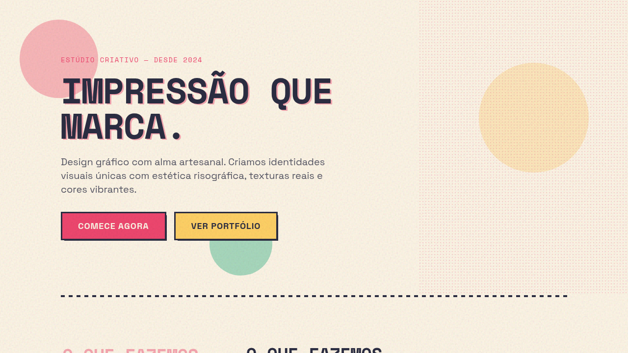
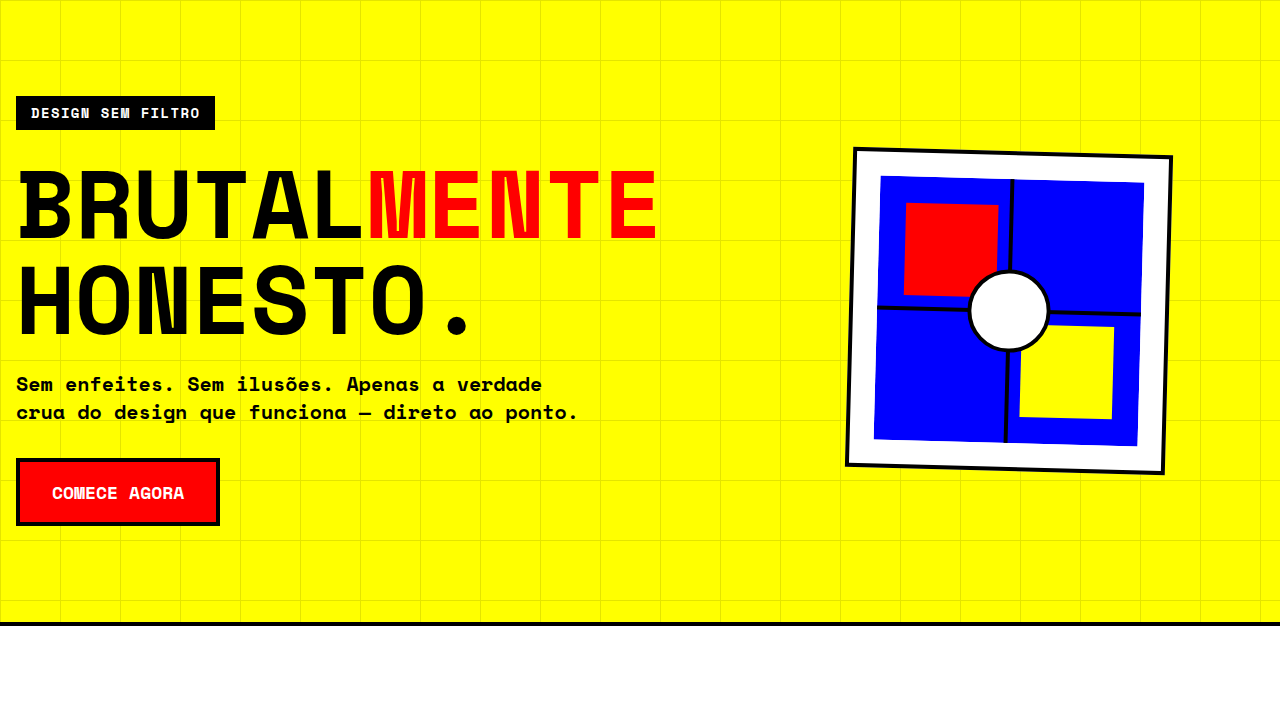
Risograph / Retro-Pop
Risograph / Retro-Pop — Design general com halftone dots, limited ink layers, registration misalignment. Template e prompt pronto para IA.
Uso: Landing pages, SaaS
Contexto Histórico
Estilo Risograph / Retro-Pop representa uma tendência moderna em design UI/UX web com foco em general.
Especificações Técnicas
Cores
Primárias
Secundárias
Efeitos
No smooth gradients (use halftone), registration offset effect (2-3px misalignment), grain texture overlay, instant transitions, bold shape reveals
Light/Dark
✓ Full / ◐ Partial
CSS
background: #FDF5E6 with grain overlay, color: limited palette, filter: contrast(1.1), mix-blend-mode: multiply for overlaps, background-image: radial-gradient for halftone, transform: translate(2px) for misalignment
Variáveis
--paper-bg: #FDF5E6, --ink-1: #EF476F, --ink-2: #06A77D, --ink-3: #FFD166, --grain-opacity: 0.2, --misalign-offset: 2px
Checklist
☐ Limited colors (2-3 inks), ☐ Halftone dots visible, ☐ Registration offset subtle, ☐ Paper grain texture, ☐ Bold flat shapes, ☐ Retro print feel
DESIGN.md
Design System: Risograph / Retro-Pop
1. Visual Theme & Atmosphere
Risograph / Retro-Pop — Design general com halftone dots, limited ink layers, registration misalignment. Template e prompt pronto para IA. Estilo Risograph / Retro-Pop representa uma tendência moderna em design UI/UX web com foco em general.
- Density: 5/10 — Balanced
- Variance: 7/10 — Dynamic
- Motion: 1/10 — Static
2. Color Palette & Roles
- Warm Paper (#FDF5E6) — Primary surface or dominant color
- Deep Navy (#2B2D42) — Secondary surface or text color
- Coral Pink (#EF476F) — Primary text color
- Mustard (#FFD166) — Supporting palette color
- Teal (#06A77D) — Secondary accent
- Ocean Blue (#118AB2) — Secondary accent
- Dark Teal (#073B4C) — Deep contrast surface
3. Typography Rules
- Display / Hero: System UI stack (-apple-system, sans-serif) — Weight 700, tight tracking, used for headline impact
- Body: System UI stack (-apple-system, sans-serif) — Weight 400, 16px/1.6 line-height, max 72ch per line
- UI Labels / Captions: System UI stack (-apple-system, sans-serif) — 0.875rem, weight 500, slight letter-spacing
- Monospace: JetBrains Mono — Used for code, metadata, and technical values
Scale:
- Hero: clamp(2.5rem, 5vw, 4rem)
- H1: 2.25rem
- H2: 1.5rem
- Body: 1rem / 1.6
- Small: 0.875rem
4. Component Stylings
- Primary Button: Subtly rounded (0.5rem) shape. Accent color fill. Hover: 8% darken + subtle lift shadow. Active: -1px translate tactile press. Font weight 600. No outer glows.
- Secondary / Ghost Button: Outline variant. 1.5px border in muted color. Text in primary color. Hover: subtle background fill.
- Cards: Subtly rounded (0.5rem) corners. Surface background. Subtle shadow (0 2px 12px rgba(0,0,0,0.06)). 1px border stroke.
- Inputs: Label above input. 1px border stroke. Focus ring: 2px accent color offset 2px. Error text below in semantic red. No floating labels.
- Navigation: Primary surface background. Active item: accent color indicator. Font weight 500 when active.
- Skeletons: Shimmer animation matching component dimensions. No circular spinners.
- Empty States: Icon-based composition with descriptive text and action button.
5. Layout Principles
- Grid: CSS Grid primary. Max-width containment: 1280px centered with 1.5rem side padding.
- Spacing rhythm: Balanced. Base unit: 0.5rem (8px).
- Section vertical gaps: clamp(4rem, 8vw, 8rem).
- Hero layout: Asymmetric composition.
- Feature sections: Asymmetric grid with varied card sizes. No 3-equal-columns.
- Mobile collapse: All multi-column layouts collapse below 768px. No horizontal overflow.
- z-index contract: base (0) / sticky-nav (100) / overlay (200) / modal (300) / toast (500).
6. Motion & Interaction
- Minimal motion design. Hover states use color transitions only (150ms).
- No entry animations. No page transitions. Instant, utilitarian feedback.
- Performance: No animation overhead. Static-first approach.
7. Anti-Patterns (Banned)
- No emojis in UI — use icon system only (Lucide, Heroicons)
- No pure black (#000000) — use off-black or charcoal variants
- No oversaturated accent colors (saturation cap: 80%)
- No 3-column equal-width feature layouts — use zig-zag or asymmetric grid
- No
h-screen— usemin-h-[100dvh] - No AI copywriting clichés: "Elevate", "Seamless", "Unleash", "Next-Gen"
- No broken external image links — use picsum.photos or inline SVG
- No generic lorem ipsum in demos
Prompt para AI
Design a risograph retro-pop interface. Use: limited color palette (2-3 ink layers), halftone dot patterns, registration misalignment simulation, grainy paper texture, bold flat shapes, overlapping transparent layers, retro print aesthetic.
Relacionados
Última sincronização: 01/04/2026