Wabi-Sabi Anti-UX
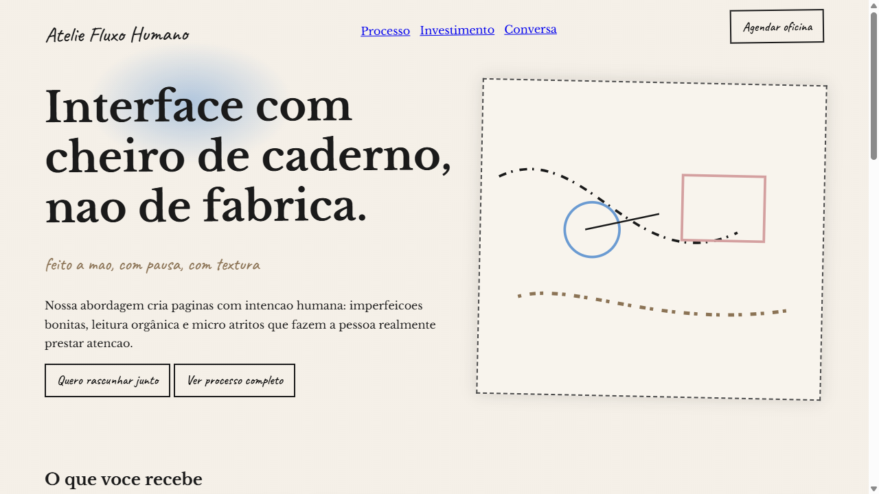
Wabi-sabi inspired landing page celebrating imperfection and human touch. Ideal for portfolios artisticos, marcas artesanais, cafeterias e restaurantes, estudio de design, blogs pessoais, produtos organicos. AI-ready template.
Use case: Portfolios artisticos, Artisan brands, Cafeterias e restaurantes, Estudio de design, Blogs personal, Products organicos
Historical Context
Wabi-sabi entered digital design as a quiet rebellion. While the entire industry obsessed over conversion funnels and frictionless flows, a handful of designers started asking: what if the friction IS the point? What if a slightly misaligned grid, a hand-drawn element that refuses to snap to pixels, or a loading state that invites patience instead of demanding speed — what if these things create more meaningful experiences than another polished SaaS interface? The roots trace back to Japanese tea ceremony aesthetics — the cracked bowl valued above the perfect one — but the digital application is distinctly contemporary. It emerged from exhaustion with optimization culture, with A/B testing every pixel into submission until websites became indistinguishable from each other. Anti-UX doesn't mean bad UX. It means deliberately choosing where to introduce texture, resistance, and humanity into an interaction. This is design that breathes. Pages that load like they're being assembled by hand. Typography that wobbles. Interfaces that reward slowness over efficiency. It's a philosophical stance disguised as a design system — the assertion that not everything worth experiencing should be easy to consume.
When to Use
When the brand's entire identity rejects corporate polish. Art portfolios, independent publishers, craft studios, philosophical projects that need their digital presence to feel as intentional and imperfect as their physical work. Use when your client would rather lose impatient visitors than compromise their voice. Never use for e-commerce checkout flows or accessibility-critical interfaces — wabi-sabi is a luxury of context, not a universal principle.
Design Principles
- Embrace visible craft — hand-drawn elements, uneven spacing, and textures that reveal process over polish
- Introduce intentional friction — slower transitions, deliberate pauses, interactions that reward patience rather than speed
- Reject pixel perfection — allow organic asymmetry, slight misalignments, and elements that feel placed by hand rather than algorithm
- Honor impermanence — design elements that shift, decay, or change over time rather than remaining static and preserved
- Prioritize atmosphere over conversion — every design decision serves emotional resonance, not engagement metrics
DESIGN.md
---
version: "alpha"
name: "Wabi-Sabi Anti-UX"
description: "Wabi-sabi inspired landing page celebrating imperfection and human touch. Ideal for portfolios artisticos, marcas artesanais, cafeterias e restaurantes, estudio de design, blogs pessoais, produtos organicos. AI-ready template."
colors:
  primary: "#F5F0E8"
  secondary: "#1A1A1A"
  tertiary: "#8B7355"
  neutral: "#6B9BD2"
  surface: "#D4A0A0"
  accent: "#7BA68C"
typography:
  h1:
    fontFamily: Libre Baskerville
    fontSize: 2.5rem
    fontWeight: 700
  body-md:
    fontFamily: Libre Baskerville
    fontSize: 1rem
    fontWeight: 400
components:
  button-primary:
    backgroundColor: "{colors.primary}"
    textColor: "{colors.neutral}"
    padding: 12px
---

## Overview

Wabi-sabi inspired landing page celebrating imperfection and human touch. Ideal for portfolios artisticos, marcas artesanais, cafeterias e restaurantes, estudio de design, blogs pessoais, produtos organicos. AI-ready template. Wabi-sabi entered digital design as a quiet rebellion. While the entire industry obsessed over conversion funnels and frictionless flows, a handful of designers started asking: what if the friction IS the point? What if a slightly misaligned grid, a hand-drawn element that refuses to snap to pixels, or a loading state that invites patience instead of demanding speed — what if these things create more meaningful experiences than another polished SaaS interface?

The roots trace back to Japanese tea ceremony aesthetics — the cracked bowl valued above the perfect one — but the digital application is distinctly contemporary. It emerged from exhaustion with optimization culture, with A/B testing every pixel into submission until websites became indistinguishable from each other. Anti-UX doesn't mean bad UX. It means deliberately choosing where to introduce texture, resistance, and humanity into an interaction.

This is design that breathes. Pages that load like they're being assembled by hand. Typography that wobbles. Interfaces that reward slowness over efficiency. It's a philosophical stance disguised as a design system — the assertion that not everything worth experiencing should be easy to consume.

- Density: 5/10 — Balanced
- Variance: 8/10 — Expressive
- Motion: 4/10 — Subtle

- **Style:** Handmade, Imperfect, Raw Photography, Tactile Textures, Anti-AI
- **Keywords:** wabi-sabi, anti-UX, handmade, imperfect, hand-drawn arrows, doodles, asymmetric layout, raw photography, paper grain, ink bleed, watercolor splashes, organic, intentional friction, anti-AI aesthetic
- **Era:** 2025-2026 Anti-AI Handmade
- **Light/Dark:** ✓ Full / ✗ None

## Colors

- **Papel Cru** (#F5F0E8) — Primary surface or dominant color
- **Tinta Nanquim** (#1A1A1A) — Secondary surface or text color
- **Sepia Quente** (#8B7355) — Supporting palette color
- **Aquarela Azul** (#6B9BD2) — Secondary accent
- **Aquarela Rosa** (#D4A0A0) — Decorative accent, highlight elements
- **Aquarela Verde** (#7BA68C) — Success states, positive indicators
- **Tinta Borrada** (#4A4A4A) — Extended palette, decorative use


## Typography

- **Display / Hero:** Libre Baskerville — Weight 700, tight tracking, used for headline impact
- **Accent:** Caveat — Used for decorative or emphasis text
- **Body:** Libre Baskerville — Weight 400, 16px/1.6 line-height, max 72ch per line
- **UI Labels / Captions:** Libre Baskerville — 0.875rem, weight 500, slight letter-spacing
- **Monospace:** JetBrains Mono — Used for code, metadata, and technical values

Scale:
- Hero: clamp(2.5rem, 5vw, 4rem)
- H1: 2.25rem
- H2: 1.5rem
- Body: 1rem / 1.6
- Small: 0.875rem


## Layout

- **Grid:** CSS Grid primary. Max-width containment: 1280px centered with 1.5rem side padding.
- **Spacing rhythm:** Balanced. Base unit: 0.5rem (8px).
- **Section vertical gaps:** clamp(4rem, 8vw, 8rem).
- **Hero layout:** Asymmetric composition.
- **Feature sections:** Asymmetric grid with varied card sizes. No 3-equal-columns.
- **Mobile collapse:** All multi-column layouts collapse below 768px. No horizontal overflow.
- **z-index contract:** base (0) / sticky-nav (100) / overlay (200) / modal (300) / toast (500).


## Elevation & Depth

Setas e sublinhados irregulares desenhados a mao (SVG path com stroke-dasharray variavel), ilustracoes tipo rascunho (doodles), layouts deliberadamente assimetricos, texturas tateis de granulacao de papel (CSS noise filter), sangramento de tinta (box-shadow blur alto com cor escura), respingos de aquarela (radial-gradient com opacidade variavel), fotografia crua nao polida, atritos intencionais na interface

- **Physics:** Ease-out curves, 200-300ms duration. Smooth and predictable.
- **Entry animations:** Fade + translate-Y (16px → 0) over 420ms ease-out. Staggered cascades for lists: 80ms between items.
- **Hover states:** Subtle color shift + shadow adjustment over 200ms.
- **Page transitions:** Fade only (200ms).
- **Performance:** Only transform and opacity animated. No layout-triggering properties.


## Shapes

Base corner radius: 8px. See rounded tokens in front matter for the full scale.


## Components

- **Primary Button:** Subtly rounded (0.5rem) shape. Accent color fill. Hover: 8% darken + subtle lift shadow. Active: -1px translate tactile press. Font weight 600. No outer glows.
- **Secondary / Ghost Button:** Outline variant. 1.5px border in muted color. Text in primary color. Hover: subtle background fill.
- **Cards:** Subtly rounded (0.5rem) corners. Surface background. Subtle shadow (0 2px 12px rgba(0,0,0,0.06)). 1px border stroke.
- **Inputs:** Label above input. 1px border stroke. Focus ring: 2px accent color offset 2px. Error text below in semantic red. No floating labels.
- **Navigation:** Primary surface background. Active item: accent color indicator. Font weight 500 when active.
- **Skeletons:** Shimmer animation matching component dimensions. No circular spinners.
- **Empty States:** Icon-based composition with descriptive text and action button.


## Do's and Don'ts

- No emojis in UI — use icon system only (Lucide, Heroicons)
- No pure black (#000000) — use off-black or charcoal variants
- No oversaturated accent colors (saturation cap: 80%)
- No 3-column equal-width feature layouts — use zig-zag or asymmetric grid
- No `h-screen` — use `min-h-[100dvh]`
- No AI copywriting clichés: "Elevate", "Seamless", "Unleash", "Next-Gen"
- No broken external image links — use picsum.photos or inline SVG
- No generic lorem ipsum in demos

- Do Setas e sublinhados SVG irregulares desenhados a mao
- Do Layout deliberadamente assimetrico
- Do Textura de papel com grain overlay
- Do Efeito de sangramento de tinta
- Do Respingos de aquarela como backgrounds
- Do Tipografia misturando serif e handwritten
- Do Rotacoes organicas em elementos
- Do Paleta earth-tone com pops de aquarela
- Do Atritos intencionais na navegacao


## Use Case

Portfolios artisticos, Artisan brands, Cafeterias e restaurantes, Estudio de design, Blogs personal, Products organicos
Technical Specs
CSS
font-family: 'Libre Baskerville', serif / 'Caveat', cursive; background: #F5F0E8; filter: url(#grain) for paper texture; SVG paths with stroke-dasharray: random values; transform: rotate(-1deg to 2deg) on elements; box-shadow: 0 0 20px rgba(26,26,26,0.15) for ink bleed; background-image: radial-gradient(ellipse, watercolor-color 0%, transparent 70%) for splashes; mix-blend-mode: multiply on textures; border: irregular via clip-path
Variables
--color-paper: #F5F0E8; --color-ink: #1A1A1A; --color-sepia: #8B7355; --color-watercolor-blue: #6B9BD2; --color-watercolor-pink: #D4A0A0; --color-watercolor-green: #7BA68C; --font-serif: 'Libre Baskerville', serif; --font-hand: 'Caveat', cursive; --grain-opacity: 0.08; --rotation-range: -2deg to 2deg; --ink-bleed: 0 0 20px rgba(26,26,26,0.15); --texture-multiply: multiply
Checklist
☐ Setas e sublinhados SVG irregulares desenhados a mao, ☐ Layout deliberadamente assimetrico, ☐ Textura de papel com grain overlay, ☐ Efeito de sangramento de tinta, ☐ Respingos de aquarela como backgrounds, ☐ Tipografia misturando serif e handwritten, ☐ Rotacoes organicas em elementos, ☐ Paleta earth-tone com pops de aquarela, ☐ Atritos intencionais na navegacao
Colors
Primary
Secondary
Effects
Setas e sublinhados irregulares desenhados a mao (SVG path com stroke-dasharray variavel), ilustracoes tipo rascunho (doodles), layouts deliberadamente assimetricos, texturas tateis de granulacao de papel (CSS noise filter), sangramento de tinta (box-shadow blur alto com cor escura), respingos de aquarela (radial-gradient com opacidade variavel), fotografia crua nao polida, atritos intencionais na interface
Light/Dark
✓ Full / ✗ None
AI Prompt
Act as a Senior Frontend Engineer and Expert UI Designer.
Your task is to code a complete Landing Page on the first attempt.
- Landing Page Theme: <INSERT THEME>
- Sections to add: <INSERT SECTIONS>

Generate the final code immediately following these definitions:

## Style

- **Name:** Wabi-Sabi Anti-UX
- **Type:** Handmade, Imperfect, Raw Photography, Tactile Textures, Anti-AI
- **Keywords:** wabi-sabi, anti-UX, handmade, imperfect, hand-drawn arrows, doodles, asymmetric layout, raw photography, paper grain, ink bleed, watercolor splashes, organic, intentional friction, anti-AI aesthetic
- **Era:** 2025-2026 Anti-AI Handmade
- **Light/Dark:** ✓ Full / ✗ None

## Color Palette

- **Primary:** Papel Cru #F5F0E8, Tinta Nanquim #1A1A1A, Sepia Quente #8B7355
- **Secondary:** Aquarela Azul #6B9BD2, Aquarela Rosa #D4A0A0, Aquarela Verde #7BA68C, Tinta Borrada #4A4A4A

## Visual Effects

Setas e sublinhados irregulares desenhados a mao (SVG path com stroke-dasharray variavel), ilustracoes tipo rascunho (doodles), layouts deliberadamente assimetricos, texturas tateis de granulacao de papel (CSS noise filter), sangramento de tinta (box-shadow blur alto com cor escura), respingos de aquarela (radial-gradient com opacidade variavel), fotografia crua nao polida, atritos intencionais na interface

## AI Visual Direction

Design a wabi-sabi inspired landing page celebrating imperfection and human touch. Use hand-drawn SVG arrows, squiggly underlines, and doodle illustrations (stroke-only, irregular paths). Deliberately asymmetric layouts with elements slightly off-grid. Add tactile textures: paper grain overlay (CSS noise/grain filter 5-10% opacity), ink bleed effects (blurred dark shadows), watercolor splash backgrounds (layered radial-gradients with variable opacity). Use raw, unpolished photography style (desaturated, natural lighting). Create intentional friction points — unconventional navigation, unexpected scroll behaviors, elements that force users to pause and engage. Typography mixing serif (for warmth) with handwritten fonts. Muted earth-tone palette with occasional watercolor color pops.

## CSS Technical

```css
font-family: 'Libre Baskerville', serif / 'Caveat', cursive; background: #F5F0E8; filter: url(#grain) for paper texture; SVG paths with stroke-dasharray: random values; transform: rotate(-1deg to 2deg) on elements; box-shadow: 0 0 20px rgba(26,26,26,0.15) for ink bleed; background-image: radial-gradient(ellipse, watercolor-color 0%, transparent 70%) for splashes; mix-blend-mode: multiply on textures; border: irregular via clip-path
```

## Design System Variables

```css
--color-paper: #F5F0E8; --color-ink: #1A1A1A; --color-sepia: #8B7355; --color-watercolor-blue: #6B9BD2; --color-watercolor-pink: #D4A0A0; --color-watercolor-green: #7BA68C; --font-serif: 'Libre Baskerville', serif; --font-hand: 'Caveat', cursive; --grain-opacity: 0.08; --rotation-range: -2deg to 2deg; --ink-bleed: 0 0 20px rgba(26,26,26,0.15); --texture-multiply: multiply
```

## Implementation Checklist

- ☐ Setas e sublinhados SVG irregulares desenhados a mao
- ☐ Layout deliberadamente assimetrico
- ☐ Textura de papel com grain overlay
- ☐ Efeito de sangramento de tinta
- ☐ Respingos de aquarela como backgrounds
- ☐ Tipografia misturando serif e handwritten
- ☐ Rotacoes organicas em elementos
- ☐ Paleta earth-tone com pops de aquarela
- ☐ Atritos intencionais na navegacao

## Execution Rules

1. Strictly follow the defined visual style.
2. Use high-quality inline SVG icons (Heroicons or Lucide style) — NEVER use emojis as icons.
3. Add `cursor-pointer` and smooth `hover` states (transition-all) on all interactive elements.
4. Required Page Structure:
   - Navbar (Logo + Links + CTA)
   - Hero Section (Impactful Headline + Subtitle + 2 buttons + 3D/Abstract visual element via CSS)
   - Features (3 cards with icons)
   - Testimonials (3 cards)
   - Pricing (3 tiers, highlight the middle one)
   - Final CTA
   - Full Footer with social links, privacy policy, terms of use, contact and SEO links.
5. All text content must be in English.
6. The visual must be CLEARLY distinct — do not create a "default Bootstrap" design. Force the use of the provided design system variables.
7. Use `<style>` tags in the head for custom classes (especially for complex backdrop-filter effects and animations) that Tailwind CDN doesn't cover.
8. Full Responsiveness: Layout must adapt perfectly to Mobile, Tablet and Desktop (vertical stack on mobile).
9. Include basic SEO, Viewport and Open Graph meta tags in `<head>`.
10. Footer must contain: Copyright 2026, Secondary navigation links and Social media icons.
11. Make the creative decisions needed to deliver the complete, functional result now.
Related
Last synced: 4/1/2026