Vertical Whiteboard Timeline
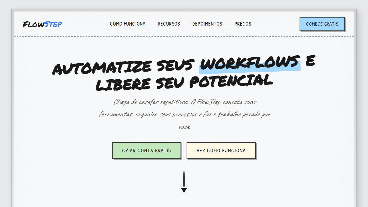
Vertical whiteboard tutorial landing page with metallic aluminum frame border (gray gradient, dual box-shadow) and decorative Expo markers at the bottom. Ideal for tutoriais passo a passo, onboarding de produto, guias educativos, how-to pages, documentacao visual, landing pages long-form. AI-ready template.
Use case: Tutoriais passo a passo, Onboarding de produto, Guias educativos, How-to pages, Documentacao visual, Landing pages long-form
Historical Context
The vertical timeline is one of those patterns that predates digital design entirely. Think of any whiteboard session where someone draws a line down the center and starts plotting milestones — that's the mental model we're working with. It's deeply rooted in how humans process sequential information: top to bottom, cause to effect, past to future. What makes the whiteboard aesthetic particularly interesting is its deliberate rejection of polish. In the early 2010s, skeuomorphic design tried to simulate real-world textures, and hand-drawn UI elements were everywhere — then flatness killed most of it. But the whiteboard timeline survived because it solves a real communication problem. When you strip away the grid perfection and let connectors breathe with slight imperfection, readers instinctively trust the content more. It reads as 'someone thought this through' rather than 'someone ran a template.' The vertical orientation itself carries weight. Horizontal timelines fight against scroll direction on every device. Vertical ones embrace it. They scale naturally from three steps to thirty without layout gymnastics.
When to Use
Reach for this when your content has clear sequential logic but you want to avoid the sterility of a numbered list. Product roadmaps, company history pages, onboarding flows, changelogs — anywhere the reader needs to understand both the order and the relationship between steps. It works especially well when entries have uneven content lengths, since vertical layouts absorb that asymmetry gracefully. Avoid it for non-sequential comparisons or when you have fewer than three items — at that point you're over-engineering a simple stack.
Design Principles
- Embrace imperfection intentionally — hand-drawn connectors and slightly irregular node shapes signal authenticity, but randomize within tight constraints so it reads as crafted, not sloppy.
- Maintain a strong vertical spine as the single anchoring element. Every decorative choice can be loose, but the central axis must be unmistakably clear or the entire hierarchy collapses.
- Give each node generous vertical breathing room. Cramped timelines defeat the purpose — whiteboard thinking is spatial thinking, and density kills scannability.
- Use progressive disclosure through visual weight: active or current steps get full opacity and larger nodes, while past and future steps recede. The eye should land on 'now' without instruction.
- Keep the illustration style consistent across all nodes. Mixing marker-style strokes with clean vector icons breaks the metaphor instantly — commit to one register and hold it.
DESIGN.md
---
version: "alpha"
name: "Vertical Whiteboard Timeline"
description: "Vertical whiteboard tutorial landing page with metallic aluminum frame border (gray gradient, dual box-shadow) and decorative Expo markers at the bottom. Ideal for tutoriais passo a passo, onboarding de produto, guias educativos, how-to pages, documentacao visual, landing pages long-form. AI-ready template."
colors:
  primary: "#F9FAFB"
  secondary: "#1A1A1A"
  tertiary: "#B8BBBE"
  neutral: "#E8E9EB"
  surface: "#A5D8FF"
  accent: "#FFF9E6"
typography:
  h1:
    fontFamily: Permanent Marker
    fontSize: 2.5rem
    fontWeight: 700
  body-md:
    fontFamily: Permanent Marker
    fontSize: 1rem
    fontWeight: 400
spacing:
  sm: 5.0rem
  md: 10.0rem
  lg: 20.0rem
components:
  button-primary:
    backgroundColor: "{colors.primary}"
    textColor: "{colors.neutral}"
    padding: 12px
---

## Overview

Vertical whiteboard tutorial landing page with metallic aluminum frame border (gray gradient, dual box-shadow) and decorative Expo markers at the bottom. Ideal for tutoriais passo a passo, onboarding de produto, guias educativos, how-to pages, documentacao visual, landing pages long-form. AI-ready template. The vertical timeline is one of those patterns that predates digital design entirely. Think of any whiteboard session where someone draws a line down the center and starts plotting milestones — that's the mental model we're working with. It's deeply rooted in how humans process sequential information: top to bottom, cause to effect, past to future.

What makes the whiteboard aesthetic particularly interesting is its deliberate rejection of polish. In the early 2010s, skeuomorphic design tried to simulate real-world textures, and hand-drawn UI elements were everywhere — then flatness killed most of it. But the whiteboard timeline survived because it solves a real communication problem. When you strip away the grid perfection and let connectors breathe with slight imperfection, readers instinctively trust the content more. It reads as 'someone thought this through' rather than 'someone ran a template.'

The vertical orientation itself carries weight. Horizontal timelines fight against scroll direction on every device. Vertical ones embrace it. They scale naturally from three steps to thirty without layout gymnastics.

- Density: 5/10 — Balanced
- Variance: 8/10 — Expressive
- Motion: 4/10 — Subtle

- **Style:** Handmade, Vertical Timeline, Step-by-Step, Whiteboard, Tutorial, Onboarding
- **Keywords:** vertical whiteboard, timeline, step-by-step, tutorial, onboarding, handmade, sketch, doodle icons, sticky notes, hard shadows, moldura metalica, marcadores expo, Permanent Marker, Caveat, Kalam, Patrick Hand, setas curvas, circulos numerados, bordas irregulares, pastel fills, flowchart vertical
- **Era:** 2024-2026 Handmade Digital / Tutorial Sketchnote
- **Light/Dark:** ✓ Full / ✗ None

## Colors

- **Branco-Gelo** (#F9FAFB) — Light surface, card backgrounds
- **Tinta Preta Marcador** (#1A1A1A) — Secondary surface or text color
- **Moldura Cinza** (#B8BBBE) — Secondary text, borders, muted elements
- **Fundo Pagina** (#E8E9EB) — Primary background surface
- **Azul Pastel** (#A5D8FF) — Secondary accent
- **Amarelo Pastel** (#FFF9E6) — Warning states, attention indicators
- **Verde Claro** (#C3E8BD) — Success states, positive indicators
- **Rosa Suave** (#FADADD) — Decorative accent, highlight elements
- **Laranja Suave** (#FFE0C2) — Warm accent, call-to-action secondary
- **Lavanda** (#E8DCF5) — Extended palette, decorative use


## Typography

- **Display / Hero:** Permanent Marker — Weight 700, tight tracking, used for headline impact
- **Accent:** Kalam — Used for decorative or emphasis text
- **Body:** Permanent Marker — Weight 400, 16px/1.6 line-height, max 72ch per line
- **UI Labels / Captions:** Permanent Marker — 0.875rem, weight 500, slight letter-spacing
- **Monospace:** JetBrains Mono — Used for code, metadata, and technical values

Scale:
- Hero: clamp(2.5rem, 5vw, 4rem)
- H1: 2.25rem
- H2: 1.5rem
- Body: 1rem / 1.6
- Small: 0.875rem


## Layout

- **Grid:** CSS Grid primary. Max-width containment: 1280px centered with 1.5rem side padding.
- **Spacing rhythm:** Balanced. Base unit: 0.5rem (8px).
- **Section vertical gaps:** clamp(4rem, 8vw, 8rem).
- **Hero layout:** Asymmetric composition.
- **Feature sections:** Asymmetric grid with varied card sizes. No 3-equal-columns.
- **Mobile collapse:** All multi-column layouts collapse below 768px. No horizontal overflow.
- **z-index contract:** base (0) / sticky-nav (100) / overlay (200) / modal (300) / toast (500).


## Elevation & Depth

MOLDURA METALICA: Borda cinza gradient multi-stop simulando frame de aluminio de whiteboard fisico com box-shadow duplo. Na base, marcadores Expo e apagador como elementos decorativos (divs estilizados). | TIMELINE VERTICAL: Linha tracejada ou solida preta irregular descendo do lado esquerdo (30-40% largura), conectando circulos numerados de cada step. | CIRCULOS NUMERADOS: Circulos com borda preta grossa 2.5-3px, fill pastel (azul, verde, rosa alternando), numero grande em Permanent Marker. | SETAS CONECTORAS: SVG paths com stroke-linecap round, stroke-width 3-4px variavel, curvatura organica. Setas horizontais do circulo para a caixa de conteudo a direita. Setas verticais descendentes entre steps. | CAIXAS DE CONTEUDO: Retangulos com bordas pretas irregulares 2-3px, fundo branco ou amarelo pastel, hard shadow 4-6px offset sem blur. Screenshots internos com bordas grossas e cantos levemente amassados. | ICONES DOODLE: SVG stroke-only (laptop, pasta, engrenagem, play, megafone, cursor), contorno preto 2-3px, fill pastel opcional, tamanho 40-80px. | SOMBRAS HARD: box-shadow com blur ZERO, offset 4-6px, cor #333 opacity 0.3-0.5. | TEXTURA WHITEBOARD: Background noise sutil 5-8% opacity sobre fundo branco-gelo.

- **Physics:** Ease-out curves, 200-300ms duration. Smooth and predictable.
- **Entry animations:** Fade + translate-Y (16px → 0) over 420ms ease-out. Staggered cascades for lists: 80ms between items.
- **Hover states:** Subtle color shift + shadow adjustment over 200ms.
- **Page transitions:** Fade only (200ms).
- **Performance:** Only transform and opacity animated. No layout-triggering properties.


## Shapes

Base corner radius: 12px. See rounded tokens in front matter for the full scale.


## Components

- **Primary Button:** Moderately rounded (0.75rem) shape. Accent color fill. Hover: 8% darken + subtle lift shadow. Active: -1px translate tactile press. Font weight 600. No outer glows.
- **Secondary / Ghost Button:** Outline variant. 1.5px border in muted color. Text in primary color. Hover: subtle background fill.
- **Cards:** Moderately rounded (0.75rem) corners. Surface background. Subtle shadow (0 2px 12px rgba(0,0,0,0.06)). 1px border stroke.
- **Inputs:** Label above input. 1px border stroke. Focus ring: 2px accent color offset 2px. Error text below in semantic red. No floating labels.
- **Navigation:** Primary surface background. Active item: accent color indicator. Font weight 500 when active.
- **Skeletons:** Shimmer animation matching component dimensions. No circular spinners.
- **Empty States:** Icon-based composition with descriptive text and action button.


## Do's and Don'ts

- No emojis in UI — use icon system only (Lucide, Heroicons)
- No pure black (#000000) — use off-black or charcoal variants
- No oversaturated accent colors (saturation cap: 80%)
- No 3-column equal-width feature layouts — use zig-zag or asymmetric grid
- No `h-screen` — use `min-h-[100dvh]`
- No AI copywriting clichés: "Elevate", "Seamless", "Unleash", "Next-Gen"
- No broken external image links — use picsum.photos or inline SVG
- No generic lorem ipsum in demos

- Do Moldura metalica com gradient cinza e marcadores Expo decorativos na base
- Do Timeline vertical esquerda com linha tracejada preta
- Do Circulos numerados com fill pastel alternado e borda preta grossa
- Do Setas SVG curvas horizontais (circulo → caixa) e verticais (step → step)
- Do Caixas de conteudo com bordas irregulares e hard shadow sem blur
- Do 4 fontes Google: Permanent Marker + Kalam + Patrick Hand + Caveat
- Do Icones doodle SVG stroke-only com fill pastel opcional
- Do Sombras hard 4-6px offset sem blur em todos os elementos
- Do Textura whiteboard sutil no fundo
- Do Layout 35/65 colapsando para stack em mobile
- Do Fade-in sequencial dos steps ao scroll
- Do CTA final com destaque de cor mais forte


## Use Case

Tutoriais passo a passo, Onboarding de produto, Guias educativos, How-to pages, Documentacao visual, Landing pages long-form
Technical Specs
CSS
font-family: 'Permanent Marker'/'Kalam'/'Patrick Hand'/'Caveat', box-shadow: 4px 4px 0px rgba(51,51,51,0.4) NO BLUR, border: 2.5px solid #1A1A1A, stroke-width: 3-4px variable, stroke-linecap: round, stroke-linejoin: round, stroke-dasharray for dashed timeline, background: linear-gradient(135deg, #C8CACD, #D8DADD, #C0C2C5, #B0B2B5) for frame, grid-template-columns: 35% 65% collapsing to 1fr at 768px, gap: 4-6rem between steps, transform: rotate(-2deg) on titles, clip-path or rough.js for irregular borders, Intersection Observer for scroll reveal
Variables
--wb-bg: #F9FAFB, --wb-bg-page: #E8E9EB, --wb-frame: #B8BBBE, --wb-ink: #1A1A1A, --wb-ink-soft: rgba(26,26,26,0.7), --wb-ink-faint: rgba(26,26,26,0.35), --wb-blue: #A5D8FF, --wb-yellow: #FFF9E6, --wb-green: #C3E8BD, --wb-pink: #FADADD, --wb-lavender: #E8DCF5, --wb-orange: #FFE0C2, --wb-shadow: 4px 4px 0px rgba(51,51,51,0.4), --wb-shadow-strong: 6px 6px 0px rgba(51,51,51,0.5), --font-title: 'Permanent Marker' cursive, --font-body: 'Kalam' cursive, --font-accent: 'Patrick Hand' cursive, --font-handwrite: 'Caveat' cursive, --wb-border: 2.5px solid #1A1A1A, --wb-border-thick: 3px solid #1A1A1A, --timeline-width: 35%, --content-width: 65%, --step-gap: 5rem
Checklist
☐ Moldura metalica com gradient cinza e marcadores Expo decorativos na base, ☐ Timeline vertical esquerda com linha tracejada preta, ☐ Circulos numerados com fill pastel alternado e borda preta grossa, ☐ Setas SVG curvas horizontais (circulo → caixa) e verticais (step → step), ☐ Caixas de conteudo com bordas irregulares e hard shadow sem blur, ☐ 4 fontes Google: Permanent Marker + Kalam + Patrick Hand + Caveat, ☐ Icones doodle SVG stroke-only com fill pastel opcional, ☐ Sombras hard 4-6px offset sem blur em todos os elementos, ☐ Textura whiteboard sutil no fundo, ☐ Layout 35/65 colapsando para stack em mobile, ☐ Fade-in sequencial dos steps ao scroll, ☐ CTA final com destaque de cor mais forte
Colors
Primary
Secondary
Effects
MOLDURA METALICA: Borda cinza gradient multi-stop simulando frame de aluminio de whiteboard fisico com box-shadow duplo. Na base, marcadores Expo e apagador como elementos decorativos (divs estilizados). | TIMELINE VERTICAL: Linha tracejada ou solida preta irregular descendo do lado esquerdo (30-40% largura), conectando circulos numerados de cada step. | CIRCULOS NUMERADOS: Circulos com borda preta grossa 2.5-3px, fill pastel (azul, verde, rosa alternando), numero grande em Permanent Marker. | SETAS CONECTORAS: SVG paths com stroke-linecap round, stroke-width 3-4px variavel, curvatura organica. Setas horizontais do circulo para a caixa de conteudo a direita. Setas verticais descendentes entre steps. | CAIXAS DE CONTEUDO: Retangulos com bordas pretas irregulares 2-3px, fundo branco ou amarelo pastel, hard shadow 4-6px offset sem blur. Screenshots internos com bordas grossas e cantos levemente amassados. | ICONES DOODLE: SVG stroke-only (laptop, pasta, engrenagem, play, megafone, cursor), contorno preto 2-3px, fill pastel opcional, tamanho 40-80px. | SOMBRAS HARD: box-shadow com blur ZERO, offset 4-6px, cor #333 opacity 0.3-0.5. | TEXTURA WHITEBOARD: Background noise sutil 5-8% opacity sobre fundo branco-gelo.
Light/Dark
✓ Full / ✗ None
AI Prompt
Act as a Senior Frontend Engineer and Expert UI Designer.
Your task is to code a complete Landing Page on the first attempt.
- Landing Page Theme: <INSERT THEME>
- Sections to add: <INSERT SECTIONS>

Generate the final code immediately following these definitions:

## Style

- **Name:** Vertical Whiteboard Timeline
- **Type:** Handmade, Vertical Timeline, Step-by-Step, Whiteboard, Tutorial, Onboarding
- **Keywords:** vertical whiteboard, timeline, step-by-step, tutorial, onboarding, handmade, sketch, doodle icons, sticky notes, hard shadows, moldura metalica, marcadores expo, Permanent Marker, Caveat, Kalam, Patrick Hand, setas curvas, circulos numerados, bordas irregulares, pastel fills, flowchart vertical
- **Era:** 2024-2026 Handmade Digital / Tutorial Sketchnote
- **Light/Dark:** ✓ Full / ✗ None

## Color Palette

- **Primary:** Branco-Gelo #F9FAFB, Tinta Preta Marcador #1A1A1A, Moldura Cinza #B8BBBE, Fundo Pagina #E8E9EB
- **Secondary:** Azul Pastel #A5D8FF, Amarelo Pastel #FFF9E6, Verde Claro #C3E8BD, Rosa Suave #FADADD, Laranja Suave #FFE0C2, Lavanda #E8DCF5

## Visual Effects

MOLDURA METALICA: Borda cinza gradient multi-stop simulando frame de aluminio de whiteboard fisico com box-shadow duplo. Na base, marcadores Expo e apagador como elementos decorativos (divs estilizados). | TIMELINE VERTICAL: Linha tracejada ou solida preta irregular descendo do lado esquerdo (30-40% largura), conectando circulos numerados de cada step. | CIRCULOS NUMERADOS: Circulos com borda preta grossa 2.5-3px, fill pastel (azul, verde, rosa alternando), numero grande em Permanent Marker. | SETAS CONECTORAS: SVG paths com stroke-linecap round, stroke-width 3-4px variavel, curvatura organica. Setas horizontais do circulo para a caixa de conteudo a direita. Setas verticais descendentes entre steps. | CAIXAS DE CONTEUDO: Retangulos com bordas pretas irregulares 2-3px, fundo branco ou amarelo pastel, hard shadow 4-6px offset sem blur. Screenshots internos com bordas grossas e cantos levemente amassados. | ICONES DOODLE: SVG stroke-only (laptop, pasta, engrenagem, play, megafone, cursor), contorno preto 2-3px, fill pastel opcional, tamanho 40-80px. | SOMBRAS HARD: box-shadow com blur ZERO, offset 4-6px, cor #333 opacity 0.3-0.5. | TEXTURA WHITEBOARD: Background noise sutil 5-8% opacity sobre fundo branco-gelo.

## AI Visual Direction

Design a vertical whiteboard tutorial landing page with metallic aluminum frame border (gray gradient, dual box-shadow) and decorative Expo markers at the bottom. Layout: left column (30-40%) has vertical dashed timeline with numbered step circles (pastel fills, thick black borders, Permanent Marker font numbers), right column (60-70%) has content boxes with explanations and doodle icons. Curved SVG arrows connect circles to content boxes horizontally, and vertical arrows connect steps top-to-bottom. 4 Google Fonts: Permanent Marker for titles/step numbers (uppercase, slight rotation), Caveat for handwritten annotations (italic), Kalam for body text, Patrick Hand for labels. All elements use hard shadows (4-6px offset, ZERO blur, #333 at 0.3-0.5 opacity). Solid black borders 2-3px on everything. Content boxes have white or pale yellow #FFF9E6 background. Doodle SVG icons: laptop with download arrow, cursor clicking, folder with checkmark, plus button, gear, play button, megaphone, connector plugs — all stroke-only with round linecap/linejoin. Step circles alternate pastel colors: blue #A5D8FF, green #C3E8BD, pink #FADADD, orange #FFE0C2, lavender #E8DCF5. Final CTA box with stronger blue or pink background. Whiteboard texture: subtle noise overlay 5-8% opacity. Mobile: timeline centers, content stacks below each step circle. Intersection Observer fade-in animation on scroll.

## CSS Technical

```css
font-family: 'Permanent Marker'/'Kalam'/'Patrick Hand'/'Caveat', box-shadow: 4px 4px 0px rgba(51,51,51,0.4) NO BLUR, border: 2.5px solid #1A1A1A, stroke-width: 3-4px variable, stroke-linecap: round, stroke-linejoin: round, stroke-dasharray for dashed timeline, background: linear-gradient(135deg, #C8CACD, #D8DADD, #C0C2C5, #B0B2B5) for frame, grid-template-columns: 35% 65% collapsing to 1fr at 768px, gap: 4-6rem between steps, transform: rotate(-2deg) on titles, clip-path or rough.js for irregular borders, Intersection Observer for scroll reveal
```

## Design System Variables

```css
--wb-bg: #F9FAFB, --wb-bg-page: #E8E9EB, --wb-frame: #B8BBBE, --wb-ink: #1A1A1A, --wb-ink-soft: rgba(26,26,26,0.7), --wb-ink-faint: rgba(26,26,26,0.35), --wb-blue: #A5D8FF, --wb-yellow: #FFF9E6, --wb-green: #C3E8BD, --wb-pink: #FADADD, --wb-lavender: #E8DCF5, --wb-orange: #FFE0C2, --wb-shadow: 4px 4px 0px rgba(51,51,51,0.4), --wb-shadow-strong: 6px 6px 0px rgba(51,51,51,0.5), --font-title: 'Permanent Marker' cursive, --font-body: 'Kalam' cursive, --font-accent: 'Patrick Hand' cursive, --font-handwrite: 'Caveat' cursive, --wb-border: 2.5px solid #1A1A1A, --wb-border-thick: 3px solid #1A1A1A, --timeline-width: 35%, --content-width: 65%, --step-gap: 5rem
```

## Implementation Checklist

- ☐ Moldura metalica com gradient cinza e marcadores Expo decorativos na base
- ☐ Timeline vertical esquerda com linha tracejada preta
- ☐ Circulos numerados com fill pastel alternado e borda preta grossa
- ☐ Setas SVG curvas horizontais (circulo → caixa) e verticais (step → step)
- ☐ Caixas de conteudo com bordas irregulares e hard shadow sem blur
- ☐ 4 fontes Google: Permanent Marker + Kalam + Patrick Hand + Caveat
- ☐ Icones doodle SVG stroke-only com fill pastel opcional
- ☐ Sombras hard 4-6px offset sem blur em todos os elementos
- ☐ Textura whiteboard sutil no fundo
- ☐ Layout 35/65 colapsando para stack em mobile
- ☐ Fade-in sequencial dos steps ao scroll
- ☐ CTA final com destaque de cor mais forte

## Execution Rules

1. Strictly follow the defined visual style.
2. Use high-quality inline SVG icons (Heroicons or Lucide style) — NEVER use emojis as icons.
3. Add `cursor-pointer` and smooth `hover` states (transition-all) on all interactive elements.
4. Required Page Structure:
   - Navbar (Logo + Links + CTA)
   - Hero Section (Impactful Headline + Subtitle + 2 buttons + 3D/Abstract visual element via CSS)
   - Features (3 cards with icons)
   - Testimonials (3 cards)
   - Pricing (3 tiers, highlight the middle one)
   - Final CTA
   - Full Footer with social links, privacy policy, terms of use, contact and SEO links.
5. All text content must be in English.
6. The visual must be CLEARLY distinct — do not create a "default Bootstrap" design. Force the use of the provided design system variables.
7. Use `<style>` tags in the head for custom classes (especially for complex backdrop-filter effects and animations) that Tailwind CDN doesn't cover.
8. Full Responsiveness: Layout must adapt perfectly to Mobile, Tablet and Desktop (vertical stack on mobile).
9. Include basic SEO, Viewport and Open Graph meta tags in `<head>`.
10. Footer must contain: Copyright 2026, Secondary navigation links and Social media icons.
11. Make the creative decisions needed to deliver the complete, functional result now.
Related
Last synced: 4/1/2026