The Barely-There UI
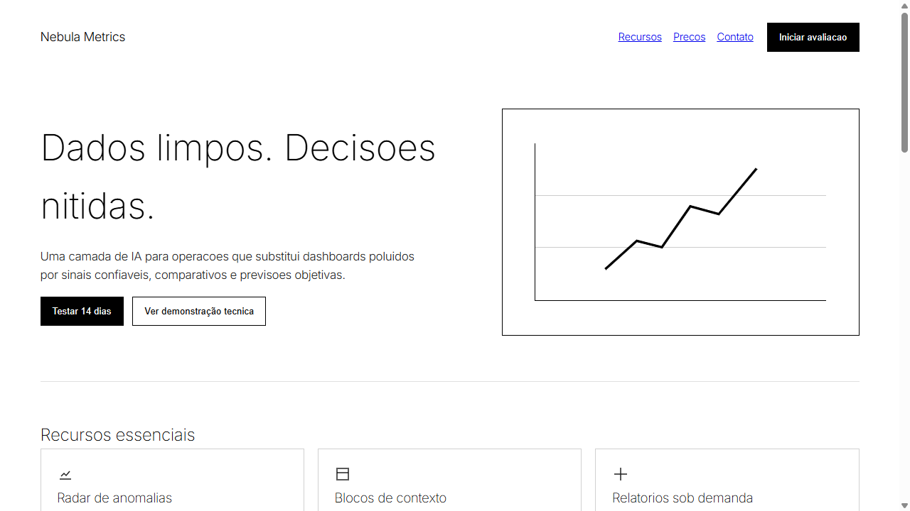
Design an ultra-minimal AI-native interface inspired by OpenAI and Perplexity. Ideal for plataformas de ia, saas b2b enterprise, dashboards analiticos, ferramentas de produtividade, interfaces de dados. AI-ready template.
Use case: Platforms de IA, SaaS B2B enterprise, Dashboards analiticos, Tools de produtividade, Interfaces de dados
Historical Context
The barely-there UI didn't emerge from nowhere — it's the logical endpoint of a conversation Swiss designers started in the 1950s. Müller-Brockmann and his grid obsessives proved that restraint communicates more than decoration ever could. But where International Typographic Style still announced itself through bold structure, the barely-there approach takes that philosophy to its vanishing point. The real catalyst was the reading app boom of the early 2010s. Instapaper, iA Writer, Medium's original design — they all asked the same question: what if the interface just... got out of the way? Not hidden behind hamburger menus, but dissolved into near-invisibility through opacity hierarchies and ultra-thin strokes. The chrome didn't disappear; it became translucent. What makes this trend genuinely interesting is its confidence. It takes a designer who trusts their content hierarchy completely to reduce UI elements to 40% opacity hairlines. There's no safety net of bold borders or high-contrast containers. You're betting everything on spatial relationships and typographic weight doing the heavy lifting. When it works — and it often does — the user forgets they're looking at an interface at all.
When to Use
Deploy barely-there when your content deserves absolute primacy. Photography portfolios where a visible nav would compete with the images. Long-form reading tools where cognitive load from chrome actively degrades the experience. Meditation and wellness apps where visual quietness IS the product value. Content-first dashboards where data density demands every pixel of attention. Skip it entirely for complex workflows, e-commerce, or anything requiring clear affordances — invisible buttons are just broken buttons wearing a turtleneck.
Design Principles
- Opacity as hierarchy: Primary actions at 60-80% opacity, secondary at 30-40%, tertiary at 15-20%. Never use color weight when transparency can communicate the same relationship with less visual noise.
- Ultra-thin everything: 0.5px borders maximum. If your strokes are visible at arm's length, they're too heavy. The divider should be felt more than seen — a suggestion of structure, not a declaration.
- Negative space is the container: Stop wrapping things in boxes. Let whitespace define boundaries. A 48px gap communicates grouping more elegantly than any card border ever will.
- Typography carries all weight: With chrome dissolved, your type system becomes your entire visual hierarchy. Invest in a scale with real contrast — 11px metadata against 32px titles. The spread does the work that UI elements used to do.
- Reveal on intent: Interactive elements surface on hover/focus, not by default. The interface responds to attention rather than demanding it. But always maintain accessible focus states — invisible doesn't mean inaccessible.
DESIGN.md
---
version: "alpha"
name: "The Barely-There UI"
description: "Design an ultra-minimal AI-native interface inspired by OpenAI and Perplexity. Ideal for plataformas de ia, saas b2b enterprise, dashboards analiticos, ferramentas de produtividade, interfaces de dados. AI-ready template."
colors:
  primary: "#FFFFFF"
  secondary: "#000000"
  tertiary: "#808080"
  neutral: "#F5F5F5"
  surface: "#BDBDBD"
  accent: "#424242"
typography:
  h1:
    fontFamily: Inter
    fontSize: 2.5rem
    fontWeight: 700
  body-md:
    fontFamily: Inter
    fontSize: 1rem
    fontWeight: 400
spacing:
  sm: 3.0rem
  md: 6.0rem
  lg: 12.0rem
components:
  button-primary:
    backgroundColor: "{colors.primary}"
    textColor: "{colors.neutral}"
    padding: 12px
---

## Overview

Design an ultra-minimal AI-native interface inspired by OpenAI and Perplexity. Ideal for plataformas de ia, saas b2b enterprise, dashboards analiticos, ferramentas de produtividade, interfaces de dados. AI-ready template. The barely-there UI didn't emerge from nowhere — it's the logical endpoint of a conversation Swiss designers started in the 1950s. Müller-Brockmann and his grid obsessives proved that restraint communicates more than decoration ever could. But where International Typographic Style still announced itself through bold structure, the barely-there approach takes that philosophy to its vanishing point.

The real catalyst was the reading app boom of the early 2010s. Instapaper, iA Writer, Medium's original design — they all asked the same question: what if the interface just... got out of the way? Not hidden behind hamburger menus, but dissolved into near-invisibility through opacity hierarchies and ultra-thin strokes. The chrome didn't disappear; it became translucent.

What makes this trend genuinely interesting is its confidence. It takes a designer who trusts their content hierarchy completely to reduce UI elements to 40% opacity hairlines. There's no safety net of bold borders or high-contrast containers. You're betting everything on spatial relationships and typographic weight doing the heavy lifting. When it works — and it often does — the user forgets they're looking at an interface at all.

- Density: 3/10 — Airy
- Variance: 2/10 — Structured
- Motion: 4/10 — Subtle

- **Style:** Ultra-Minimal, Opacity-Driven, Data-Focused, AI-Native
- **Keywords:** barely-there, ultra-thin, opacity hierarchy, single typeface, data visualization, white space architecture, cognitive reduction, AI interface, technical minimalism, high-resolution
- **Era:** 2025-2026 AI-Native
- **Light/Dark:** ✓ Full / ✓ Full

## Colors

- **Branco Puro** (#FFFFFF) — Light surface, card backgrounds
- **Preto Absoluto** (#000000) — Dark surface, primary background
- **Cinza Neutro** (#808080) — Secondary text, borders, muted elements
- **Cinza Claro** (#F5F5F5) — Secondary text, borders, muted elements
- **Cinza Medio** (#BDBDBD) — Secondary text, borders, muted elements
- **Cinza Escuro** (#424242) — Deep contrast surface


## Typography

- **Display / Hero:** Inter — Weight 700, tight tracking, used for headline impact
- **Body:** Inter — Weight 400, 16px/1.6 line-height, max 72ch per line
- **UI Labels / Captions:** Inter — 0.875rem, weight 500, slight letter-spacing
- **Monospace:** JetBrains Mono — Used for code, metadata, and technical values

Scale:
- Hero: clamp(2.5rem, 5vw, 4rem)
- H1: 2.25rem
- H2: 1.5rem
- Body: 1rem / 1.6
- Small: 0.875rem


## Layout

- **Grid:** CSS Grid primary. Max-width containment: 1280px centered with 1.5rem side padding.
- **Spacing rhythm:** Balanced. Base unit: 0.5rem (8px).
- **Section vertical gaps:** clamp(4rem, 8vw, 8rem).
- **Hero layout:** Split-screen (text left, visual right).
- **Feature sections:** Zig-zag alternating text+image rows. No 3-equal-columns.
- **Mobile collapse:** All multi-column layouts collapse below 768px. No horizontal overflow.
- **z-index contract:** base (0) / sticky-nav (100) / overlay (200) / modal (300) / toast (500).


## Elevation & Depth

Opacidade como hierarquia (100% titulo, 87% corpo, 60% secundario), transicoes ultra-suaves 300ms, zero sombras, zero gradientes, espacamento arquitetonico generoso, visualizacoes de dados rigorosas substituindo ilustracoes

- **Physics:** Ease-out curves, 200-300ms duration. Smooth and predictable.
- **Entry animations:** Fade + translate-Y (16px → 0) over 420ms ease-out. Staggered cascades for lists: 80ms between items.
- **Hover states:** Subtle color shift + shadow adjustment over 200ms.
- **Page transitions:** Fade only (200ms).
- **Performance:** Only transform and opacity animated. No layout-triggering properties.


## Shapes

Base corner radius: 0px. See rounded tokens in front matter for the full scale.


## Components

- **Primary Button:** Sharp edges (0px) shape. Accent color fill. Hover: 8% darken + subtle lift shadow. Active: -1px translate tactile press. Font weight 600. No outer glows.
- **Secondary / Ghost Button:** Outline variant. 1.5px border in muted color. Text in primary color. Hover: subtle background fill.
- **Cards:** Sharp edges (0px) corners. Surface background. Subtle shadow (0 2px 12px rgba(0,0,0,0.06)). 1px border stroke.
- **Inputs:** Label above input. 1px border stroke. Focus ring: 2px accent color offset 2px. Error text below in semantic red. No floating labels.
- **Navigation:** Primary surface background. Active item: accent color indicator. Font weight 500 when active.
- **Skeletons:** Shimmer animation matching component dimensions. No circular spinners.
- **Empty States:** Icon-based composition with descriptive text and action button.


## Do's and Don'ts

- No emojis in UI — use icon system only (Lucide, Heroicons)
- No decorative gradients — flat color only
- No shadows heavier than 0 2px 8px rgba(0,0,0,0.08)
- No pure black (#000000) — use off-black or charcoal variants
- No oversaturated accent colors (saturation cap: 80%)
- No 3-column equal-width feature layouts — use zig-zag or asymmetric grid
- No `h-screen` — use `min-h-[100dvh]`
- No AI copywriting clichés: "Elevate", "Seamless", "Unleash", "Next-Gen"
- No broken external image links — use picsum.photos or inline SVG
- No generic lorem ipsum in demos

- Do Apenas UMA familia tipografica
- Do Pesos ultra-finos (100-300)
- Do Hierarquia por opacidade (4 niveis)
- Do Maximo 3 cores
- Do Zero sombras e gradientes
- Do Visualizacoes de dados no lugar de ilustracoes
- Do Espacamento arquitetonico generoso
- Do Contraste WCAG AA verificado


## Use Case

Platforms de IA, SaaS B2B enterprise, Dashboards analiticos, Tools de produtividade, Interfaces de dados
Technical Specs
CSS
font-family: 'Inter', system-ui, sans-serif; font-weight: 100-300; color: rgba(0,0,0,1/0.87/0.7/0.6); letter-spacing: -0.02em; line-height: 1.6; max-width: 1200px; margin: 0 auto; padding: 4rem; gap: 3rem; border: none; box-shadow: none; background: #FFFFFF or #000000; transition: opacity 300ms ease
Variables
--font-primary: 'Inter', system-ui; --weight-thin: 100; --weight-light: 200; --weight-regular: 300; --opacity-high: 1; --opacity-medium: 0.87; --opacity-low: 0.7; --opacity-muted: 0.6; --color-bg: #FFFFFF; --color-ink: #000000; --spacing-xl: 4rem; --spacing-lg: 3rem; --border-radius: 0; --shadow: none
Checklist
☐ Apenas UMA familia tipografica, ☐ Pesos ultra-finos (100-300), ☐ Hierarquia por opacidade (4 niveis), ☐ Maximo 3 cores, ☐ Zero sombras e gradientes, ☐ Visualizacoes de dados no lugar de ilustracoes, ☐ Espacamento arquitetonico generoso, ☐ Contraste WCAG AA verificado
Colors
Primary
Secondary
Effects
Opacidade como hierarquia (100% titulo, 87% corpo, 60% secundario), transicoes ultra-suaves 300ms, zero sombras, zero gradientes, espacamento arquitetonico generoso, visualizacoes de dados rigorosas substituindo ilustracoes
Light/Dark
✓ Full / ✓ Full
AI Prompt
Act as a Senior Frontend Engineer and Expert UI Designer.
Your task is to code a complete Landing Page on the first attempt.
- Landing Page Theme: <INSERT THEME>
- Sections to add: <INSERT SECTIONS>

Generate the final code immediately following these definitions:

## Style

- **Name:** The Barely-There UI
- **Type:** Ultra-Minimal, Opacity-Driven, Data-Focused, AI-Native
- **Keywords:** barely-there, ultra-thin, opacity hierarchy, single typeface, data visualization, white space architecture, cognitive reduction, AI interface, technical minimalism, high-resolution
- **Era:** 2025-2026 AI-Native
- **Light/Dark:** ✓ Full / ✓ Full

## Color Palette

- **Primary:** Branco Puro #FFFFFF, Preto Absoluto #000000, Cinza Neutro #808080
- **Secondary:** Cinza Claro #F5F5F5, Cinza Medio #BDBDBD, Cinza Escuro #424242

## Visual Effects

Opacidade como hierarquia (100% titulo, 87% corpo, 60% secundario), transicoes ultra-suaves 300ms, zero sombras, zero gradientes, espacamento arquitetonico generoso, visualizacoes de dados rigorosas substituindo ilustracoes

## AI Visual Direction

Design an ultra-minimal AI-native interface inspired by OpenAI and Perplexity. Use ONLY ONE sans-serif font family (Inter or system-ui) in ultra-thin weights (100-300). Create text hierarchy EXCLUSIVELY through opacity levels: 100% for headings, 87% for body, 70% for secondary, 60% for tertiary. Maximum 2-3 colors total (black, white, one neutral gray). Replace all illustrations with functional data visualizations and rigorous charts. Use white space as architectural tool to reduce cognitive load. Zero shadows, zero gradients, zero decorative elements. Sharp geometric layouts with mathematical precision. Every pixel must serve a purpose.

## CSS Technical

```css
font-family: 'Inter', system-ui, sans-serif; font-weight: 100-300; color: rgba(0,0,0,1/0.87/0.7/0.6); letter-spacing: -0.02em; line-height: 1.6; max-width: 1200px; margin: 0 auto; padding: 4rem; gap: 3rem; border: none; box-shadow: none; background: #FFFFFF or #000000; transition: opacity 300ms ease
```

## Design System Variables

```css
--font-primary: 'Inter', system-ui; --weight-thin: 100; --weight-light: 200; --weight-regular: 300; --opacity-high: 1; --opacity-medium: 0.87; --opacity-low: 0.7; --opacity-muted: 0.6; --color-bg: #FFFFFF; --color-ink: #000000; --spacing-xl: 4rem; --spacing-lg: 3rem; --border-radius: 0; --shadow: none
```

## Implementation Checklist

- ☐ Apenas UMA familia tipografica
- ☐ Pesos ultra-finos (100-300)
- ☐ Hierarquia por opacidade (4 niveis)
- ☐ Maximo 3 cores
- ☐ Zero sombras e gradientes
- ☐ Visualizacoes de dados no lugar de ilustracoes
- ☐ Espacamento arquitetonico generoso
- ☐ Contraste WCAG AA verificado

## Execution Rules

1. Strictly follow the defined visual style.
2. Use high-quality inline SVG icons (Heroicons or Lucide style) — NEVER use emojis as icons.
3. Add `cursor-pointer` and smooth `hover` states (transition-all) on all interactive elements.
4. Required Page Structure:
   - Navbar (Logo + Links + CTA)
   - Hero Section (Impactful Headline + Subtitle + 2 buttons + 3D/Abstract visual element via CSS)
   - Features (3 cards with icons)
   - Testimonials (3 cards)
   - Pricing (3 tiers, highlight the middle one)
   - Final CTA
   - Full Footer with social links, privacy policy, terms of use, contact and SEO links.
5. All text content must be in English.
6. The visual must be CLEARLY distinct — do not create a "default Bootstrap" design. Force the use of the provided design system variables.
7. Use `<style>` tags in the head for custom classes (especially for complex backdrop-filter effects and animations) that Tailwind CDN doesn't cover.
8. Full Responsiveness: Layout must adapt perfectly to Mobile, Tablet and Desktop (vertical stack on mobile).
9. Include basic SEO, Viewport and Open Graph meta tags in `<head>`.
10. Footer must contain: Copyright 2026, Secondary navigation links and Social media icons.
11. Make the creative decisions needed to deliver the complete, functional result now.
Related
Last synced: 4/1/2026