Studio
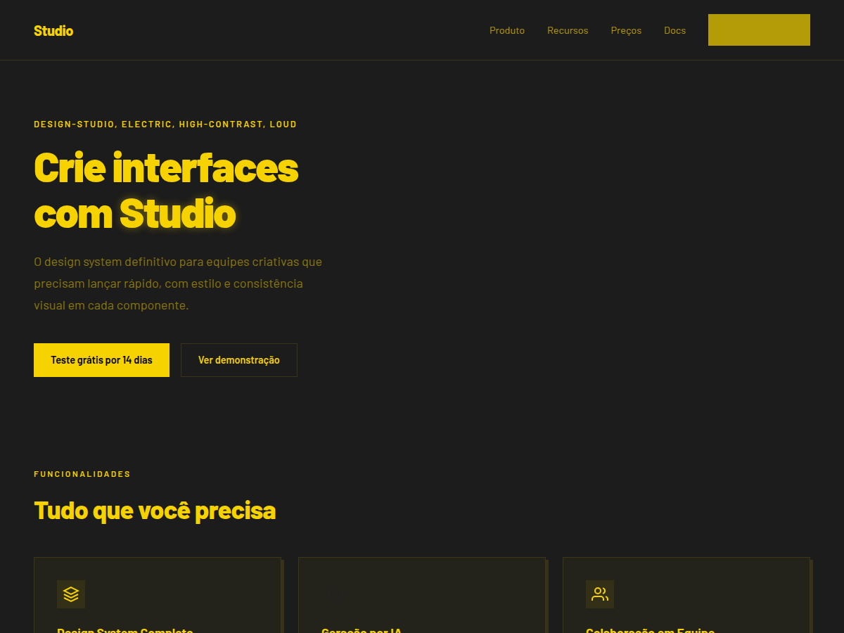
Studio — Black canvas with electric-yellow type; high-voltage design studio aesthetic. Barlow typography. near-black canvas with one signature electric-yellow that doubles as foreground . Best for design studio credentials, creative agency pitch, brand showcase. AI-ready design system.
Use case: design studio credentials, creative agency pitch, brand showcase, art-direction review, fashion / sneaker brand, bilingual EN/CN deck
Historical Context
The electric yellow and near-black combination didn't come from branding agencies. It came from warning signs, high-voltage labels, and construction tape — contexts where contrast isn't a style choice, it's a survival mechanism. Somewhere in the late 2000s, design studios started appropriating that industrial urgency for their own identities, recognizing that maximum contrast signals maximum confidence. Barlow at 900 weight is a specific kind of statement. It's a grotesk that doesn't apologize for taking up space — wide-set, mechanically precise, almost aggressive in how it fills a line. At its heaviest weight, it stops being text and becomes architecture. The letterforms become walls. Studios adopted this because it mirrors how they want to be perceived: unavoidable, structurally sound, impossible to scroll past. This pairing — nuclear yellow against void black, anchored by type that could hold up a building — is the visual equivalent of walking into a room and not introducing yourself because you don't need to. It's polarizing by design. Studios that choose this aren't looking for universal appeal; they're filtering for clients who match their energy.
When to Use
Deploy this for creative studios and agencies that lead with conviction, not compromise. Design firms whose work is the pitch — they don't need soft colors to seem approachable. Bold digital agencies, type foundries, portfolio sites where the design itself is the credential. It suits any brand that would rather lose a timid client than dilute the message. Not for healthcare, not for children's products, not for anything that needs to whisper. This system shouts on purpose.
Design Principles
- Maximum contrast as philosophy — if two elements can be pushed further apart in value, they should be
- Type as architecture — Barlow 900 isn't set, it's constructed; treat headlines as structural elements with mass and weight
- Chromatic restraint with electric punctuation — near-black dominates, yellow intervenes surgically and sparingly
- Negative space is loud — emptiness at this contrast level becomes as aggressive as the filled areas
- No gradients, no softness — every edge is hard, every transition is a cut, every boundary is intentional
DESIGN.md
---
version: "alpha"
name: "Studio"
description: "Studio — Black canvas with electric-yellow type; high-voltage design studio aesthetic. Barlow typography. near-black canvas with one signature electric-yellow that doubles as foreground . Best for design studio credentials, creative agency pitch, brand showcase. AI-ready design system."
colors:
  primary: "#1c1c1c"
  secondary: "#242422"
  tertiary: "#f5d200"
  neutral: "#f5d200"
  surface: "#f5d200"
typography:
  h1:
    fontFamily: Barlow
    fontSize: 2.5rem
    fontWeight: 700
  body-md:
    fontFamily: Barlow
    fontSize: 1rem
    fontWeight: 400
spacing:
  sm: 1.5rem
  md: 3.0rem
  lg: 6.0rem
components:
  button-primary:
    backgroundColor: "{colors.primary}"
    textColor: "{colors.neutral}"
    padding: 12px
---

## Overview

Studio — Black canvas with electric-yellow type; high-voltage design studio aesthetic. Barlow typography. near-black canvas with one signature electric-yellow that doubles as foreground . Best for design studio credentials, creative agency pitch, brand showcase. AI-ready design system. The electric yellow and near-black combination didn't come from branding agencies. It came from warning signs, high-voltage labels, and construction tape — contexts where contrast isn't a style choice, it's a survival mechanism. Somewhere in the late 2000s, design studios started appropriating that industrial urgency for their own identities, recognizing that maximum contrast signals maximum confidence.

Barlow at 900 weight is a specific kind of statement. It's a grotesk that doesn't apologize for taking up space — wide-set, mechanically precise, almost aggressive in how it fills a line. At its heaviest weight, it stops being text and becomes architecture. The letterforms become walls. Studios adopted this because it mirrors how they want to be perceived: unavoidable, structurally sound, impossible to scroll past.

This pairing — nuclear yellow against void black, anchored by type that could hold up a building — is the visual equivalent of walking into a room and not introducing yourself because you don't need to. It's polarizing by design. Studios that choose this aren't looking for universal appeal; they're filtering for clients who match their energy.

- Density: 5/10 — Balanced
- Variance: 5/10 — Moderate
- Motion: 7/10 — Kinetic

- **Style:** Design-Studio, Electric, High-Contrast, Loud
- **Keywords:** Electric yellow, near-black, Barlow 900, design studio, high contrast, electric, loud, fashion
- **Era:** 2020s Design Studio
- **Light/Dark:** ✗ None / ✓ Full

## Colors

- **Bg** (#1c1c1c) — Primary surface or dominant color
- **Bg Alt** (#242422) — Accent highlight, links and focus states
- **Fg** (#f5d200) — Secondary accent
- **Accent** (#f5d200) — Accent color, emphasis elements
- **Bg Light** (#f5d200) — Extended palette, decorative use


## Typography

- **Display / Hero:** Barlow — Weight 700, tight tracking, used for headline impact
- **Body:** Barlow — Weight 400, 16px/1.6 line-height, max 72ch per line
- **UI Labels / Captions:** Barlow — 0.875rem, weight 500, slight letter-spacing
- **Monospace:** IBM Plex Mono — Used for code, metadata, and technical values

Scale:
- Hero: clamp(2.5rem, 5vw, 4rem)
- H1: 2.25rem
- H2: 1.5rem
- Body: 1rem / 1.6
- Small: 0.875rem


## Layout

- **Grid:** CSS Grid primary. Max-width containment: 1280px centered with 1.5rem side padding.
- **Spacing rhythm:** Balanced. Base unit: 0.5rem (8px).
- **Section vertical gaps:** clamp(4rem, 8vw, 8rem).
- **Hero layout:** Split-screen (text left, visual right).
- **Feature sections:** Zig-zag alternating text+image rows. No 3-equal-columns.
- **Mobile collapse:** All multi-column layouts collapse below 768px. No horizontal overflow.
- **z-index contract:** base (0) / sticky-nav (100) / overlay (200) / modal (300) / toast (500).


## Elevation & Depth

display font Barlow for hero headlines, bold hover color shift (150ms), high-contrast active states, dark canvas with glow/shadow accents, electric-yellow type on near-black, reverses to yellow-paper mode for contrast

- **Physics:** Ease-out curves, 200-300ms duration. Smooth and predictable.
- **Entry animations:** Fade + translate-Y (16px → 0) over 420ms ease-out. Staggered cascades for lists: 80ms between items.
- **Hover states:** Subtle color shift + shadow adjustment over 200ms.
- **Page transitions:** Fade only (200ms).
- **Performance:** Only transform and opacity animated. No layout-triggering properties.


## Shapes

Base corner radius: 0px. See rounded tokens in front matter for the full scale.


## Components

- **Primary Button:** 0px border-radius. Accent color fill. Hover: 8% darken + subtle lift shadow. Active: -1px translate tactile press. Font weight 600. No outer glows.
- **Secondary / Ghost Button:** Outline variant. 1.5px border in muted color. Text in primary color. Hover: subtle background fill.
- **Cards:** 0px corners. Surface background. Subtle shadow (0 2px 12px rgba(0,0,0,0.06)). 1px border stroke.
- **Inputs:** Label above input. 1px border stroke. Focus ring: 2px accent color offset 2px. Error text below in semantic red. No floating labels.
- **Navigation:** Primary surface background. Active item: accent color indicator. Font weight 500 when active.
- **Skeletons:** Shimmer animation matching component dimensions. No circular spinners.
- **Empty States:** Icon-based composition with descriptive text and action button.


## Do's and Don'ts

- No emojis in UI — use icon system only (Lucide, Heroicons)
- No pure black (#000000) — use off-black or charcoal variants
- No oversaturated accent colors (saturation cap: 80%)
- No 3-column equal-width feature layouts — use zig-zag or asymmetric grid
- No `h-screen` — use `min-h-[100dvh]`
- No AI copywriting clichés: "Elevate", "Seamless", "Unleash", "Next-Gen"
- No broken external image links — use picsum.photos or inline SVG
- No generic lorem ipsum in demos

- Do Barlow display font loaded via Google Fonts
- Do Color palette variables applied consistently
- Do Typography scale: hero clamp(2.5rem,5vw,4rem)
- Do H1 2.25rem
- Do body 1rem/1.6
- Do WCAG AA contrast ratio verified (4.5:1 body text)
- Do Dark background contrast ≥ 7:1 for body text
- Do Mobile responsive layout (stack below 768px)


## Use Case

design studio credentials, creative agency pitch, brand showcase, art-direction review, fashion / sneaker brand, bilingual EN/CN deck
Technical Specs
CSS
font-family: 'Barlow', sans-serif; font-weight: 900; background: #1c1c1c; color: #f5d200; --accent: #f5d200; text-transform: uppercase; font-size: clamp(2rem,5vw,5rem)
Variables
--bg: #1c1c1c, --fg: #f5d200, --accent: #f5d200, --font-display: 'Barlow', --font-body: 'Barlow', --radius: 0px, --spacing: 1.5rem
Checklist
☐ Barlow display font loaded via Google Fonts, ☐ Color palette variables applied consistently, ☐ Typography scale: hero clamp(2.5rem,5vw,4rem), H1 2.25rem, body 1rem/1.6, ☐ WCAG AA contrast ratio verified (4.5:1 body text), ☐ Dark background contrast ≥ 7:1 for body text, ☐ Mobile responsive layout (stack below 768px)
Colors
Primary
Secondary
Effects
display font Barlow for hero headlines, bold hover color shift (150ms), high-contrast active states, dark canvas with glow/shadow accents, electric-yellow type on near-black, reverses to yellow-paper mode for contrast
Light/Dark
✗ None / ✓ Full
AI Prompt
Act as a Senior Frontend Engineer and Expert UI Designer.
Your task is to code a complete Landing Page on the first attempt.
- Landing Page Theme: <INSERT THEME>
- Sections to add: <INSERT SECTIONS>

Generate the final code immediately following these definitions:

## Style

- **Name:** Studio
- **Type:** Design-Studio, Electric, High-Contrast, Loud
- **Keywords:** Electric yellow, near-black, Barlow 900, design studio, high contrast, electric, loud, fashion
- **Era:** 2020s Design Studio
- **Light/Dark:** ✗ None / ✓ Full

## Color Palette

- **Primary:** Bg #1c1c1c, Bg Alt #242422, Fg #f5d200
- **Secondary:** Accent #f5d200, Bg Light #f5d200

## Visual Effects

display font Barlow for hero headlines, bold hover color shift (150ms), high-contrast active states, dark canvas with glow/shadow accents, electric-yellow type on near-black, reverses to yellow-paper mode for contrast

## AI Visual Direction

Design a high-voltage design studio layout. Use: near-black canvas (#1c1c1c) primary, electric yellow (#f5d200) as BOTH foreground type AND accent, Barlow 900 weight uppercase display, clamp(3rem,6vw,6rem) hero type. Reverse to yellow-paper (#f5d200 bg, dark fg) for breathing sections.

## CSS Technical

```css
font-family: 'Barlow', sans-serif; font-weight: 900; background: #1c1c1c; color: #f5d200; --accent: #f5d200; text-transform: uppercase; font-size: clamp(2rem,5vw,5rem)
```

## Design System Variables

```css
--bg: #1c1c1c, --fg: #f5d200, --accent: #f5d200, --font-display: 'Barlow', --font-body: 'Barlow', --radius: 0px, --spacing: 1.5rem
```

## Implementation Checklist

- ☐ Barlow display font loaded via Google Fonts
- ☐ Color palette variables applied consistently
- ☐ Typography scale: hero clamp(2.5rem,5vw,4rem)
- H1 2.25rem
- body 1rem/1.6
- ☐ WCAG AA contrast ratio verified (4.5:1 body text)
- ☐ Dark background contrast ≥ 7:1 for body text
- ☐ Mobile responsive layout (stack below 768px)

## Execution Rules

1. Strictly follow the defined visual style.
2. Use high-quality inline SVG icons (Heroicons or Lucide style) — NEVER use emojis as icons.
3. Add `cursor-pointer` and smooth `hover` states (transition-all) on all interactive elements.
4. Required Page Structure:
   - Navbar (Logo + Links + CTA)
   - Hero Section (Impactful Headline + Subtitle + 2 buttons + 3D/Abstract visual element via CSS)
   - Features (3 cards with icons)
   - Testimonials (3 cards)
   - Pricing (3 tiers, highlight the middle one)
   - Final CTA
   - Full Footer with social links, privacy policy, terms of use, contact and SEO links.
5. All text content must be in English.
6. The visual must be CLEARLY distinct — do not create a "default Bootstrap" design. Force the use of the provided design system variables.
7. Use `<style>` tags in the head for custom classes (especially for complex backdrop-filter effects and animations) that Tailwind CDN doesn't cover.
8. Full Responsiveness: Layout must adapt perfectly to Mobile, Tablet and Desktop (vertical stack on mobile).
9. Include basic SEO, Viewport and Open Graph meta tags in `<head>`.
10. Footer must contain: Copyright 2026, Secondary navigation links and Social media icons.
11. Make the creative decisions needed to deliver the complete, functional result now.
Related
Last synced: 5/6/2026