Stencil & Tablet
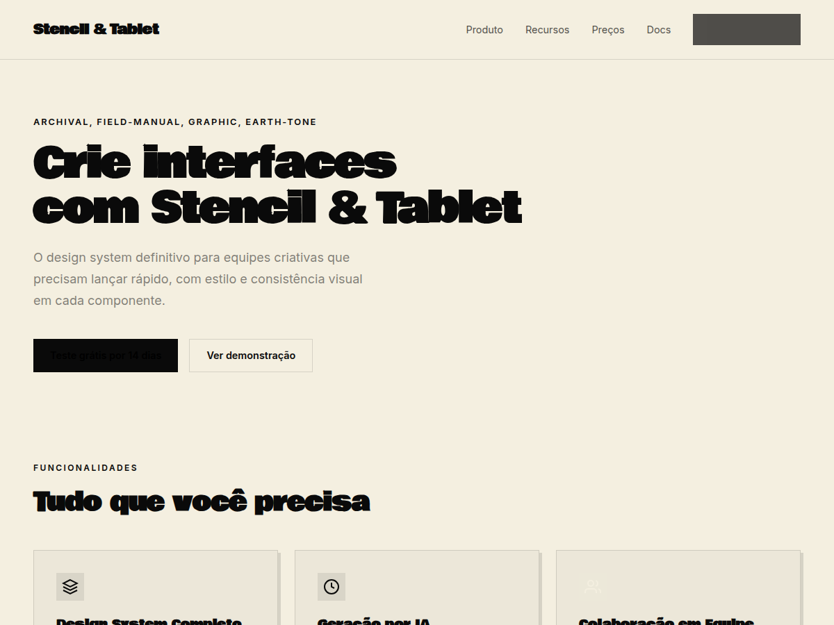
Stencil & Tablet — Bone paper with stencil-cut headlines and a six-color earth palette: archaeology meets brand. Bowlby One typography. warm bone and paper neutrals with a saturated earthy palette (sienna, magenta, o. Best for museum / cultural institution, art / architecture brand, longform research. AI-ready design system.
Use case: museum / cultural institution, art / architecture brand, longform research, heritage / craft brand, manifesto
Historical Context
Stencil lettering wasn't designed to be beautiful. It was designed to survive — stamped onto ammunition crates, cargo containers, and field equipment where legibility under duress mattered more than elegance. The broken letterforms exist because of physical bridges holding the stencil plate together, not because some typographer thought disconnected strokes looked cool. That constraint became an aesthetic. The earth palette follows the same logic. Olive drab, raw umber, sand — these aren't mood board choices, they're camouflage doctrine translated into communication design. Field manuals from the 1940s through Vietnam established a visual language where information hierarchy was life-or-death: bold stencil headers, tight mono body text, diagrams with zero decoration. Every element earned its place or got cut. What makes this system compelling today is that same ruthless economy. When you strip a design system down to stencil display type and terrain colors, you're borrowing from a tradition where visual noise could literally get someone killed. That discipline reads as authenticity.
When to Use
Reach for this when the brand needs to feel like it's been through something. Outdoor gear that actually gets used in the field, not just photographed at a trailhead. Military-adjacent brands that respect the source material without cosplaying it. Field guides, survival manuals, expedition documentation — anything where the design should communicate competence over polish. It works when your audience distrusts slickness and respects utility. Avoid it for anything precious or aspirational; this system has dirt under its fingernails.
Design Principles
- Function dictates form — every element must solve an information problem before it earns visual space
- Constraint as identity — embrace the broken letterforms and limited palette as features, not limitations
- Hierarchy through weight, not decoration — use scale and density shifts instead of color or ornament to direct attention
- Material honesty — design as if it will be printed on rough stock, stamped on metal, or read in bad light
- Earned roughness — distress and texture must feel systematic, never randomly applied for aesthetic effect
Technical Specs
Colors
Primary
Secondary
Effects
display font Bowlby One for hero headlines, smooth hover transitions (200-250ms), subtle lift shadows, stencil-cut display headlines, six-color earth palette, field-manual grid
Light/Dark
✓ Full / ✗ None
Related
Last synced: 5/6/2026