Soft Maximalism
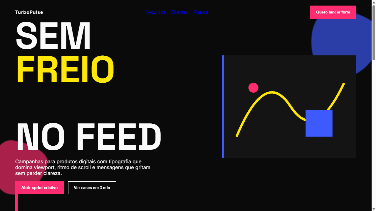
Soft maximalist landing page with CONTROLLED CHAOS energy. Ideal for marcas jovens, agencias criativas, lancamentos de produto, portfolios ousados, eventos e festivais. AI-ready template.
Use case: Youth brands, Agencias creative, Lancamentos de produto, Portfolios ousados, Events e festivais
Historical Context
Soft maximalism emerged as a direct rebellion against the sterile minimalism that dominated digital design through the 2010s. Designers got bored — and rightfully so. But instead of swinging into full visual anarchy like the early-2000s rave flyer aesthetic, soft maximalism introduced restraint into excess. Think of it as maximalism that went to art school and actually paid attention. The movement draws heavily from 1960s pop art, Memphis Group's irreverence, and the layered editorial layouts of magazines like The Face and Emigre. What makes it distinct from pure chaos is intentional hierarchy — every oversized headline, every clashing color block, every overlapping element still serves a reading order. You can pile textures, mix type scales aggressively, and stack visual layers without losing the user. It's controlled chaos with a grid underneath. The density is the point, but legibility is never sacrificed for spectacle. That's the discipline most people miss when they attempt this style.
When to Use
Deploy soft maximalism when your brand needs to feel alive, opinionated, and unapologetically loud — but still functional. Fashion labels, lifestyle brands, creative agencies, and bold consumer products thrive here. It works when your audience expects visual richness and interprets density as confidence rather than confusion. Avoid it for utility-first interfaces or contexts where cognitive load is already high. This style rewards browsing, not task completion.
Design Principles
- Layer with intent — every overlapping element must have a clear z-index purpose, never stack for decoration alone
- Oversized typography anchors the chaos — one dominant type element per section acts as the reader's entry point
- Color clashes are deliberate pairings, not random — limit your palette to 4-5 bold hues and rotate them systematically
- Maintain invisible structure — the grid exists, it's just not obvious. Alignment points keep density from becoming noise
- Whitespace is a weapon, not a filler — strategic breathing room between dense sections amplifies the maximalist moments
DESIGN.md
---
version: "alpha"
name: "Soft Maximalism"
description: "Soft maximalist landing page with CONTROLLED CHAOS energy. Ideal for marcas jovens, agencias criativas, lancamentos de produto, portfolios ousados, eventos e festivais. AI-ready template."
colors:
  primary: "#0A0A0A"
  secondary: "#FAFAFA"
  tertiary: "#2D2D2D"
  neutral: "#FF2D6F"
  surface: "#FFE600"
  accent: "#3D5AFE"
typography:
  h1:
    fontFamily: Space Grotesk
    fontSize: 2.25rem
    fontWeight: 700
  body-md:
    fontFamily: Inter
    fontSize: 1rem
    fontWeight: 400
  label-caps:
    fontFamily: Inter
    fontSize: 0.75rem
    fontWeight: 500
components:
  button-primary:
    backgroundColor: "{colors.primary}"
    textColor: "{colors.neutral}"
    padding: 12px
---

## Overview

Soft maximalist landing page with CONTROLLED CHAOS energy. Ideal for marcas jovens, agencias criativas, lancamentos de produto, portfolios ousados, eventos e festivais. AI-ready template. Soft maximalism emerged as a direct rebellion against the sterile minimalism that dominated digital design through the 2010s. Designers got bored — and rightfully so. But instead of swinging into full visual anarchy like the early-2000s rave flyer aesthetic, soft maximalism introduced restraint into excess. Think of it as maximalism that went to art school and actually paid attention.

The movement draws heavily from 1960s pop art, Memphis Group's irreverence, and the layered editorial layouts of magazines like The Face and Emigre. What makes it distinct from pure chaos is intentional hierarchy — every oversized headline, every clashing color block, every overlapping element still serves a reading order. You can pile textures, mix type scales aggressively, and stack visual layers without losing the user.

It's controlled chaos with a grid underneath. The density is the point, but legibility is never sacrificed for spectacle. That's the discipline most people miss when they attempt this style.

- Density: 5/10 — Balanced
- Variance: 7/10 — Dynamic
- Motion: 8/10 — Cinematic

- **Style:** Controlled Chaos, Bold Typography, Scroll-Reactive, Layered Animation
- **Keywords:** soft maximalism, controlled chaos, oversized typography, bold, scroll-driven, layered animations, vibrant pops, dynamic components, youth-focused, energetic, viewport-filling text
- **Era:** 2025-2026 Gen-Z Energy
- **Light/Dark:** ✓ Full / ✓ Full

## Colors

- **Preto Base** (#0A0A0A) — Primary background surface
- **Branco Off-White** (#FAFAFA) — Light surface, card backgrounds
- **Cinza Quente** (#2D2D2D) — Secondary text, borders, muted elements
- **Pop Magenta** (#FF2D6F) — Decorative accent, highlight elements
- **Pop Amarelo** (#FFE600) — Warning states, attention indicators
- **Pop Azul Eletrico** (#3D5AFE) — Secondary accent
- **Pop Verde Lima** (#76FF03) — Success states, positive indicators


## Typography

- **Display / Hero:** Space Grotesk — Weight 700, tight tracking, used for headline impact
- **Accent:** Inter — Used for decorative or emphasis text
- **Body:** Space Grotesk — Weight 400, 16px/1.6 line-height, max 72ch per line
- **UI Labels / Captions:** Space Grotesk — 0.875rem, weight 500, slight letter-spacing
- **Monospace:** JetBrains Mono — Used for code, metadata, and technical values

Scale:
- Hero: clamp(2.5rem, 5vw, 4rem)
- H1: 2.25rem
- H2: 1.5rem
- Body: 1rem / 1.6
- Small: 0.875rem


## Layout

- **Grid:** CSS Grid primary. Max-width containment: 1280px centered with 1.5rem side padding.
- **Spacing rhythm:** Balanced. Base unit: 0.5rem (8px).
- **Section vertical gaps:** clamp(4rem, 8vw, 8rem).
- **Hero layout:** Asymmetric composition.
- **Feature sections:** Asymmetric grid with varied card sizes. No 3-equal-columns.
- **Mobile collapse:** All multi-column layouts collapse below 768px. No horizontal overflow.
- **z-index contract:** base (0) / sticky-nav (100) / overlay (200) / modal (300) / toast (500).


## Elevation & Depth

Tipografia gigantesca ocupando 80% da viewport, animacoes em camadas reagindo ao scroll, componentes dinamicos com parallax, pops de cor unicos e disruptivos por secao, transicoes bold 400-600ms com easing dramatico, mix-blend-mode para sobreposicoes

- **Physics:** Spring — stiffness 120, damping 20. Confident, weighted transitions.
- **Entry animations:** Fade + translate-Y (16px → 0) over 540ms ease-out. Staggered cascades for lists: 120ms between items.
- **Hover states:** Scale(1.03) + shadow lift over 200ms.
- **Page transitions:** Fade + slide (300ms).
- **Performance:** Only transform and opacity animated. No layout-triggering properties.


## Shapes

Base corner radius: 12px. See rounded tokens in front matter for the full scale.


## Components

- **Primary Button:** Moderately rounded (0.75rem) shape. Accent color fill. Hover: 8% darken + subtle lift shadow. Active: -1px translate tactile press. Font weight 600. No outer glows.
- **Secondary / Ghost Button:** Outline variant. 1.5px border in muted color. Text in primary color. Hover: subtle background fill.
- **Cards:** Moderately rounded (0.75rem) corners. Surface background. Subtle shadow (0 2px 12px rgba(0,0,0,0.06)). 1px border stroke.
- **Inputs:** Label above input. 1px border stroke. Focus ring: 2px accent color offset 2px. Error text below in semantic red. No floating labels.
- **Navigation:** Primary surface background. Active item: accent color indicator. Font weight 500 when active.
- **Skeletons:** Shimmer animation matching component dimensions. No circular spinners.
- **Empty States:** Icon-based composition with descriptive text and action button.


## Do's and Don'ts

- No emojis in UI — use icon system only (Lucide, Heroicons)
- No pure black (#000000) — use off-black or charcoal variants
- No oversaturated accent colors (saturation cap: 80%)
- No 3-column equal-width feature layouts — use zig-zag or asymmetric grid
- No `h-screen` — use `min-h-[100dvh]`
- No AI copywriting clichés: "Elevate", "Seamless", "Unleash", "Next-Gen"
- No broken external image links — use picsum.photos or inline SVG
- No generic lorem ipsum in demos

- Do Tipografia hero ocupando 80% viewport
- Do Animacoes reagindo ao scroll
- Do Um pop de cor disruptivo por secao
- Do Mix-blend-mode em sobreposicoes
- Do Parallax em camadas
- Do Hover states dramaticos
- Do Usabilidade mantida apesar do caos visual
- Do Responsivo com stack vertical no mobile


## Use Case

Youth brands, Agencias creative, Lancamentos de produto, Portfolios ousados, Events e festivais
Technical Specs
CSS
font-size: clamp(3rem, 10vw, 8rem); font-weight: 800-900; mix-blend-mode: difference/exclusion; scroll-behavior: smooth; animation-timeline: scroll(); transform: scale/rotate on scroll; transition: all 400ms cubic-bezier(0.16, 1, 0.3, 1); overflow-x: hidden; position: sticky for layered sections
Variables
--font-display: 'Space Grotesk', sans-serif; --font-body: 'Inter', sans-serif; --weight-black: 900; --color-base: #0A0A0A; --color-surface: #FAFAFA; --pop-magenta: #FF2D6F; --pop-yellow: #FFE600; --pop-blue: #3D5AFE; --pop-lime: #76FF03; --transition-bold: 400ms cubic-bezier(0.16, 1, 0.3, 1); --spacing-section: 8rem; --type-hero: clamp(3rem, 10vw, 8rem)
Checklist
☐ Tipografia hero ocupando 80% viewport, ☐ Animacoes reagindo ao scroll, ☐ Um pop de cor disruptivo por secao, ☐ Mix-blend-mode em sobreposicoes, ☐ Parallax em camadas, ☐ Hover states dramaticos, ☐ Usabilidade mantida apesar do caos visual, ☐ Responsivo com stack vertical no mobile
Colors
Primary
Secondary
Effects
Tipografia gigantesca ocupando 80% da viewport, animacoes em camadas reagindo ao scroll, componentes dinamicos com parallax, pops de cor unicos e disruptivos por secao, transicoes bold 400-600ms com easing dramatico, mix-blend-mode para sobreposicoes
Light/Dark
✓ Full / ✓ Full
AI Prompt
Act as a Senior Frontend Engineer and Expert UI Designer.
Your task is to code a complete Landing Page on the first attempt.
- Landing Page Theme: <INSERT THEME>
- Sections to add: <INSERT SECTIONS>

Generate the final code immediately following these definitions:

## Style

- **Name:** Soft Maximalism
- **Type:** Controlled Chaos, Bold Typography, Scroll-Reactive, Layered Animation
- **Keywords:** soft maximalism, controlled chaos, oversized typography, bold, scroll-driven, layered animations, vibrant pops, dynamic components, youth-focused, energetic, viewport-filling text
- **Era:** 2025-2026 Gen-Z Energy
- **Light/Dark:** ✓ Full / ✓ Full

## Color Palette

- **Primary:** Preto Base #0A0A0A, Branco Off-White #FAFAFA, Cinza Quente #2D2D2D
- **Secondary:** Pop Magenta #FF2D6F, Pop Amarelo #FFE600, Pop Azul Eletrico #3D5AFE, Pop Verde Lima #76FF03

## Visual Effects

Tipografia gigantesca ocupando 80% da viewport, animacoes em camadas reagindo ao scroll, componentes dinamicos com parallax, pops de cor unicos e disruptivos por secao, transicoes bold 400-600ms com easing dramatico, mix-blend-mode para sobreposicoes

## AI Visual Direction

Design a soft maximalist landing page with CONTROLLED CHAOS energy. Use oversized bold typography (clamp(3rem, 10vw, 8rem)) that fills up to 80% of the viewport width, breaking traditional margins. Layer multiple animated elements that react to scroll position using Intersection Observer and CSS scroll-driven animations. Each section should have ONE disruptive color pop against a controlled base (dark or light). Use mix-blend-mode for text overlapping images. Parallax layers on scroll. Bold hover states with dramatic scale transforms. Dynamic components that shift, rotate, or morph on scroll. Keep usability intact despite the visual energy — clear CTAs, readable body text, logical flow.

## CSS Technical

```css
font-size: clamp(3rem, 10vw, 8rem); font-weight: 800-900; mix-blend-mode: difference/exclusion; scroll-behavior: smooth; animation-timeline: scroll(); transform: scale/rotate on scroll; transition: all 400ms cubic-bezier(0.16, 1, 0.3, 1); overflow-x: hidden; position: sticky for layered sections
```

## Design System Variables

```css
--font-display: 'Space Grotesk', sans-serif; --font-body: 'Inter', sans-serif; --weight-black: 900; --color-base: #0A0A0A; --color-surface: #FAFAFA; --pop-magenta: #FF2D6F; --pop-yellow: #FFE600; --pop-blue: #3D5AFE; --pop-lime: #76FF03; --transition-bold: 400ms cubic-bezier(0.16, 1, 0.3, 1); --spacing-section: 8rem; --type-hero: clamp(3rem, 10vw, 8rem)
```

## Implementation Checklist

- ☐ Tipografia hero ocupando 80% viewport
- ☐ Animacoes reagindo ao scroll
- ☐ Um pop de cor disruptivo por secao
- ☐ Mix-blend-mode em sobreposicoes
- ☐ Parallax em camadas
- ☐ Hover states dramaticos
- ☐ Usabilidade mantida apesar do caos visual
- ☐ Responsivo com stack vertical no mobile

## Execution Rules

1. Strictly follow the defined visual style.
2. Use high-quality inline SVG icons (Heroicons or Lucide style) — NEVER use emojis as icons.
3. Add `cursor-pointer` and smooth `hover` states (transition-all) on all interactive elements.
4. Required Page Structure:
   - Navbar (Logo + Links + CTA)
   - Hero Section (Impactful Headline + Subtitle + 2 buttons + 3D/Abstract visual element via CSS)
   - Features (3 cards with icons)
   - Testimonials (3 cards)
   - Pricing (3 tiers, highlight the middle one)
   - Final CTA
   - Full Footer with social links, privacy policy, terms of use, contact and SEO links.
5. All text content must be in English.
6. The visual must be CLEARLY distinct — do not create a "default Bootstrap" design. Force the use of the provided design system variables.
7. Use `<style>` tags in the head for custom classes (especially for complex backdrop-filter effects and animations) that Tailwind CDN doesn't cover.
8. Full Responsiveness: Layout must adapt perfectly to Mobile, Tablet and Desktop (vertical stack on mobile).
9. Include basic SEO, Viewport and Open Graph meta tags in `<head>`.
10. Footer must contain: Copyright 2026, Secondary navigation links and Social media icons.
11. Make the creative decisions needed to deliver the complete, functional result now.
Related
Last synced: 4/1/2026