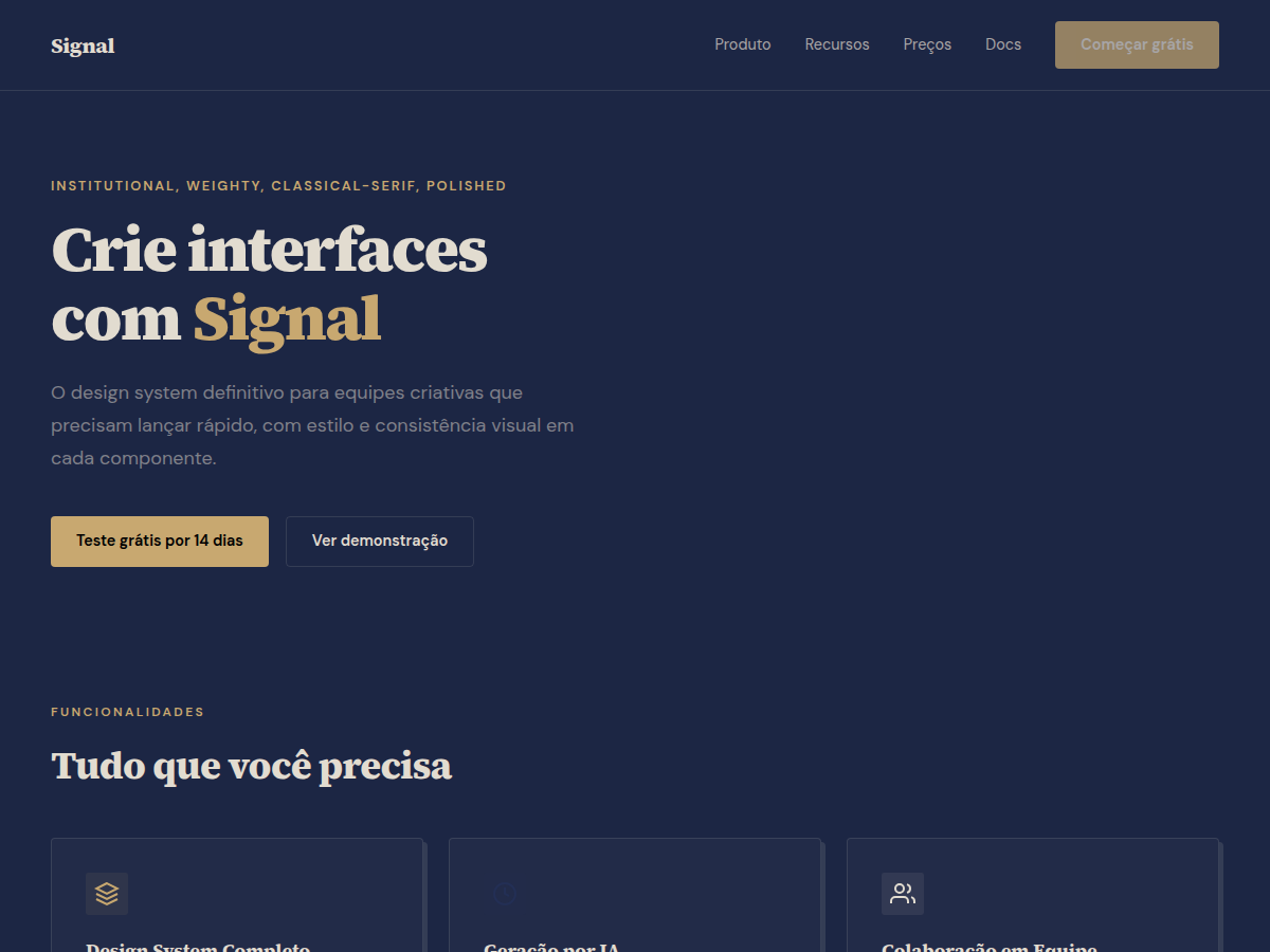
Signal
Signal — Deep navy canvas with bone paper and a single muted-gold accent; institutional with quiet weight. Source Serif 4 typography. deep navy primary with warm bone paper alternate and a single muted-gold accent. Best for investor deck, consulting deliverable, board presentation. AI-ready design system.
Use case: investor deck, consulting deliverable, board presentation, legal / policy brief, academic deck, advisory pitch, bilingual EN/CN deck
Historical Context
Signal draws from the Swiss International Style's most restrained impulse — the belief that typography and negative space alone can carry authority. But where mid-century Swiss design operated in black and white newsprint, Signal reinterprets that discipline through the lens of private banking communications and premium editorial publishing. The deep navy ground isn't decorative; it's structural. It creates the same psychological weight that leather-bound reports and engraved stationery once carried in financial institutions. The pairing of Source Serif 4 with muted gold accents is deliberately anachronistic. Source Serif 4 has the optical refinement of a Plantin or a Times, but with contemporary spacing metrics that breathe on screen. The gold isn't aspirational — it's earned. Used sparingly, as a typographic accent or rule, it signals institutional confidence without the vulgarity of excess. This is design for contexts where trust is built through restraint, where every element present must justify its existence against the alternative of simply not being there.
When to Use
Deploy Signal when the content itself is the product — long-form financial analysis, investment prospectuses, premium newsletters, or editorial platforms where readers pay for insight. It works when your audience expects sophistication without explanation, when the brand's credibility depends on visual quietness rather than visual noise. Avoid it for anything requiring warmth, approachability, or high-energy conversion. This system assumes the reader already trusts you enough to stay.
Design Principles
- Negative space is load-bearing structure, not leftover emptiness — every margin is a deliberate decision about hierarchy and breathing room
- Color operates as punctuation, never as decoration — deep navy establishes gravity, muted gold marks emphasis the way an editor marks a pull quote
- Typography carries the entire emotional register — weight, size, and spacing do the work that imagery does in lesser systems
- Restraint compounds trust — each element you remove strengthens the authority of what remains
- Density is earned through information architecture, not visual compression — let content breathe at the cost of vertical space, never at the cost of legibility
Technical Specs
Colors
Primary
Secondary
Effects
display font Source Serif 4 for hero headlines, smooth hover transitions (200-250ms), subtle lift shadows, alternating light/dark sections for rhythm, deep navy full-bleed sections, muted-gold rule accents, bone paper cards, dense grid, compact 1.2rem gaps
Light/Dark
✓ Full / ◐ Partial
Related
Last synced: 5/6/2026