Scatterbrain
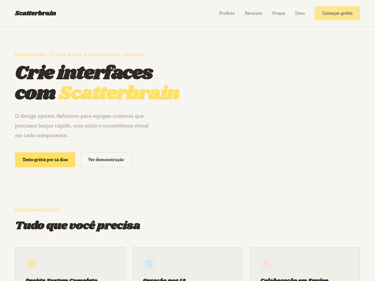
Scatterbrain — Post-it inspired: pastel sticky notes, Caveat handwriting, Shrikhand and Zilla Slab type stack. Shrikhand typography. off-white paper with a full pastel sticky-note palette (yellow, blue, pink, gree. Best for brainstorm / workshop, creative agency credentials, design-thinking session. AI-ready design system.
Use case: brainstorm / workshop, creative agency credentials, design-thinking session, ideation pitch, art-direction review
Historical Context
The sticky note is one of design's happiest accidents. Spencer Silver's failed superglue became Art Fry's bookmark, and by the mid-1980s every brainstorm wall in every agency looked like a Mondrian made of pastel squares. The physical act of scribbling on a Post-it — fast, impermanent, deliberately rough — gave teams permission to think badly before thinking well. Ideas didn't need to be precious when they cost three cents and could be crumpled in a fist. Digital tools spent years trying to replicate that energy and mostly failed. Miro boards and FigJam canvases feel clinical — too aligned, too pixel-perfect. What makes a real brainstorm wall work is the chaos: cards at odd angles, overlapping edges, handwriting that ranges from legible to hieroglyphic. Scatterbrain leans into that disorder on purpose. The Caveat typeface is the linchpin here. Its wobbly baseline and uneven letter spacing read as human thought captured mid-flight, not a font pretending to be handwriting. Pair it with slight card rotations — two to five degrees, never uniform — and you get a layout that feels like someone actually used it, not just designed it.
When to Use
Reach for Scatterbrain when the interface needs to communicate that nothing is final yet. Ideation dashboards, brainstorming canvases, creative briefs in draft mode, retrospective boards — anywhere rigidity would kill the vibe. It works beautifully for note-taking apps that want to feel more analog than digital, and for planning tools where the mess IS the method. Avoid it for anything requiring hierarchy or scanability at speed. This pattern trades efficiency for creative permission.
Design Principles
- Embrace controlled chaos — rotations should feel random but stay within a tight 2-5° range to avoid actual illegibility
- Caveat carries the personality; never substitute a geometric sans or the entire illusion collapses into a wireframe
- Overlap is information — cards that touch or stack imply relationship without needing explicit connectors or arrows
- Color should be Post-it-grade: saturated pastels, never pure white, never dark backgrounds that break the paper metaphor
- Resist the urge to snap-to-grid on interaction; if cards auto-align when dropped, you've killed the reason this pattern exists
Technical Specs
Colors
Primary
Secondary
Effects
display font Shrikhand for hero headlines, playful hover animations (scale 1.03, 200ms), bouncy click states, rotated post-it cards (±3–6deg), Caveat handwriting, pastel sticky-note palette, dense grid, compact 1.2rem gaps
Light/Dark
✓ Full / ✗ None
Related
Last synced: 5/6/2026