Scandinavian Design
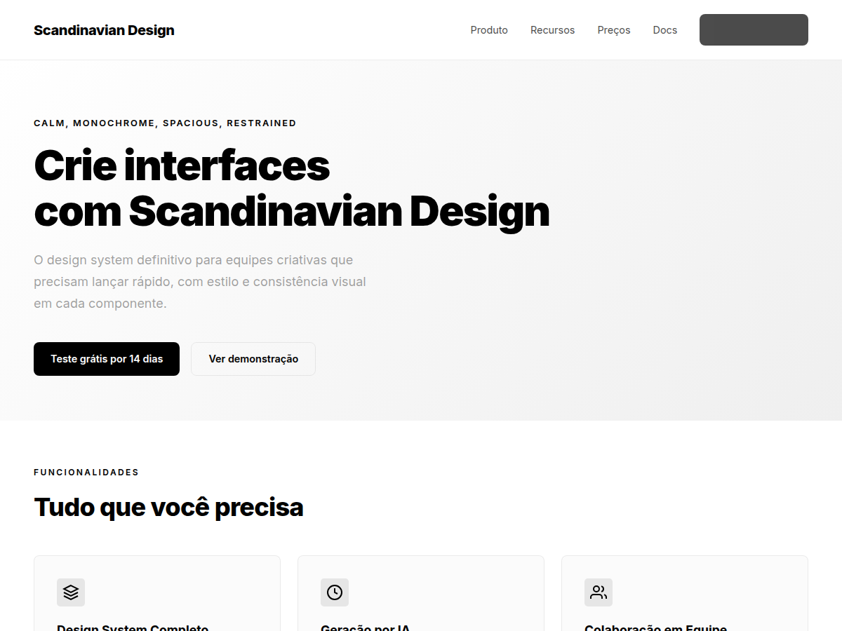
Minimalism style inspired by the scandinavian-design skill. Neutral black-and-white foundation with alpha-black ink ladder, single sans-serif family, hierarchy through opacity, generous spacing and minimal decoration.
Use case: Editorial landing pages, SaaS product sites, portfolios, technical documentation, calm dashboards, surfaces that prioritize clarity and restraint
Historical Context
System popularized in 2025-2026 by the scandinavian-design AI agent skill (ericzakariasson), tested against ten real before/after sites. It codifies the Nordic design tradition — functionalism, restraint, material honesty — as an alpha-black ink ladder over white, contained sans-serif typography (Inter Variable) and pages organized into generous chapters.
When to Use
Use when comprehension, calm and restraint matter more than chromatic expression: editorial marketing pages, product sites, docs and dashboards that should feel quiet, functional and intentionally simple.
Design Principles
- Build hierarchy with the alpha-black opacity ladder, not tinted grays or many weights
- Let product imagery carry expression while surrounding chrome stays quiet
- Space replaces rules: chapters, not card stacks; one rule per viewport at most
- Every element must earn its place; reject changes whose rationale is style alone
DESIGN.md
---
version: "alpha"
name: "Scandinavian Design"
description: "Scandinavian visual system with neutral black-and-white foundation, restrained sans-serif typography and generous spacing."
colors:
  primary: "#000000"
  secondary: "#FFFFFF"
typography:
  h1:
    fontFamily: Inter Variable
    fontSize: 2.5rem
    fontWeight: 600
  body-md:
    fontFamily: Inter Variable
    fontSize: 1.0625rem
    fontWeight: 400
components:
  button-primary:
    backgroundColor: "{colors.primary}"
    color: "#FFFFFF"
    borderRadius: "8px"
    padding: "12px 24px"
---

## Overview

Scandinavian Design — sistema visual nórdico de contenção funcional: fundação preto e branco neutra construída com alpha-black sobre branco, uma única família sans-serif, hierarquia criada por opacidade e espaço em vez de peso ou cor, capítulos generosos e decoração mínima. A imagens de produto carregam a expressão; a interface ao redor permanece quieta.

- Density: 4/10 — Airy
- Variance: 3/10 — Structured
- Motion: 2/10 — Minimal

- **Style:** Calm, Monochrome, Spacious, Restrained
- **Keywords:** Scandinavian, Nordic, monochrome, alpha-black ladder, restrained sans-serif, generous whitespace, quiet UI
- **Era:** 2020s Modern
- **Light/Dark:** ✓ Light / ✓ Dark (inversão disciplinada)

## Colors

Escala de tinta neutra — hierarquia por opacidade, nunca por cinza tingido:

- **#FFFFFF** (#FFFFFF) — Canvas e superfície
- **#000000** (#000000) — Tinta primária (texto principal, ícones críticos)
- **rgb(0 0 0 / 64%)** — Tinta secundária (texto de apoio)
- **rgb(0 0 0 / 44–56%)** — Tinta terciária (metadados opcionais; elevar se houver leitura real)
- **rgb(0 0 0 / 10%)** — Bordas e separadores
- **rgb(0 0 0 / 5%)** — Hover; **rgb(0 0 0 / 9%)** — Pressed/selected
- **rgb(0 0 0 / 44%)** — Scrim sobre conteúdo

Regras: definir tinta com cores alfa (nunca `opacity` no contêiner); proibidos bege, creme e cinzas azulados/esverdeados; um único accent de marca é tolerado na ação primária; logo da marca permanece em cor cheia; marcas de terceiros vão para monocromático. Variante escura: canvas `#0A0A0A`, tinta primária branca, secundária `rgb(255 255 255 / 56%)`, terciária `36%` (50% acima de `#1A1A1A`), bordas `rgb(255 255 255 / 10–12%)`.

## Typography

Uma única família sans-serif. Padrão web: **Inter Variable** (se já licenciada, Scto Grotesk A dá caráter nórdico).

- **Display / Hero:** Inter Variable — weight 500–600, line-height 1.05–1.15, tracking levemente negativo. Evitar 700–900.
- **Body:** Inter Variable — 16–18px, weight 400, line-height 1.5–1.6, tracking neutro, medida 55–68 caracteres.
- **Labels / Controls:** weight 500, sentence case — nunca all-caps nem lowercase forçado.
- Máximo 3–4 estilos de texto por tela editorial (6 em telas densas); hierarquia por tamanho e whitespace, não por muitos pesos.

## Layout

- **Grid:** max-width ~1200px, margens 24px mobile / 40–64px desktop.
- **Spacing rhythm:** base 8px (ajustes de 4px). Transições entre capítulos: 96–144px desktop / 64–96px mobile.
- **Capítulos, não cards:** páginas longas como sequência de capítulos espaçosos com uma ideia cada — heading conciso, explicação curta, 3–4 resumos de features, uma visual dominante. Alternar fills `rgb(0 0 0 / 4%)` para ritmo.
- **Divisórias raras:** espaço antes de linha; ~1 regra por viewport; nunca dividir par imagem-legenda ou label-campo; linhas verticais de grid multi-coluna são mantidas.
- **Radii:** 6–12px, consistentes por tipo de componente; pills só como família distinta de tags/filtros.
- **Sem sombras** exceto quando elevação comunica comportamento (sombra neutra quase invisível).
- **Alinhamento à esquerda** por padrão (headings, labels, metadata, footer).

## Effects

- Transições quietas < 300ms; `ease-out` em entradas, `ease-in-out` em movimento on-screen, `ease` em cor/hover.
- Sem animação de entrada a partir de `scale(0)`; usar `scale(0.95–0.98)` + opacidade.
- Respeitar `prefers-reduced-motion`; hover-motion apenas com `(hover: hover) and (pointer: fine)`.
- Proibidos: gradientes decorativos, texturas, glows, sombras grandes, emoji como iconografia.

## Anti-patterns (escalation triggers)

- Cinzas tingidos quentes/frios no lugar de alpha-black neutro
- Serifas display ou sistemas serif/sans misturados
- All-caps ou CSS `text-transform: uppercase`
- Emoji como ícones de interface
- Divisórias separando elemento de sua própria legenda/metadata
- Cards uniformes sem elemento dominante
- Pills em controles retangulares comuns; raios/alturas/paddings inconsistentes entre CTAs equivalentes
- Cor removida de estados semânticos (erro, sucesso, foco, selecionado)

## Use Case

Landing pages editoriais, sites de produto SaaS, portfólios, documentações, dashboards calmos e qualquer superfície onde compreensão e calma valem mais que expressividade cromática.Technical Specs
CSS
font-family: 'Inter Variable', sans-serif; background: #FFFFFF; color: #000000; supporting text rgb(0 0 0 / 64%); border: 1px solid rgb(0 0 0 / 10%); border-radius: 6-12px; spacing scale 8px; section padding clamp(4rem, 8vw, 9rem); line-height 1.5-1.6; measure 55-68ch; font-weight 400-600; letter-spacing -0.01em on display sizes; transitions < 300ms ease-out; box-shadow none unless elevation communicates
Variables
--bg: #FFFFFF, --fg: #000000, --accent: #000000, --radius: 8px, --spacing: 2rem, --font-display: 'Inter', --font-body: 'Inter'
Checklist
☐ Escala alpha-black aplicada ☐ Família sans-serif única ☐ Sem all-caps/lowercase forçado ☐ Ritmo 8px e capítulos generosos ☐ Radii 6-12px consistentes ☐ Sem gradientes/sombras decorativas ☐ Estados semânticos preservados ☐ Contraste AA verificado
Colors
Primary
Effects
Transições quietas (<300ms, ease-out), sem sombras decorativas, sem gradientes, hover fill rgb(0 0 0 / 5%), pressed rgb(0 0 0 / 9%)
Light/Dark
✓ Light / ○ Inverted
AI Prompt
Act as a Senior Frontend Engineer and Expert UI Designer.
Your task is to code a complete Landing Page on the first attempt.
- Landing Page Theme: <INSERT THEME>
- Sections to add: <INSERT SECTIONS>

Generate the final code immediately following these definitions:

## Style

- **Name:** Scandinavian Design
- **Type:** Calm, Monochrome, Spacious, Restrained
- **Keywords:** scandinavian, nordic, monochrome, alpha-black, opacity-ladder, inter, calm, spacious, restrained, quiet-ui, minimal
- **Era:** 2020s Modern
- **Light/Dark:** ✓ Light / ○ Inverted

## Color Palette

- **Primary:** #FFFFFF (Canvas), #000000 (Ink primário), rgb(0 0 0 / 64%) (Ink secundário)
- **Secondary:** rgb(0 0 0 / 44%) (Terciário), rgb(0 0 0 / 10%) (Border), rgb(0 0 0 / 5%) (Hover fill)

## Visual Effects

Transições quietas (<300ms, ease-out), sem sombras decorativas, sem gradientes, hover fill rgb(0 0 0 / 5%), pressed rgb(0 0 0 / 9%)

## AI Visual Direction

Design a calm Scandinavian interface with a neutral black-and-white foundation. Use Inter Variable only (weights 400-600, never 700-900), build hierarchy with an alpha-black opacity ladder over white (primary #000000, secondary rgb(0 0 0 / 64%), borders rgb(0 0 0 / 10%)), an 8px spacing rhythm with generous chapter gaps (96-144px), left-aligned text, sentence case everywhere, radii 6-12px, no gradients, no decorative shadows, no all-caps, one filled primary action per chapter, quiet sub-300ms motion.

## CSS Technical

```css
font-family: 'Inter Variable', sans-serif; background: #FFFFFF; color: #000000; supporting text rgb(0 0 0 / 64%); border: 1px solid rgb(0 0 0 / 10%); border-radius: 6-12px; spacing scale 8px; section padding clamp(4rem, 8vw, 9rem); line-height 1.5-1.6; measure 55-68ch; font-weight 400-600; letter-spacing -0.01em on display sizes; transitions < 300ms ease-out; box-shadow none unless elevation communicates
```

## Design System Variables

```css
--bg: #FFFFFF, --fg: #000000, --accent: #000000, --radius: 8px, --spacing: 2rem, --font-display: 'Inter', --font-body: 'Inter'
```

## Implementation Checklist

- ☐ Escala alpha-black aplicada ☐ Família sans-serif única ☐ Sem all-caps/lowercase forçado ☐ Ritmo 8px e capítulos generosos ☐ Radii 6-12px consistentes ☐ Sem gradientes/sombras decorativas ☐ Estados semânticos preservados ☐ Contraste AA verificado

## Execution Rules

1. Strictly follow the defined visual style.
2. Use high-quality inline SVG icons (Heroicons or Lucide style) — NEVER use emojis as icons.
3. Add `cursor-pointer` and smooth `hover` states (transition-all) on all interactive elements.
4. Required Page Structure:
   - Navbar (Logo + Links + CTA)
   - Hero Section (Impactful Headline + Subtitle + 2 buttons + 3D/Abstract visual element via CSS)
   - Features (3 cards with icons)
   - Testimonials (3 cards)
   - Pricing (3 tiers, highlight the middle one)
   - Final CTA
   - Full Footer with social links, privacy policy, terms of use, contact and SEO links.
5. All text content must be in English.
6. The visual must be CLEARLY distinct — do not create a "default Bootstrap" design. Force the use of the provided design system variables.
7. Use `<style>` tags in the head for custom classes (especially for complex backdrop-filter effects and animations) that Tailwind CDN doesn't cover.
8. Full Responsiveness: Layout must adapt perfectly to Mobile, Tablet and Desktop (vertical stack on mobile).
9. Include basic SEO, Viewport and Open Graph meta tags in `<head>`.
10. Footer must contain: Copyright 2026, Secondary navigation links and Social media icons.
11. Make the creative decisions needed to deliver the complete, functional result now.
Related
Last synced: 8/22/2026