SaaS Signature Gradient
Design the quintessential SaaS/AI startup landing page with THE signature tech gradient. Ideal for startups saas, ai tools, plataformas de desenvolvedores, landing pages tech, produtos b2b modernos, apis e sdks. AI-ready template.
Use case: Startups SaaS, AI tools, Platforms de desenvolvedores, Tech landing pages, Products B2B modernos, APIs e SDKs
Historical Context
The purple-to-blue gradient didn't appear out of nowhere — it was engineered into existence by Stripe around 2016-2017, when their brand refresh introduced those luminous violet-to-indigo washes that made every other fintech site look like a government portal. Within eighteen months, every YC batch demo day deck was swimming in the same spectrum. The gradient became shorthand for "we're technical but approachable" — a visual dog whistle for Series A readiness. What followed was predictable: saturation. By 2020, the purple-blue gradient had become the Comic Sans of startup branding — ubiquitous to the point of meaninglessness. AI companies made it worse. Every GPT wrapper, every "AI-powered" landing page defaulted to the same tired spectrum, as if purple photons were a prerequisite for machine learning. The gradient stopped communicating innovation and started communicating laziness. Yet here's the thing — it persists because it genuinely works at a perceptual level. Purple-to-blue occupies a sweet spot in color psychology: futuristic without being cold, premium without being inaccessible. The problem was never the gradient itself. It was the lack of craft in its application.
When to Use
Deploy this gradient when you're building in genuinely technical spaces — developer tools, infrastructure products, AI platforms — where the visual language carries earned context. It works when your product actually lives in the ecosystem that birthed this aesthetic. It fails catastrophically on lifestyle brands, e-commerce, or anything targeting audiences who associate this palette with "another AI startup that'll be dead in six months." Best paired with dark interfaces, monospace type, and restrained usage — a hero wash, not wallpaper.
Design Principles
- Restraint over saturation — use the gradient as an accent or atmospheric element, never as the entire personality of your interface
- Anchor with neutrals — the gradient needs dark grays, near-blacks, or crisp whites to breathe; gradient-on-gradient is visual noise
- Shift the stops — move away from the exact Stripe spectrum; push toward violet-indigo or blue-cyan to claim your own territory within the family
- Earn the glow — pair with actual technical substance in your UI; the gradient on a Calendly clone reads as costume, on a CLI tool reads as intentional
- Mind the context collapse — in 2026, this gradient carries baggage; acknowledge it through execution quality rather than pretending it's novel
DESIGN.md
---
version: "alpha"
name: "SaaS Signature Gradient"
description: "Design the quintessential SaaS/AI startup landing page with THE signature tech gradient. Ideal for startups saas, ai tools, plataformas de desenvolvedores, landing pages tech, produtos b2b modernos, apis e sdks. AI-ready template."
colors:
  primary: "#6C3AED"
  secondary: "#2563EB"
  tertiary: "#0B0F1A"
  neutral: "#06B6D4"
  surface: "#14B8A6"
  accent: "#F1F5F9"
typography:
  h1:
    fontFamily: Inter
    fontSize: 2.5rem
    fontWeight: 700
  body-md:
    fontFamily: Inter
    fontSize: 1rem
    fontWeight: 400
rounded:
  sm: 16px
  md: 32px
  lg: 48px
components:
  button-primary:
    backgroundColor: "{colors.primary}"
    textColor: "{colors.neutral}"
    rounded: "{rounded.sm}"
    padding: 12px
---

## Overview

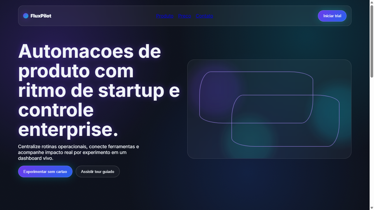
Design the quintessential SaaS/AI startup landing page with THE signature tech gradient. Ideal for startups saas, ai tools, plataformas de desenvolvedores, landing pages tech, produtos b2b modernos, apis e sdks. AI-ready template. The purple-to-blue gradient didn't appear out of nowhere — it was engineered into existence by Stripe around 2016-2017, when their brand refresh introduced those luminous violet-to-indigo washes that made every other fintech site look like a government portal. Within eighteen months, every YC batch demo day deck was swimming in the same spectrum. The gradient became shorthand for "we're technical but approachable" — a visual dog whistle for Series A readiness.

What followed was predictable: saturation. By 2020, the purple-blue gradient had become the Comic Sans of startup branding — ubiquitous to the point of meaninglessness. AI companies made it worse. Every GPT wrapper, every "AI-powered" landing page defaulted to the same tired spectrum, as if purple photons were a prerequisite for machine learning. The gradient stopped communicating innovation and started communicating laziness.

Yet here's the thing — it persists because it genuinely works at a perceptual level. Purple-to-blue occupies a sweet spot in color psychology: futuristic without being cold, premium without being inaccessible. The problem was never the gradient itself. It was the lack of craft in its application.

- Density: 5/10 — Balanced
- Variance: 4/10 — Moderate
- Motion: 8/10 — Cinematic

- **Style:** Tech Bro Gradient, Purple-Blue Mesh, Orb Floating, Glassmorphism Noise, Visual Rhyme
- **Keywords:** SaaS gradient, tech bro, purple to blue, mesh gradient, orbs, blobs, cyan accent, teal accent, neon glow, glassmorphism, noise texture, visual rhyme, floating spheres, startup aesthetic, AI tool, developer tool
- **Era:** 2025-2026 SaaS/AI Startup
- **Light/Dark:** ✗ None / ✓ Full

## Colors

- **Roxo Base** (#6C3AED) — Primary background surface
- **Azul Profundo** (#2563EB) — Primary background surface
- **Fundo Escuro** (#0B0F1A) — Primary background surface
- **Ciano Destaque** (#06B6D4) — Primary accent, CTAs and interactive elements
- **Verde-Agua Teal** (#14B8A6) — Success states, positive indicators
- **Branco Texto** (#F1F5F9) — Secondary surface
- **Roxo Claro** (#A78BFA) — Accent color, emphasis elements
- **Azul Claro** (#60A5FA) — Secondary accent


## Typography

- **Display / Hero:** Inter — Weight 700, tight tracking, used for headline impact
- **Accent:** Plus Jakarta Sans — Used for decorative or emphasis text
- **Body:** Inter — Weight 400, 16px/1.6 line-height, max 72ch per line
- **UI Labels / Captions:** Inter — 0.875rem, weight 500, slight letter-spacing
- **Monospace:** JetBrains Mono — Used for code, metadata, and technical values

Scale:
- Hero: clamp(2.5rem, 5vw, 4rem)
- H1: 2.25rem
- H2: 1.5rem
- Body: 1rem / 1.6
- Small: 0.875rem


## Layout

- **Grid:** CSS Grid primary. Max-width containment: 1280px centered with 1.5rem side padding.
- **Spacing rhythm:** Balanced. Base unit: 0.5rem (8px).
- **Section vertical gaps:** clamp(4rem, 8vw, 8rem).
- **Hero layout:** Split-screen (text left, visual right).
- **Feature sections:** Zig-zag alternating text+image rows. No 3-equal-columns.
- **Mobile collapse:** All multi-column layouts collapse below 768px. No horizontal overflow.
- **z-index contract:** base (0) / sticky-nav (100) / overlay (200) / modal (300) / toast (500).


## Elevation & Depth

Gradientes roxo-para-azul extremamente suaves como base, orbes (esferas 3D sutis) e blobs de malha flexiveis (mesh gradients) flutuando interativamente na tela com animacao CSS, brilhos de neon simulado em bordas e textos (text-shadow e box-shadow com cor), opacidade perdendo-se nas bordas (mask-image radial-gradient), ruido artificial sutil (noise texture SVG 3-5% opacity) criando textura aspera/granulada ou vidro fosco (glassmorphism), rima visual espalhando consistentemente gradientes e formas curvas do logo em botoes e cards para coesao absoluta

- **Physics:** Spring — stiffness 120, damping 20. Confident, weighted transitions.
- **Entry animations:** Fade + translate-Y (16px → 0) over 540ms ease-out. Staggered cascades for lists: 120ms between items.
- **Hover states:** Scale(1.03) + shadow lift over 200ms.
- **Page transitions:** Fade + slide (300ms).
- **Performance:** Only transform and opacity animated. No layout-triggering properties.


## Shapes

Base corner radius: 16px. See rounded tokens in front matter for the full scale.


## Components

- **Primary Button:** Rounded (16px) shape. Accent color fill. Hover: 8% darken + subtle lift shadow. Active: -1px translate tactile press. Font weight 600. No outer glows.
- **Secondary / Ghost Button:** Outline variant. 1.5px border in muted color. Text in primary color. Hover: subtle background fill.
- **Cards:** Rounded (16px) corners. Surface background. Subtle shadow (0 2px 12px rgba(0,0,0,0.06)). 1px border stroke.
- **Inputs:** Label above input. 1px border stroke. Focus ring: 2px accent color offset 2px. Error text below in semantic red. No floating labels.
- **Navigation:** Primary surface background. Active item: accent color indicator. Font weight 500 when active.
- **Skeletons:** Shimmer animation matching component dimensions. No circular spinners.
- **Empty States:** Icon-based composition with descriptive text and action button.


## Do's and Don'ts

- No emojis in UI — use icon system only (Lucide, Heroicons)
- No pure white (#FFFFFF) backgrounds — use off-white or dark surfaces
- No oversaturated accent colors (saturation cap: 80%)
- No 3-column equal-width feature layouts — use zig-zag or asymmetric grid
- No `h-screen` — use `min-h-[100dvh]`
- No AI copywriting clichés: "Elevate", "Seamless", "Unleash", "Next-Gen"
- No broken external image links — use picsum.photos or inline SVG
- No generic lorem ipsum in demos

- Do Gradiente roxo-para-azul como identidade visual principal
- Do Orbes flutuantes com blur alto e animacao
- Do Blobs mesh gradient com opacidade perdendo nas bordas
- Do Destaques em ciano e teal obrigatorios
- Do Noise texture SVG sutil 3-5% opacity
- Do Glassmorphism em cards (backdrop-filter blur)
- Do Glow neon em textos e bordas chave
- Do Rima visual consistente em toda a pagina
- Do Fundo escuro #0B0F1A
- Do Tipografia geometrica limpa


## Use Case

Startups SaaS, AI tools, Platforms de desenvolvedores, Tech landing pages, Products B2B modernos, APIs e SDKs
Technical Specs
CSS
background: #0B0F1A; background-image: radial-gradient(ellipse at 20% 50%, rgba(108,58,237,0.3) 0%, transparent 50%), radial-gradient(ellipse at 80% 20%, rgba(37,99,235,0.2) 0%, transparent 50%); filter: blur(80px) on orbs; mask-image: radial-gradient(circle, black 40%, transparent 70%); backdrop-filter: blur(20px); background: rgba(255,255,255,0.05) on cards; text-shadow: 0 0 20px rgba(108,58,237,0.5); box-shadow: 0 0 30px rgba(6,182,212,0.3); SVG feTurbulence baseFrequency=0.65 for noise; @keyframes float-orb { 0%,100% { transform: translate(0,0) } 50% { transform: translate(30px,-20px) } }; font-family: 'Inter', 'Plus Jakarta Sans', sans-serifVariables
--bg-dark: #0B0F1A; --bg-surface: rgba(255,255,255,0.05); --gradient-primary: linear-gradient(135deg, #6C3AED, #2563EB); --gradient-accent: linear-gradient(135deg, #06B6D4, #14B8A6); --color-purple: #6C3AED; --color-blue: #2563EB; --color-cyan: #06B6D4; --color-teal: #14B8A6; --color-text: #F1F5F9; --color-text-muted: rgba(241,245,249,0.6); --glow-purple: 0 0 20px rgba(108,58,237,0.5); --glow-cyan: 0 0 30px rgba(6,182,212,0.3); --blur-glass: 20px; --noise-opacity: 0.04; --orb-blur: 80px; --border-radius: 16px; --font-primary: 'Inter', sans-serif
Checklist
☐ Gradiente roxo-para-azul como identidade visual principal, ☐ Orbes flutuantes com blur alto e animacao, ☐ Blobs mesh gradient com opacidade perdendo nas bordas, ☐ Destaques em ciano e teal obrigatorios, ☐ Noise texture SVG sutil 3-5% opacity, ☐ Glassmorphism em cards (backdrop-filter blur), ☐ Glow neon em textos e bordas chave, ☐ Rima visual consistente em toda a pagina, ☐ Fundo escuro #0B0F1A, ☐ Tipografia geometrica limpa
Colors
Primary
Secondary
Effects
Gradientes roxo-para-azul extremamente suaves como base, orbes (esferas 3D sutis) e blobs de malha flexiveis (mesh gradients) flutuando interativamente na tela com animacao CSS, brilhos de neon simulado em bordas e textos (text-shadow e box-shadow com cor), opacidade perdendo-se nas bordas (mask-image radial-gradient), ruido artificial sutil (noise texture SVG 3-5% opacity) criando textura aspera/granulada ou vidro fosco (glassmorphism), rima visual espalhando consistentemente gradientes e formas curvas do logo em botoes e cards para coesao absoluta
Light/Dark
✗ None / ✓ Full
AI Prompt
Act as a Senior Frontend Engineer and Expert UI Designer.
Your task is to code a complete Landing Page on the first attempt.
- Landing Page Theme: <INSERT THEME>
- Sections to add: <INSERT SECTIONS>

Generate the final code immediately following these definitions:

## Style

- **Name:** SaaS Signature Gradient
- **Type:** Tech Bro Gradient, Purple-Blue Mesh, Orb Floating, Glassmorphism Noise, Visual Rhyme
- **Keywords:** SaaS gradient, tech bro, purple to blue, mesh gradient, orbs, blobs, cyan accent, teal accent, neon glow, glassmorphism, noise texture, visual rhyme, floating spheres, startup aesthetic, AI tool, developer tool
- **Era:** 2025-2026 SaaS/AI Startup
- **Light/Dark:** ✗ None / ✓ Full

## Color Palette

- **Primary:** Roxo Base #6C3AED, Azul Profundo #2563EB, Fundo Escuro #0B0F1A
- **Secondary:** Ciano Destaque #06B6D4, Verde-Agua Teal #14B8A6, Branco Texto #F1F5F9, Roxo Claro #A78BFA, Azul Claro #60A5FA

## Visual Effects

Gradientes roxo-para-azul extremamente suaves como base, orbes (esferas 3D sutis) e blobs de malha flexiveis (mesh gradients) flutuando interativamente na tela com animacao CSS, brilhos de neon simulado em bordas e textos (text-shadow e box-shadow com cor), opacidade perdendo-se nas bordas (mask-image radial-gradient), ruido artificial sutil (noise texture SVG 3-5% opacity) criando textura aspera/granulada ou vidro fosco (glassmorphism), rima visual espalhando consistentemente gradientes e formas curvas do logo em botoes e cards para coesao absoluta

## AI Visual Direction

Design the quintessential SaaS/AI startup landing page with THE signature tech gradient. Primary gradient flows from purple (#6C3AED) to blue (#2563EB) with mandatory cyan (#06B6D4) and teal (#14B8A6) accent highlights. Dark background (#0B0F1A). Create floating ORBS — soft 3D spheres using radial-gradient with blur (filter: blur(60-100px)) that drift slowly with CSS @keyframes animation. Mesh gradient BLOBS using multiple overlapping radial-gradients with different colors at varying positions. These orbs/blobs should lose opacity at edges (mask-image: radial-gradient(circle, black 40%, transparent 70%)). Apply subtle NOISE TEXTURE overlay using SVG feTurbulence at 3-5% opacity for a frosted/grainy feel. Glassmorphism cards with backdrop-filter: blur(20px) and background: rgba(255,255,255,0.05). Simulated NEON GLOW on key elements: text-shadow: 0 0 20px rgba(purple, 0.5) and box-shadow: 0 0 30px rgba(cyan, 0.3). VISUAL RHYME — repeat the same curved shapes and gradient family consistently across logo area, buttons, card corners, and decorative elements for absolute cohesion. Typography: clean geometric sans-serif (Inter or Plus Jakarta Sans).

## CSS Technical

```css
background: #0B0F1A; background-image: radial-gradient(ellipse at 20% 50%, rgba(108,58,237,0.3) 0%, transparent 50%), radial-gradient(ellipse at 80% 20%, rgba(37,99,235,0.2) 0%, transparent 50%); filter: blur(80px) on orbs; mask-image: radial-gradient(circle, black 40%, transparent 70%); backdrop-filter: blur(20px); background: rgba(255,255,255,0.05) on cards; text-shadow: 0 0 20px rgba(108,58,237,0.5); box-shadow: 0 0 30px rgba(6,182,212,0.3); SVG feTurbulence baseFrequency=0.65 for noise; @keyframes float-orb { 0%,100% { transform: translate(0,0) } 50% { transform: translate(30px,-20px) } }; font-family: 'Inter', 'Plus Jakarta Sans', sans-serif
```

## Design System Variables

```css
--bg-dark: #0B0F1A; --bg-surface: rgba(255,255,255,0.05); --gradient-primary: linear-gradient(135deg, #6C3AED, #2563EB); --gradient-accent: linear-gradient(135deg, #06B6D4, #14B8A6); --color-purple: #6C3AED; --color-blue: #2563EB; --color-cyan: #06B6D4; --color-teal: #14B8A6; --color-text: #F1F5F9; --color-text-muted: rgba(241,245,249,0.6); --glow-purple: 0 0 20px rgba(108,58,237,0.5); --glow-cyan: 0 0 30px rgba(6,182,212,0.3); --blur-glass: 20px; --noise-opacity: 0.04; --orb-blur: 80px; --border-radius: 16px; --font-primary: 'Inter', sans-serif
```

## Implementation Checklist

- ☐ Gradiente roxo-para-azul como identidade visual principal
- ☐ Orbes flutuantes com blur alto e animacao
- ☐ Blobs mesh gradient com opacidade perdendo nas bordas
- ☐ Destaques em ciano e teal obrigatorios
- ☐ Noise texture SVG sutil 3-5% opacity
- ☐ Glassmorphism em cards (backdrop-filter blur)
- ☐ Glow neon em textos e bordas chave
- ☐ Rima visual consistente em toda a pagina
- ☐ Fundo escuro #0B0F1A
- ☐ Tipografia geometrica limpa

## Execution Rules

1. Strictly follow the defined visual style.
2. Use high-quality inline SVG icons (Heroicons or Lucide style) — NEVER use emojis as icons.
3. Add `cursor-pointer` and smooth `hover` states (transition-all) on all interactive elements.
4. Required Page Structure:
   - Navbar (Logo + Links + CTA)
   - Hero Section (Impactful Headline + Subtitle + 2 buttons + 3D/Abstract visual element via CSS)
   - Features (3 cards with icons)
   - Testimonials (3 cards)
   - Pricing (3 tiers, highlight the middle one)
   - Final CTA
   - Full Footer with social links, privacy policy, terms of use, contact and SEO links.
5. All text content must be in English.
6. The visual must be CLEARLY distinct — do not create a "default Bootstrap" design. Force the use of the provided design system variables.
7. Use `<style>` tags in the head for custom classes (especially for complex backdrop-filter effects and animations) that Tailwind CDN doesn't cover.
8. Full Responsiveness: Layout must adapt perfectly to Mobile, Tablet and Desktop (vertical stack on mobile).
9. Include basic SEO, Viewport and Open Graph meta tags in `<head>`.
10. Footer must contain: Copyright 2026, Secondary navigation links and Social media icons.
11. Make the creative decisions needed to deliver the complete, functional result now.Related
Last synced: 4/1/2026