Pinterest Warm Discovery
Pinterest-inspired warm discovery landing page. Ideal for marketplaces visuais, galerias de inspiração, plataformas de descoberta, e-commerce visual. AI-ready template.
Use case: Marketplaces visuais, Galerias de inspiração, Platforms de descoberta, E-commerce visual
Historical Context
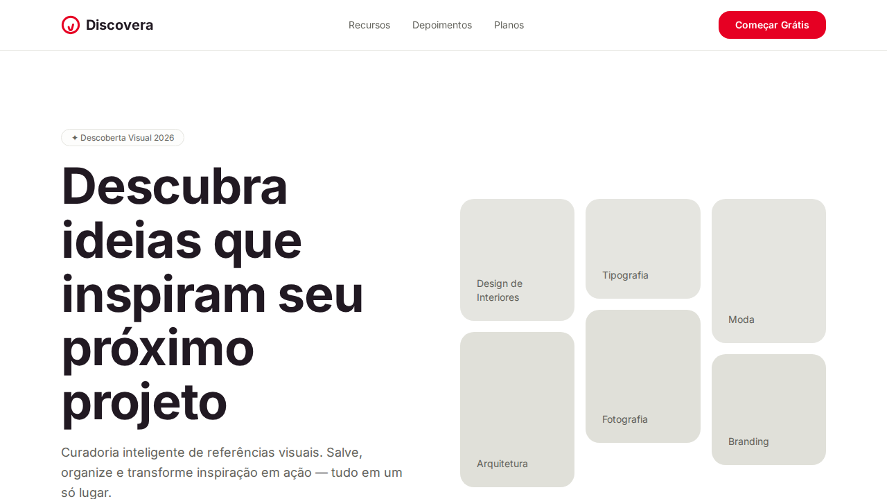
Pinterest didn't invent the mood board — but they mass-produced the feeling of one. When Ben Silbermann launched the platform in 2010, the masonry grid wasn't a layout choice, it was a philosophical statement: content has no fixed aspect ratio, and discovery shouldn't be constrained by uniformity. The waterfall of images mimicked the chaos of a corkboard in a way that felt intentional rather than messy. The introduction of Pin Sans in 2017 marked Pinterest's shift from borrowed identity (Helvetica Neue, then their brief fling with a custom geometric) to owning their typographic voice. Pin Sans is quietly rounded, warm without being childish — it reads like a recommendation from a friend rather than a command from a brand. The weight distribution favors medium over bold, reinforcing suggestion over assertion. What makes Pinterest's system genuinely interesting is how it treats negative space as invitation. The gutters between pins aren't margins — they're breathing room that says 'there's more.' The warm palette (soft reds, muted creams, that signature #E60023) creates urgency without anxiety. Every pixel is calibrated to keep you in a state of pleasant anticipation, never quite satisfied, always one scroll away from the thing you didn't know you needed.
When to Use
Reach for this when your product lives in the space between browsing and buying — where users don't have a query, they have a mood. Visual discovery platforms, lifestyle editorial, recipe collections, travel inspiration, interior design tools. Anywhere the user's intent is 'show me things I'll love' rather than 'find me this specific thing.' Works beautifully when content is heterogeneous in dimension and you refuse to crop it into submission. Terrible for data-dense interfaces or anything requiring scannable hierarchy.
Design Principles
- Masonry over uniformity — let content dictate its own container height; never force aspect ratios that betray the source material
- Warmth through restraint — use the red sparingly as action color, let cream and white do the emotional heavy lifting across surfaces
- Typography as tone of voice — Pin Sans at medium weight suggests rather than shouts; reserve bold for moments of genuine importance, not visual habit
- Negative space as invitation — gutters and padding aren't wasted pixels, they're the silence between notes that makes the melody legible
- Progressive disclosure through scroll — reveal content in waves that reward continued exploration without overwhelming the initial viewport
DESIGN.md
---
version: "alpha"
name: "Pinterest Warm Discovery"
description: "Pinterest-inspired warm discovery landing page. Ideal for marketplaces visuais, galerias de inspiração, plataformas de descoberta, e-commerce visual. AI-ready template."
colors:
  primary: "#ffffff"
  secondary: "#211922"
  tertiary: "#e60023"
  neutral: "#e5e5e0"
  surface: "#62625b"
  accent: "#91918c"
typography:
  h1:
    fontFamily: system-ui
    fontSize: 2.25rem
    fontWeight: 700
  body-md:
    fontFamily: system-ui
    fontSize: 1rem
    fontWeight: 400
  label-caps:
    fontFamily: system-ui
    fontSize: 0.75rem
    fontWeight: 500
rounded:
  sm: 16px
  md: 32px
  lg: 48px
components:
  button-primary:
    backgroundColor: "{colors.primary}"
    textColor: "{colors.neutral}"
    rounded: "{rounded.sm}"
    padding: 12px
---

## Overview

Pinterest-inspired warm discovery landing page. Ideal for marketplaces visuais, galerias de inspiração, plataformas de descoberta, e-commerce visual. AI-ready template. Pinterest didn't invent the mood board — but they mass-produced the feeling of one. When Ben Silbermann launched the platform in 2010, the masonry grid wasn't a layout choice, it was a philosophical statement: content has no fixed aspect ratio, and discovery shouldn't be constrained by uniformity. The waterfall of images mimicked the chaos of a corkboard in a way that felt intentional rather than messy.

The introduction of Pin Sans in 2017 marked Pinterest's shift from borrowed identity (Helvetica Neue, then their brief fling with a custom geometric) to owning their typographic voice. Pin Sans is quietly rounded, warm without being childish — it reads like a recommendation from a friend rather than a command from a brand. The weight distribution favors medium over bold, reinforcing suggestion over assertion.

What makes Pinterest's system genuinely interesting is how it treats negative space as invitation. The gutters between pins aren't margins — they're breathing room that says 'there's more.' The warm palette (soft reds, muted creams, that signature #E60023) creates urgency without anxiety. Every pixel is calibrated to keep you in a state of pleasant anticipation, never quite satisfied, always one scroll away from the thing you didn't know you needed.

- Density: 5/10 — Balanced
- Variance: 2/10 — Structured
- Motion: 4/10 — Subtle

- **Style:** Warm White Canvas, Pinterest Red Accent, Pin Sans, Warm Olive Neutrals, Photography-First
- **Keywords:** pinterest, warm discovery, Pin Sans, Pinterest Red, warm olive neutrals, masonry grid, photography-first, plum black, generous radius, craft-like
- **Era:** 2024-2026 Visual Discovery
- **Light/Dark:** ✓ Full / ✗ Not Recommended

## Colors

- **Branco** (#ffffff) — Light surface, card backgrounds
- **Plum Black** (#211922) — Dark surface, primary background
- **Pinterest Red** (#e60023) — Error states, destructive actions
- **Sand Gray** (#e5e5e0) — Secondary text, borders, muted elements
- **Olive Gray** (#62625b) — Secondary text, borders, muted elements
- **Warm Silver** (#91918c) — Extended palette, decorative use
- **Warm Light** (#e0e0d9) — Extended palette, decorative use
- **Dark Surface** (#33332e) — Deep contrast surface


## Typography

- **Display / Hero:** system-ui — Weight 700, tight tracking, used for headline impact
- **Body:** system-ui — Weight 400, 16px/1.6 line-height, max 72ch per line
- **UI Labels / Captions:** system-ui — 0.875rem, weight 500, slight letter-spacing
- **Monospace:** JetBrains Mono — Used for code, metadata, and technical values

Scale:
- Hero: clamp(2.5rem, 5vw, 4rem)
- H1: 2.25rem
- H2: 1.5rem
- Body: 1rem / 1.6
- Small: 0.875rem


## Layout

- **Grid:** CSS Grid primary. Max-width containment: 1280px centered with 1.5rem side padding.
- **Spacing rhythm:** Balanced. Base unit: 0.5rem (8px).
- **Section vertical gaps:** clamp(4rem, 8vw, 8rem).
- **Hero layout:** Split-screen (text left, visual right).
- **Feature sections:** Zig-zag alternating text+image rows. No 3-equal-columns.
- **Mobile collapse:** All multi-column layouts collapse below 768px. No horizontal overflow.
- **z-index contract:** base (0) / sticky-nav (100) / overlay (200) / modal (300) / toast (500).


## Elevation & Depth

Canvas branco com neutrals olive/sand quentes (#91918c, #62625b, #e5e5e0) criando atmosfera craft acolhedora. Pinterest Red (#e60023) como acento singular bold e confiante. Texto plum black (#211922) — near-black com subtom ameixa quente. Botões secundários sand (#e5e5e0) com tom quente. Radius generoso: 16px botões, 20px+ cards. Botões circulares (50%) para controles. Masonry grid para conteúdo fotográfico. Badges com fundo warm wash (hsla(60,20%,98%,0.5)). Pin Sans como fonte única.

- **Physics:** Ease-out curves, 200-300ms duration. Smooth and predictable.
- **Entry animations:** Fade + translate-Y (16px → 0) over 420ms ease-out. Staggered cascades for lists: 80ms between items.
- **Hover states:** Subtle color shift + shadow adjustment over 200ms.
- **Page transitions:** Fade only (200ms).
- **Performance:** Only transform and opacity animated. No layout-triggering properties.


## Shapes

Base corner radius: 16px. See rounded tokens in front matter for the full scale.


## Components

- **Primary Button:** Rounded (16px buttons) shape. Accent color fill. Hover: 8% darken + subtle lift shadow. Active: -1px translate tactile press. Font weight 600. No outer glows.
- **Secondary / Ghost Button:** Outline variant. 1.5px border in muted color. Text in primary color. Hover: subtle background fill.
- **Cards:** Rounded (16px buttons) corners. Surface background. Subtle shadow (0 2px 12px rgba(0,0,0,0.06)). 1px border stroke.
- **Inputs:** Label above input. 1px border stroke. Focus ring: 2px accent color offset 2px. Error text below in semantic red. No floating labels.
- **Navigation:** Primary surface background. Active item: accent color indicator. Font weight 500 when active.
- **Skeletons:** Shimmer animation matching component dimensions. No circular spinners.
- **Empty States:** Icon-based composition with descriptive text and action button.


## Do's and Don'ts

- No emojis in UI — use icon system only (Lucide, Heroicons)
- No pure black (#000000) — use off-black or charcoal variants
- No oversaturated accent colors (saturation cap: 80%)
- No 3-column equal-width feature layouts — use zig-zag or asymmetric grid
- No `h-screen` — use `min-h-[100dvh]`
- No AI copywriting clichés: "Elevate", "Seamless", "Unleash", "Next-Gen"
- No broken external image links — use picsum.photos or inline SVG
- No generic lorem ipsum in demos

- Do Canvas branco com neutrals quentes
- Do Pinterest Red #e60023 singular
- Do Texto plum black #211922
- Do Botões sand #e5e5e0
- Do Radius generoso 16-20px
- Do Controles circulares 50%
- Do Masonry grid
- Do Responsivo


## Use Case

Marketplaces visuais, Galerias de inspiração, Platforms de descoberta, E-commerce visual
Technical Specs
CSS
background:#ffffff;color:#211922;accent:#e60023;secondary-bg:#e5e5e0;border-radius:16px buttons,20px cards,50% circles;font-family:system-ui,sans-serif;font-weight:600-700 headings,400 body;letter-spacing:-1.2px at 28px
Variables
--bg:#ffffff;--text:#211922;--red:#e60023;--sand:#e5e5e0;--olive:#62625b;--silver:#91918c;--warm-light:#e0e0d9;--dark:#33332e;--radius-btn:16px;--radius-card:20px;--radius-circle:50%
Checklist
☐ Canvas branco com neutrals quentes, ☐ Pinterest Red #e60023 singular, ☐ Texto plum black #211922, ☐ Botões sand #e5e5e0, ☐ Radius generoso 16-20px, ☐ Controles circulares 50%, ☐ Masonry grid, ☐ Responsivo
Colors
Primary
Secondary
Effects
Canvas branco com neutrals olive/sand quentes (#91918c, #62625b, #e5e5e0) criando atmosfera craft acolhedora. Pinterest Red (#e60023) como acento singular bold e confiante. Texto plum black (#211922) — near-black com subtom ameixa quente. Botões secundários sand (#e5e5e0) com tom quente. Radius generoso: 16px botões, 20px+ cards. Botões circulares (50%) para controles. Masonry grid para conteúdo fotográfico. Badges com fundo warm wash (hsla(60,20%,98%,0.5)). Pin Sans como fonte única.
Light/Dark
✓ Full / ✗ Not Recommended
AI Prompt
Act as a Senior Frontend Engineer and Expert UI Designer.
Your task is to code a complete Landing Page on the first attempt.
- Landing Page Theme: <INSERT THEME>
- Sections to add: <INSERT SECTIONS>

Generate the final code immediately following these definitions:

## Style

- **Name:** Pinterest Warm Discovery
- **Type:** Warm White Canvas, Pinterest Red Accent, Pin Sans, Warm Olive Neutrals, Photography-First
- **Keywords:** pinterest, warm discovery, Pin Sans, Pinterest Red, warm olive neutrals, masonry grid, photography-first, plum black, generous radius, craft-like
- **Era:** 2024-2026 Visual Discovery
- **Light/Dark:** ✓ Full / ✗ Not Recommended

## Color Palette

- **Primary:** Branco #ffffff, Plum Black #211922, Pinterest Red #e60023, Sand Gray #e5e5e0
- **Secondary:** Olive Gray #62625b, Warm Silver #91918c, Warm Light #e0e0d9, Dark Surface #33332e

## Visual Effects

Canvas branco com neutrals olive/sand quentes (#91918c, #62625b, #e5e5e0) criando atmosfera craft acolhedora. Pinterest Red (#e60023) como acento singular bold e confiante. Texto plum black (#211922) — near-black com subtom ameixa quente. Botões secundários sand (#e5e5e0) com tom quente. Radius generoso: 16px botões, 20px+ cards. Botões circulares (50%) para controles. Masonry grid para conteúdo fotográfico. Badges com fundo warm wash (hsla(60,20%,98%,0.5)). Pin Sans como fonte única.

## AI Visual Direction

Design a Pinterest-inspired warm discovery landing page. White canvas with warm olive/sand neutrals (#91918c, #62625b, #e5e5e0). Pinterest Red (#e60023) as singular bold accent for primary CTAs. Plum black (#211922) text — warm near-black with plum undertone. Sand gray (#e5e5e0) secondary buttons. Generous border-radius: 16px buttons, 20px cards, 50% circular controls. Pin Sans at 70px weight 600 for hero. Photography-first masonry grid layout. Warm badge backgrounds (hsla(60,20%,98%,0.5)).

## CSS Technical

```css
background:#ffffff;color:#211922;accent:#e60023;secondary-bg:#e5e5e0;border-radius:16px buttons,20px cards,50% circles;font-family:system-ui,sans-serif;font-weight:600-700 headings,400 body;letter-spacing:-1.2px at 28px
```

## Design System Variables

```css
--bg:#ffffff;--text:#211922;--red:#e60023;--sand:#e5e5e0;--olive:#62625b;--silver:#91918c;--warm-light:#e0e0d9;--dark:#33332e;--radius-btn:16px;--radius-card:20px;--radius-circle:50%
```

## Implementation Checklist

- ☐ Canvas branco com neutrals quentes
- ☐ Pinterest Red #e60023 singular
- ☐ Texto plum black #211922
- ☐ Botões sand #e5e5e0
- ☐ Radius generoso 16-20px
- ☐ Controles circulares 50%
- ☐ Masonry grid
- ☐ Responsivo

## Execution Rules

1. Strictly follow the defined visual style.
2. Use high-quality inline SVG icons (Heroicons or Lucide style) — NEVER use emojis as icons.
3. Add `cursor-pointer` and smooth `hover` states (transition-all) on all interactive elements.
4. Required Page Structure:
   - Navbar (Logo + Links + CTA)
   - Hero Section (Impactful Headline + Subtitle + 2 buttons + 3D/Abstract visual element via CSS)
   - Features (3 cards with icons)
   - Testimonials (3 cards)
   - Pricing (3 tiers, highlight the middle one)
   - Final CTA
   - Full Footer with social links, privacy policy, terms of use, contact and SEO links.
5. All text content must be in English.
6. The visual must be CLEARLY distinct — do not create a "default Bootstrap" design. Force the use of the provided design system variables.
7. Use `<style>` tags in the head for custom classes (especially for complex backdrop-filter effects and animations) that Tailwind CDN doesn't cover.
8. Full Responsiveness: Layout must adapt perfectly to Mobile, Tablet and Desktop (vertical stack on mobile).
9. Include basic SEO, Viewport and Open Graph meta tags in `<head>`.
10. Footer must contain: Copyright 2026, Secondary navigation links and Social media icons.
11. Make the creative decisions needed to deliver the complete, functional result now.
Related
Last synced: 4/1/2026