Lovable Cream Humanist
Lovable-inspired warm landing page. Ideal for ai builders, ferramentas no-code, plataformas amigáveis, dev tools approachable. AI-ready template.
Use case: AI builders, Tools no-code, Platforms amigáveis, Dev tools approachable
Historical Context
The cream humanist aesthetic didn't emerge from a single moment — it's the quiet rebellion against the cold, clinical interfaces that dominated the 2010s. When every SaaS product looked like a sterile hospital dashboard, designers started reaching back to print traditions: warm off-whites, humanist typefaces with visible pen strokes, and generous whitespace that actually breathes. The lineage traces through early Mailchimp (before the rebrand flattened it), the original Slack palette, and indie apps like Notion in its softer early days. These products understood something fundamental: people don't want to feel like they're operating machinery. They want to feel like they're using something made by humans, for humans. The cream background isn't just an aesthetic choice — it reduces eye strain and signals 'this space is yours, relax.' What makes this system distinct from generic 'friendly UI' is its restraint. It's not playful to the point of being unserious. The warmth comes from typography and color temperature, not from illustrations of people high-fiving. It earns trust through craft, not performance.
When to Use
Reach for this when your product needs to feel like a conversation, not a transaction. Consumer apps where retention depends on emotional comfort. Community platforms where coldness kills participation. Friendly SaaS where the user isn't a power-user — they're someone who opened your app hoping it wouldn't make them feel stupid. Terrible fit for data-dense dashboards, developer tools, or anything where information density matters more than emotional resonance.
Design Principles
- Warm neutrals over pure whites — #FAFAFA is not cream, it's cowardice. Commit to the warmth or don't bother.
- Humanist type only — no geometric sans-serifs. If the lowercase 'a' doesn't have a story to tell, pick a different font.
- Depth through elevation, never through borders — soft shadows at low opacity create hierarchy without visual noise.
- Generous padding is non-negotiable — cramped layouts betray the entire premise. Let elements breathe or the warmth suffocates.
- Color as accent, not as system — one or two muted tones max. The cream does the heavy lifting; everything else is punctuation.
DESIGN.md
---
version: "alpha"
name: "Lovable Cream Humanist"
description: "Lovable-inspired warm landing page. Ideal for ai builders, ferramentas no-code, plataformas amigáveis, dev tools approachable. AI-ready template."
colors:
primary: "#f7f4ed"
secondary: "#1c1c1c"
tertiary: "#fcfbf8"
neutral: "#eceae4"
surface: "#5f5f5d"
accent: "#3b82f6"
typography:
h1:
fontFamily: system-ui
fontSize: 2.25rem
fontWeight: 700
body-md:
fontFamily: system-ui
fontSize: 1rem
fontWeight: 400
label-caps:
fontFamily: system-ui
fontSize: 0.75rem
fontWeight: 500
rounded:
sm: 6px
md: 12px
lg: 18px
components:
button-primary:
backgroundColor: "{colors.primary}"
textColor: "{colors.neutral}"
rounded: "{rounded.sm}"
padding: 12px
---
## Overview
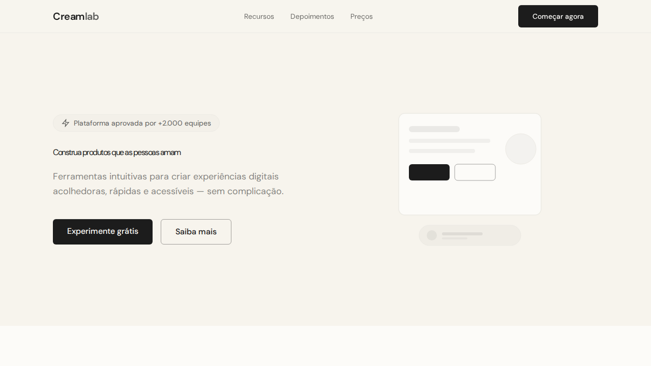
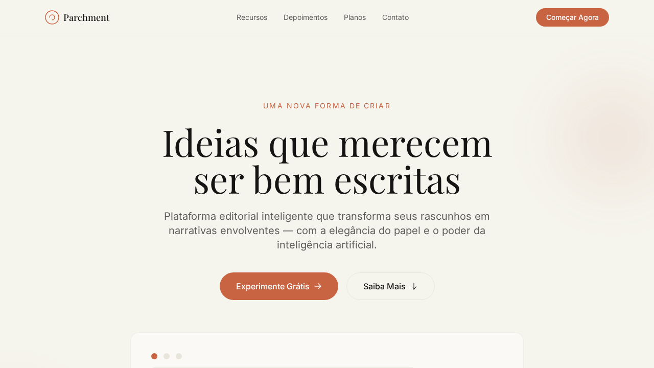
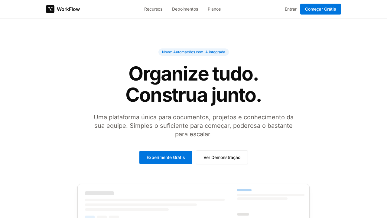
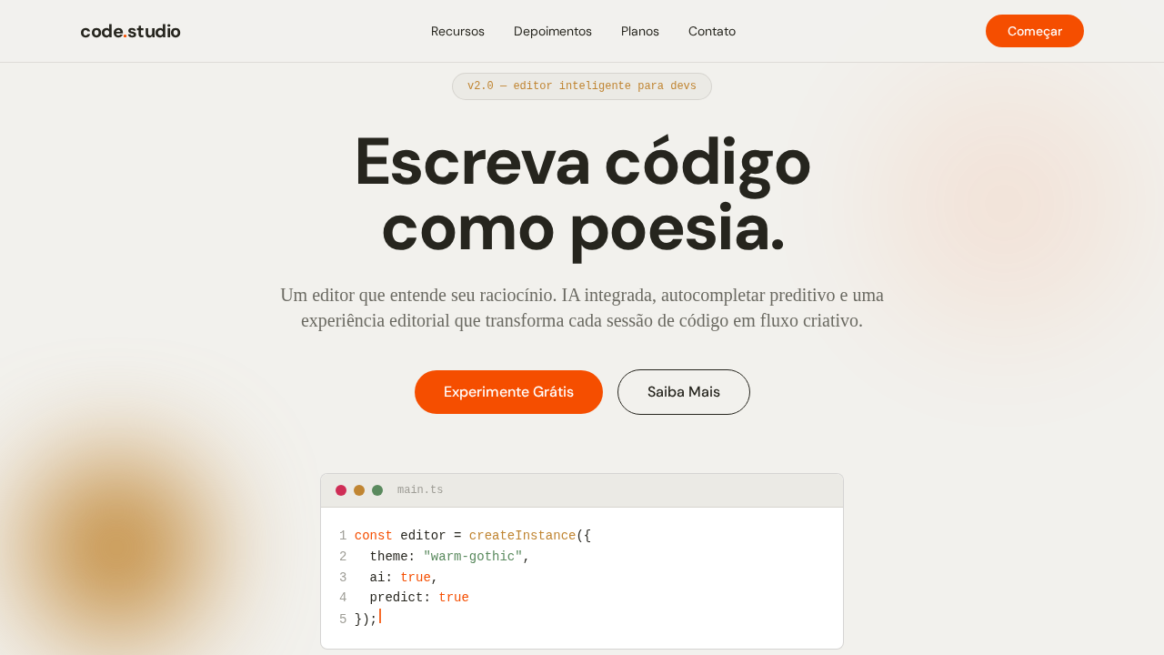
Lovable-inspired warm landing page. Ideal for ai builders, ferramentas no-code, plataformas amigáveis, dev tools approachable. AI-ready template. The cream humanist aesthetic didn't emerge from a single moment — it's the quiet rebellion against the cold, clinical interfaces that dominated the 2010s. When every SaaS product looked like a sterile hospital dashboard, designers started reaching back to print traditions: warm off-whites, humanist typefaces with visible pen strokes, and generous whitespace that actually breathes.
The lineage traces through early Mailchimp (before the rebrand flattened it), the original Slack palette, and indie apps like Notion in its softer early days. These products understood something fundamental: people don't want to feel like they're operating machinery. They want to feel like they're using something made by humans, for humans. The cream background isn't just an aesthetic choice — it reduces eye strain and signals 'this space is yours, relax.'
What makes this system distinct from generic 'friendly UI' is its restraint. It's not playful to the point of being unserious. The warmth comes from typography and color temperature, not from illustrations of people high-fiving. It earns trust through craft, not performance.
- Density: 5/10 — Balanced
- Variance: 4/10 — Moderate
- Motion: 4/10 — Subtle
- **Style:** Warm Cream, Humanist Font, Opacity-Driven Colors, Inset Shadows, Pill Icons
- **Keywords:** lovable, cream, humanist, opacity-driven, inset shadows, pill icons, warm borders, Camera Plain, shadcn, approachable
- **Era:** 2024-2026 Approachable Dev Tool
- **Light/Dark:** ✓ Full / ✗ Not Recommended
## Colors
- **Creme** (#f7f4ed) — Primary surface or dominant color
- **Charcoal** (#1c1c1c) — Dark surface, primary background
- **Off-White** (#fcfbf8) — Light surface, card backgrounds
- **Borda Creme** (#eceae4) — Supporting palette color
- **Cinza Muted** (#5f5f5d) — Secondary text, borders, muted elements
- **Ring Blue** (#3b82f6) — Secondary accent
- **Borda Interativa** (rgba(28,28,28,0.4)) — Extended palette, decorative use
- **Tint** (rgba(28,28,28,0.04)) — Extended palette, decorative use
## Typography
- **Display / Hero:** system-ui — Weight 700, tight tracking, used for headline impact
- **Body:** system-ui — Weight 400, 16px/1.6 line-height, max 72ch per line
- **UI Labels / Captions:** system-ui — 0.875rem, weight 500, slight letter-spacing
- **Monospace:** JetBrains Mono — Used for code, metadata, and technical values
Scale:
- Hero: clamp(2.5rem, 5vw, 4rem)
- H1: 2.25rem
- H2: 1.5rem
- Body: 1rem / 1.6
- Small: 0.875rem
## Layout
- **Grid:** CSS Grid primary. Max-width containment: 1280px centered with 1.5rem side padding.
- **Spacing rhythm:** Balanced. Base unit: 0.5rem (8px).
- **Section vertical gaps:** clamp(4rem, 8vw, 8rem).
- **Hero layout:** Split-screen (text left, visual right).
- **Feature sections:** Zig-zag alternating text+image rows. No 3-equal-columns.
- **Mobile collapse:** All multi-column layouts collapse below 768px. No horizontal overflow.
- **z-index contract:** base (0) / sticky-nav (100) / overlay (200) / modal (300) / toast (500).
## Elevation & Depth
Canvas creme quente (#f7f4ed) como caderno premium. Font humanista com terminais arredondados e curvas orgânicas. Sistema de cores baseado em opacidade — todos os cinzas derivados de #1c1c1c em transparências variadas. Inset shadows em botões (rgba(255,255,255,0.2) 0px 0.5px inset + rgba(0,0,0,0.2) 0px 0px 0.5px inset). Bordas quentes (#eceae4). Pill icons (9999px). Variable font com peso 480 intermediário.
- **Physics:** Ease-out curves, 200-300ms duration. Smooth and predictable.
- **Entry animations:** Fade + translate-Y (16px → 0) over 420ms ease-out. Staggered cascades for lists: 80ms between items.
- **Hover states:** Subtle color shift + shadow adjustment over 200ms.
- **Page transitions:** Fade only (200ms).
- **Performance:** Only transform and opacity animated. No layout-triggering properties.
## Shapes
Base corner radius: 6px. See rounded tokens in front matter for the full scale.
## Components
- **Primary Button:** Pill-shaped (9999px) shape. Accent color fill. Hover: 8% darken + subtle lift shadow. Active: -1px translate tactile press. Font weight 600. No outer glows.
- **Secondary / Ghost Button:** Outline variant. 1.5px border in muted color. Text in primary color. Hover: subtle background fill.
- **Cards:** Pill-shaped (9999px) corners. Surface background. Subtle shadow (0 2px 12px rgba(0,0,0,0.06)). 1px border stroke.
- **Inputs:** Label above input. 1px border stroke. Focus ring: 2px accent color offset 2px. Error text below in semantic red. No floating labels.
- **Navigation:** Primary surface background. Active item: accent color indicator. Font weight 500 when active.
- **Skeletons:** Shimmer animation matching component dimensions. No circular spinners.
- **Empty States:** Icon-based composition with descriptive text and action button.
## Do's and Don'ts
- No emojis in UI — use icon system only (Lucide, Heroicons)
- No pure black (#000000) — use off-black or charcoal variants
- No oversaturated accent colors (saturation cap: 80%)
- No 3-column equal-width feature layouts — use zig-zag or asymmetric grid
- No `h-screen` — use `min-h-[100dvh]`
- No AI copywriting clichés: "Elevate", "Seamless", "Unleash", "Next-Gen"
- No broken external image links — use picsum.photos or inline SVG
- No generic lorem ipsum in demos
- Do Fundo creme #f7f4ed
- Do Font humanista
- Do Cores baseadas em opacidade
- Do Inset shadows em botões
- Do Bordas quentes
- Do Pill icons 9999px
- Do Variable font weight 480
- Do Responsivo
## Use Case
AI builders, Tools no-code, Platforms amigáveis, Dev tools approachable
Technical Specs
CSS
background: #f7f4ed; color: #1c1c1c; border: 1px solid #eceae4; box-shadow: rgba(255,255,255,0.2) 0px 0.5px 0px 0px inset, rgba(0,0,0,0.2) 0px 0px 0px 0.5px inset; font-family: system-ui, sans-serif; border-radius: 6px buttons, 12px cards, 9999px pills
Variables
--bg: #f7f4ed; --text: #1c1c1c; --off-white: #fcfbf8; --border: #eceae4; --muted: #5f5f5d; --interactive-border: rgba(28,28,28,0.4); --tint: rgba(28,28,28,0.04); --radius-btn: 6px; --radius-card: 12px; --radius-pill: 9999px
Checklist
☐ Fundo creme #f7f4ed, ☐ Font humanista, ☐ Cores baseadas em opacidade, ☐ Inset shadows em botões, ☐ Bordas quentes, ☐ Pill icons 9999px, ☐ Variable font weight 480, ☐ Responsivo
Colors
Primary
Secondary
Effects
Canvas creme quente (#f7f4ed) como caderno premium. Font humanista com terminais arredondados e curvas orgânicas. Sistema de cores baseado em opacidade — todos os cinzas derivados de #1c1c1c em transparências variadas. Inset shadows em botões (rgba(255,255,255,0.2) 0px 0.5px inset + rgba(0,0,0,0.2) 0px 0px 0.5px inset). Bordas quentes (#eceae4). Pill icons (9999px). Variable font com peso 480 intermediário.
Light/Dark
✓ Full / ✗ Not Recommended
AI Prompt
Act as a Senior Frontend Engineer and Expert UI Designer.
Your task is to code a complete Landing Page on the first attempt.
- Landing Page Theme: <INSERT THEME>
- Sections to add: <INSERT SECTIONS>

Generate the final code immediately following these definitions:

## Style

- **Name:** Lovable Cream Humanist
- **Type:** Warm Cream, Humanist Font, Opacity-Driven Colors, Inset Shadows, Pill Icons
- **Keywords:** lovable, cream, humanist, opacity-driven, inset shadows, pill icons, warm borders, Camera Plain, shadcn, approachable
- **Era:** 2024-2026 Approachable Dev Tool
- **Light/Dark:** ✓ Full / ✗ Not Recommended

## Color Palette

- **Primary:** Creme #f7f4ed, Charcoal #1c1c1c, Off-White #fcfbf8, Borda Creme #eceae4
- **Secondary:** Cinza Muted #5f5f5d, Borda Interativa rgba(28,28,28,0.4), Tint rgba(28,28,28,0.04), Ring Blue #3b82f6

## Visual Effects

Canvas creme quente (#f7f4ed) como caderno premium. Font humanista com terminais arredondados e curvas orgânicas. Sistema de cores baseado em opacidade — todos os cinzas derivados de #1c1c1c em transparências variadas. Inset shadows em botões (rgba(255,255,255,0.2) 0px 0.5px inset + rgba(0,0,0,0.2) 0px 0px 0.5px inset). Bordas quentes (#eceae4). Pill icons (9999px). Variable font com peso 480 intermediário.

## AI Visual Direction

Design a Lovable-inspired warm landing page. Cream parchment background (#f7f4ed). Humanist sans-serif font with rounded terminals. Opacity-driven color system — all grays from #1c1c1c at varying transparency. Inset shadow technique on dark buttons. Warm cream borders (#eceae4). Pill-shaped icon containers (9999px). Variable font with weight 480 for display. Headlines at 60px weight 600 with -1.5px letter-spacing. Ghost outline buttons with rgba(28,28,28,0.4) border.

## CSS Technical

```css
background: #f7f4ed; color: #1c1c1c; border: 1px solid #eceae4; box-shadow: rgba(255,255,255,0.2) 0px 0.5px 0px 0px inset, rgba(0,0,0,0.2) 0px 0px 0px 0.5px inset; font-family: system-ui, sans-serif; border-radius: 6px buttons, 12px cards, 9999px pills
```

## Design System Variables

```css
--bg: #f7f4ed; --text: #1c1c1c; --off-white: #fcfbf8; --border: #eceae4; --muted: #5f5f5d; --interactive-border: rgba(28,28,28,0.4); --tint: rgba(28,28,28,0.04); --radius-btn: 6px; --radius-card: 12px; --radius-pill: 9999px
```

## Implementation Checklist

- ☐ Fundo creme #f7f4ed
- ☐ Font humanista
- ☐ Cores baseadas em opacidade
- ☐ Inset shadows em botões
- ☐ Bordas quentes
- ☐ Pill icons 9999px
- ☐ Variable font weight 480
- ☐ Responsivo

## Execution Rules

1. Strictly follow the defined visual style.
2. Use high-quality inline SVG icons (Heroicons or Lucide style) — NEVER use emojis as icons.
3. Add `cursor-pointer` and smooth `hover` states (transition-all) on all interactive elements.
4. Required Page Structure:
   - Navbar (Logo + Links + CTA)
   - Hero Section (Impactful Headline + Subtitle + 2 buttons + 3D/Abstract visual element via CSS)
   - Features (3 cards with icons)
   - Testimonials (3 cards)
   - Pricing (3 tiers, highlight the middle one)
   - Final CTA
   - Full Footer with social links, privacy policy, terms of use, contact and SEO links.
5. All text content must be in English.
6. The visual must be CLEARLY distinct — do not create a "default Bootstrap" design. Force the use of the provided design system variables.
7. Use `<style>` tags in the head for custom classes (especially for complex backdrop-filter effects and animations) that Tailwind CDN doesn't cover.
8. Full Responsiveness: Layout must adapt perfectly to Mobile, Tablet and Desktop (vertical stack on mobile).
9. Include basic SEO, Viewport and Open Graph meta tags in `<head>`.
10. Footer must contain: Copyright 2026, Secondary navigation links and Social media icons.
11. Make the creative decisions needed to deliver the complete, functional result now.
Related
Last synced: 4/1/2026