Pin & Paper
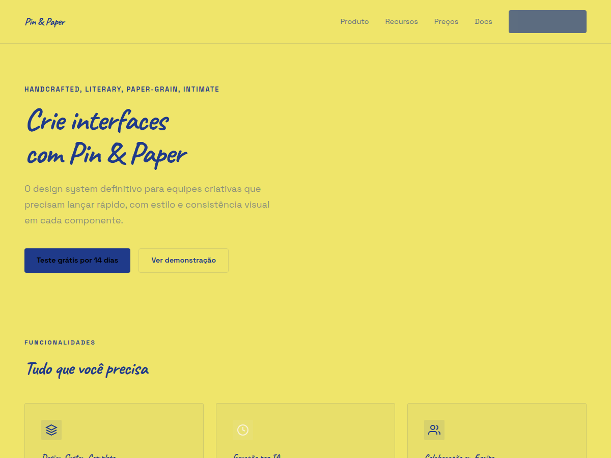
Pin & Paper — Yellow paper with safety-pin illustrations, ink-blue handwritten Caveat, paper-grain texture. Caveat typography. saturated yellow paper, soft cream alternate, deep ink-blue type, plus rust red,. Best for research findings with personality, qualitative report, founder reflection. AI-ready design system.
Use case: research findings with personality, qualitative report, founder reflection, creator essay deck, workshop debrief
Historical Context
The safety pin didn't become a design element by accident. When punk exploded in 1976, it was the cheapest, most accessible act of defiance you could perform on a piece of clothing. That gesture — taking something functional and making it confrontational — carried directly into zine culture, where photocopied pages held together with staples and pins became the publishing format for anyone locked out of mainstream media. Paper grain and handwritten type existed in this world not as aesthetic choices but as economic realities. You used what you had. Caveat-style handwriting on rough stock wasn't a font pairing decision — it was someone's actual hand, pressing hard with a ballpoint on whatever paper was lying around. The texture was the message: unmediated, unpolished, real. What makes this combination endure is that it never pretended to be anything else. The pin holds things together. The paper accepts the ink. The handwriting proves a human was here. Every revival of this aesthetic — from riot grrrl in the 90s to contemporary craft branding — succeeds because it refuses the slickness that erodes trust.
When to Use
When your brand needs to feel made-by-hands rather than manufactured. This system works for independent makers, zine publishers, DIY workshops, handmade product lines, and any project where polish would actually undermine credibility. Deploy it when your audience values authenticity over refinement — when they'd rather see the process than the production value. It falls apart instantly if applied to corporate contexts or anything requiring institutional authority. Know your audience: this speaks to people who shop at independent bookstores, not department stores.
Design Principles
- Imperfection is intentional — uneven baselines, visible paper texture, and wobbly linework aren't bugs, they're the entire point. Never correct what should feel human.
- Constraint breeds character — limit your palette to what a single-color risograph or photocopier could produce. If you can't imagine making it at a copy shop at 2am, simplify further.
- The pin is structural, not decorative — every safety-pin illustration should imply it's holding something together. It connects, fastens, repairs. Use it where elements actually join.
- Paper is the first layer, not the background — treat grain, fold marks, and edge wear as active design elements that occupy visual hierarchy alongside type and illustration.
- Handwriting carries voice — Caveat or any handwritten face should read like someone's actual notes. Vary weight and size like a person would. The moment it looks typeset, you've lost the plot.
DESIGN.md
---
version: "alpha"
name: "Pin & Paper"
description: "Pin & Paper — Yellow paper with safety-pin illustrations, ink-blue handwritten Caveat, paper-grain texture. Caveat typography. saturated yellow paper, soft cream alternate, deep ink-blue type, plus rust red,. Best for research findings with personality, qualitative report, founder reflection. AI-ready design system."
colors:
  primary: "#EFE56A"
  secondary: "#F8F1D6"
  tertiary: "#1F3A8A"
  neutral: "#C2342B"
typography:
  h1:
    fontFamily: Caveat
    fontSize: 2.5rem
    fontWeight: 700
  body-md:
    fontFamily: Caveat
    fontSize: 1rem
    fontWeight: 400
spacing:
  sm: 1.5rem
  md: 3.0rem
  lg: 6.0rem
components:
  button-primary:
    backgroundColor: "{colors.primary}"
    textColor: "{colors.neutral}"
    padding: 12px
---

## Overview

Pin & Paper — Yellow paper with safety-pin illustrations, ink-blue handwritten Caveat, paper-grain texture. Caveat typography. saturated yellow paper, soft cream alternate, deep ink-blue type, plus rust red,. Best for research findings with personality, qualitative report, founder reflection. AI-ready design system. The safety pin didn't become a design element by accident. When punk exploded in 1976, it was the cheapest, most accessible act of defiance you could perform on a piece of clothing. That gesture — taking something functional and making it confrontational — carried directly into zine culture, where photocopied pages held together with staples and pins became the publishing format for anyone locked out of mainstream media.

Paper grain and handwritten type existed in this world not as aesthetic choices but as economic realities. You used what you had. Caveat-style handwriting on rough stock wasn't a font pairing decision — it was someone's actual hand, pressing hard with a ballpoint on whatever paper was lying around. The texture was the message: unmediated, unpolished, real.

What makes this combination endure is that it never pretended to be anything else. The pin holds things together. The paper accepts the ink. The handwriting proves a human was here. Every revival of this aesthetic — from riot grrrl in the 90s to contemporary craft branding — succeeds because it refuses the slickness that erodes trust.

- Density: 5/10 — Balanced
- Variance: 5/10 — Moderate
- Motion: 2/10 — Minimal

- **Style:** Handcrafted, Literary, Paper-Grain, Intimate
- **Keywords:** Caveat handwriting, safety-pin illustrations, paper grain, yellow paper, crafted, literary, intimate
- **Era:** 2020s Modern
- **Light/Dark:** ✓ Full / ✗ None

## Colors

- **Paper** (#EFE56A) — Primary surface or dominant color
- **Cream** (#F8F1D6) — Accent highlight, links and focus states
- **Ink** (#1F3A8A) — Secondary accent
- **Red** (#C2342B) — Accent color, emphasis elements


## Typography

- **Display / Hero:** Caveat — Weight 700, tight tracking, used for headline impact
- **Body:** Space Grotesk — Weight 400, 16px/1.6 line-height, max 72ch per line
- **UI Labels / Captions:** Space Grotesk — 0.875rem, weight 500, slight letter-spacing
- **Monospace:** DM Mono — Used for code, metadata, and technical values

Scale:
- Hero: clamp(2.5rem, 5vw, 4rem)
- H1: 2.25rem
- H2: 1.5rem
- Body: 1rem / 1.6
- Small: 0.875rem


## Layout

- **Grid:** CSS Grid primary. Max-width containment: 1280px centered with 1.5rem side padding.
- **Spacing rhythm:** Balanced. Base unit: 0.5rem (8px).
- **Section vertical gaps:** clamp(4rem, 8vw, 8rem).
- **Hero layout:** Split-screen (text left, visual right).
- **Feature sections:** Zig-zag alternating text+image rows. No 3-equal-columns.
- **Mobile collapse:** All multi-column layouts collapse below 768px. No horizontal overflow.
- **z-index contract:** base (0) / sticky-nav (100) / overlay (200) / modal (300) / toast (500).


## Elevation & Depth

display font Caveat for hero headlines, subtle hover (opacity 0.8, 200ms), refined focus rings, safety-pin SVG illustrations, paper-grain CSS texture, Caveat handwriting

- **Physics:** Ease-out curves, 200-300ms duration. Smooth and predictable.
- **Entry animations:** Fade + translate-Y (16px → 0) over 420ms ease-out. Staggered cascades for lists: 80ms between items.
- **Hover states:** Subtle color shift + shadow adjustment over 200ms.
- **Page transitions:** Fade only (200ms).
- **Performance:** Only transform and opacity animated. No layout-triggering properties.


## Shapes

Base corner radius: 4px. See rounded tokens in front matter for the full scale.


## Components

- **Primary Button:** 4px border-radius. Accent color fill. Hover: 8% darken + subtle lift shadow. Active: -1px translate tactile press. Font weight 600. No outer glows.
- **Secondary / Ghost Button:** Outline variant. 1.5px border in muted color. Text in primary color. Hover: subtle background fill.
- **Cards:** 4px corners. Surface background. Subtle shadow (0 2px 12px rgba(0,0,0,0.06)). 1px border stroke.
- **Inputs:** Label above input. 1px border stroke. Focus ring: 2px accent color offset 2px. Error text below in semantic red. No floating labels.
- **Navigation:** Primary surface background. Active item: accent color indicator. Font weight 500 when active.
- **Skeletons:** Shimmer animation matching component dimensions. No circular spinners.
- **Empty States:** Icon-based composition with descriptive text and action button.


## Do's and Don'ts

- No emojis in UI — use icon system only (Lucide, Heroicons)
- No pure black (#000000) — use off-black or charcoal variants
- No oversaturated accent colors (saturation cap: 80%)
- No 3-column equal-width feature layouts — use zig-zag or asymmetric grid
- No `h-screen` — use `min-h-[100dvh]`
- No AI copywriting clichés: "Elevate", "Seamless", "Unleash", "Next-Gen"
- No broken external image links — use picsum.photos or inline SVG
- No generic lorem ipsum in demos

- Do Caveat display font loaded via Google Fonts
- Do Color palette variables applied consistently
- Do Typography scale: hero clamp(2.5rem,5vw,4rem)
- Do H1 2.25rem
- Do body 1rem/1.6
- Do WCAG AA contrast ratio verified (4.5:1 body text)
- Do Hand-drawn / crafted SVG decorations present
- Do Mobile responsive layout (stack below 768px)


## Use Case

research findings with personality, qualitative report, founder reflection, creator essay deck, workshop debrief
Technical Specs
CSS
font-family: 'Caveat', cursive; background: #F5E8A0; color: #1A2550; background-image: url("data:image/svg+xml,..."); border: 1px solid #D4C060Variables
--bg: #EFE56A, --fg: #1F3A8A, --accent: #1F3A8A, --font-display: 'Caveat', --font-body: 'Space Grotesk', --radius: 4px, --spacing: 1.5rem
Checklist
☐ Caveat display font loaded via Google Fonts, ☐ Color palette variables applied consistently, ☐ Typography scale: hero clamp(2.5rem,5vw,4rem), H1 2.25rem, body 1rem/1.6, ☐ WCAG AA contrast ratio verified (4.5:1 body text), ☐ Hand-drawn / crafted SVG decorations present, ☐ Mobile responsive layout (stack below 768px)
Colors
Primary
Secondary
Effects
display font Caveat for hero headlines, subtle hover (opacity 0.8, 200ms), refined focus rings, safety-pin SVG illustrations, paper-grain CSS texture, Caveat handwriting
Light/Dark
✓ Full / ✗ None
AI Prompt
Act as a Senior Frontend Engineer and Expert UI Designer.
Your task is to code a complete Landing Page on the first attempt.
- Landing Page Theme: <INSERT THEME>
- Sections to add: <INSERT SECTIONS>

Generate the final code immediately following these definitions:

## Style

- **Name:** Pin & Paper
- **Type:** Handcrafted, Literary, Paper-Grain, Intimate
- **Keywords:** Caveat handwriting, safety-pin illustrations, paper grain, yellow paper, crafted, literary, intimate
- **Era:** 2020s Modern
- **Light/Dark:** ✓ Full / ✗ None

## Color Palette

- **Primary:** Paper #EFE56A, Cream #F8F1D6, Ink #1F3A8A
- **Secondary:** Red #C2342B

## Visual Effects

display font Caveat for hero headlines, subtle hover (opacity 0.8, 200ms), refined focus rings, safety-pin SVG illustrations, paper-grain CSS texture, Caveat handwriting

## AI Visual Direction

Design a handcrafted warm literary layout. Use: aged yellow paper (#F5E8A0), ink-blue text (#1A2550), Caveat handwriting font for headlines, paper-grain CSS texture, safety-pin SVG decorations. Intimate and crafted, not digital-polished.

## CSS Technical

```css
font-family: 'Caveat', cursive; background: #F5E8A0; color: #1A2550; background-image: url("data:image/svg+xml,..."); border: 1px solid #D4C060
```

## Design System Variables

```css
--bg: #EFE56A, --fg: #1F3A8A, --accent: #1F3A8A, --font-display: 'Caveat', --font-body: 'Space Grotesk', --radius: 4px, --spacing: 1.5rem
```

## Implementation Checklist

- ☐ Caveat display font loaded via Google Fonts
- ☐ Color palette variables applied consistently
- ☐ Typography scale: hero clamp(2.5rem,5vw,4rem)
- H1 2.25rem
- body 1rem/1.6
- ☐ WCAG AA contrast ratio verified (4.5:1 body text)
- ☐ Hand-drawn / crafted SVG decorations present
- ☐ Mobile responsive layout (stack below 768px)

## Execution Rules

1. Strictly follow the defined visual style.
2. Use high-quality inline SVG icons (Heroicons or Lucide style) — NEVER use emojis as icons.
3. Add `cursor-pointer` and smooth `hover` states (transition-all) on all interactive elements.
4. Required Page Structure:
   - Navbar (Logo + Links + CTA)
   - Hero Section (Impactful Headline + Subtitle + 2 buttons + 3D/Abstract visual element via CSS)
   - Features (3 cards with icons)
   - Testimonials (3 cards)
   - Pricing (3 tiers, highlight the middle one)
   - Final CTA
   - Full Footer with social links, privacy policy, terms of use, contact and SEO links.
5. All text content must be in English.
6. The visual must be CLEARLY distinct — do not create a "default Bootstrap" design. Force the use of the provided design system variables.
7. Use `<style>` tags in the head for custom classes (especially for complex backdrop-filter effects and animations) that Tailwind CDN doesn't cover.
8. Full Responsiveness: Layout must adapt perfectly to Mobile, Tablet and Desktop (vertical stack on mobile).
9. Include basic SEO, Viewport and Open Graph meta tags in `<head>`.
10. Footer must contain: Copyright 2026, Secondary navigation links and Social media icons.
11. Make the creative decisions needed to deliver the complete, functional result now.Related
Last synced: 5/6/2026