Paper & Ink
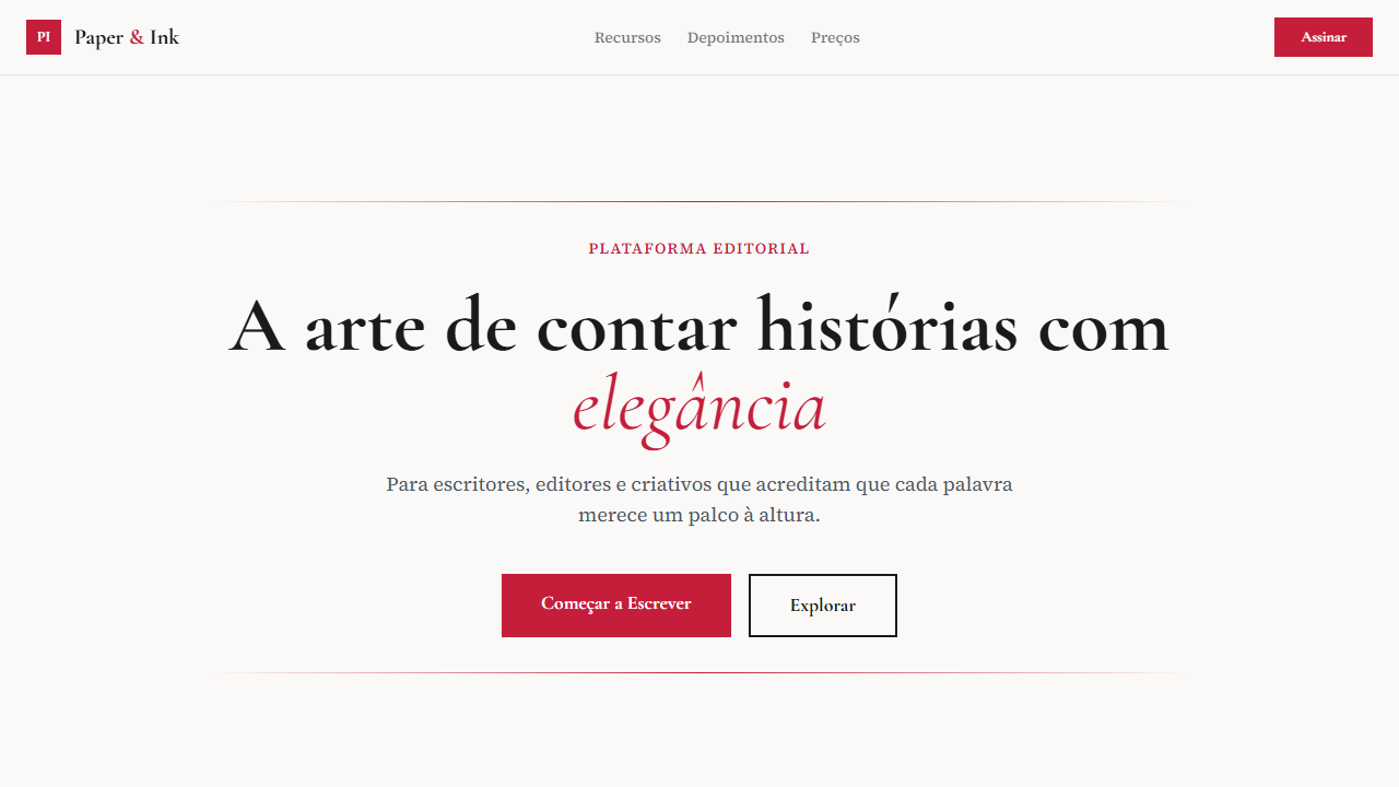
Design an editorial, literary, thoughtful landing page with paper and ink aesthetic. Ideal for editoras, blogs literários, revistas culturais, portfolios de escritores. AI-ready template.
Use case: Publishers, Literary blogs, Cultural magazines, Writer portfolios
Historical Context
There's something almost subversive about bringing paper texture into a digital interface. For centuries, the relationship between ink and substrate was the entire design medium — letterpress operators obsessed over impression depth, printmakers chose papers that would hold ink without feathering, and book designers understood that the tooth of a page affected readability as much as the typeface itself. When screens arrived, we spent decades pretending paper didn't exist. Flat design wiped every texture clean. But the pendulum swung back because readers noticed what was missing: warmth. A screen rendering Garamond on pure white (#fff) feels clinical. That same Garamond on a cream field with subtle fiber noise feels like something you want to spend an afternoon with. The Paper & Ink aesthetic isn't skeuomorphism — nobody's adding fake leather stitching here. It's a selective reintroduction of analog signal. Ink bleed on headlines. Slight halftone grain in illustrations. Off-white backgrounds that reduce eye strain while signaling 'this content was crafted, not generated.' It borrows the authority of print without pretending the screen is a page.
When to Use
Reach for Paper & Ink when your content demands sustained reading and the interface should disappear behind the words. Literary magazines, poetry platforms, independent publishers translating their catalogs online, essay-driven blogs that refuse to look like every other Substack. It works beautifully for print-digital hybrids where brand consistency across physical books and web presence actually matters. Also strong for archival projects, typographic portfolios, and any context where you want users to slow down rather than scroll faster.
Design Principles
- Substrate first — choose your background color and texture before anything else; every element inherits its character from the 'paper' beneath it
- Ink economy — treat color like expensive ink on a press run; one or two spot colors maximum, let black do the heavy lifting through weight and size contrast
- Visible craft in typography — use optical sizing, real small caps, oldstyle figures, and proper hanging punctuation; if your type doesn't look set by hand, you've missed the point
- Texture as whisper, not shout — grain, noise, and fiber should register subconsciously; if a user consciously notices the texture, you've overdone it by half
- Respect the margins — generous whitespace isn't wasted space, it's the digital equivalent of deckle edges and French folds; let content breathe like a well-set book page
DESIGN.md
---
version: "alpha"
name: "Paper & Ink"
description: "Design an editorial, literary, thoughtful landing page with paper and ink aesthetic. Ideal for editoras, blogs literários, revistas culturais, portfolios de escritores. AI-ready template."
colors:
  primary: "#faf9f7"
  secondary: "#1a1a1a"
  tertiary: "#c41e3a"
  neutral: "#f5f3ef"
  surface: "#666666"
  accent: "#8b7355"
typography:
  h1:
    fontFamily: Cormorant Garamond
    fontSize: 2.5rem
    fontWeight: 700
  body-md:
    fontFamily: Cormorant Garamond
    fontSize: 1rem
    fontWeight: 400
components:
  button-primary:
    backgroundColor: "{colors.primary}"
    textColor: "{colors.neutral}"
    padding: 12px
---

## Overview

Design an editorial, literary, thoughtful landing page with paper and ink aesthetic. Ideal for editoras, blogs literários, revistas culturais, portfolios de escritores. AI-ready template. There's something almost subversive about bringing paper texture into a digital interface. For centuries, the relationship between ink and substrate was the entire design medium — letterpress operators obsessed over impression depth, printmakers chose papers that would hold ink without feathering, and book designers understood that the tooth of a page affected readability as much as the typeface itself.

When screens arrived, we spent decades pretending paper didn't exist. Flat design wiped every texture clean. But the pendulum swung back because readers noticed what was missing: warmth. A screen rendering Garamond on pure white (#fff) feels clinical. That same Garamond on a cream field with subtle fiber noise feels like something you want to spend an afternoon with.

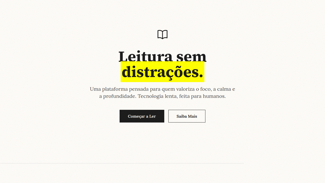
The Paper & Ink aesthetic isn't skeuomorphism — nobody's adding fake leather stitching here. It's a selective reintroduction of analog signal. Ink bleed on headlines. Slight halftone grain in illustrations. Off-white backgrounds that reduce eye strain while signaling 'this content was crafted, not generated.' It borrows the authority of print without pretending the screen is a page.

- Density: 5/10 — Balanced
- Variance: 4/10 — Moderate
- Motion: 4/10 — Subtle

- **Style:** Editorial, Literary, Thoughtful, Elegant
- **Keywords:** paper, ink, editorial, literary, Cormorant Garamond, Source Serif 4, drop caps, pull quotes, horizontal rules, warm cream, crimson accent
- **Era:** Classic Literary + 2024 Modern
- **Light/Dark:** ✓ Full / ✗ No

## Colors

- **Warm Cream** (#faf9f7) — Light surface, card backgrounds
- **Charcoal** (#1a1a1a) — Dark surface, primary background
- **Crimson Accent** (#c41e3a) — Primary accent, CTAs and interactive elements
- **Light Cream** (#f5f3ef) — Secondary surface
- **Medium Grey** (#666666) — Secondary text, borders, muted elements
- **Soft Brown** (#8b7355) — Extended palette, decorative use


## Typography

- **Display / Hero:** Cormorant Garamond — Weight 700, tight tracking, used for headline impact
- **Accent:** Cormorant Garamond' for headings — Used for decorative or emphasis text
- **Body:** Cormorant Garamond — Weight 400, 16px/1.6 line-height, max 72ch per line
- **UI Labels / Captions:** Cormorant Garamond — 0.875rem, weight 500, slight letter-spacing
- **Monospace:** JetBrains Mono — Used for code, metadata, and technical values

Scale:
- Hero: clamp(2.5rem, 5vw, 4rem)
- H1: 2.25rem
- H2: 1.5rem
- Body: 1rem / 1.6
- Small: 0.875rem


## Layout

- **Grid:** CSS Grid primary. Max-width containment: 1280px centered with 1.5rem side padding.
- **Spacing rhythm:** Balanced. Base unit: 0.5rem (8px).
- **Section vertical gaps:** clamp(4rem, 8vw, 8rem).
- **Hero layout:** Split-screen (text left, visual right).
- **Feature sections:** Zig-zag alternating text+image rows. No 3-equal-columns.
- **Mobile collapse:** All multi-column layouts collapse below 768px. No horizontal overflow.
- **z-index contract:** base (0) / sticky-nav (100) / overlay (200) / modal (300) / toast (500).


## Elevation & Depth

Drop caps (first letter large and decorative), pull quotes with elegant styling, elegant horizontal rules (thin lines with ornaments), literary typography hierarchy, smooth page-like transitions 300ms

- **Physics:** Ease-out curves, 200-300ms duration. Smooth and predictable.
- **Entry animations:** Fade + translate-Y (16px → 0) over 420ms ease-out. Staggered cascades for lists: 80ms between items.
- **Hover states:** Subtle color shift + shadow adjustment over 200ms.
- **Page transitions:** Fade only (200ms).
- **Performance:** Only transform and opacity animated. No layout-triggering properties.


## Shapes

Base corner radius: 8px. See rounded tokens in front matter for the full scale.


## Components

- **Primary Button:** Subtly rounded (0.5rem) shape. Accent color fill. Hover: 8% darken + subtle lift shadow. Active: -1px translate tactile press. Font weight 600. No outer glows.
- **Secondary / Ghost Button:** Outline variant. 1.5px border in muted color. Text in primary color. Hover: subtle background fill.
- **Cards:** Subtly rounded (0.5rem) corners. Surface background. Subtle shadow (0 2px 12px rgba(0,0,0,0.06)). 1px border stroke.
- **Inputs:** Label above input. 1px border stroke. Focus ring: 2px accent color offset 2px. Error text below in semantic red. No floating labels.
- **Navigation:** Primary surface background. Active item: accent color indicator. Font weight 500 when active.
- **Skeletons:** Shimmer animation matching component dimensions. No circular spinners.
- **Empty States:** Icon-based composition with descriptive text and action button.


## Do's and Don'ts

- No emojis in UI — use icon system only (Lucide, Heroicons)
- No pure black (#000000) — use off-black or charcoal variants
- No oversaturated accent colors (saturation cap: 80%)
- No 3-column equal-width feature layouts — use zig-zag or asymmetric grid
- No `h-screen` — use `min-h-[100dvh]`
- No AI copywriting clichés: "Elevate", "Seamless", "Unleash", "Next-Gen"
- No broken external image links — use picsum.photos or inline SVG
- No generic lorem ipsum in demos

- Do Cormorant Garamond + Source Serif 4 carregados
- Do Warm cream background #faf9f7
- Do Drop caps decorativos
- Do Pull quotes com estilo elegante
- Do Horizontal rules elegantes
- Do Crimson accent #c41e3a
- Do Typography hierarchy literária
- Do Responsivo mobile/tablet/desktop


## Use Case

Publishers, Literary blogs, Cultural magazines, Writer portfolios
Technical Specs
CSS
font-family: 'Cormorant Garamond' for headings, 'Source Serif 4' for body, background: #faf9f7, color: #1a1a1a, .drop-cap::first-letter { font-size: 4em; float: left; line-height: 0.8; padding-right: 8px; font-family: 'Cormorant Garamond'; color: #c41e3a }, .pull-quote { font-family: 'Cormorant Garamond'; font-size: 1.5em; font-style: italic; border-left: 3px solid #c41e3a; padding-left: 20px }, hr.elegant { border: none; height: 1px; background: linear-gradient(to right, transparent, #1a1a1a, transparent) }Variables
--bg-cream: #faf9f7, --text-charcoal: #1a1a1a, --accent-crimson: #c41e3a, --font-display: 'Cormorant Garamond', --font-body: 'Source Serif 4', --drop-cap-size: 4em, --pull-quote-border: 3px, --hr-color: #1a1a1a
Checklist
☐ Cormorant Garamond + Source Serif 4 carregados, ☐ Warm cream background #faf9f7, ☐ Drop caps decorativos, ☐ Pull quotes com estilo elegante, ☐ Horizontal rules elegantes, ☐ Crimson accent #c41e3a, ☐ Typography hierarchy literária, ☐ Responsivo mobile/tablet/desktop
Colors
Primary
Secondary
Effects
Drop caps (first letter large and decorative), pull quotes with elegant styling, elegant horizontal rules (thin lines with ornaments), literary typography hierarchy, smooth page-like transitions 300ms
Light/Dark
✓ Full / ✗ No
AI Prompt
Act as a Senior Frontend Engineer and Expert UI Designer.
Your task is to code a complete Landing Page on the first attempt.
- Landing Page Theme: <INSERT THEME>
- Sections to add: <INSERT SECTIONS>

Generate the final code immediately following these definitions:

## Style

- **Name:** Paper & Ink
- **Type:** Editorial, Literary, Thoughtful, Elegant
- **Keywords:** paper, ink, editorial, literary, Cormorant Garamond, Source Serif 4, drop caps, pull quotes, horizontal rules, warm cream, crimson accent
- **Era:** Classic Literary + 2024 Modern
- **Light/Dark:** ✓ Full / ✗ No

## Color Palette

- **Primary:** Warm Cream #faf9f7, Charcoal #1a1a1a, Crimson Accent #c41e3a
- **Secondary:** Light Cream #f5f3ef, Medium Grey #666666, Soft Brown #8b7355

## Visual Effects

Drop caps (first letter large and decorative), pull quotes with elegant styling, elegant horizontal rules (thin lines with ornaments), literary typography hierarchy, smooth page-like transitions 300ms

## AI Visual Direction

Design an editorial, literary, thoughtful landing page with paper and ink aesthetic. Warm cream background (#faf9f7) with charcoal text (#1a1a1a). Use Cormorant Garamond for elegant serif display and Source Serif 4 for body text. Add drop caps (large decorative first letters). Include pull quotes with elegant styling. Use elegant horizontal rules (thin lines). Crimson accent (#c41e3a) for highlights. Literary, thoughtful feel throughout.

## CSS Technical

```css
font-family: 'Cormorant Garamond' for headings, 'Source Serif 4' for body, background: #faf9f7, color: #1a1a1a, .drop-cap::first-letter { font-size: 4em; float: left; line-height: 0.8; padding-right: 8px; font-family: 'Cormorant Garamond'; color: #c41e3a }, .pull-quote { font-family: 'Cormorant Garamond'; font-size: 1.5em; font-style: italic; border-left: 3px solid #c41e3a; padding-left: 20px }, hr.elegant { border: none; height: 1px; background: linear-gradient(to right, transparent, #1a1a1a, transparent) }
```

## Design System Variables

```css
--bg-cream: #faf9f7, --text-charcoal: #1a1a1a, --accent-crimson: #c41e3a, --font-display: 'Cormorant Garamond', --font-body: 'Source Serif 4', --drop-cap-size: 4em, --pull-quote-border: 3px, --hr-color: #1a1a1a
```

## Implementation Checklist

- ☐ Cormorant Garamond + Source Serif 4 carregados
- ☐ Warm cream background #faf9f7
- ☐ Drop caps decorativos
- ☐ Pull quotes com estilo elegante
- ☐ Horizontal rules elegantes
- ☐ Crimson accent #c41e3a
- ☐ Typography hierarchy literária
- ☐ Responsivo mobile/tablet/desktop

## Execution Rules

1. Strictly follow the defined visual style.
2. Use high-quality inline SVG icons (Heroicons or Lucide style) — NEVER use emojis as icons.
3. Add `cursor-pointer` and smooth `hover` states (transition-all) on all interactive elements.
4. Required Page Structure:
   - Navbar (Logo + Links + CTA)
   - Hero Section (Impactful Headline + Subtitle + 2 buttons + 3D/Abstract visual element via CSS)
   - Features (3 cards with icons)
   - Testimonials (3 cards)
   - Pricing (3 tiers, highlight the middle one)
   - Final CTA
   - Full Footer with social links, privacy policy, terms of use, contact and SEO links.
5. All text content must be in English.
6. The visual must be CLEARLY distinct — do not create a "default Bootstrap" design. Force the use of the provided design system variables.
7. Use `<style>` tags in the head for custom classes (especially for complex backdrop-filter effects and animations) that Tailwind CDN doesn't cover.
8. Full Responsiveness: Layout must adapt perfectly to Mobile, Tablet and Desktop (vertical stack on mobile).
9. Include basic SEO, Viewport and Open Graph meta tags in `<head>`.
10. Footer must contain: Copyright 2026, Secondary navigation links and Social media icons.
11. Make the creative decisions needed to deliver the complete, functional result now.Related
Last synced: 4/1/2026