Luxury & Elegant
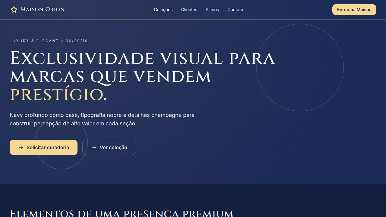
Luxury and elegant interface with strict 60/30/10 color hierarchy. Ideal for branding de luxo, hotéis e hospitalidade premium, moda high-end, joalheria, serviços financeiros exclusivos. AI-ready template.
Use case: Luxury branding, Hotels and premium hospitality, High-end fashion, Jewelry, Exclusive financial services
Historical Context
Luxury design didn't emerge from aesthetics alone — it came from scarcity. The earliest luxury visual languages were born in Parisian couture houses and Swiss watchmaking, where every typographic choice signaled exclusivity. Didone serifs, generous whitespace, and restrained color palettes weren't decorative decisions; they were gatekeeping mechanisms. If your materials looked accessible, you weren't luxury. The digital era nearly destroyed this. Early web design democratized everything, and luxury brands struggled to translate physical restraint into pixels. It took until the late 2010s for digital luxury to find its footing — brands like Bottega Veneta deleting social media entirely, Celine dropping its accent, entire websites reduced to a single typeface and negative space. The lesson was clear: luxury online means refusing to compete for attention. Today's luxury design systems inherit this lineage but face new tensions. Dark modes, motion design, and immersive experiences push against the traditional stillness of luxury. The best work resolves this by treating motion as choreography rather than animation — deliberate, unhurried, almost reluctant to reveal itself.
When to Use
Deploy this system when the brand's entire value proposition rests on perceived quality and exclusivity. Luxury brands, five-star hospitality, private banking, haute couture, fine jewelry, premium real estate — anywhere the audience expects to feel selected rather than sold to. If your conversion funnel involves urgency tactics or discount badges, this isn't your system. Luxury design earns trust through restraint. It works when silence communicates more than noise, and when every pixel of whitespace is doing deliberate, expensive work.
Design Principles
- Radical restraint — remove until it breaks, then add back one element. Luxury is what you refuse to include.
- Typographic authority — one serif family, used with conviction. Size contrast replaces color contrast. Let letterforms do the heavy lifting.
- Choreographed motion — nothing animates without purpose. Transitions are slow, eased with intention, and never loop. Think curtain reveal, not bounce.
- Material honesty — textures, photography, and color must reference physical luxury. No gradients that don't exist in nature. No shadows without a light source.
- Asymmetric tension — reject centered-everything layouts. Luxury compositions use deliberate imbalance to create visual intrigue and guide the eye with confidence.
DESIGN.md
---
version: "alpha"
name: "Luxury & Elegant"
description: "Luxury and elegant interface with strict 60/30/10 color hierarchy. Ideal for branding de luxo, hotéis e hospitalidade premium, moda high-end, joalheria, serviços financeiros exclusivos. AI-ready template."
colors:
  primary: "#192A56"
  secondary: "#FCFBFB"
  tertiary: "#EDA6A3"
typography:
  h1:
    fontFamily: Playfair Display
    fontSize: 2.25rem
    fontWeight: 700
  body-md:
    fontFamily: Inter
    fontSize: 1rem
    fontWeight: 400
  label-caps:
    fontFamily: Inter
    fontSize: 0.75rem
    fontWeight: 500
components:
  button-primary:
    backgroundColor: "{colors.primary}"
    padding: 12px
---

## Overview

Luxury and elegant interface with strict 60/30/10 color hierarchy. Ideal for branding de luxo, hotéis e hospitalidade premium, moda high-end, joalheria, serviços financeiros exclusivos. AI-ready template. Luxury design didn't emerge from aesthetics alone — it came from scarcity. The earliest luxury visual languages were born in Parisian couture houses and Swiss watchmaking, where every typographic choice signaled exclusivity. Didone serifs, generous whitespace, and restrained color palettes weren't decorative decisions; they were gatekeeping mechanisms. If your materials looked accessible, you weren't luxury.

The digital era nearly destroyed this. Early web design democratized everything, and luxury brands struggled to translate physical restraint into pixels. It took until the late 2010s for digital luxury to find its footing — brands like Bottega Veneta deleting social media entirely, Celine dropping its accent, entire websites reduced to a single typeface and negative space. The lesson was clear: luxury online means refusing to compete for attention.

Today's luxury design systems inherit this lineage but face new tensions. Dark modes, motion design, and immersive experiences push against the traditional stillness of luxury. The best work resolves this by treating motion as choreography rather than animation — deliberate, unhurried, almost reluctant to reveal itself.

- Density: 5/10 — Balanced
- Variance: 4/10 — Moderate
- Motion: 4/10 — Subtle

- **Style:** Sophisticated, Timeless, Refined, Premium
- **Keywords:** luxury, elegant, classic, premium, high-end, editorial, serif, upscale, timeless, sophisticated
- **Era:** Classic Luxury Reimagined
- **Light/Dark:** ✓ Full / ✓ Full

## Colors

- **Midnight Navy** (#192A56) — Dark surface, primary background
- **Pearl White** (#FCFBFB) — Secondary surface
- **Dusty Rose** (#EDA6A3) — Extended palette, decorative use


## Typography

- **Display / Hero:** Playfair Display — Weight 700, tight tracking, used for headline impact
- **Accent:** Inter — Used for decorative or emphasis text
- **Body:** Playfair Display — Weight 400, 16px/1.6 line-height, max 72ch per line
- **UI Labels / Captions:** Playfair Display — 0.875rem, weight 500, slight letter-spacing
- **Monospace:** JetBrains Mono — Used for code, metadata, and technical values

Scale:
- Hero: clamp(2.5rem, 5vw, 4rem)
- H1: 2.25rem
- H2: 1.5rem
- Body: 1rem / 1.6
- Small: 0.875rem


## Layout

- **Grid:** CSS Grid primary. Max-width containment: 1280px centered with 1.5rem side padding.
- **Spacing rhythm:** Balanced. Base unit: 0.5rem (8px).
- **Section vertical gaps:** clamp(4rem, 8vw, 8rem).
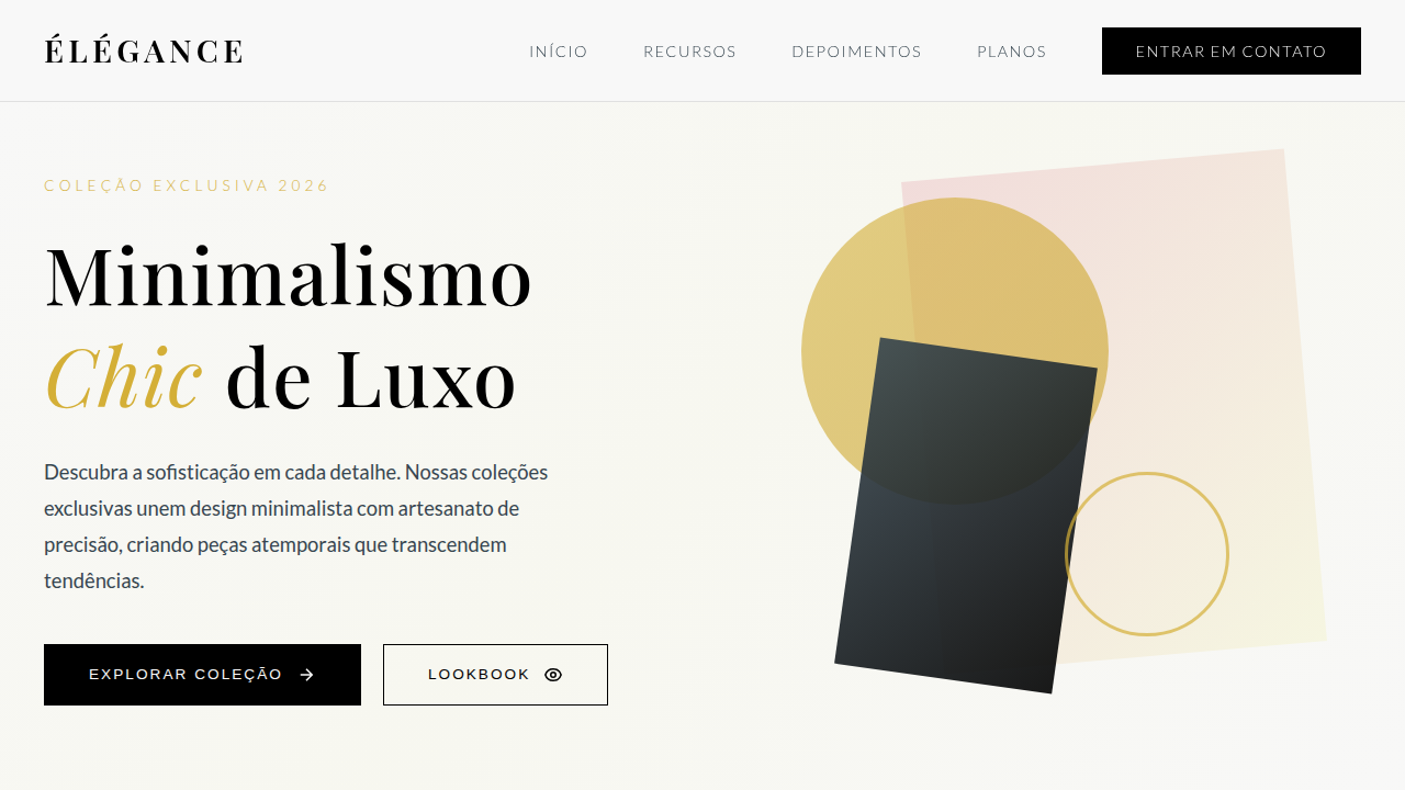
- **Hero layout:** Split-screen (text left, visual right).
- **Feature sections:** Zig-zag alternating text+image rows. No 3-equal-columns.
- **Mobile collapse:** All multi-column layouts collapse below 768px. No horizontal overflow.
- **z-index contract:** base (0) / sticky-nav (100) / overlay (200) / modal (300) / toast (500).


## Elevation & Depth

10%: Champagne #F7D794 em filetes, logomarca e botões premium; tipografia serifada para títulos, contraste refinado, brilho discreto e transições suaves (240-320ms)

- **Physics:** Ease-out curves, 200-300ms duration. Smooth and predictable.
- **Entry animations:** Fade + translate-Y (16px → 0) over 420ms ease-out. Staggered cascades for lists: 80ms between items.
- **Hover states:** Subtle color shift + shadow adjustment over 200ms.
- **Page transitions:** Fade only (200ms).
- **Performance:** Only transform and opacity animated. No layout-triggering properties.


## Shapes

Base corner radius: 8px. See rounded tokens in front matter for the full scale.


## Components

- **Primary Button:** Subtly rounded (0.5rem) shape. Accent color fill. Hover: 8% darken + subtle lift shadow. Active: -1px translate tactile press. Font weight 600. No outer glows.
- **Secondary / Ghost Button:** Outline variant. 1.5px border in muted color. Text in primary color. Hover: subtle background fill.
- **Cards:** Subtly rounded (0.5rem) corners. Surface background. Subtle shadow (0 2px 12px rgba(0,0,0,0.06)). 1px border stroke.
- **Inputs:** Label above input. 1px border stroke. Focus ring: 2px accent color offset 2px. Error text below in semantic red. No floating labels.
- **Navigation:** Primary surface background. Active item: accent color indicator. Font weight 500 when active.
- **Skeletons:** Shimmer animation matching component dimensions. No circular spinners.
- **Empty States:** Icon-based composition with descriptive text and action button.


## Do's and Don'ts

- No emojis in UI — use icon system only (Lucide, Heroicons)
- No pure black (#000000) — use off-black or charcoal variants
- No oversaturated accent colors (saturation cap: 80%)
- No 3-column equal-width feature layouts — use zig-zag or asymmetric grid
- No `h-screen` — use `min-h-[100dvh]`
- No AI copywriting clichés: "Elevate", "Seamless", "Unleash", "Next-Gen"
- No broken external image links — use picsum.photos or inline SVG
- No generic lorem ipsum in demos

- Do Midnight Navy dominante (60%)
- Do Pearl White + Dusty Rose compondo 30%
- Do Champagne aplicado com parcimônia (10%)
- Do Hierarquia tipográfica elegante
- Do Sensação premium consistente
- Do Responsivo


## Use Case

Luxury branding, Hotels and premium hospitality, High-end fashion, Jewelry, Exclusive financial services
Technical Specs
CSS
background: #192A56; color: #FCFBFB; --rose: #EDA6A3; --champagne: #F7D794; border: 1px solid rgba(247,215,148,0.26); box-shadow: 0 10px 30px rgba(25,42,86,0.45); letter-spacing: 0.01em; transition: all 0.28s ease;
Variables
--color-dominant-60: #192A56; --color-secondary-30-text: #FCFBFB; --color-secondary-30-surface: #EDA6A3; --color-accent-10: #F7D794; --font-display: 'Playfair Display', serif; --font-body: 'Inter', sans-serif; --radius-md: 10px; --shadow-lux: 0 10px 30px rgba(25,42,86,0.45);
Checklist
☐ Midnight Navy dominante (60%), ☐ Pearl White + Dusty Rose compondo 30%, ☐ Champagne aplicado com parcimônia (10%), ☐ Hierarquia tipográfica elegante, ☐ Sensação premium consistente, ☐ Responsivo
Colors
Primary
Secondary
Effects
10%: Champagne #F7D794 em filetes, logomarca e botões premium; tipografia serifada para títulos, contraste refinado, brilho discreto e transições suaves (240-320ms)
Light/Dark
✓ Full / ✓ Full
AI Prompt
Act as a Senior Frontend Engineer and Expert UI Designer.
Your task is to code a complete Landing Page on the first attempt.
- Landing Page Theme: <INSERT THEME>
- Sections to add: <INSERT SECTIONS>

Generate the final code immediately following these definitions:

## Style

- **Name:** Luxury & Elegant
- **Type:** Sophisticated, Timeless, Refined, Premium
- **Keywords:** luxury, elegant, classic, premium, high-end, editorial, serif, upscale, timeless, sophisticated
- **Era:** Classic Luxury Reimagined
- **Light/Dark:** ✓ Full / ✓ Full

## Color Palette

- **Primary:** 60%: Midnight Navy #192A56 para fundos profundos e atmosfera sofisticada
- **Secondary:** 30%: Pearl White #FCFBFB para tipografia elegante + Dusty Rose #EDA6A3 para planos secundários e detalhes sutis

## Visual Effects

10%: Champagne #F7D794 em filetes, logomarca e botões premium; tipografia serifada para títulos, contraste refinado, brilho discreto e transições suaves (240-320ms)

## AI Visual Direction

Craft a luxury and elegant interface with strict 60/30/10 color hierarchy. Use 60% midnight navy (#192A56) to establish exclusivity, 30% pearl white (#FCFBFB) and dusty rose (#EDA6A3) for refined typography and supporting surfaces, and 10% champagne (#F7D794) for premium accents such as logo details, dividers, and key CTA highlights. Prioritize timeless composition and restrained ornamentation.

## CSS Technical

```css
background: #192A56; color: #FCFBFB; --rose: #EDA6A3; --champagne: #F7D794; border: 1px solid rgba(247,215,148,0.26); box-shadow: 0 10px 30px rgba(25,42,86,0.45); letter-spacing: 0.01em; transition: all 0.28s ease;
```

## Design System Variables

```css
--color-dominant-60: #192A56; --color-secondary-30-text: #FCFBFB; --color-secondary-30-surface: #EDA6A3; --color-accent-10: #F7D794; --font-display: 'Playfair Display', serif; --font-body: 'Inter', sans-serif; --radius-md: 10px; --shadow-lux: 0 10px 30px rgba(25,42,86,0.45);
```

## Implementation Checklist

- ☐ Midnight Navy dominante (60%)
- ☐ Pearl White + Dusty Rose compondo 30%
- ☐ Champagne aplicado com parcimônia (10%)
- ☐ Hierarquia tipográfica elegante
- ☐ Sensação premium consistente
- ☐ Responsivo

## Execution Rules

1. Strictly follow the defined visual style.
2. Use high-quality inline SVG icons (Heroicons or Lucide style) — NEVER use emojis as icons.
3. Add `cursor-pointer` and smooth `hover` states (transition-all) on all interactive elements.
4. Required Page Structure:
   - Navbar (Logo + Links + CTA)
   - Hero Section (Impactful Headline + Subtitle + 2 buttons + 3D/Abstract visual element via CSS)
   - Features (3 cards with icons)
   - Testimonials (3 cards)
   - Pricing (3 tiers, highlight the middle one)
   - Final CTA
   - Full Footer with social links, privacy policy, terms of use, contact and SEO links.
5. All text content must be in English.
6. The visual must be CLEARLY distinct — do not create a "default Bootstrap" design. Force the use of the provided design system variables.
7. Use `<style>` tags in the head for custom classes (especially for complex backdrop-filter effects and animations) that Tailwind CDN doesn't cover.
8. Full Responsiveness: Layout must adapt perfectly to Mobile, Tablet and Desktop (vertical stack on mobile).
9. Include basic SEO, Viewport and Open Graph meta tags in `<head>`.
10. Footer must contain: Copyright 2026, Secondary navigation links and Social media icons.
11. Make the creative decisions needed to deliver the complete, functional result now.
Related
Last synced: 4/1/2026