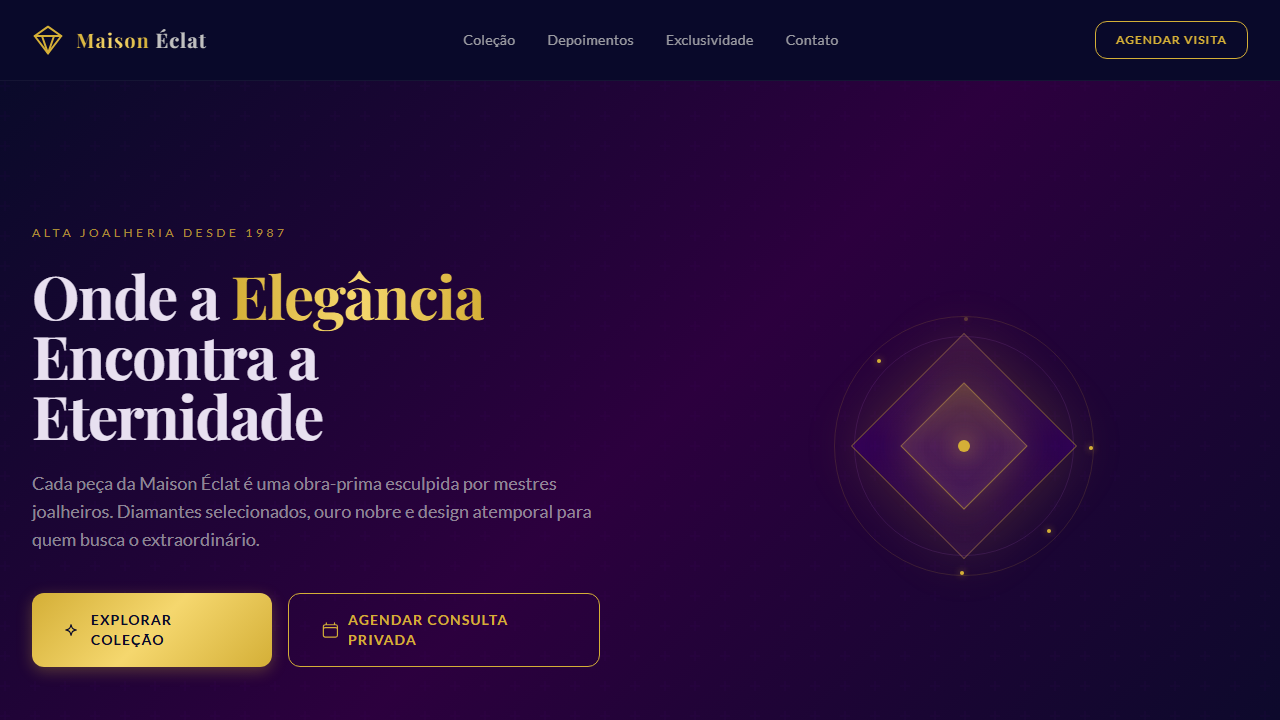
Roxo Veludo Real
Luxurious and sophisticated UI with a royal feel. Ideal for marcas de luxo, joalherias, moda premium, hotéis boutique, eventos exclusivos. AI-ready template.
Use case: Luxury brands, Jewelry stores, Moda premium, Hotéis boutique, Events exclusivos
Historical Context
Purple wasn't chosen as the color of royalty — it was forced into that role by economics. Tyrian purple, extracted from the mucus of predatory sea snails off the Phoenician coast, required twelve thousand shellfish to yield barely 1.5 grams of dye. The labor was grotesque, the smell unbearable, and the cost astronomical. Only emperors and senators could afford it. Sumptuary laws in Rome literally made it illegal for commoners to wear the color. That's not branding — that's state-enforced exclusivity. The association stuck because it was never democratized the way other luxury signifiers were. When synthetic mauveine arrived in 1856, it opened purple to the masses, but deep purple — that specific, saturated, almost-black violet — retained its gravity. It reads as velvet even on a flat screen. There's a tactile weight to it that lighter purples simply don't carry. In modern design, deep purple operates as a shorthand for 'this costs more than you think.' It's the color of VIP lounges, not dance floors. Of private banking interfaces, not fintech apps. It communicates that the brand has nothing to prove and no need to shout.
When to Use
Deploy royal purple when the entire experience needs to whisper rather than announce. It belongs on luxury brand identities, premium tier interfaces, VIP event collateral, and high-end service platforms where the audience expects restraint. Avoid it for anything mass-market or youth-oriented — deep purple ages a brand up by a decade instantly. It pairs best with gold, cream, and charcoal. Never combine it with bright saturated colors unless you want it to read as costume rather than couture.
Design Principles
- Treat deep purple as a dominant, not an accent — it loses its authority when reduced to small touches alongside louder colors
- Pair exclusively with low-chroma neutrals and metallics; high-saturation neighbors cheapen the palette immediately
- Use generous negative space around purple elements — crowding destroys the sense of exclusivity the color carries
- Specify typography that matches the weight of the color: high-contrast serifs or ultra-thin sans-serifs, nothing in between
- Reserve true black for text only — let the purple itself serve as your darkest environmental tone to maintain richness across the layout
DESIGN.md
---
version: "alpha"
name: "Roxo Veludo Real"
description: "Luxurious and sophisticated UI with a royal feel. Ideal for marcas de luxo, joalherias, moda premium, hotéis boutique, eventos exclusivos. AI-ready template."
colors:
primary: "#4B0082"
secondary: "#2C003E"
tertiary: "#0A0A2A"
neutral: "#8E44AD"
surface: "#D4AF37"
accent: "#36454F"
typography:
h1:
fontFamily: Playfair Display
fontSize: 2.25rem
fontWeight: 700
body-md:
fontFamily: Playfair Display
fontSize: 1rem
fontWeight: 400
label-caps:
fontFamily: Playfair Display
fontSize: 0.75rem
fontWeight: 500
rounded:
sm: 12px
md: 24px
lg: 36px
components:
button-primary:
backgroundColor: "{colors.primary}"
textColor: "{colors.neutral}"
rounded: "{rounded.sm}"
padding: 12px
---
## Overview
Luxurious and sophisticated UI with a royal feel. Ideal for marcas de luxo, joalherias, moda premium, hotéis boutique, eventos exclusivos. AI-ready template. Purple wasn't chosen as the color of royalty — it was forced into that role by economics. Tyrian purple, extracted from the mucus of predatory sea snails off the Phoenician coast, required twelve thousand shellfish to yield barely 1.5 grams of dye. The labor was grotesque, the smell unbearable, and the cost astronomical. Only emperors and senators could afford it. Sumptuary laws in Rome literally made it illegal for commoners to wear the color. That's not branding — that's state-enforced exclusivity.
The association stuck because it was never democratized the way other luxury signifiers were. When synthetic mauveine arrived in 1856, it opened purple to the masses, but deep purple — that specific, saturated, almost-black violet — retained its gravity. It reads as velvet even on a flat screen. There's a tactile weight to it that lighter purples simply don't carry.
In modern design, deep purple operates as a shorthand for 'this costs more than you think.' It's the color of VIP lounges, not dance floors. Of private banking interfaces, not fintech apps. It communicates that the brand has nothing to prove and no need to shout.
- Density: 5/10 — Balanced
- Variance: 4/10 — Moderate
- Motion: 4/10 — Subtle
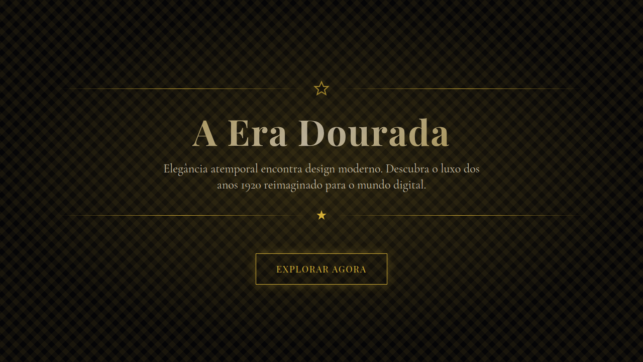
- **Style:** Luxury & Sophisticated
- **Keywords:** Royal, velvet, luxury, rich, deep, sophisticated, elegant, berry, mysterious, opulent, premium
- **Era:** Timeless Opulence
- **Light/Dark:** ✓ Full
## Colors
- **Royal Velvet Purple** (#4B0082) — Accent color, emphasis elements
- **Deep Berry** (#2C003E) — Secondary surface or text color
- **Midnight Blue** (#0A0A2A) — Dark surface, primary background
- **Plum** (#8E44AD) — Extended palette, decorative use
- **Antique Gold** (#D4AF37) — Premium accent, decorative highlights
- **Charcoal Grey** (#36454F) — Deep contrast surface
- **Silver Mist** (#C0C0C0) — Extended palette, decorative use
## Typography
- **Display / Hero:** Playfair Display — Weight 700, tight tracking, used for headline impact
- **Accent:** Lato — Used for decorative or emphasis text
- **Body:** Playfair Display — Weight 400, 16px/1.6 line-height, max 72ch per line
- **UI Labels / Captions:** Playfair Display — 0.875rem, weight 500, slight letter-spacing
- **Monospace:** JetBrains Mono — Used for code, metadata, and technical values
Scale:
- Hero: clamp(2.5rem, 5vw, 4rem)
- H1: 2.25rem
- H2: 1.5rem
- Body: 1rem / 1.6
- Small: 0.875rem
## Layout
- **Grid:** CSS Grid primary. Max-width containment: 1280px centered with 1.5rem side padding.
- **Spacing rhythm:** Balanced. Base unit: 0.5rem (8px).
- **Section vertical gaps:** clamp(4rem, 8vw, 8rem).
- **Hero layout:** Split-screen (text left, visual right).
- **Feature sections:** Zig-zag alternating text+image rows. No 3-equal-columns.
- **Mobile collapse:** All multi-column layouts collapse below 768px. No horizontal overflow.
- **z-index contract:** base (0) / sticky-nav (100) / overlay (200) / modal (300) / toast (500).
## Elevation & Depth
Soft, plush textures, subtle metallic sheen, deep and dramatic shadows, elegant serif typography for headlines, refined sans-serif for body, smooth and flowing transitions, focus on depth and richness
- **Physics:** Ease-out curves, 200-300ms duration. Smooth and predictable.
- **Entry animations:** Fade + translate-Y (16px → 0) over 420ms ease-out. Staggered cascades for lists: 80ms between items.
- **Hover states:** Subtle color shift + shadow adjustment over 200ms.
- **Page transitions:** Fade only (200ms).
- **Performance:** Only transform and opacity animated. No layout-triggering properties.
## Shapes
Base corner radius: 12px. See rounded tokens in front matter for the full scale.
## Components
- **Primary Button:** Rounded (12px) shape. Accent color fill. Hover: 8% darken + subtle lift shadow. Active: -1px translate tactile press. Font weight 600. No outer glows.
- **Secondary / Ghost Button:** Outline variant. 1.5px border in muted color. Text in primary color. Hover: subtle background fill.
- **Cards:** Rounded (12px) corners. Surface background. Subtle shadow (0 2px 12px rgba(0,0,0,0.06)). 1px border stroke.
- **Inputs:** Label above input. 1px border stroke. Focus ring: 2px accent color offset 2px. Error text below in semantic red. No floating labels.
- **Navigation:** Primary surface background. Active item: accent color indicator. Font weight 500 when active.
- **Skeletons:** Shimmer animation matching component dimensions. No circular spinners.
- **Empty States:** Icon-based composition with descriptive text and action button.
## Do's and Don'ts
- No emojis in UI — use icon system only (Lucide, Heroicons)
- No pure black (#000000) — use off-black or charcoal variants
- No oversaturated accent colors (saturation cap: 80%)
- No 3-column equal-width feature layouts — use zig-zag or asymmetric grid
- No `h-screen` — use `min-h-[100dvh]`
- No AI copywriting clichés: "Elevate", "Seamless", "Unleash", "Next-Gen"
- No broken external image links — use picsum.photos or inline SVG
- No generic lorem ipsum in demos
- Do Royal Velvet Purple primary #4B0082
- Do Deep and rich color palette
- Do Elegant serif typography for headlines
- Do Deep
- Do dramatic shadows
- Do Plush textures (e.g.
- Do velvet
- Do silk)
- Do Responsive design for all devices
## Use Case
Luxury brands, Jewelry stores, Moda premium, Hotéis boutique, Events exclusivos
Technical Specs
CSS
font-family: 'Playfair Display', serif; --font-body: 'Lato', sans-serif; color: #4B0082; background-color: #0A0A2A; border-radius: 12px; box-shadow: 0 10px 30px rgba(0,0,0,0.4); transition: all 0.5s ease-in-out;
Variables
--color-royal-purple: #4B0082; --color-deep-berry: #2C003E; --color-midnight-blue: #0A0A2A; --font-serif-primary: 'Playfair Display', serif; --font-sans-body: 'Lato', sans-serif; --border-radius-xl: 12px; --shadow-deep: 0 10px 30px rgba(0,0,0,0.4);
Checklist
☐ Royal Velvet Purple primary #4B0082, ☐ Deep and rich color palette, ☐ Elegant serif typography for headlines, ☐ Deep, dramatic shadows, ☐ Plush textures (e.g., velvet, silk), ☐ Responsive design for all devices
Colors
Primary
Secondary
Effects
Soft, plush textures, subtle metallic sheen, deep and dramatic shadows, elegant serif typography for headlines, refined sans-serif for body, smooth and flowing transitions, focus on depth and richness
Light/Dark
✓ Full
AI Prompt
Act as a Senior Frontend Engineer and Expert UI Designer.
Your task is to code a complete Landing Page on the first attempt.
- Landing Page Theme: <INSERT THEME>
- Sections to add: <INSERT SECTIONS>

Generate the final code immediately following these definitions:

## Style

- **Name:** Roxo Veludo Real
- **Type:** Luxury & Sophisticated
- **Keywords:** Royal, velvet, luxury, rich, deep, sophisticated, elegant, berry, mysterious, opulent, premium
- **Era:** Timeless Opulence
- **Light/Dark:** ✓ Full

## Color Palette

- **Primary:** Royal Velvet Purple #4B0082, Deep Berry #2C003E, Midnight Blue #0A0A2A
- **Secondary:** Plum #8E44AD, Antique Gold #D4AF37, Charcoal Grey #36454F, Silver Mist #C0C0C0

## Visual Effects

Soft, plush textures, subtle metallic sheen, deep and dramatic shadows, elegant serif typography for headlines, refined sans-serif for body, smooth and flowing transitions, focus on depth and richness

## AI Visual Direction

Create a luxurious and sophisticated UI with a royal feel. Use royal velvet purple (#4B0082) as the primary color, complemented by deep berry tones and midnight blue. Incorporate soft, plush textures, subtle metallic accents (gold/silver), elegant serif typography for headlines, and refined sans-serif for body. Focus on deep shadows and smooth transitions to convey opulence and mystery.

## CSS Technical

```css
font-family: 'Playfair Display', serif; --font-body: 'Lato', sans-serif; color: #4B0082; background-color: #0A0A2A; border-radius: 12px; box-shadow: 0 10px 30px rgba(0,0,0,0.4); transition: all 0.5s ease-in-out;
```

## Design System Variables

```css
--color-royal-purple: #4B0082; --color-deep-berry: #2C003E; --color-midnight-blue: #0A0A2A; --font-serif-primary: 'Playfair Display', serif; --font-sans-body: 'Lato', sans-serif; --border-radius-xl: 12px; --shadow-deep: 0 10px 30px rgba(0,0,0,0.4);
```

## Implementation Checklist

- ☐ Royal Velvet Purple primary #4B0082
- ☐ Deep and rich color palette
- ☐ Elegant serif typography for headlines
- ☐ Deep
- dramatic shadows
- ☐ Plush textures (e.g.
- velvet
- silk)
- ☐ Responsive design for all devices

## Execution Rules

1. Strictly follow the defined visual style.
2. Use high-quality inline SVG icons (Heroicons or Lucide style) — NEVER use emojis as icons.
3. Add `cursor-pointer` and smooth `hover` states (transition-all) on all interactive elements.
4. Required Page Structure:
   - Navbar (Logo + Links + CTA)
   - Hero Section (Impactful Headline + Subtitle + 2 buttons + 3D/Abstract visual element via CSS)
   - Features (3 cards with icons)
   - Testimonials (3 cards)
   - Pricing (3 tiers, highlight the middle one)
   - Final CTA
   - Full Footer with social links, privacy policy, terms of use, contact and SEO links.
5. All text content must be in English.
6. The visual must be CLEARLY distinct — do not create a "default Bootstrap" design. Force the use of the provided design system variables.
7. Use `<style>` tags in the head for custom classes (especially for complex backdrop-filter effects and animations) that Tailwind CDN doesn't cover.
8. Full Responsiveness: Layout must adapt perfectly to Mobile, Tablet and Desktop (vertical stack on mobile).
9. Include basic SEO, Viewport and Open Graph meta tags in `<head>`.
10. Footer must contain: Copyright 2026, Secondary navigation links and Social media icons.
11. Make the creative decisions needed to deliver the complete, functional result now.
Related
Last synced: 4/1/2026