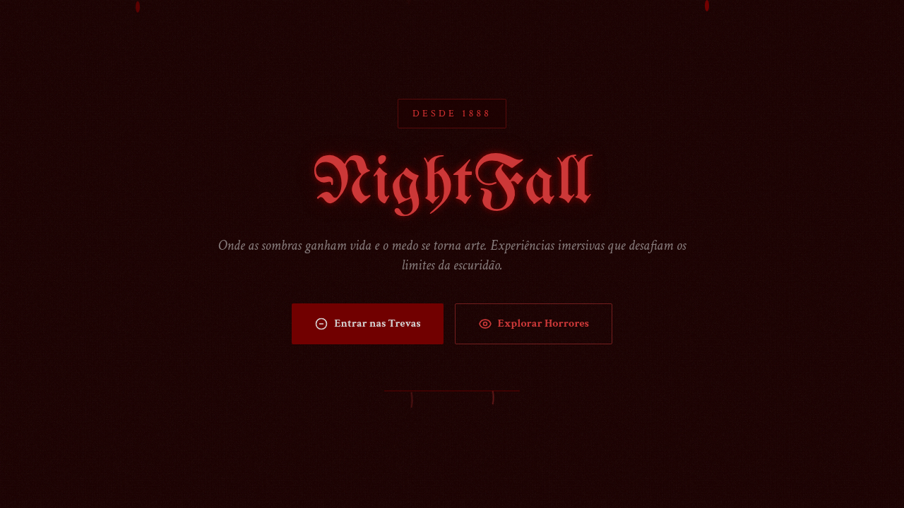
Horror / Gothic Dark
Horror gothic dark interface. Ideal for landing pages, saas. AI-ready template.
Use case: Landing pages, SaaS
Historical Context
Gothic design didn't start on screens. It started in cathedrals — pointed arches, grotesques, the deliberate orchestration of shadow to make you feel small. That psychological weight carried straight into print (penny dreadfuls, Hammer Horror posters) and eventually into digital. The tradition is about controlled dread. When Resident Evil dropped in '96, the UI was part of the horror. That heartbeat monitor, the inventory screen that looked like a blood-stained notebook — every pixel reinforced vulnerability. Bloodborne pushed it further: the HUD barely existed, letting the architecture and fog do the emotional work. Silent Hill's grain and rust. Darkest Dungeon's woodcut stress meters. These aren't decorative choices. They're tension systems. Dark atmospheric design works because it restricts information. You can't see everything. The palette is suffocating. Typography feels carved, not typed. When done right, the interface itself becomes a source of unease — which is exactly the point.
When to Use
When the product needs to evoke dread, intensity, or dark grandeur. Horror games, obviously. But also gothic fashion brands, Halloween campaigns, dark entertainment platforms, metal music sites, haunted attractions, true crime content. Works when your audience wants to feel something visceral — not comforted. Avoid if accessibility is paramount or if the darkness is purely aesthetic with no narrative backing it. This theme demands commitment. Half-gothic looks like a costume.
Design Principles
- Restrict visibility — withhold information through deep blacks, narrow value ranges, and selective reveals to build tension
- Let typography bleed — use blackletter, distressed serifs, or hand-carved faces that feel ancient and slightly wrong, never clean sans-serifs
- Blood red is earned — reserve saturated reds and crimsons for moments of impact; overuse kills the drama
- Texture over flatness — grain, noise, scratches, vignettes; gothic surfaces should feel decayed and tactile, never pristine
- Sound the architecture — pointed shapes, vertical emphasis, heavy borders; the layout itself should loom over the viewer like a cathedral nave
Technical Specs
Colors
Primary
Secondary
Effects
Low-key dramatic shadows, blood-red highlights, dripping animations, flicker effects, grunge texture overlays, eerie hover transitions, fog/mist effects
Light/Dark
✗ No / ✓ Only
Related
Last synced: 4/1/2026