Helios Design System (HashiCorp)
Highly structured and technical enterprise UI inspired by HashiCorp Helios. Ideal for ferramentas devops, saas técnico, dashboards de infraestrutura, plataformas open-source, painéis de engenharia. AI-ready template.
Use case: DevOps tools, Technical SaaS, Infrastructure dashboards, Open-source platforms, Engineering panels
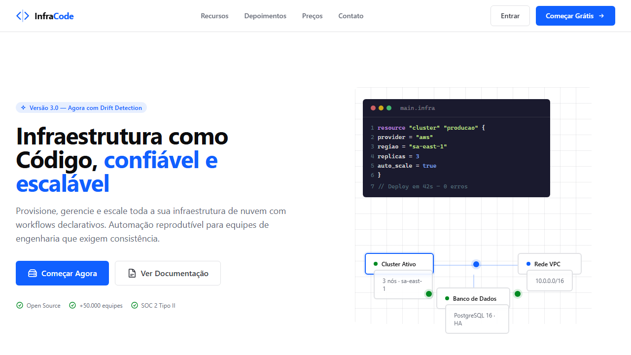
Historical Context
HashiCorp didn't set out to build a design system. They set out to make infrastructure manageable — and Helios emerged from that obsession with operational clarity. When you're building UIs for Terraform state files, Vault secret hierarchies, and Consul service meshes, you can't afford decorative ambiguity. Every pixel needs to communicate system state without hesitation. What makes Helios fascinating is how it reverse-engineered aesthetics from constraint. Infrastructure tools demand information density that would break most consumer-facing systems. HashiCorp's team had to solve for operators scanning hundreds of resources at 2am during an incident — not users leisurely browsing a feed. That pressure forged a visual language where hierarchy is ruthlessly enforced, color is functional rather than emotional, and whitespace exists only to prevent cognitive collision. The system carries the DNA of terminal interfaces forward into modern UI. It respects the developer's mental model — structured, predictable, scannable — while adding just enough visual refinement to feel like software rather than a spreadsheet. Helios proves that infrastructure companies produce some of the most disciplined design systems precisely because their users have zero tolerance for ambiguity.
When to Use
Reach for Helios-style patterns when your interface serves operators managing complex distributed systems. If your users think in graphs, hierarchies, and state machines — not marketing funnels — this is your territory. Ideal for platforms where data density is a feature, not a problem. DevOps dashboards, infrastructure management consoles, enterprise developer tooling, and anything where the user's primary task is understanding system state at a glance rather than completing a linear flow.
Design Principles
- Systematic over expressive — every component exists to communicate state, not to decorate. If it doesn't reduce cognitive load during an incident, it doesn't ship.
- Reliability as aesthetic — visual consistency isn't a nice-to-have, it's operational infrastructure. Users build muscle memory around patterns; breaking them costs trust and response time.
- Data-density by design — embrace information-rich interfaces instead of hiding complexity behind progressive disclosure. Operators need the full picture, not a guided tour.
- Infrastructure-grade durability — components must handle extreme edge cases: thousand-row tables, deeply nested hierarchies, real-time state changes, and graceful degradation when systems fail.
- Terminal heritage, modern execution — honor the developer's CLI mental model (structured, predictable, keyboard-first) while leveraging visual hierarchy that plain text cannot achieve.
DESIGN.md
---
version: "alpha"
name: "Helios Design System (HashiCorp)"
description: "Highly structured and technical enterprise UI inspired by HashiCorp Helios. Ideal for ferramentas devops, saas técnico, dashboards de infraestrutura, plataformas open-source, painéis de engenharia. AI-ready template."
colors:
  primary: "#1060ff"
  secondary: "#0c0c0e"
  tertiary: "#ffffff"
  neutral: "#0c56e9"
  surface: "#008a22"
  accent: "#e52228"
typography:
  h1:
    fontFamily: "-apple-system"
    fontSize: 2.5rem
    fontWeight: 700
  body-md:
    fontFamily: "-apple-system"
    fontSize: 1rem
    fontWeight: 400
components:
  button-primary:
    backgroundColor: "{colors.primary}"
    textColor: "{colors.neutral}"
    padding: 12px
---

## Overview

Highly structured and technical enterprise UI inspired by HashiCorp Helios. Ideal for ferramentas devops, saas técnico, dashboards de infraestrutura, plataformas open-source, painéis de engenharia. AI-ready template. HashiCorp didn't set out to build a design system. They set out to make infrastructure manageable — and Helios emerged from that obsession with operational clarity. When you're building UIs for Terraform state files, Vault secret hierarchies, and Consul service meshes, you can't afford decorative ambiguity. Every pixel needs to communicate system state without hesitation.

What makes Helios fascinating is how it reverse-engineered aesthetics from constraint. Infrastructure tools demand information density that would break most consumer-facing systems. HashiCorp's team had to solve for operators scanning hundreds of resources at 2am during an incident — not users leisurely browsing a feed. That pressure forged a visual language where hierarchy is ruthlessly enforced, color is functional rather than emotional, and whitespace exists only to prevent cognitive collision.

The system carries the DNA of terminal interfaces forward into modern UI. It respects the developer's mental model — structured, predictable, scannable — while adding just enough visual refinement to feel like software rather than a spreadsheet. Helios proves that infrastructure companies produce some of the most disciplined design systems precisely because their users have zero tolerance for ambiguity.

- Density: 8/10 — Dense
- Variance: 4/10 — Moderate
- Motion: 4/10 — Subtle

- **Style:** Technical Enterprise
- **Keywords:** Systemic, reliable, data-dense, technical, accessible, open-source, engineering-focused
- **Era:** 2020s Technical SaaS
- **Light/Dark:** ✓ Full

## Colors

- **Action Blue** (#1060ff) — Accent highlight, links and focus states
- **Foreground Strong** (#0c0c0e) — Secondary surface or text color
- **Surface Primary** (#ffffff) — Primary accent, CTAs and interactive elements
- **Action Hover** (#0c56e9) — Extended palette, decorative use
- **Success Green** (#008a22) — Success states, positive indicators
- **Critical Red** (#e52228) — Error states, destructive actions
- **Neutral Faint** (#fafafa) — Extended palette, decorative use


## Typography

- **Display / Hero:** Segoe UI — Weight 700, tight tracking, used for headline impact
- **Accent:** -apple-system — Used for decorative or emphasis text
- **Body:** Segoe UI — Weight 400, 16px/1.6 line-height, max 72ch per line
- **UI Labels / Captions:** Segoe UI — 0.875rem, weight 500, slight letter-spacing
- **Monospace:** JetBrains Mono — Used for code, metadata, and technical values

Scale:
- Hero: clamp(2.5rem, 5vw, 4rem)
- H1: 2.25rem
- H2: 1.5rem
- Body: 1rem / 1.6
- Small: 0.875rem


## Layout

- **Grid:** CSS Grid primary. Max-width containment: 1280px centered with 1.5rem side padding.
- **Spacing rhythm:** Balanced. Base unit: 0.5rem (8px).
- **Section vertical gaps:** clamp(4rem, 8vw, 8rem).
- **Hero layout:** Split-screen (text left, visual right).
- **Feature sections:** Zig-zag alternating text+image rows. No 3-equal-columns.
- **Mobile collapse:** All multi-column layouts collapse below 768px. No horizontal overflow.
- **z-index contract:** base (0) / sticky-nav (100) / overlay (200) / modal (300) / toast (500).


## Elevation & Depth

Small border-radius (5-6px), layered elevation (soft shadows for interactivity), precise grid layouts, high contrast ratios (WCAG AA), subtle hover transitions

- **Physics:** Ease-out curves, 200-300ms duration. Smooth and predictable.
- **Entry animations:** Fade + translate-Y (16px → 0) over 420ms ease-out. Staggered cascades for lists: 80ms between items.
- **Hover states:** Subtle color shift + shadow adjustment over 200ms.
- **Page transitions:** Fade only (200ms).
- **Performance:** Only transform and opacity animated. No layout-triggering properties.


## Shapes

Base corner radius: 8px. See rounded tokens in front matter for the full scale.


## Components

- **Primary Button:** Subtly rounded (0.5rem) shape. Accent color fill. Hover: 8% darken + subtle lift shadow. Active: -1px translate tactile press. Font weight 600. No outer glows.
- **Secondary / Ghost Button:** Outline variant. 1.5px border in muted color. Text in primary color. Hover: subtle background fill.
- **Cards:** Subtly rounded (0.5rem) corners. Surface background. Subtle shadow (0 2px 12px rgba(0,0,0,0.06)). 1px border stroke.
- **Inputs:** Label above input. 1px border stroke. Focus ring: 2px accent color offset 2px. Error text below in semantic red. No floating labels.
- **Navigation:** Primary surface background. Active item: accent color indicator. Font weight 500 when active.
- **Skeletons:** Shimmer animation matching component dimensions. No circular spinners.
- **Empty States:** Icon-based composition with descriptive text and action button.


## Do's and Don'ts

- No emojis in UI — use icon system only (Lucide, Heroicons)
- No pure black (#000000) — use off-black or charcoal variants
- No oversaturated accent colors (saturation cap: 80%)
- No 3-column equal-width feature layouts — use zig-zag or asymmetric grid
- No `h-screen` — use `min-h-[100dvh]`
- No AI copywriting clichés: "Elevate", "Seamless", "Unleash", "Next-Gen"
- No broken external image links — use picsum.photos or inline SVG
- No generic lorem ipsum in demos

- Do Action Blue #1060ff
- Do Border-radius 5-6px
- Do System font stack
- Do Data-dense layout spacing
- Do High contrast accessibility (WCAG AA)


## Use Case

DevOps tools, Technical SaaS, Infrastructure dashboards, Open-source platforms, Engineering panels
Technical Specs
CSS
font-family: -apple-system, BlinkMacSystemFont, 'Segoe UI', Roboto, Helvetica, Arial, sans-serif; --token-color-action: #1060ff; --token-radius-md: 6px; --token-border-primary: rgba(101, 106, 118, 0.2); box-shadow: 0 1px 3px 0 rgba(0, 0, 0, 0.1), 0 1px 2px 0 rgba(0, 0, 0, 0.06); transition: all 0.2s cubic-bezier(0.4, 0, 0.2, 1);
Variables
--hds-color-action: #1060ff; --hds-color-fg-primary: #3b3d45; --hds-color-bg-primary: #ffffff; --hds-radius-sm: 5px; --hds-radius-md: 6px; --hds-shadow-mid: 0 4px 6px -1px rgba(0, 0, 0, 0.1), 0 2px 4px -1px rgba(0, 0, 0, 0.06);
Checklist
☐ Action Blue #1060ff, ☐ Border-radius 5-6px, ☐ System font stack, ☐ Data-dense layout spacing, ☐ High contrast accessibility (WCAG AA)
Colors
Primary
Secondary
Effects
Small border-radius (5-6px), layered elevation (soft shadows for interactivity), precise grid layouts, high contrast ratios (WCAG AA), subtle hover transitions
Light/Dark
✓ Full
AI Prompt
Act as a Senior Frontend Engineer and Expert UI Designer.
Your task is to code a complete Landing Page on the first attempt.
- Landing Page Theme: <INSERT THEME>
- Sections to add: <INSERT SECTIONS>

Generate the final code immediately following these definitions:

## Style

- **Name:** Helios Design System (HashiCorp)
- **Type:** Technical Enterprise
- **Keywords:** Systemic, reliable, data-dense, technical, accessible, open-source, engineering-focused
- **Era:** 2020s Technical SaaS
- **Light/Dark:** ✓ Full

## Color Palette

- **Primary:** Action Blue #1060ff, Foreground Strong #0c0c0e, Surface Primary #ffffff
- **Secondary:** Action Hover #0c56e9, Success Green #008a22, Critical Red #e52228, Neutral Faint #fafafa

## Visual Effects

Small border-radius (5-6px), layered elevation (soft shadows for interactivity), precise grid layouts, high contrast ratios (WCAG AA), subtle hover transitions

## AI Visual Direction

Create a highly structured and technical enterprise UI inspired by HashiCorp Helios. Use a clean white surface with high-contrast dark text. Incorporate a primary blue (#1060ff) for actions. Components should have small rounded corners (5-6px) and very subtle shadows. Focus on data density, clear hierarchy, and technical precision. Use system fonts (SF Pro, Segoe UI).

## CSS Technical

```css
font-family: -apple-system, BlinkMacSystemFont, 'Segoe UI', Roboto, Helvetica, Arial, sans-serif; --token-color-action: #1060ff; --token-radius-md: 6px; --token-border-primary: rgba(101, 106, 118, 0.2); box-shadow: 0 1px 3px 0 rgba(0, 0, 0, 0.1), 0 1px 2px 0 rgba(0, 0, 0, 0.06); transition: all 0.2s cubic-bezier(0.4, 0, 0.2, 1);
```

## Design System Variables

```css
--hds-color-action: #1060ff; --hds-color-fg-primary: #3b3d45; --hds-color-bg-primary: #ffffff; --hds-radius-sm: 5px; --hds-radius-md: 6px; --hds-shadow-mid: 0 4px 6px -1px rgba(0, 0, 0, 0.1), 0 2px 4px -1px rgba(0, 0, 0, 0.06);
```

## Implementation Checklist

- ☐ Action Blue #1060ff
- ☐ Border-radius 5-6px
- ☐ System font stack
- ☐ Data-dense layout spacing
- ☐ High contrast accessibility (WCAG AA)

## Execution Rules

1. Strictly follow the defined visual style.
2. Use high-quality inline SVG icons (Heroicons or Lucide style) — NEVER use emojis as icons.
3. Add `cursor-pointer` and smooth `hover` states (transition-all) on all interactive elements.
4. Required Page Structure:
   - Navbar (Logo + Links + CTA)
   - Hero Section (Impactful Headline + Subtitle + 2 buttons + 3D/Abstract visual element via CSS)
   - Features (3 cards with icons)
   - Testimonials (3 cards)
   - Pricing (3 tiers, highlight the middle one)
   - Final CTA
   - Full Footer with social links, privacy policy, terms of use, contact and SEO links.
5. All text content must be in English.
6. The visual must be CLEARLY distinct — do not create a "default Bootstrap" design. Force the use of the provided design system variables.
7. Use `<style>` tags in the head for custom classes (especially for complex backdrop-filter effects and animations) that Tailwind CDN doesn't cover.
8. Full Responsiveness: Layout must adapt perfectly to Mobile, Tablet and Desktop (vertical stack on mobile).
9. Include basic SEO, Viewport and Open Graph meta tags in `<head>`.
10. Footer must contain: Copyright 2026, Secondary navigation links and Social media icons.
11. Make the creative decisions needed to deliver the complete, functional result now.
Related
Last synced: 4/1/2026