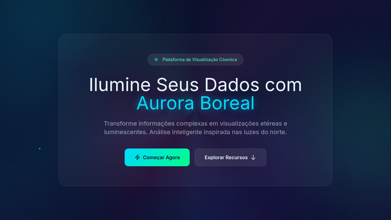
Gradient Aurora Borealis
Gradient aurora borealis infographic. Ideal for landing pages, modern websites. AI-ready template.
Use case: Landing pages, Modern websites
Historical Context
Aurora gradients in data visualization didn't start with dashboards. They started with NASA. The deep blues bleeding into greens, the magenta arcs dissolving into black — these were colors pulled from satellite imagery and repurposed by designers who understood that scientific data deserves more than bar charts on white backgrounds. The space-tech aesthetic emerged in the early 2010s when agencies and premium brands realized that luminescent color transitions could make complex datasets feel approachable without dumbing them down. What makes aurora palettes work in infographics is contrast behavior. Dark backgrounds with glowing data points mimic how we actually perceive light phenomena — bright against void. This isn't decoration. It's leveraging how human vision prioritizes luminance differences. When Bloomberg or SpaceX use these gradients in their data presentations, they're not being flashy. They're encoding hierarchy through light intensity. The premium association is earned, not arbitrary. Luminescent waves signal precision, advanced technology, the kind of care that costs money. A gradient that shifts from deep violet through teal to pale green carries implicit authority — it says this data matters, this organization operates at scale.
When to Use
Reach for aurora gradients when your data lives in scientific, aerospace, or premium-tier contexts. They excel in dark-mode dashboards where glowing data points need to pop against deep backgrounds. Perfect for annual reports that need gravitas without stuffiness, creative presentations where you want the audience to lean in, and any infographic dealing with scale — cosmic distances, market capitalizations, genomic sequences. Avoid them for casual consumer apps or anything that needs to feel warm and approachable. These gradients are cold, precise, and intentionally dramatic.
Design Principles
- Dark canvas first — aurora effects only read correctly against deep, near-black backgrounds. Never place them on white or light gray.
- Limit your luminescent range to 2-3 hue shifts maximum. Real auroras are restrained. Neon rainbow soup is a rave flyer, not a data system.
- Use glow intensity as a data encoding channel — brighter means more important. Don't waste luminance on decorative elements that carry no information.
- Maintain at least 4.5:1 contrast ratio on any text overlaying gradient regions. Beautiful is useless if unreadable.
- Animate sparingly and only along natural wave paths. Horizontal shimmer works. Random particle explosions do not. Movement should feel atmospheric, not mechanical.
DESIGN.md
---
version: "alpha"
name: "Gradient Aurora Borealis"
description: "Gradient aurora borealis infographic. Ideal for landing pages, modern websites. AI-ready template."
colors:
  primary: "#0A0E27"
  secondary: "#E8F4F8"
  tertiary: "#00D9FF"
  neutral: "#00FF88"
  surface: "#FF006E"
  accent: "#00C9FF"
typography:
  h1:
    fontFamily: System UI stack
    fontSize: 2.25rem
    fontWeight: 700
  body-md:
    fontFamily: System UI stack
    fontSize: 1rem
    fontWeight: 400
  label-caps:
    fontFamily: System UI stack
    fontSize: 0.75rem
    fontWeight: 500
components:
  button-primary:
    backgroundColor: "{colors.primary}"
    textColor: "{colors.neutral}"
    padding: 12px
---

## Overview

Gradient aurora borealis infographic. Ideal for landing pages, modern websites. AI-ready template. Aurora gradients in data visualization didn't start with dashboards. They started with NASA. The deep blues bleeding into greens, the magenta arcs dissolving into black — these were colors pulled from satellite imagery and repurposed by designers who understood that scientific data deserves more than bar charts on white backgrounds. The space-tech aesthetic emerged in the early 2010s when agencies and premium brands realized that luminescent color transitions could make complex datasets feel approachable without dumbing them down.

What makes aurora palettes work in infographics is contrast behavior. Dark backgrounds with glowing data points mimic how we actually perceive light phenomena — bright against void. This isn't decoration. It's leveraging how human vision prioritizes luminance differences. When Bloomberg or SpaceX use these gradients in their data presentations, they're not being flashy. They're encoding hierarchy through light intensity.

The premium association is earned, not arbitrary. Luminescent waves signal precision, advanced technology, the kind of care that costs money. A gradient that shifts from deep violet through teal to pale green carries implicit authority — it says this data matters, this organization operates at scale.

- Density: 5/10 — Balanced
- Variance: 4/10 — Moderate
- Motion: 8/10 — Cinematic

- **Style:** Infographic
- **Keywords:** Aurora borealis gradients, cosmic waves, luminescent light waves, magical shimmer, ethereal transparency, dreamy, inspiring, northern lights
- **Era:** Cosmic Ethereal
- **Light/Dark:** ✗ No / ✓ Full

## Colors

- **Deep Space** (#0A0E27) — Primary surface or dominant color
- **Light Cyan Text** (#E8F4F8) — Primary text color
- **Bright Cyan** (#00D9FF) — Accent highlight, links and focus states
- **Mint Green** (#00FF88) — Supporting palette color
- **Hot Pink** (#FF006E) — Primary text color
- **Sky Cyan** (#00C9FF) — Secondary accent
- **Purple** (#7928CA) — Accent color, emphasis elements
- **Teal** (#50E3C2) — Secondary accent


## Typography

- **Display / Hero:** System UI stack (-apple-system, sans-serif) — Weight 700, tight tracking, used for headline impact
- **Body:** System UI stack (-apple-system, sans-serif) — Weight 400, 16px/1.6 line-height, max 72ch per line
- **UI Labels / Captions:** System UI stack (-apple-system, sans-serif) — 0.875rem, weight 500, slight letter-spacing
- **Monospace:** JetBrains Mono — Used for code, metadata, and technical values

Scale:
- Hero: clamp(2.5rem, 5vw, 4rem)
- H1: 2.25rem
- H2: 1.5rem
- Body: 1rem / 1.6
- Small: 0.875rem


## Layout

- **Grid:** CSS Grid primary. Max-width containment: 1280px centered with 1.5rem side padding.
- **Spacing rhythm:** Balanced. Base unit: 0.5rem (8px).
- **Section vertical gaps:** clamp(4rem, 8vw, 8rem).
- **Hero layout:** Split-screen (text left, visual right).
- **Feature sections:** Zig-zag alternating text+image rows. No 3-equal-columns.
- **Mobile collapse:** All multi-column layouts collapse below 768px. No horizontal overflow.
- **z-index contract:** base (0) / sticky-nav (100) / overlay (200) / modal (300) / toast (500).


## Elevation & Depth

Multicolor luminescent lighting, magical glow, aurora wave animations (flowing gradients), cosmic particle effects, ethereal fade transitions, light wave pulses

- **Physics:** Spring — stiffness 120, damping 20. Confident, weighted transitions.
- **Entry animations:** Fade + translate-Y (16px → 0) over 540ms ease-out. Staggered cascades for lists: 120ms between items.
- **Hover states:** Scale(1.03) + shadow lift over 200ms.
- **Page transitions:** Fade + slide (300ms).
- **Performance:** Only transform and opacity animated. No layout-triggering properties.


## Shapes

Base corner radius: 8px. See rounded tokens in front matter for the full scale.


## Components

- **Primary Button:** Subtly rounded (0.5rem) shape. Accent color fill. Hover: 8% darken + subtle lift shadow. Active: -1px translate tactile press. Font weight 600. No outer glows.
- **Secondary / Ghost Button:** Outline variant. 1.5px border in muted color. Text in primary color. Hover: subtle background fill.
- **Cards:** Subtly rounded (0.5rem) corners. Surface background. Subtle shadow (0 2px 12px rgba(0,0,0,0.06)). 1px border stroke.
- **Inputs:** Label above input. 1px border stroke. Focus ring: 2px accent color offset 2px. Error text below in semantic red. No floating labels.
- **Navigation:** Primary surface background. Active item: accent color indicator. Font weight 500 when active.
- **Skeletons:** Shimmer animation matching component dimensions. No circular spinners.
- **Empty States:** Icon-based composition with descriptive text and action button.


## Do's and Don'ts

- No emojis in UI — use icon system only (Lucide, Heroicons)
- No pure black (#000000) — use off-black or charcoal variants
- No oversaturated accent colors (saturation cap: 80%)
- No 3-column equal-width feature layouts — use zig-zag or asymmetric grid
- No `h-screen` — use `min-h-[100dvh]`
- No AI copywriting clichés: "Elevate", "Seamless", "Unleash", "Next-Gen"
- No broken external image links — use picsum.photos or inline SVG
- No generic lorem ipsum in demos

- Do Aurora gradients flowing
- Do Deep space background
- Do Luminescent effects
- Do Cosmic particles
- Do Text readable
- Do Magical ethereal feel


## Use Case

Landing pages, Modern websites
Technical Specs
CSS
background: #0A0E27, conic-gradient or radial-gradient for aurora, animation: aurora-flow (background-position shift), filter: blur for glow, mix-blend-mode: screen, cosmic particle canvas, text-shadow: glow
Variables
--deep-space: #0A0E27, --aurora-cyan: #00D9FF, --aurora-green: #00FF88, --aurora-pink: #FF006E, --aurora-purple: #7928CA, --flow-duration: 12s
Checklist
☐ Aurora gradients flowing, ☐ Deep space background, ☐ Luminescent effects, ☐ Cosmic particles, ☐ Text readable, ☐ Magical ethereal feel
Colors
Primary
Secondary
Effects
Multicolor luminescent lighting, magical glow, aurora wave animations (flowing gradients), cosmic particle effects, ethereal fade transitions, light wave pulses
Light/Dark
✗ No / ✓ Full
AI Prompt
Act as a Senior Frontend Engineer and Expert UI Designer.
Your task is to code a complete Landing Page on the first attempt.
- Landing Page Theme: <INSERT THEME>
- Sections to add: <INSERT SECTIONS>

Generate the final code immediately following these definitions:

## Style

- **Name:** Gradient Aurora Borealis
- **Type:** Infographic
- **Keywords:** Aurora borealis gradients, cosmic waves, luminescent light waves, magical shimmer, ethereal transparency, dreamy, inspiring, northern lights
- **Era:** Cosmic Ethereal
- **Light/Dark:** ✗ No / ✓ Full

## Color Palette

- **Primary:** Deep Space #0A0E27, Light Cyan Text #E8F4F8, Bright Cyan #00D9FF, Mint Green #00FF88
- **Secondary:** Hot Pink #FF006E, Sky Cyan #00C9FF, Purple #7928CA, Teal #50E3C2, cosmic particles

## Visual Effects

Multicolor luminescent lighting, magical glow, aurora wave animations (flowing gradients), cosmic particle effects, ethereal fade transitions, light wave pulses

## AI Visual Direction

Design a gradient aurora borealis infographic. Use: aurora-inspired flowing gradients, cosmic wave patterns, luminescent light effects, deep space background (#0A0E27), multicolor gradient transitions (cyan, green, pink, purple), ethereal transparency, magical shimmer.

## CSS Technical

```css
background: #0A0E27, conic-gradient or radial-gradient for aurora, animation: aurora-flow (background-position shift), filter: blur for glow, mix-blend-mode: screen, cosmic particle canvas, text-shadow: glow
```

## Design System Variables

```css
--deep-space: #0A0E27, --aurora-cyan: #00D9FF, --aurora-green: #00FF88, --aurora-pink: #FF006E, --aurora-purple: #7928CA, --flow-duration: 12s
```

## Implementation Checklist

- ☐ Aurora gradients flowing
- ☐ Deep space background
- ☐ Luminescent effects
- ☐ Cosmic particles
- ☐ Text readable
- ☐ Magical ethereal feel

## Execution Rules

1. Strictly follow the defined visual style.
2. Use high-quality inline SVG icons (Heroicons or Lucide style) — NEVER use emojis as icons.
3. Add `cursor-pointer` and smooth `hover` states (transition-all) on all interactive elements.
4. Required Page Structure:
   - Navbar (Logo + Links + CTA)
   - Hero Section (Impactful Headline + Subtitle + 2 buttons + 3D/Abstract visual element via CSS)
   - Features (3 cards with icons)
   - Testimonials (3 cards)
   - Pricing (3 tiers, highlight the middle one)
   - Final CTA
   - Full Footer with social links, privacy policy, terms of use, contact and SEO links.
5. All text content must be in English.
6. The visual must be CLEARLY distinct — do not create a "default Bootstrap" design. Force the use of the provided design system variables.
7. Use `<style>` tags in the head for custom classes (especially for complex backdrop-filter effects and animations) that Tailwind CDN doesn't cover.
8. Full Responsiveness: Layout must adapt perfectly to Mobile, Tablet and Desktop (vertical stack on mobile).
9. Include basic SEO, Viewport and Open Graph meta tags in `<head>`.
10. Footer must contain: Copyright 2026, Secondary navigation links and Social media icons.
11. Make the creative decisions needed to deliver the complete, functional result now.
Related
Last synced: 4/1/2026